GITNUXSOFTWARE ADVICE
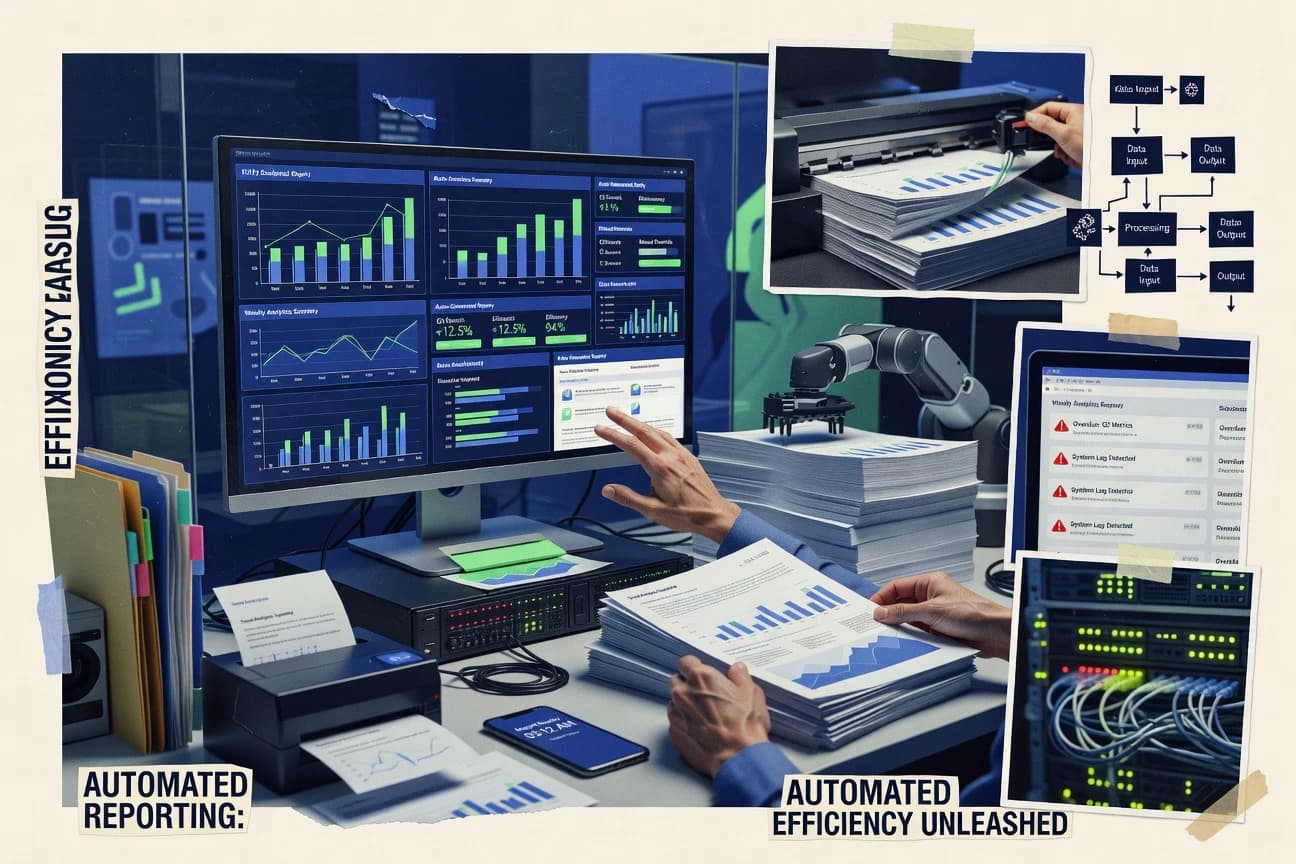
Data Science AnalyticsTop 10 Best Automated Reporting Software of 2026
Explore the top 10 automated reporting software to streamline workflows, save time, and gain insights.

How we ranked these tools
Core product claims cross-referenced against official documentation, changelogs, and independent technical reviews.
Analyzed video reviews and hundreds of written evaluations to capture real-world user experiences with each tool.
AI persona simulations modeled how different user types would experience each tool across common use cases and workflows.
Final rankings reviewed and approved by our editorial team with authority to override AI-generated scores based on domain expertise.
Score: Features 40% · Ease 30% · Value 30%
Gitnux may earn a commission through links on this page — this does not influence rankings. Editorial policy
Editor picks
Three quick recommendations before you dive into the full comparison below — each one leads on a different dimension.
Databox
Scheduled dashboard and report delivery that automates KPI updates to email recipients
Built for teams automating stakeholder KPI reporting with dashboards and scheduled email updates.
Whatagraph
Runner UpScheduled, branded client report delivery with automated data refresh across connected marketing accounts
Built for marketing agencies automating client reporting across channels and tools.
Domo
Also GreatAutomated scheduled data refresh powering interactive dashboards and report notifications
Built for organizations standardizing automated KPI reporting across many data sources.
Related reading
Comparison Table
This comparison table evaluates automated reporting and BI tools such as Databox, Whatagraph, Domo, Tableau, and Microsoft Power BI to help you match software to your reporting workflows. You’ll compare how each platform connects to data sources, schedules report delivery, supports dashboards and visualizations, and supports collaboration and governance features. Use the results to shortlist the tools that fit your metrics depth, reporting frequency, and team distribution needs.
Databox
marketing analyticsConnects to common data sources and schedules automated dashboards and recurring reports for business teams.
Scheduled dashboard and report delivery that automates KPI updates to email recipients
Databox distinguishes itself with end-to-end automated KPI reporting that pulls data from common business tools and delivers scheduled dashboards. It supports drag-and-drop dashboard building and report scheduling with email delivery so stakeholders receive updates without manual exports.
Connectors to analytics, ads, marketing, and sales sources let you monitor metrics in near real time. Workflow automation centers on turning connected data into branded, repeatable reports delivered on a cadence.
- +Automates scheduled KPI reports from connected marketing, sales, and analytics sources
- +Builds dashboards with a drag-and-drop editor and reusable metric definitions
- +Supports branded report delivery to email recipients on a fixed cadence
- +Connectors cover common tools so teams avoid manual CSV imports
- +Dashboards and reports keep stakeholders aligned without recurring manual work
- –Advanced reporting logic can become complex compared with simple static exports
- –Email delivery supports common needs but lacks deeper multi-channel distribution
- –Some connector setup requires careful metric mapping and data validation
- –Pricing can feel high for small teams using only a few metrics
Best for: Teams automating stakeholder KPI reporting with dashboards and scheduled email updates
More related reading
Whatagraph
agency reportingAutomates client reporting across ad, social, and SEO platforms with scheduled report delivery and branded templates.
Scheduled, branded client report delivery with automated data refresh across connected marketing accounts
Whatagraph stands out with automated marketing reporting that pulls data from multiple sources into consistent client-ready dashboards. It excels at scheduled reporting exports and branded report delivery, reducing manual spreadsheet work.
The platform supports role-based access and reusable report templates for repeatable monthly performance reporting. Its setup feels straightforward for common marketing stacks, while advanced reporting logic can require additional configuration time.
- +Automates recurring reporting with scheduled delivery to clients and internal teams
- +Supports multiple data sources for cross-channel marketing performance reporting
- +Provides branded report templates for consistent client deliverables
- +Central dashboard view helps teams validate results before exporting
- –Advanced layout customization can take effort for complex report designs
- –Some edge-case metrics may require manual data handling workarounds
- –Reporting logic complexity can increase onboarding time for new workflows
Best for: Marketing agencies automating client reporting across channels and tools
Domo
enterprise BIProvides an enterprise BI platform that automates reporting from connected data sources with sharing and scheduled exports.
Automated scheduled data refresh powering interactive dashboards and report notifications
Domo stands out for turning connected data into scheduled, automated visual reporting across the business in near real time. It offers automated data preparation, built-in dashboards, and alerting workflows powered by data connections to common business systems.
You can standardize metrics with reusable components and distribute reports to teams through embedded and shareable views. Governance controls and dataset management help keep automated reporting consistent as data sources and refresh schedules grow.
- +Strong automated dashboard refresh with scheduled data connections
- +Deep data integration supports analytics across multiple operational systems
- +Built-in alerting helps teams act on metrics without manual checks
- –Dashboard building and dataset modeling can feel heavy for smaller teams
- –Automation workflows require thoughtful setup to avoid inconsistent outputs
- –Reporting value declines when you only need basic static charts
Best for: Organizations standardizing automated KPI reporting across many data sources
Tableau
self-service BIAutomates distribution of analytics and reports through scheduled subscriptions and dashboards backed by live or extracted data.
Tableau Server scheduled refresh for automated workbook updates and governed sharing
Tableau stands out for turning connected data into interactive dashboards that users can filter, explore, and share without writing code. It supports scheduled refreshes and extract-based performance for automated reporting workflows across business teams.
Tableau also offers governance features like workbook permissions and data source management for repeatable reporting at scale. Its strength is visualization automation, not fully hands-off report generation with minimal analyst involvement.
- +Interactive dashboards enable self-serve reporting with filters and drilldowns
- +Scheduled refreshes support repeatable automated report updates
- +Robust governance via workbook and data source permissions
- +Strong ecosystem for connecting to databases and files
- –Building the first dashboard still requires analyst skill and setup
- –Extracts and refresh scheduling can add operational complexity
- –Automation across many report variants can become expensive with more users
Best for: Teams automating dashboard refresh and governed self-serve reporting from shared data
Microsoft Power BI
BI automationAutomates reporting using dashboards, paginated reports, and scheduled refresh and delivery for data-driven insights.
Power BI data refresh schedules with dataset credentials and Azure-hosted gateway support
Power BI stands out for its tight integration with Microsoft ecosystems like Excel, Azure, and Teams for automated refresh and sharing. It supports scheduled dataset refresh, row-level security, and dashboard subscriptions for distributing reports without manual effort.
With Power Query and reusable semantic models, it automates data shaping and standardizes metrics across reports. Its automation is strongest for reporting workflows, while complex multi-step actions beyond reporting often require external orchestration.
- +Scheduled refresh automates up-to-date dashboards and reports
- +Power Query standardizes data prep with repeatable transformations
- +Row-level security controls access at the dataset level
- +Dashboard subscriptions push updates to users on a schedule
- –Building reliable semantic models takes time and planning
- –Advanced automation beyond reporting often needs external tools
- –Governance and dataset sprawl can become difficult at scale
Best for: Analytics teams automating dashboard refresh and distribution across departments
Looker
model-driven BIAutomates reporting from governed data models by enabling scheduled explores and delivering insights as dashboards and reports.
LookML semantic modeling that standardizes metrics and dimensions across all reports.
Looker stands out for its LookML modeling layer that turns business definitions into consistent metrics across dashboards. It supports automated scheduled delivery for reports and dashboards, with role-based access controls tied to data sources.
You can build embedded analytics with fine-grained permissions and explore data through interactive visualizations. For organizations needing governance and reusable reporting logic, Looker emphasizes repeatable metric logic over quick one-off spreadsheets.
- +LookML enforces reusable, governed metrics across dashboards and reports.
- +Scheduled report and dashboard delivery supports automated reporting workflows.
- +Robust role-based access controls keep sensitive data scoped by permissions.
- –Modeling with LookML adds setup overhead compared with drag-and-drop tools.
- –Advanced administration requires dedicated expertise to manage data models.
- –Cost can feel high for small teams needing simple automated exports.
Best for: Mid-size to enterprise teams automating governed analytics with reusable metrics
Apache Superset
open-source BIBuilds automated reporting dashboards with scheduled emails and exports using visualization workflows backed by SQL or APIs.
Dashboard scheduling with automated refresh of saved charts and queries
Apache Superset stands out for its open-source analytics and dashboarding that lets teams build automated, shareable reporting from connected data sources. It supports scheduled dashboard refresh, SQL-based chart creation, interactive filters, and role-based access tied to authentication.
You can embed dashboards and visualizations into internal apps, which makes it practical for repeatable reporting workflows without building a custom UI. Its main limitation is that production hardening, governance, and data modeling discipline require operational effort.
- +Scheduled refresh for dashboards and charts from multiple data sources
- +Interactive filters and drilldowns for reusable reporting views
- +SQL and semantic layers support flexible visualization definitions
- +Embedding support enables report delivery inside other applications
- +Row-level security patterns work for controlled self-serve analytics
- –Chart and metric design can become complex without a clear data model
- –Operational overhead is higher than managed BI tools for production use
- –UI setup and permissions configuration takes time for teams without BI admins
- –Performance tuning can require database and Superset configuration expertise
Best for: Teams running self-hosted BI needing scheduled dashboards with SQL-defined metrics
Grafana
observability reportingAutomates observability reporting by scheduling and rendering dashboards from time-series data sources for operations teams.
Dashboard snapshot and scheduled reporting from templated Grafana dashboards
Grafana stands out for automated reporting built around dashboards, where scheduled refresh and report generation draw from live data sources. It supports alerting and templated dashboards that can be reused across teams, and it integrates with common metrics and log backends.
You can automate report delivery through built-in scheduling and external integrations, but Grafana’s reporting workflow depends on configuring data sources and render pipelines. Grafana works best when reporting is an extension of monitoring and analytics rather than a standalone document factory.
- +Scheduled dashboard renders enable recurring reporting without manual exports
- +Strong data-source ecosystem for metrics, logs, and tracing views
- +Alerting ties reports to actionable thresholds and operational context
- –Reporting setup requires more Grafana configuration than dedicated report tools
- –Formatting long, narrative reports needs extra work outside Grafana
- –Scaling multi-tenant reporting adds operational overhead for administrators
Best for: Teams automating recurring KPI dashboards and operational updates from observability data
Sisense
embedded BICreates automated analytics reports by combining data preparation, embedded BI, and scheduled report delivery.
Sense Engine for intelligent analytics and semantic layer-driven automated reporting
Sisense stands out for embedding analytics into operational apps and automating reporting on governed, governed datasets. Its Sense Engine supports data discovery, modeling, and scheduled report delivery across dashboards and reports.
Strong semantic modeling reduces rebuild work when metrics change. Advanced options for user access controls and administration help teams standardize reporting.
- +Embedded analytics for distributing automated reports inside internal tools
- +Schedule refreshes and delivery from governed datasets
- +Semantic modeling helps keep metrics consistent across reports
- –Setup and modeling take meaningful time for non-technical teams
- –Admin and governance features add complexity for smaller deployments
- –Advanced customization can require platform-level expertise
Best for: Teams embedding automated reporting into apps with strong data governance
ReportPortal
test reportingGenerates automated test reporting with dashboards and scheduled updates for continuous quality tracking.
Execution timeline and searchable run details across automated reporting runs
ReportPortal stands out for managing automated reporting workflows with centralized run tracking, logs, and metrics. It supports importing and summarizing test or automation results into dashboards for teams that need consistent visibility.
Collaboration features like shared views and searchable execution history help reduce manual reporting effort. Setup focuses on connecting your automation sources and standardizing reporting outputs across runs.
- +Centralized execution history with searchable run details
- +Rich reporting views that track automation results over time
- +Collaboration features for sharing and reviewing report outputs
- –Integration setup can be heavy for teams without automation experience
- –Dashboard customization feels constrained compared with full BI tools
- –Operational overhead can increase if you self-host
Best for: Teams running frequent automation needing standardized reporting and shared history
Conclusion
After evaluating 10 data science analytics, Databox stands out as our overall top pick — it scored highest across our combined criteria of features, ease of use, and value, which is why it sits at #1 in the rankings above.
Use the comparison table and detailed reviews above to validate the fit against your own requirements before committing to a tool.
How to Choose the Right Automated Reporting Software
This buyer’s guide explains how to choose automated reporting software using concrete capabilities from Databox, Whatagraph, Domo, Tableau, Microsoft Power BI, Looker, Apache Superset, Grafana, Sisense, and ReportPortal. You will learn which features map to scheduled reporting needs, governed metric reuse, interactive self-serve dashboards, and operational reporting from time-series sources. The guide also highlights common setup and workflow mistakes that show up across these tools.
What Is Automated Reporting Software?
Automated reporting software connects to data sources and generates scheduled dashboards and report outputs without manual exporting. It solves repeatable reporting work by refreshing data on a cadence and delivering dashboards or rendered snapshots to users and stakeholders. Teams also use it to standardize metrics so repeated reporting stays consistent across departments and clients. Tools like Databox automate scheduled KPI reporting to email recipients, while Whatagraph automates branded client report delivery across ad, social, and SEO sources.
Key Features to Look For
The strongest automated reporting tools line up three needs at the same time: reliable scheduling, reusable reporting logic, and controlled delivery to the right audience.
Scheduled dashboard and report delivery
Look for built-in scheduling that refreshes dashboards and delivers report outputs to stakeholders on a fixed cadence. Databox automates scheduled KPI dashboards and branded report delivery to email recipients, and Whatagraph schedules branded client report delivery with automated data refresh.
Multi-source data connections and automated refresh
Choose tools that pull from common business systems so you avoid manual CSV imports and one-off refresh steps. Domo emphasizes automated scheduled data refresh powering interactive dashboards, and Microsoft Power BI emphasizes scheduled dataset refresh with Azure-hosted gateway support.
Reusable metric logic and semantic modeling
Prioritize semantic layers that standardize metrics across dashboards and reports so your KPI definitions do not drift. Looker uses LookML to enforce reusable governed metrics and dimensions, and Sisense uses its Sense Engine with semantic modeling to reduce rebuild work when metrics change.
Governed access controls and data permissions
Automated reporting needs permissions that match the sensitivity of data, not just who can view a dashboard. Tableau provides workbook permissions and data source management for governed sharing, and Looker ties role-based access controls to data sources.
Interactive self-serve dashboards with drilldown
If stakeholders need to explore details without analysts producing new exports, interactive dashboards are the automation multiplier. Tableau delivers interactive dashboards with filters and drilldowns, and Domo distributes reports through embedded and shareable views.
Operational alerting and report-linked thresholds
For teams that treat reporting as an action loop, alerting tied to metric thresholds reduces manual monitoring. Domo includes built-in alerting workflows, and Grafana connects dashboard reporting to alerting based on actionable thresholds and operational context.
How to Choose the Right Automated Reporting Software
Pick the tool that matches your primary automation output, your required governance level, and the complexity of your reporting logic.
Start with your output format and delivery method
Decide whether you need scheduled email reports, interactive dashboards, embedded analytics, or dashboard snapshots from templated views. Databox is optimized for scheduled KPI report delivery to email recipients, Whatagraph is optimized for scheduled branded client report delivery, and Apache Superset and Grafana focus on scheduled refresh and shareable dashboard views.
Match the tool to your reporting data sources
Choose a tool that fits your data environment so refresh scheduling and connection setup stay stable. Microsoft Power BI targets teams that already use Excel, Azure, and Teams for automated refresh and sharing, and Domo is designed for deep integration across multiple operational systems.
Lock your KPI definitions with the right semantic approach
If KPI consistency matters across many reports, select a tool with reusable semantic modeling. Looker uses LookML to standardize metrics and dimensions, while Sisense uses its Sense Engine and semantic layer-driven automation to keep metrics consistent across reports.
Validate governance and access controls for the people who consume reports
Map permissions to the audience that should see each dataset, workbook, or view. Tableau governs sharing through workbook permissions and data source management, and Looker uses role-based access controls tied to data sources.
Assess setup complexity for your team’s capabilities
If you need quick dashboard creation with repeatable scheduling, Databox and Whatagraph emphasize drag-and-drop dashboard building and straightforward setup for common marketing stacks. If you need advanced modeling discipline, expect higher setup overhead with Looker’s LookML or with Apache Superset’s production hardening and configuration needs.
Who Needs Automated Reporting Software?
Automated reporting tools fit different teams based on how they deliver updates, how many stakeholders consume results, and how strictly they need metric governance.
Marketing teams and agencies delivering scheduled client performance reporting
Whatagraph is a strong match because it automates client reporting across ad, social, and SEO platforms with scheduled delivery and branded templates. Databox also fits marketing stakeholders who want scheduled KPI dashboards and email updates for recurring internal or stakeholder reporting.
Enterprise and multi-source organizations standardizing KPI reporting across many systems
Domo is built for scheduled data refresh powering interactive dashboards and report notifications across multiple operational systems. Tableau is also well suited when you need governed self-serve reporting with scheduled refresh on shared data sources.
Analytics teams that need refresh automation and enterprise sharing inside Microsoft ecosystems
Microsoft Power BI supports scheduled dataset refresh and dashboard subscriptions, which fits departmental distribution driven by Teams and Azure-connected workflows. It also uses Power Query and semantic models to automate data shaping and standardize metrics.
Teams that require governed metric reuse and reusable definitions across dashboards and reports
Looker is built around LookML semantic modeling that standardizes metrics and dimensions, which is ideal for consistent governed analytics. Sisense supports semantic modeling via Sense Engine so metric changes propagate without rebuilding every report.
Common Mistakes to Avoid
These pitfalls show up when teams underestimate workflow complexity, governance requirements, or the effort needed to build durable reporting logic.
Building automation that is too complex to maintain
Advanced reporting logic can become complex in Databox and Whatagraph when metric mapping and layout customization require careful work. Choose simpler repeatable structures first, then expand only after you validate that scheduled outputs stay correct.
Skipping semantic governance and letting KPI definitions drift
If you rely on ad hoc chart definitions without a semantic layer, automation becomes inconsistent as reports multiply. Looker’s LookML and Sisense’s Sense Engine are designed to centralize metric logic so dashboard outputs remain aligned.
Assuming interactive self-serve reporting is automatic
Tableau provides interactive filtering and drilldowns, but building the first dashboard still requires analyst skill and setup. Apache Superset and Grafana also require more configuration discipline than dedicated report delivery tools to keep dashboards usable.
Using observability dashboards as a standalone narrative report factory
Grafana focuses on scheduled dashboard renders and alerting tied to operational context, and it is not optimized for long narrative document formatting. Use Grafana for operational updates and pair it with other reporting patterns when you need report documents built around narrative sections.
How We Selected and Ranked These Tools
We evaluated each product on overall ability to automate reporting workflows, feature depth for dashboards and report scheduling, ease of use for building and operationalizing automated outputs, and value for teams that need recurring delivery without manual exports. We prioritized tools that deliver on scheduled automation repeatedly, like Databox’s scheduled KPI delivery to email recipients and Domo’s automated scheduled data refresh powering interactive dashboards and notifications. We also separated tools that require heavier modeling or administrative effort from those that accelerate common reporting loops. Databox stood out because it connects to common business sources and delivers branded recurring KPI updates on a cadence with a drag-and-drop approach for repeatable dashboards.
Frequently Asked Questions About Automated Reporting Software
How do Databox, Whatagraph, and Domo automate report delivery without manual exports?
Which tool best standardizes business metrics across many dashboards and teams: Looker, Domo, or Power BI?
What’s the difference between Tableau and Power BI for automated reporting workflows at scale?
Which platform is best when you need governed, role-based access with reusable templates?
Which automated reporting tool is strongest for embedding analytics into internal apps or external customer experiences?
If your reporting comes from observability and log or metrics systems, which tools align best with monitoring-style automation?
How do Apache Superset and Grafana handle scheduled refresh and automated report generation for repeatable workflows?
What are common technical setup requirements when automating reporting: connectors, modeling, or data prep?
How do security controls show up in tools like Power BI, Looker, and Apache Superset for automated reporting?
What’s a practical starting workflow for teams that already run automation and want standardized reporting: ReportPortal versus BI dashboards?
Tools reviewed
Primary sources checked during evaluation.
Referenced in the comparison table and product reviews above.
Keep exploring
Comparing two specific tools?
Software Alternatives
See head-to-head software comparisons with feature breakdowns, pricing, and our recommendation for each use case.
Explore software alternatives→In this category
Data Science Analytics alternatives
See side-by-side comparisons of data science analytics tools and pick the right one for your stack.
Compare data science analytics tools→FOR SOFTWARE VENDORS
Not on this list? Let’s fix that.
Our best-of pages are how many teams discover and compare tools in this space. If you think your product belongs in this lineup, we’d like to hear from you—we’ll walk you through fit and what an editorial entry looks like.
Apply for a ListingWHAT THIS INCLUDES
Where buyers compare
Readers come to these pages to shortlist software—your product shows up in that moment, not in a random sidebar.
Editorial write-up
We describe your product in our own words and check the facts before anything goes live.
On-page brand presence
You appear in the roundup the same way as other tools we cover: name, positioning, and a clear next step for readers who want to learn more.
Kept up to date
We refresh lists on a regular rhythm so the category page stays useful as products and pricing change.