GITNUXSOFTWARE ADVICE
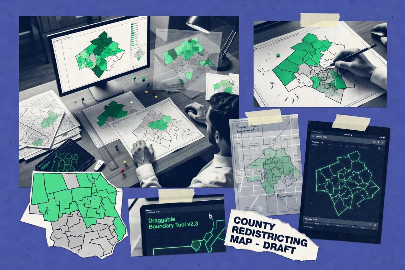
Policy Government MattersTop 10 Best Redistricting Software of 2026
Discover the top redistricting software tools to simplify your process.

How we ranked these tools
Core product claims cross-referenced against official documentation, changelogs, and independent technical reviews.
Analyzed video reviews and hundreds of written evaluations to capture real-world user experiences with each tool.
AI persona simulations modeled how different user types would experience each tool across common use cases and workflows.
Final rankings reviewed and approved by our editorial team with authority to override AI-generated scores based on domain expertise.
Score: Features 40% · Ease 30% · Value 30%
Gitnux may earn a commission through links on this page — this does not influence rankings. Editorial policy
Editor picks
Three quick recommendations before you dive into the full comparison below — each one leads on a different dimension.
Districtr
Interactive plan scoring and constraints for comparing districting alternatives
Built for teams exploring multiple districting scenarios with metric-driven iteration.
Maptitude for Redistricting
Runner UpPrecinct-based district plan editing and evaluation in a single map-driven workflow
Built for redistricting teams needing GIS-based plan iteration, evaluation, and defensible map outputs.
Redistricting Data Hub (Public mapping workflows built around APIs and data services)
Also GreatAPI-driven data services for repeatable public mapping workflow automation
Built for teams building automated redistricting workflows from APIs and data services.
Related reading
Comparison Table
This comparison table evaluates redistricting software used for mapping, boundary analysis, and workflow automation across tools such as Districtr, Maptitude for Redistricting, the Redistricting Data Hub, QGIS Redistricting tools, and ESRI ArcGIS Pro. Readers can compare how each platform handles data ingestion, geospatial editing, API-based workflows, collaboration, and reporting so tool selection aligns with specific workflow and data requirements.
Districtr
open-web mappingDistrictr is a browser-based redistricting workflow that lets users draw maps on geographic boundaries and evaluate district statistics for plan comparisons.
Interactive plan scoring and constraints for comparing districting alternatives
Districtr stands out for combining districting analytics with an accessible, browser-based workflow that supports map creation and scoring. The tool emphasizes iterative plans with metrics and constraints, making it practical for comparing alternative district maps. It also integrates with a broader redistricting workflow by leveraging data formats commonly used in mapping and election contexts.
- +Browser-first workflow keeps districting steps in one place
- +Plan evaluation supports fast comparison of multiple district maps
- +Constraint and metric tooling supports analytical iteration
- +Works well with common geographic data used in redistricting
- –Advanced customization requires deeper familiarity with redistricting concepts
- –Large datasets can slow interaction during plan exploration
- –Collaboration and review tooling are not as robust as in enterprise systems
Best for: Teams exploring multiple districting scenarios with metric-driven iteration
More related reading
Maptitude for Redistricting
mapping plus analyticsCaliper Maptitude for Redistricting supports interactive map creation and districting workflows with demographic overlays and plan analysis outputs.
Precinct-based district plan editing and evaluation in a single map-driven workflow
Maptitude for Redistricting stands out with a redistricting-focused workflow built on Caliper’s mature GIS mapping and spatial analysis foundation. The tool supports boundary and precinct-based districting, plan editing, and map-driven evaluation for showing how proposed boundaries change demographic and geographic characteristics.
It emphasizes repeatable redistricting operations like plan comparisons and scenario work, which helps teams iterate on compliance-oriented maps. Visual outputs and analytics-centric controls are designed for producing defensible districting proposals from spatial data.
- +Redistricting-specific tools for boundary handling and plan editing within a GIS environment
- +Map-driven workflows for evaluating changes across demographic and geographic factors
- +Scenario planning and plan comparison supports structured iteration on district proposals
- –Setup and data preparation can be time-consuming for organizations without GIS practices
- –Advanced evaluation workflows require more training than simple map labeling tools
- –Export and reporting formatting can feel limited compared with full reporting platforms
Best for: Redistricting teams needing GIS-based plan iteration, evaluation, and defensible map outputs
Redistricting Data Hub (Public mapping workflows built around APIs and data services)
data platformRedistricting Data Hub provides datasets and workflow components that support building district plans with official geography and demographic inputs.
API-driven data services for repeatable public mapping workflow automation
Redistricting Data Hub is distinct for building public redistricting mapping workflows around APIs and reusable data services rather than a single closed interface. It supports data operations that feed map creation, boundary analysis, and workflow automation from external tools.
The approach favors repeatable pipelines and integration, especially for teams that manage datasets, geographies, and map outputs programmatically. The tradeoff is that users relying on a fully self-contained editor may find fewer built-in, end-to-end mapping conveniences than toolkits with a primary UI.
- +API-first workflow design enables automated redistricting data pipelines
- +Reusable data services streamline consistent geometry and attribute handling
- +Integration-friendly approach supports external visualization and analysis tools
- +Automation reduces manual steps for recurring districting tasks
- –More integration effort than all-in-one mapping software with a full UI
- –Workflow setup can be harder for users without scripting experience
- –Limited built-in editorial tooling compared with UI-first mapping platforms
Best for: Teams building automated redistricting workflows from APIs and data services
QGIS Redistricting tools (community toolchain)
GIS toolkitQGIS is a maintained GIS platform that supports redistricting analysis through standard geoprocessing, plugins, and reproducible workflows.
GIS-native district validation and spatial analysis within the QGIS redistricting toolchain
QGIS Redistricting tools stands out by extending QGIS with a community toolchain for building, validating, and running districting workflows on spatial data. Core capabilities include map-based assignment and adjustment workflows, spatial analytics for contiguity and geometry checks, and dataset handling through the broader QGIS ecosystem. The toolchain benefits users already working in GIS because it leverages QGIS layers, symbology, and analysis tools for redistricting projects.
- +Integrates directly with QGIS layers and geoprocessing tools for district workflows
- +Supports spatial validation like contiguity and geometry checks within GIS workflows
- +Community toolchain enables extensible redistricting analysis using standard QGIS components
- –Workflow setup can feel complex without strong GIS and data model knowledge
- –Limited out-of-the-box redistricting policy features compared with dedicated platforms
- –Interoperability depends on correct GIS schema and manual configuration of inputs
Best for: GIS-focused teams needing redistricting workflows inside QGIS
ESRI ArcGIS Pro
enterprise GISArcGIS Pro enables redistricting workflows through feature editing, spatial analysis, and dashboard-style reporting for plan evaluation.
Topology validation and geoprocessing automation for repeatable boundary editing and QA
ArcGIS Pro stands out for redistricting workflows built on a mature GIS data model with advanced cartography and geoprocessing. Core capabilities include spatial joins, attribute-based selection, topology checks, and map visualization suitable for plan comparison and boundary editing.
The platform also supports automation with Python and robust data management across file geodatabases and enterprise geodatabases. Redistricting teams can use its analysis tools and scripting to support iterative plan construction, QA, and reporting.
- +Strong GIS data model supports reliable boundary edits and QA
- +Map-based visualization makes plan review and presentation straightforward
- +Python and geoprocessing tools enable repeatable redistricting workflows
- +Topology and validation tools help catch boundary errors early
- –Redistricting-specific functionality often requires additional tools or scripting
- –Complex geodatabases and task setup add setup and operational overhead
- –Performance tuning can be necessary for large precinct or block datasets
- –Workflow requires GIS experience for efficient plan iteration
Best for: GIS-forward teams needing automated redistricting analysis, QA, and mapping
Terria (TerriaMap) for public geography overlays and map-based policy work
geospatial presentationTerria supports interactive map compositions for policy and geography layers that can be used to present redistricting materials and overlays.
Terria web apps for publishing public map overlays as reusable, configurable experiences
TerriaMap stands out for publishing map-based data and workflows through configurable Terria web apps built around public geospatial overlays. It supports rich basemap and layer composition, legend-driven discovery, and dataset sourcing aimed at non-technical stakeholders.
For map-based policy and redistricting research, it enables interactive visualization of boundary and demographic layers while coordinating shared map states across teams. The platform’s strength is in overlay management and stakeholder-facing map experiences rather than automated district plan generation.
- +Powerful public overlay publishing with configurable layer experiences
- +Strong interactive map exploration for stakeholder review of spatial scenarios
- +Supports boundary and attribute overlays that fit redistricting analysis workflows
- +Reusable map app patterns that reduce repeated build effort for teams
- –Limited native redistricting tooling like plan scoring and automated constraints
- –Complex configuration can slow progress for non-technical map admins
- –Exporting analysis-ready outputs often requires extra tooling beyond visualization
- –Performance can degrade with very large or highly detailed overlay datasets
Best for: Teams needing stakeholder-facing overlay maps for redistricting research and review
Google Earth Engine
geospatial computeEarth Engine provides scalable geospatial processing that can support demographic and spatial feature engineering used in redistricting analysis pipelines.
ImageCollection and FeatureCollection processing with server-side reducers across polygons
Google Earth Engine stands out for its planetary-scale satellite and geospatial data processing via Google-hosted catalogs and scalable computation. It supports redistricting-relevant geospatial workflows like buffering, spatial joins, raster analysis, and summarizing land cover or population surfaces inside arbitrary boundaries.
The platform also enables repeatable, scriptable analysis through its JavaScript and Python APIs and its Earth Engine Data Catalog. Limitations for redistricting come from a lack of turn-key districting tools, built-in boundary optimization, and dedicated election-specific features.
- +Scales geospatial raster processing using cloud-based computation
- +Runs analysis inside user-defined polygons for boundary-level metrics
- +Supports repeatable redistricting workflows through JavaScript and Python APIs
- –No native redistricting engine for plan generation or constraint optimization
- –Boundary handling and topology checks require custom engineering
- –Debugging large geospatial scripts can be time-consuming for teams
Best for: Teams needing automated spatial analytics for candidate districts and plans
Mapbox Studio
map visualizationMapbox Studio supports custom map rendering that can power redistricting plan visualization for policy review and public communication.
Mapbox Studio style editor for building layered Mapbox GL cartography
Mapbox Studio stands out for translating redistricting workflows into production-ready web maps using Mapbox GL styles and tools. It supports rich basemap customization, style editing, and interactive map rendering that can visualize district plans and changes in browser-based review. It provides geospatial building blocks like vector tiles and layer styling rather than purpose-built redistricting analytics like district compactness scoring or boundary legal checks.
- +Highly customizable map styling for district plan storytelling
- +Fast, interactive rendering using vector tile and layer workflows
- +Strong support for integrating custom data layers into web maps
- –Limited native redistricting analytics and no built-in plan validation
- –Styling and layer configuration require technical GIS and web skills
- –Less direct support for ensemble plan comparison and metrics
Best for: Teams publishing interactive redistricting maps and reviews with custom geospatial layers
CARTO
geospatial analyticsCARTO provides geospatial analytics and visualization services that support redistricting plan exploration and reporting.
CARTO Builder interactive map dashboards for publishing spatial analysis results
CARTO stands out by combining a geospatial data platform with map-centric workflows for visual analysis and spatial storytelling. It supports ingestion of geospatial datasets into a governed map workspace where users can style layers, run spatial analytics, and publish interactive visualizations.
For redistricting work, it fits teams that need repeatable geospatial processing and stakeholder-ready maps rather than a purpose-built districting engine. It can accelerate planning and review with analysis-ready layers and collaborative dashboards, but it is not a dedicated election districting system with built-in compliance workflows.
- +Map-first workspace for styling, layer management, and publication
- +Spatial analysis and visualization built directly on ingested geospatial datasets
- +Collaboration features support stakeholder review through shareable dashboards
- +Workflow fits iterative planning with reusable data layers and views
- –Not a purpose-built redistricting tool with districting-specific operations
- –Geometry editing and partitioning workflows are less specialized than dedicated software
- –Compliance tooling for redistricting constraints requires external processes
Best for: Teams needing geospatial analysis and stakeholder maps without specialized districting automation
Tableau
dashboard analyticsTableau enables interactive district plan dashboards that combine district-level metrics and geographic filters for redistricting evaluation.
Interactive dashboard parameters and filters for scenario comparison across districts
Tableau stands out with interactive, shareable visual analytics that can turn redistricting workflows into maps, dashboards, and stakeholder-ready reports. It supports spatial analysis through geographic fields and map visualizations, plus calculated fields for compact metric logic tied to districting variables.
The platform also enables dashboard interactivity with filters and parameters, which helps iterate scenarios and compare outcomes. Tableau can integrate with external geospatial and districting tools for the actual plan building and geometry editing, while focusing on analysis, visualization, and communication.
- +Rapid creation of interactive district dashboards using filters and parameters
- +Strong map visualization for visual comparison of plan scenarios
- +Calculated fields and dashboard linking support tailored redistricting metrics
- –Limited native support for district boundary editing and plan generation
- –Geospatial workflow depends on external preparation of geometries and fields
- –Complex redistricting validations require custom data modeling outside Tableau
Best for: Teams visualizing and comparing redistricting scenarios with stakeholder dashboards
Conclusion
After evaluating 10 policy government matters, Districtr stands out as our overall top pick — it scored highest across our combined criteria of features, ease of use, and value, which is why it sits at #1 in the rankings above.
Use the comparison table and detailed reviews above to validate the fit against your own requirements before committing to a tool.
How to Choose the Right Redistricting Software
This buyer’s guide explains how to evaluate redistricting software by matching workflow needs to capabilities across Districtr, Maptitude for Redistricting, Redistricting Data Hub, QGIS Redistricting tools, ESRI ArcGIS Pro, Terria, Google Earth Engine, Mapbox Studio, CARTO, and Tableau. The guide details key feature sets like plan scoring and constraints, precinct-based editing, API-driven automation, topology validation, and stakeholder-ready dashboards. It also highlights common buying mistakes that create friction, such as choosing a visualization platform when plan scoring and boundary QA are required.
What Is Redistricting Software?
Redistricting software supports the end-to-end work of building district plans, editing boundaries, running spatial checks, and evaluating outcomes with metrics and comparisons. Many teams use it to manage complex geographies like precincts and blocks while producing defensible map outputs and scenario comparisons. Tools like Districtr focus on an interactive browser workflow for iterative plan scoring and constraints. GIS-focused platforms like ESRI ArcGIS Pro and QGIS Redistricting tools provide the geospatial foundations for boundary editing, validation, and repeatable spatial QA.
Key Features to Look For
The right mix of features determines whether the tool can accelerate plan iteration, catch boundary problems early, and produce decision-ready outputs.
Interactive plan scoring with constraint-driven comparisons
Districtr provides interactive plan scoring and constraint tooling that supports fast comparison of multiple district maps. This capability is designed for iterative exploration where different map versions must be evaluated consistently.
Precinct-based district plan editing in a single map workflow
Maptitude for Redistricting enables precinct-based district plan editing and evaluation inside a map-driven workflow. This reduces handoffs between map creation and plan analysis when teams iterate on compliance-oriented boundaries.
API-first redistricting data services for automation
Redistricting Data Hub is built around APIs and reusable data services that feed map creation and boundary analysis. Teams that run recurring workflows can automate geometry and attribute handling rather than repeating manual steps.
GIS-native spatial validation and contiguity or geometry checks
QGIS Redistricting tools add GIS-native district validation and spatial analysis to the QGIS toolchain. This helps teams run contiguity and geometry checks inside the same environment used for spatial processing.
Topology validation and geoprocessing automation for boundary QA
ESRI ArcGIS Pro supports topology checks and validation tools that catch boundary errors early. Its Python and geoprocessing tools enable repeatable redistricting workflows for QA and plan construction.
Stakeholder-ready interactive map publishing and dashboarding
Terria publishes configurable Terria web apps for interactive public geography overlays and stakeholder review. CARTO Builder supports collaborative dashboards for publishing spatial analysis results. Tableau adds interactive district dashboards with geographic filters and parameters for scenario comparison.
How to Choose the Right Redistricting Software
A practical selection process maps workflow goals to the tool’s built-in editing, validation, analytics, and stakeholder communication strengths.
Start with the plan-building workflow type
Choose Districtr when plan exploration requires an interactive browser workflow with plan scoring and constraint-based comparisons. Choose Maptitude for Redistricting when precinct-based editing and evaluation must happen inside one map-driven redistricting workflow. Choose ESRI ArcGIS Pro or QGIS Redistricting tools when the team must operate inside established GIS layers and geoprocessing pipelines.
Validate early with topology or geometry checks
Pick ESRI ArcGIS Pro when topology validation and validation tools are needed to catch boundary errors during edits. Pick QGIS Redistricting tools when contiguity and geometry checks must run within GIS-native workflows that use QGIS layers. Avoid using visualization-only tools like Mapbox Studio for QA because they provide rendering and styling rather than boundary validation.
Match scenario analytics to the evaluation workflow
Choose Districtr for iterative plan scoring and metric-driven comparison across multiple district maps. Choose Maptitude for Redistricting when structured scenario work and plan comparisons are needed alongside precinct-based editing. Choose Tableau when the priority is interactive district-level metrics and scenario comparisons through dashboard parameters and filters.
Decide between built-in UX and automation pipelines
Choose Redistricting Data Hub when automation and repeatable pipelines matter because it provides API-driven data services for consistent geometry and attribute handling. Choose Google Earth Engine when spatial feature engineering and scalable raster or vector processing across user-defined polygons must be automated with server-side reducers. Use these when plan generation is not the only goal and scripted spatial analytics is the primary engine.
Plan stakeholder delivery as a first-class requirement
Choose Terria when stakeholder-facing overlay maps must be delivered as configurable Terria web apps with reusable map experiences. Choose CARTO when the work needs governed map workspaces that publish interactive visualizations through CARTO Builder dashboards. Choose Mapbox Studio when the priority is highly customized map rendering via Mapbox GL styles for communicating district plans with custom layers.
Who Needs Redistricting Software?
Different redistricting roles need different capabilities, from boundary editing and QA to automated spatial analytics and stakeholder dashboards.
Teams exploring multiple districting scenarios with metric-driven iteration
Districtr fits teams that must score and compare multiple plan alternatives quickly because it includes interactive plan scoring and constraints in the browser workflow. Tableau also fits teams that compare outcomes via interactive dashboard parameters and filters once district metrics are computed.
Redistricting teams that require precinct-based editing and defensible map outputs
Maptitude for Redistricting is built for precinct-based district plan editing and evaluation in a single map-driven workflow. ESRI ArcGIS Pro supports boundary QA with topology validation and geoprocessing automation, which helps teams produce reliable edits when geometry complexity is high.
Engineering-heavy teams building automated public mapping workflows from datasets and APIs
Redistricting Data Hub targets teams that want API-first redistricting data services for repeatable pipelines and automation of geometry and attributes. Google Earth Engine supports scalable spatial processing through FeatureCollection and server-side reducers, which helps teams compute boundary-level metrics programmatically.
Stakeholder-focused teams publishing interactive maps and dashboards for policy review
Terria is built for publishing reusable, configurable Terria web apps that coordinate shared map states for public overlay review. CARTO Builder and Tableau support collaborative dashboards and interactive scenario filtering, which helps translate district metrics into stakeholder-ready formats.
Common Mistakes to Avoid
Common errors come from choosing the wrong workflow layer, underestimating GIS setup complexity, and expecting visualization tools to handle boundary QA and plan scoring.
Buying a visualization platform when district plan scoring and constraints are required
Mapbox Studio excels at custom Mapbox GL cartography but lacks native plan validation and districting analytics like constraint scoring. Terria is strong for overlay publishing and stakeholder review but has limited native redistricting tooling for automated scoring and constraints.
Underestimating GIS data preparation work for GIS-first workflows
Maptitude for Redistricting requires time for setup and data preparation when organizations lack GIS practices. QGIS Redistricting tools and ESRI ArcGIS Pro depend on correct GIS schema and configuration, which can slow teams if inputs are not aligned to the required geospatial model.
Expecting automation or APIs to provide a full end-to-end editor
Redistricting Data Hub emphasizes API-driven data services and reusable workflows, so it provides fewer built-in editorial conveniences than UI-first redistricting platforms. Google Earth Engine provides scalable spatial analytics and scriptable processing, so it does not deliver a turn-key districting engine for boundary optimization or constraints.
Skipping topology and geometry validation during boundary edits
ESRI ArcGIS Pro includes topology validation and QA tooling, which is designed to catch boundary errors early. QGIS Redistricting tools add GIS-native district validation and geometry checks, while tools like CARTO and Tableau focus on analysis-ready visualization rather than boundary legality checks.
How We Selected and Ranked These Tools
we evaluated Districtr, Maptitude for Redistricting, Redistricting Data Hub, QGIS Redistricting tools, ESRI ArcGIS Pro, Terria, Google Earth Engine, Mapbox Studio, CARTO, and Tableau on three sub-dimensions: features with a weight of 0.4, ease of use with a weight of 0.3, and value with a weight of 0.3. The overall rating is the weighted average computed as overall = 0.40 × features + 0.30 × ease of use + 0.30 × value. Districtr separated itself through feature depth that supports interactive plan scoring and constraints for comparing districting alternatives inside a browser workflow, which directly improves iterative plan exploration.
Frequently Asked Questions About Redistricting Software
Which tool is best for iterative district plan scoring inside the same workflow?
What’s the fastest path to precinct-based redistricting editing and evaluation?
Which option suits teams that want to automate redistricting data pipelines instead of using a single UI?
What’s the best choice for GIS-native validation like contiguity and geometry checks?
Which platform supports automation and QA at scale using scripting?
Which tool is better for stakeholder-facing overlays rather than district plan generation?
When should a team use Mapbox Studio instead of a dedicated redistricting editor?
Which approach works best for large-scale spatial analysis inside candidate district boundaries?
What’s a practical workflow for building stakeholder dashboards from redistricting scenario outputs?
Which tool is most suitable when the goal is repeatable collaboration around governed map data?
Tools reviewed
Primary sources checked during evaluation.
Referenced in the comparison table and product reviews above.
Keep exploring
Comparing two specific tools?
Software Alternatives
See head-to-head software comparisons with feature breakdowns, pricing, and our recommendation for each use case.
Explore software alternatives→In this category
Policy Government Matters alternatives
See side-by-side comparisons of policy government matters tools and pick the right one for your stack.
Compare policy government matters tools→FOR SOFTWARE VENDORS
Not on this list? Let’s fix that.
Our best-of pages are how many teams discover and compare tools in this space. If you think your product belongs in this lineup, we’d like to hear from you—we’ll walk you through fit and what an editorial entry looks like.
Apply for a ListingWHAT THIS INCLUDES
Where buyers compare
Readers come to these pages to shortlist software—your product shows up in that moment, not in a random sidebar.
Editorial write-up
We describe your product in our own words and check the facts before anything goes live.
On-page brand presence
You appear in the roundup the same way as other tools we cover: name, positioning, and a clear next step for readers who want to learn more.
Kept up to date
We refresh lists on a regular rhythm so the category page stays useful as products and pricing change.