GITNUXSOFTWARE ADVICE
Marketing AdvertisingTop 10 Best Heat Mapping Software of 2026
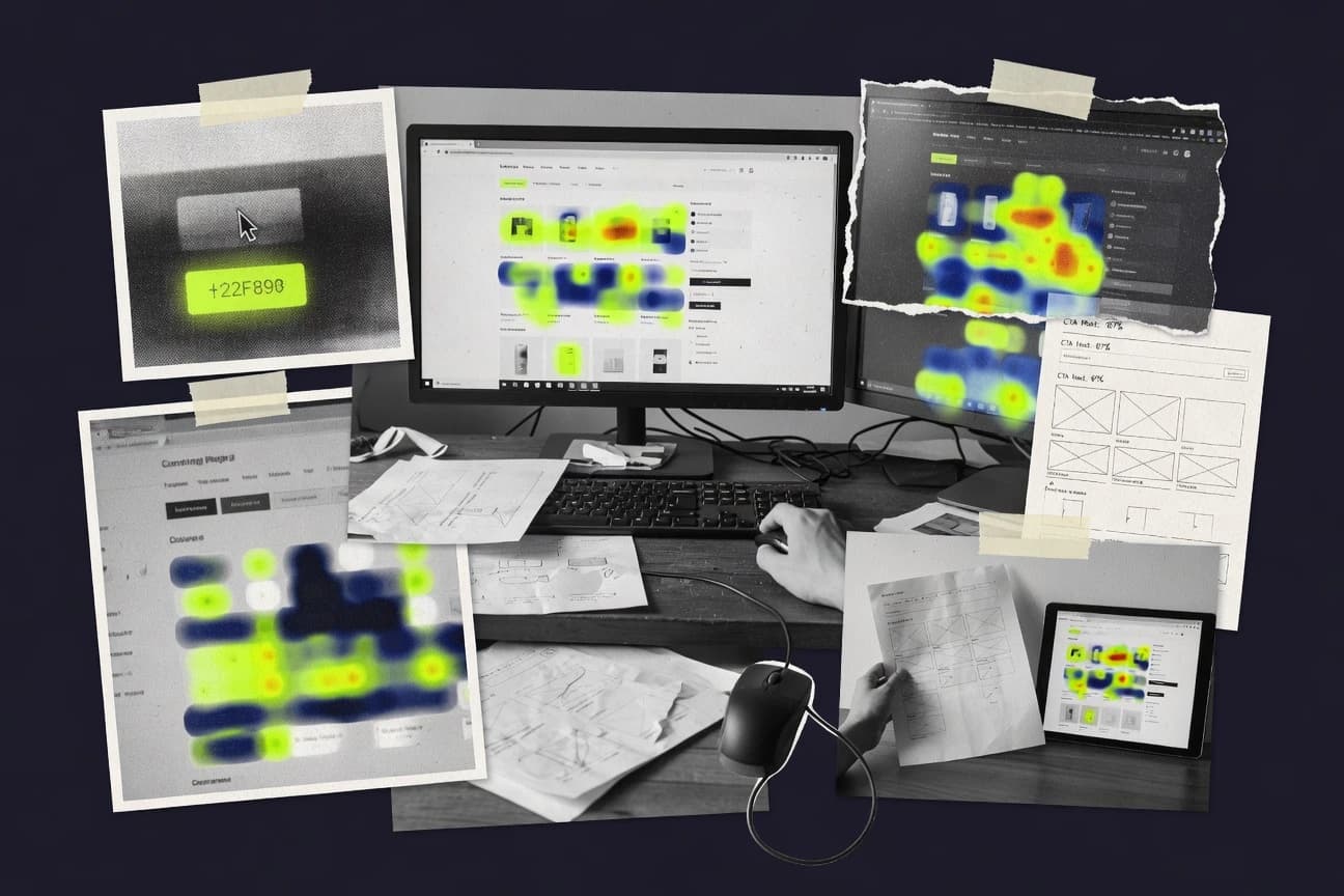
Top 10 heat mapping software ranking with editorial picks and tradeoffs, covering Plerdy, Zoho PageSense, and Glassbox for UX teams.

How we ranked these tools
Gitnux editors write the brief first: the topic, the inclusion rules, and the frame for what belongs.
Agents extract product evidence with provenance, then collect written reviews and transcribe video reviews and podcasts.
Framework: Features 40% · Ease 30% · Value 30%
Gitnux may earn a commission through links on this page — this does not influence rankings. Editorial policy
Plerdy is the best fit for product and growth teams that want heatmaps alongside form diagnostics with integration-friendly automation, while Zoho PageSense is the cheaper entry if you run experiments inside the Zoho workflow and Glassbox is the better move for enterprise UX where replay evidence matters.
Editor’s top 3 picks
Three quick recommendations before you dive into the full comparison below — each one leads on a different dimension.
Plerdy
Form analytics tied to captured user sessions connects field abandonment patterns to the exact interactive journey.
Best for: Fits when product and growth teams need heat plus form diagnostics with automation-grade integration.
Zoho PageSense
Editor pickHeatmap findings connect to A B testing results so interaction hotspots can be evaluated inside experiment reporting.
Best for: Fits when marketing and product teams want heatmaps linked to experiments inside the Zoho workflow.
Glassbox
Editor pickBuilt-in session-to-visual linkage pairs heat hotspots with replay evidence for targeted debugging.
Best for: Fits when product and UX teams need heatmaps plus replay evidence for experiments and UX diagnostics.
Comparison Table
Plerdy
SMBPlerdy offers click, scroll, hover, and segment-based heatmaps for websites.
Form analytics tied to captured user sessions connects field abandonment patterns to the exact interactive journey.
Plerdy generates multiple heatmap layers like click distribution and scrolling coverage, so teams can compare interaction density with content consumption on the same URL. The capture setup can target by URL and CSS selector targeting, which helps with partial instrumentation in dynamic pages and component-heavy layouts. Plerdy also provides form-focused analytics signals that connect field-level behavior to the same user journeys used for heat visuals.
A tradeoff is that precise selector targeting and event hygiene are required to keep heat visuals stable on frequently updated front ends. Plerdy fits best when a team runs frequent UI changes and needs consistent tracking for specific forms and conversion paths rather than broad, site-wide monitoring.
- +Selector-based targeting reduces noise on component-heavy pages
- +Heat layers connect interaction density to scroll and form behavior
- +Session review supports faster root-cause checks than heat alone
- +API and integrations support automated rollout workflows
- –Selector maintenance is required after UI refactors
- –Heat accuracy depends on clean front-end event capture coverage
- –Setup can take longer on single-page apps with dynamic routes
- –Advanced configuration increases operational overhead
Growth analytics teams
Diagnose landing page CTA engagement
Higher CTA engagement clarity
UX research teams
Validate onboarding flow comprehension
Faster usability issue triage
Show 2 more scenarios
Front-end engineering teams
Instrument component updates safely
Lower tracking regression risk
Selector targeting and event rules support targeted tracking for frequently changing UI modules.
Marketing operations teams
Audit campaign landing page friction
Reduced form abandonment
Heat visuals and form analytics isolate dead ends across campaign-specific URLs.
Best for: Fits when product and growth teams need heat plus form diagnostics with automation-grade integration.
Zoho PageSense
SMBZoho PageSense provides web heatmaps, session recordings, polls, and funnel analysis.
Heatmap findings connect to A B testing results so interaction hotspots can be evaluated inside experiment reporting.
For marketing and product teams that already run Zoho tools, PageSense can keep instrumentation and reporting inside a single operational flow. The heatmap experience covers interaction density and attention over time, while its replay and event capture help turn a high-heat region into an actionable usability issue. Segmentation features support practical breakdowns like browser and device differences, which helps explain why a click target works on desktop but not on mobile.
A tradeoff appears in governance and iteration cycles for larger sites with heavy dynamic content, where CSS selector based capture must be kept stable as UI changes. PageSense fits teams that can enforce selector stability or use consistent component IDs, especially for single page applications with frequent front end releases.
- +Segmentation works with URL and device breakdowns for targeted diagnostics
- +Replay-style investigation helps explain why clicks cluster in heatmap hotspots
- +A B testing integration connects interaction evidence to experiment outcomes
- +Zoho ecosystem alignment reduces duplicated reporting workflows
- –Selector stability is a governance dependency during UI refactors
- –Complex single page routing needs careful targeting rules
- –Advanced event customizations require additional instrumentation work
- –Less suited for teams wanting a fully code-free rollout at scale
Conversion optimization teams
Validate CTA heatmap before experiments
Higher CTA click-through rate
Product UX teams
Debug dead UI regions after releases
Faster UI iteration cycles
Show 2 more scenarios
Growth analysts
Compare desktop and mobile behavior
Mobile-specific UX fixes
Device segmentation shows whether attention gaps correlate with responsive layout changes.
Marketing ops teams
Attribute page behavior to campaigns
Cleaner campaign performance diagnosis
URL targeting ties interaction data to landing page variants used in marketing flows.
Best for: Fits when marketing and product teams want heatmaps linked to experiments inside the Zoho workflow.
Glassbox
enterpriseGlassbox analyzes digital journeys with session replay, heatmaps, and experience metrics.
Built-in session-to-visual linkage pairs heat hotspots with replay evidence for targeted debugging.
Glassbox provides click, scroll, and attention-oriented visualizations backed by session replay, so teams can move from a heat hotspot to what users did next. JavaScript event capture supports URL-based targeting and single-page application tracking, which matters for modern routing where user journeys span multiple views. Heatmap segmentation and responsive viewport analysis help separate behavior by device and layout conditions, which reduces misreads caused by screen-size effects.
A key tradeoff is that accurate element targeting depends on predictable selectors and stable DOM structure, so dynamic UI patterns can require additional configuration effort. Teams get the best outcomes when they need user-behavior evidence for UX diagnostics and A/B test readouts that must show both aggregate patterns and replay-level context.
- +Heatmaps link directly to session replay context for faster root-cause checks
- +URL-based targeting works for multi-page paths and routed single-page application flows
- +Responsive viewport segmentation reduces noise from desktop versus mobile differences
- +Privacy controls support PII redaction and retention discipline for recordings
- –Selector stability requirements can increase setup time for frequently changing UIs
- –Advanced tracking often needs careful event schema design to avoid noisy funnels
- –High-volume replay analysis can slow down review workflows without strong filtering
Product analytics teams
Validate funnel drops with replay evidence
Clearer funnel root-cause findings
UX research teams
Investigate usability issues after redesign
More actionable UX diagnostics
Show 2 more scenarios
Experimentation leads
Assess A/B outcomes with behavioral context
Higher confidence experiment conclusions
Teams use segmentation to separate variant behavior and review replays for qualitative differences.
Engineering teams
Debug dynamic UI interaction gaps
Fewer interaction bugs
Teams target routed views and reconcile event capture with what replays show in the browser.
Best for: Fits when product and UX teams need heatmaps plus replay evidence for experiments and UX diagnostics.
Microsoft Clarity
SMBMicrosoft Clarity offers free website heatmaps, session recordings, and behavior metrics.
Consent-aware privacy controls with configurable masking for recordings and captured events.
Microsoft Clarity captures session recordings plus click and scroll visualizations to show where users stall. Its event capture runs in the browser with JavaScript instrumentation and stores aggregated attention data for heat-map style reports.
- +Session recordings align with click and scroll visuals for fast diagnosis
- +URL-based and device-level filtering helps compare page-specific behavior
- +JavaScript event capture supports single-page applications with dynamic content
- +Masking and retention controls reduce the risk of capturing sensitive text
- –Granular targeting beyond page and basic segmentation is limited
- –Advanced funnel and goal setup is thinner than specialist analytics tools
- –Large recording volumes can slow review workflows and exports
- –No first-party pixel-style API for custom heat-map overlays
Best for: Fits when teams want session recordings plus heat maps with privacy controls for UX debugging.
Crazy Egg
SMBCrazy Egg provides website heatmaps, scroll maps, recordings, and A/B testing.
Session recordings are presented as a direct follow-up to heatmap hotspots for faster root-cause checks.
Crazy Egg generates click maps and scroll maps on top of live page traffic, so teams can see where attention and interaction concentrate. It also runs session recordings to correlate heatmap hotspots with real user journeys and layout changes across page views.
- +Click maps and scroll maps visualize interaction depth across key page sections
- +Session recordings tie heatmap patterns to actual mouse and scroll behavior
- +URL targeting limits tracking to defined areas of a site
- +Event capture is designed for on-page element-level diagnostics
- –Custom tracking for complex dynamic elements needs careful selector and scope setup
- –Advanced behavior segmentation options are narrower than analytics-first suites
- –Cross-property governance features are limited for multi-team enterprises
- –Recording-based investigations can become time-consuming without strong filtering
Best for: Fits when product and UX teams need heatmaps plus session recordings for rapid page-level diagnostics.
Contentsquare
enterpriseContentsquare provides digital experience analytics with journey, zone, and behavior heatmaps.
Behavior insights linking heatmap findings to funnel and form outcomes across segmented cohorts.
Contentsquare is a heat mapping and experience analytics tool focused on turning on-page behavior into prioritized UX issues. Its click and attention visualizations connect with session-level context and funnel and form analytics to connect changes to conversion outcomes.
- +Attention heatmaps tied to measurable conversion and funnel drop-offs
- +Strong segmentation for diagnosing desktop-versus-mobile interaction differences
- +Workflow-oriented tagging supports faster triage of recurring UX failures
- +Instrumentation coverage for single-page application behavior
- –Advanced configuration needs careful governance to avoid noisy segments
- –Selectors-based targeting can require maintenance when layouts change
- –Deep analytics require discipline to keep insights tied to prioritized journeys
- –Some visualizations depend on adequate event capture and consent settings
Best for: Fits when product teams need heatmaps plus journey diagnosis and segmentation for UX prioritization.
VWO Insights
enterpriseVWO Insights provides heatmaps, session recordings, surveys, and conversion research.
Experiment-context reporting that links heatmap behavior to A/B test variations for faster root-cause validation.
VWO Insights focuses on heatmapping and session analytics tied to experiment workflows, so behavior evidence can be mapped back to A/B test decisions. Heatmaps include click maps and scroll maps, with segmentation options for comparing behavior across devices, browsers, and key URL patterns.
- +Ties heatmap findings back to experimentation contexts and test iterations
- +Click and scroll overlays are practical for diagnosing UI friction quickly
- +Segmentation supports device, browser, and URL-based comparisons for debugging
- +Role-based access supports governance across tagging and reporting users
- –Advanced tracking for dynamic-content pages needs careful selector and event coverage
- –Deeper analytics require navigating multiple reports rather than one unified dashboard
- –High-volume traffic can make heatmap filters feel slower to iterate
- –Complex segmentation rules can increase tag maintenance overhead
Best for: Fits when teams need heatmap diagnostics tied to ongoing experimentation and controlled access for multiple editors.
Lucky Orange
SMBLucky Orange combines dynamic heatmaps with session recordings, surveys, and live chat.
Dead-click detection that correlates unusable taps with the exact replay context for rapid UX fixes.
Lucky Orange maps user attention with click maps, scroll maps, and session recordings while also tying recordings to URL targeting for faster triage. Its heatmap and replay views share consistent session filters so teams can move from a hotspot to the exact user journey.
- +Dead-click detection pinpoints non-responsive UI elements during replay review
- +URL-based targeting keeps heatmap and session recording analysis scoped to pages
- +Form-field abandonment views highlight which inputs block completion
- +Privacy masking tools reduce exposure of sensitive text in captured sessions
- –Advanced targeting and segmentation require careful event and selector setup
- –Cross-domain tracking coverage depends on configuration for identifiers and sessions
- –Move-map style insights are less central than click and scroll analysis
- –Deep debugging for single-page application routing can require custom instrumentation
Best for: Fits when teams need heatmaps plus session recordings tied to URL scope for faster UX diagnosis.
Inspectlet
SMBInspectlet provides website heatmaps, visitor recordings, and form analytics.
Session replay playback tied to recorded interactions, so teams can jump from heatmap hotspots to exact user journeys.
Inspectlet captures user sessions and renders click maps, scroll maps, and move maps on real pages to connect navigation behavior with specific UI areas. Session replay includes playback controls and event context so teams can debug what users saw and did during each session.
- +Heatmaps tied to session replay for faster diagnosis of UX issues
- +Move maps provide mouse trajectory detail beyond click density alone
- +Viewport-aware behavior keeps overlay alignment closer on different screens
- +Privacy masking and retention controls cover both recordings and heatmaps
- –Event targeting and selector scope can require careful setup to avoid noisy overlays
- –Reporting segmentation relies more on collected session attributes than custom events
- –Automation and API surface are less extensive than top-tier enterprise analytics tools
- –Large replay volumes can increase manual review time for high-traffic sites
Best for: Fits when UX and product teams need session replay plus heatmaps for rapid UI debugging.
UXCam
vertical specialistUXCam provides mobile app heatmaps, session replay, and product experience analytics.
Event-capture driven analytics that ties funnel and form diagnostics to visual heatmaps using the same instrumentation.
UXCam focuses on session-level behavior analysis alongside click and attention heatmaps for web and mobile apps. Its core workflow centers on JavaScript event capture for funnel and form analytics, then visualizing where users focus and where they rage or dead-click.
- +Session recordings pair with heatmaps to connect visual issues to user intent
- +Privacy masking and data retention controls target sensitive form fields and identifiers
- +Funnel and form analytics reduce reliance on manual event stitching
- +Device segmentation helps isolate behavior differences by viewport and platform
- –Richer custom tracking requires more setup than selector-only heatmap tools
- –Heatmap segmentation and targeting can lag behind rapidly changing UI in SPAs
- –Findings often require combining multiple views to pinpoint one root cause
- –High-volume sessions can create review throughput constraints for analysts
Best for: Fits when product teams need heatmaps plus session context for diagnosing web and mobile UX friction.
Conclusion
After evaluating 10 heat mapping software, Plerdy stands out as our overall top pick — it scored highest across our combined criteria of features, ease of use, and value, which is why it sits at #1 in the rankings above.
Use the comparison table and detailed reviews above to validate the fit against your own requirements before committing to a tool.
How to Choose the Right Heat Mapping Software
Heat mapping software turns JavaScript event capture into visual density layers like click maps and scroll maps, then ties those overlays to investigation workflows like session replay. This guide covers Plerdy, Zoho PageSense, Glassbox, Microsoft Clarity, Crazy Egg, Contentsquare, VWO Insights, Lucky Orange, Inspectlet, and UXCam.
Across these tools, the practical differences show up in how heat insights connect to form analytics, replay evidence, or experiment reporting. The best fit for a given team depends on integration depth, admin controls, extensibility, and the automation and API surface behind targeting, event capture, and segmentation.
Heat Mapping Software for click, scroll, and attention overlays linked to replay, forms, and experiments
Heat mapping software displays attention heat layers across page regions using captured interaction events such as clicks, mouse movement patterns, and scrolling. Most platforms also provide segmentation and targeting so teams can compare behavior by URL scope, device attributes, and routing contexts.
Plerdy emphasizes form analytics tied to captured user sessions so field abandonment patterns link to the interactive journey behind the heat. Glassbox pairs heat hotspots directly with session replay context for faster root-cause checks in product and UX diagnostics.
Heat-to-evidence wiring: targeting, replay linkage, and workflow fit
Heat maps only answer where users interact. The buyer question is how those hotspots become debuggable evidence inside the same investigation path.
Category differentiation is driven by how heat overlays connect to session replay context, form diagnostics, and experiment reporting, not by whether click maps and scroll maps exist.
Session replay linkage from hotspots
Glassbox and Crazy Egg present heatmap findings with direct session-replay context so teams can jump from hotspots to the exact user interactions that caused them.
Form analytics tied to captured sessions
Plerdy’s form analytics connect field abandonment patterns to captured user sessions, and this wiring is the foundation for linking abandonment to the journey that preceded it.
Experiment context inside the heat workflow
Zoho PageSense and VWO Insights connect heat map behavior to A B testing outputs so interaction hotspots can be evaluated against experiment variations and test iterations.
Consent-aware privacy controls for recordings
Microsoft Clarity adds consent-aware privacy controls with configurable masking for recordings and captured events, and this reduces exposure risk while retaining UX debugging value.
Dead-click and non-responsive UI detection
Lucky Orange’s dead-click detection correlates unusable taps with replay context so teams can fix non-responsive elements instead of only chasing low click density.
Funnel and form outcomes linked to segmented cohorts
Contentsquare ties attention heatmaps to funnel and form outcomes across segmented cohorts, and this supports UX prioritization using measurable drop-offs.
Choose by the investigation path: instrumentation approach, targeting governance, and output wiring
Heat mapping buyers should start from the end of the workflow, not the overlay type. The selection fork is whether the tool’s heat output can be tied to replay evidence, form outcomes, and experiment reporting without rework.
A second fork is operational discipline. Selector-based targeting on component-heavy or frequently refactored UIs can create governance and maintenance overhead that changes total time-to-insight.
Pick the primary evidence link: replay-first vs outcome-first
Choose Glassbox or Crazy Egg when the investigation requires rapid movement from heat hotspots into session replay context for root-cause checks. Choose Contentsquare when the investigation requires outcomes, because attention heatmaps are tied to funnel and form outcomes across segmented cohorts.
Match heat to your conversion workflow: experiments or forms
Choose Zoho PageSense or VWO Insights when interaction hotspots must be evaluated inside A B test reporting so experiment variations explain the heat distribution. Choose Plerdy or UXCam when form-field abandonment and sensitive field handling are the core diagnostic target.
Set targeting governance expectations for your UI change rate
Choose Plerdy, Glassbox, or Zoho PageSense with the understanding that selector stability requirements increase setup effort after UI refactors. Choose Microsoft Clarity when consent-aware privacy controls are required alongside heat and recordings with less need for granular targeting beyond page and basic segmentation.
Validate event coverage for dynamic content and routing
Choose VWO Insights when experiment-context reporting must stay aligned with dynamic-content behavior, because tracking needs careful selector and event coverage. Choose Glassbox or Zoho PageSense when routed single-page application flows require URL-based targeting rules that remain consistent across paths.
Stress-test non-responsive UI detection if click data looks clean
Choose Lucky Orange when teams suspect usability failures that do not show up as normal click density, because dead-click detection pinpoints non-responsive taps during replay review. Choose Microsoft Clarity when recordings plus configurable masking are needed for debugging while respecting privacy constraints.
Confirm segmentation depth aligns to who will act on findings
Choose Contentsquare or Zoho PageSense when segmented cohort comparisons drive UX prioritization and marketing diagnostics, because segmentation supports desktop-versus-mobile interaction differences and targeted diagnostics. Choose Inspectlet when the priority is session replay playback tied to recorded interactions, because navigation from heat hotspots into replay is the key workflow benefit.
Who should buy Heat Mapping Software with these wiring strengths
Buyers with a defined debugging loop should prioritize tools where heat output connects to the next artifact they already use, such as session replay, form analytics, or experiment reporting.
Teams that operate under privacy constraints should also prioritize consent-aware masking where recordings and captured events are part of the workflow.
Product and UX teams running rapid UI debugging
Glassbox and Crazy Egg reduce time-to-root-cause by pairing heat hotspots with session replay context so the same investigation includes both density and evidence.
Growth teams focused on conversion and experimentation
VWO Insights and Zoho PageSense connect heatmap behavior to A B test variations so teams can validate whether interaction changes correspond to experiment outcomes.
Teams focused on form-field abandonment diagnosis
Plerdy ties form analytics to captured user sessions so field abandonment is mapped to the exact interactive journey leading to the drop-off.
Teams constrained by privacy and consent requirements for recordings
Microsoft Clarity provides consent-aware privacy controls with configurable masking for recordings and captured events, which supports UX debugging without exposing sensitive data.
Teams fixing UI usability failures that do not register as clicks
Lucky Orange’s dead-click detection correlates unusable taps with the replay context so issues like non-responsive UI elements can be resolved.
Common pitfalls in Heat Mapping Software purchases
Heat map pilots fail when targeting assumptions do not match real UI change patterns. Selector-based targeting can require maintenance after UI refactors, and this turns setup time into ongoing governance work.
Another failure mode is choosing a tool that visualizes density well but leaves the team without the next artifact. When the workflow does not connect heat to replay evidence, form outcomes, or experiment reporting, investigations stall after the overlay is reviewed.
Selecting a heat tool without planning for selector stability during UI refactors
Plerdy and Glassbox depend on selector-based targeting, and frequent UI component changes increase maintenance requirements.
Assuming heatmap insights automatically validate experiment results
Zoho PageSense and VWO Insights connect heat to A B testing, but tools without experiment-context wiring can require extra navigation to reconcile results.
Ignoring privacy controls when session recordings are part of the workflow
Microsoft Clarity includes consent-aware privacy controls with configurable masking, while other tools may require additional discipline to protect captured events.
Over-trusting click density when non-responsive UI elements are the real issue
Lucky Orange’s dead-click detection is designed to catch unusable taps, so teams should not conclude the UI is working when click maps look clean.
Building heatmap targeting for dynamic elements without confirming event coverage
Crazy Egg and VWO Insights both flag that complex dynamic elements need careful selector and scope setup, and missing event coverage creates misleading overlays.
How We Selected and Ranked These Tools
We evaluated features by measuring how each product ties heat maps to the next required artifact, such as form analytics in Plerdy, experiment context in Zoho PageSense and VWO Insights, and session replay linkage in Glassbox and Crazy Egg. We evaluated ease and value by comparing targeting workflow friction, including selector maintenance requirements and the setup care needed for dynamic content.
We prioritized throughput of investigation because heat insights must map to replay context quickly, as shown by Glassbox and Crazy Egg workflows that pair hotspots with replay evidence. Plerdy set the top position because it connects form analytics to captured user sessions and also uses selector-based targeting that reduces noise on component-heavy pages while linking heat layers to scroll and form behavior.
Frequently Asked Questions About Heat Mapping Software
How do heat maps handle dynamic content and single-page application navigation across Plerdy, Microsoft Clarity, and Glassbox?
Which tools connect heat map hotspots to session replay evidence for faster root-cause debugging?
How does segmentation work in Zoho PageSense, Contentsquare, and VWO Insights when teams compare behavior by device or URL?
When teams need experimentation workflows, what links do they get from Zoho PageSense versus VWO Insights versus Glassbox?
What breaks if governance and admin controls are weak for heat map tagging, as seen in VWO Insights and Plerdy?
How do privacy and masking controls differ across Microsoft Clarity, Lucky Orange, and Glassbox?
How do integrations and APIs support automation and workflow linking in Plerdy, Contentsquare, and Glassbox?
Which tools provide form diagnostics beyond generic click heat maps, and what specific form-related outputs exist?
How consistent is heatmap rendering across viewports and devices in Inspectlet, Microsoft Clarity, and UXCam?
Tools reviewed
Primary sources checked during evaluation.
Referenced in the comparison table and product reviews above.
Keep exploring
Comparing two specific tools?
Software Alternatives
See head-to-head software comparisons with feature breakdowns, pricing, and our recommendation for each use case.
Explore software alternatives→In this category
Marketing Advertising alternatives
See side-by-side comparisons of marketing advertising tools and pick the right one for your stack.
Compare marketing advertising tools→