GITNUXSOFTWARE ADVICE
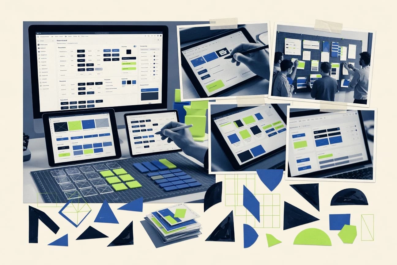
Technology Digital MediaTop 10 Best Design System Software of 2026
Discover the top 10 design system software to streamline collaboration, boost efficiency, and elevate projects.

How we ranked these tools
Core product claims cross-referenced against official documentation, changelogs, and independent technical reviews.
Analyzed video reviews and hundreds of written evaluations to capture real-world user experiences with each tool.
AI persona simulations modeled how different user types would experience each tool across common use cases and workflows.
Final rankings reviewed and approved by our editorial team with authority to override AI-generated scores based on domain expertise.
Score: Features 40% · Ease 30% · Value 30%
Gitnux may earn a commission through links on this page — this does not influence rankings. Editorial policy
Editor’s top 3 picks
Three quick recommendations before you dive into the full comparison below — each one leads on a different dimension.
Figma
Component variants with autosync across libraries and files
Built for design teams building and maintaining component libraries with developer-ready handoff.
Storybook
Editor pickControls addon for editing story props in real time
Built for design system teams needing live component catalogs and review workflows.
Zeroheight
Editor pickGovernance workflows for reviewing and publishing design system documentation changes
Built for design system teams needing governance-driven, interactive component documentation.
Related reading
Comparison Table
This comparison table evaluates design system software used to build, document, and maintain UI libraries across teams. Entries include tools such as Figma, Storybook, Zeroheight, Microsoft Power Apps, and Atlassian Confluence, alongside other platforms that support governance, component workflows, and documentation. The table helps readers match capabilities to use cases by comparing core features, integration paths, and collaboration strengths.
Figma
design-system-firstA collaborative design tool that supports shared design systems with components, variables, and team libraries.
Component variants with autosync across libraries and files
Figma stands out with a cloud-first collaborative design workflow that keeps component work and review threads in one place. Its core design system capabilities include reusable components, variants, and autosync for propagating token and component changes across files.
Teams can enforce system-wide consistency using libraries, style management, and Figma Dev mode handoff that ties specs to design assets. The platform also supports documentation and structured handoff for designers and developers to work from a shared system.
- +Reusable components with variants and autosync keep large systems consistent
- +Shared libraries let multiple teams work from the same component source of truth
- +Dev mode links specs and assets directly to developers for faster implementation
- +Cloud collaboration supports reviews on components and design decisions in context
- –Managing complex variant matrices can become difficult at scale
- –Strict token governance takes discipline across designers and libraries
- –Large files can slow down interactions on lower-end machines
- –Cross-tool token export pipelines can require extra setup
Best for: Design teams building and maintaining component libraries with developer-ready handoff
More related reading
Storybook
component-documentationA component workbench that renders UI components in isolation and documents a shared design system for teams.
Controls addon for editing story props in real time
Storybook stands out by turning UI component documentation into a live, interactive development and review surface. It supports component-driven workflows with isolated rendering via stories, enabling design system teams to validate variants and states in the browser.
Addons extend the tooling with capabilities like controls for prop editing and testing integrations that connect UI examples to automated checks. For design systems, it acts as a single place to author, version, and consume component behaviors across teams and projects.
- +Interactive story-driven documentation for design system components and variants
- +Addon ecosystem enables controls, accessibility checks, and visual regression workflows
- +Works with common UI frameworks and supports incremental adoption
- –Story organization discipline is required to keep large systems navigable
- –Cross-framework and monorepo setups can need extra configuration effort
- –Behavioral consistency across stories may require additional conventions and tooling
Best for: Design system teams needing live component catalogs and review workflows
Zeroheight
docs-and-governanceA design system documentation platform that ties design specs to component references for consistent implementation.
Governance workflows for reviewing and publishing design system documentation changes
Zeroheight turns design system documentation into a navigable product experience with live, structured content. The tool supports interactive component pages, reusable content blocks, and workflow for reviewing and publishing changes.
It integrates with design tools and code workflows so teams can keep specs and usage guidance aligned with components. Authors can model system structure, define governance rules, and generate up-to-date reference documentation for designers and developers.
- +Component documentation includes live examples and interactive props guidance
- +Clear page structure and navigation for large, multi-team design systems
- +Review and publishing workflows support governance and controlled updates
- +Integrations help link designs, specs, and implementation guidance
- –Setup for complex taxonomy and governance can take time
- –Not as strong for highly custom documentation layouts as full static-site tools
- –Keeping component interfaces synced with implementation requires consistent discipline
Best for: Design system teams needing governance-driven, interactive component documentation
Microsoft Power Apps
low-code-systemsAn application platform that supports reusable components and governed experiences across teams building internal digital products.
Power Apps Component Framework
Microsoft Power Apps stands out by generating business apps that integrate deeply with Microsoft 365 and Dataverse data models. It offers a low-code canvas app builder plus a declarative model-driven app framework designed for standardized enterprise forms and workflows. Strong connectors and automation features support common design-system workflows like shared components, governance, and role-based access.
- +Canvas and model-driven app types cover both UI customization and governed data flows.
- +Dataverse enables consistent entities, relationships, and reusable form patterns.
- +Power Automate and connectors speed up workflow integration across enterprise systems.
- –Design-system consistency is harder because styling and components need deliberate structure.
- –Complex governance and environment management can slow iterative design changes.
- –Advanced UI behaviors often require custom code and deeper platform knowledge.
Best for: Enterprise teams standardizing forms, workflows, and internal apps on Microsoft stack
Atlassian Confluence
enterprise-collaborationA wiki and collaboration space that stores design system documentation, guidelines, and component usage rules.
Page templates and macros for standardized component and token documentation pages
Confluence stands out with strong wiki-first editing that supports living documentation for design systems. It delivers structured pages, powerful search, and robust linking so tokens, components, and guidelines can be organized and reused across teams.
Versioning, approvals, and integrations with Jira and Atlassian tooling help keep governance around design system changes. Page macros and template-driven layouts support consistent documentation formats, though cross-repo design token automation depends on external pipelines.
- +Wiki editing with templates keeps design system documentation consistently structured
- +Strong page linking and search makes component and token navigation fast
- +Jira integration enables approvals and traceability for design system updates
- +Reusable page macros support consistent documentation layouts at scale
- –No native design-token schema or component registry with typed relationships
- –Maintaining strict governance requires process discipline and careful page permissioning
- –Cross-tool sync with tokens and components relies on external integrations
Best for: Design system documentation and governance for teams already using Atlassian tools
GitHub
version-controlA code hosting and collaboration platform used to version, review, and automate design system packages and component libraries.
Pull Requests with required status checks and branch protection rules
GitHub stands out for turning design system work into traceable software workflows with pull requests, issues, and code review. It supports building and maintaining component documentation through static site hosting and versioned change history. Design System assets can be managed as code with automated checks, branch protections, and dependency-aware updates.
- +Pull requests provide reviewable, line-level change history for design system assets
- +Issues and Projects support intake, triage, and tracking for component requests
- +Branch protections and required checks enforce quality gates on design updates
- –Git-based file workflows can be slower for non-developers managing tokens
- –Design system previewing requires extra setup for docs and component rendering
- –Governance depends on disciplined conventions for folders, naming, and releases
Best for: Teams integrating design systems into software delivery workflows
GitLab
devops-governanceA DevOps platform that supports design-system source control, CI pipelines, and merge-based governance for component changes.
Merge requests with approval rules and code owners
GitLab stands out by combining source control, CI/CD, and DevSecOps governance in one place for design-system code. It supports collaborative component development through merge requests, branch protections, and review workflows.
Design System automation benefits from CI pipelines that can lint design tokens, build documentation sites, and run visual or accessibility checks. GitLab also adds security and traceability controls that link changes to approvals and deployment activity.
- +Tight merge-request workflow with approvals, code owners, and protected branches
- +CI pipelines automate token builds, component tests, and documentation generation
- +Built-in audit trails connect design-system changes to deployments
- –Full DevSecOps feature set can add setup complexity for design-system teams
- –Visual regression and UI tooling often require external integrations
- –Advanced governance configuration can feel heavy for smaller teams
Best for: Teams managing design-system code with strong review, automation, and traceability
Notion
knowledge-baseA workspace for creating and maintaining design system documentation, standards, and reusable content blocks.
Databases with relations and templates for linking tokens, components, and documentation
Notion stands out for combining wiki-style documentation with database-driven structure, which works well for managing design system artifacts. Its components are built using pages, databases, templates, and linked references, so documentation can stay connected across tokens, components, and guidelines. Canvas and interactive embeds help present component usage and specs without forcing a separate documentation site workflow.
- +Database relations keep tokens, components, and guidelines cross-referenced
- +Reusable page templates speed creation of consistent component documentation
- +Permissions and page-level structure support controlled documentation spaces
- +Embedded diagrams and media make usage examples easy to review
- –Design-system component libraries need manual structure to avoid drift
- –No native token-to-code pipeline or typed API for design token syncing
- –Long pages can get slow and search relevance can degrade in large workspaces
Best for: Design system documentation and lightweight governance for teams without full tooling
Scrumwise
workflow-collaborationA collaboration tool that helps coordinate product and design system workflows with structured tasks and planning visibility.
Reusable work item framework that standardizes design system governance across sprints
Scrumwise stands out by combining Scrum portfolio workflows with a prebuilt artifact structure that teams can tailor to their delivery process. It supports backlog management, sprint execution, and cross-team visibility through shared work items and consistent status tracking. For design system work, it can centralize design requests, capture decision records, and route tasks from intake to implementation using the same governance used for product delivery.
- +Backlog and sprint workflows map cleanly to design system delivery phases
- +Consistent work item structure helps standardize requests, decisions, and implementation tasks
- +Cross-team visibility reduces drift between design governance and execution work
- –Design system-specific artifacts like tokens and components require external processes
- –Customization for governance can feel heavy compared with lightweight design ops tools
- –Advanced reporting depends on how well teams model work items and statuses
Best for: Product teams managing design system intake through Scrum workflow governance
Loom
async-reviewA video communication tool that records updates and reviews for design system changes across distributed teams.
One-click screen and webcam capture that generates an instantly shareable review link
Loom stands out with instant screen and webcam recording that captures product flows exactly as users experience them. It supports lightweight editing like trimming and drawing, and it publishes shareable links with options for viewer access.
For design systems, Loom is strongest at documenting components, narrating usage rules, and reviewing UI changes through visual feedback. It does not provide a native design-token repository or a formal component governance workflow.
- +Fast recording with screens and webcam for clear component documentation
- +Simple editing tools like trimming and annotations for quick iteration
- +Shareable links enable async review of UI behavior changes
- +Captures real product context that static docs often miss
- –No native design-token or component library management for governance
- –Annotations stay in the video, not as structured spec data
- –Search and tagging of design-system artifacts can be limited
- –Version control for component guidelines relies on external processes
Best for: Design teams documenting and reviewing component behavior with async videos
Conclusion
After evaluating 10 technology digital media, Figma stands out as our overall top pick — it scored highest across our combined criteria of features, ease of use, and value, which is why it sits at #1 in the rankings above.
Use the comparison table and detailed reviews above to validate the fit against your own requirements before committing to a tool.
How to Choose the Right Design System Software
This buyer’s guide explains how to select Design System Software using concrete capabilities from Figma, Storybook, Zeroheight, Power Apps, Confluence, GitHub, GitLab, Notion, Scrumwise, and Loom. It maps tool features to specific governance, documentation, and component-library workflows so teams can standardize interfaces and reduce implementation drift. The guide also highlights common failure modes seen across these platforms and shows what to look for during evaluation.
What Is Design System Software?
Design System Software helps teams define reusable UI patterns, connect design tokens and components to real usage guidance, and govern changes across design and engineering. It reduces inconsistencies by centralizing component references and enforcing structured documentation, component catalogs, or governed code workflows. Tools like Figma support reusable components with variants and autosync so changes propagate across files. Documentation and governance tools like Zeroheight and Confluence turn system rules and component guidance into structured, reviewable knowledge that teams can follow.
Key Features to Look For
The right feature set determines whether teams can keep component behavior, documentation, and releases aligned across multiple groups.
Component reuse with propagation across libraries
Look for reusable components plus variant management and change propagation so updates do not fork across teams. Figma supports component variants with autosync across libraries and files, which helps keep large UI systems consistent.
Live component documentation that runs in isolation
Choose tools that render component states in context of a documentation surface so teams can validate behavior and variants. Storybook provides story-driven, interactive component catalogs that isolate rendering and enable browser-based review.
Real-time editing controls for validating component APIs
Select platforms with controls that let reviewers modify component props and see outcomes immediately. Storybook’s Controls addon supports editing story props in real time for faster validation of states and variants.
Governance workflows for reviewing and publishing system changes
Prioritize a documented review and publish workflow so changes to guidelines do not bypass approvals. Zeroheight includes governance workflows for reviewing and publishing design system documentation changes, which creates controlled updates.
Standardized documentation structure with templates and macros
Use tools that enforce consistent documentation formats to prevent drift across teams and pages. Confluence supports page templates and reusable page macros for standardized component and token documentation pages.
Code-review gates and traceable change history
For engineering-led systems, require workflows that tie design system updates to review and automated checks. GitHub uses pull requests with required status checks and branch protection rules, while GitLab adds merge requests with approval rules and code owners.
How to Choose the Right Design System Software
Selection starts by matching the required governance and collaboration workflow to the tool’s strongest workflow primitives.
Match the workflow to where component truth should live
If the system’s source of truth is visual components maintained by designers, Figma fits because it supports reusable components with variants and autosync across libraries and files. If the system’s truth is code components with behavior validation, Storybook fits because it renders components via stories and keeps interactive examples close to implementation.
Decide how component documentation should be created and navigated
If documentation must be governance-driven and tied to component references, choose Zeroheight because it builds interactive component pages and includes review and publishing workflows. If documentation should be wiki-first and integrated with Jira-based approvals, choose Confluence because it supports structured templates and reusable macros.
Choose a governance mechanism that fits the team’s execution model
For engineering change control, choose GitHub or GitLab because both use pull or merge request workflows with quality gates. GitHub enforces required status checks and branch protection rules, and GitLab supports merge request approval rules and code owners.
Assess whether non-engineering teams can operate the system without drift
If teams want lightweight governance with linked content artifacts, Notion fits because it uses databases with relations and templates to connect tokens, components, and documentation. If teams need task-level intake and routing tied to delivery governance, Scrumwise fits because it standardizes work item structures for design system intake through sprint execution.
Validate async behavior communication for distributed reviewers
If distributed stakeholders need to review UI behavior changes in product context, choose Loom because it supports one-click screen and webcam capture that generates shareable review links. For enterprise apps that must standardize governed forms and workflows inside the Microsoft ecosystem, choose Microsoft Power Apps because it provides a Power Apps Component Framework and connects app behavior to Dataverse and enterprise connectors.
Who Needs Design System Software?
Design System Software fits teams that must coordinate shared UI standards across multiple contributors, tools, or release processes.
Design teams building component libraries with developer-ready handoff
Figma is built for this workflow because it supports reusable components with variants and autosync across libraries and files. Figma also supports Figma Dev mode handoff that ties specs to design assets for implementation-ready collaboration.
Design system teams needing live component catalogs and review workflows
Storybook fits because it turns component documentation into a live interactive surface using stories for isolated rendering. The Controls addon enables real-time prop editing so teams can validate variants and states during review.
Design system teams that require governance-driven, interactive documentation
Zeroheight fits because it includes governance workflows for reviewing and publishing design system documentation changes. Its interactive component pages and reusable content blocks keep guidance navigable across multiple teams.
Enterprise teams standardizing forms and workflows on the Microsoft stack
Microsoft Power Apps fits because it supports canvas and model-driven app types with deep Microsoft 365 and Dataverse integration. The platform’s Power Apps Component Framework supports governed enterprise experiences for standardized UI patterns.
Common Mistakes to Avoid
The most common failures come from picking tools that do not match the governance workflow, or from underestimating how much structure teams must maintain.
Ignoring governance discipline for structured change management
Zeroheight and Confluence provide governance and structured workflows for documenting and updating system guidance, but governance still requires discipline in page structure and review routing. GitHub and GitLab also enforce review gates through pull or merge requests, but releases fail if conventions for folders, naming, and approvals are not followed.
Allowing documentation and component navigation to degrade at scale
Storybook requires organization discipline to keep large story catalogs navigable and usable for reviewers. Confluence relies on page templates and macros for structure, and Notion requires manual structure to prevent component library drift when artifacts grow.
Relying on tools that lack native typed token-to-code integration
Loom provides async video reviews but does not manage design tokens or component libraries for governance in a structured way. GitHub and Confluence can host documentation, but cross-tool token export and typed relationships depend on external pipelines and conventions.
Overcomplicating variant matrices without clear rules
Figma supports component variants with autosync, but managing complex variant matrices becomes difficult at scale when rules are not explicit. Teams that allow variant sprawl without documentation conventions will see consistency issues across libraries and files.
How We Selected and Ranked These Tools
We evaluated each tool by scoring three sub-dimensions: features with weight 0.4, ease of use with weight 0.3, and value with weight 0.3. The overall rating is the weighted average of those three metrics, calculated as overall = 0.40 × features + 0.30 × ease of use + 0.30 × value. Figma separated itself in this scoring model because its feature set centers on reusable components with variants and autosync across libraries and files, which directly reduces inconsistency across large design systems. Storybook ranked lower than Figma in this same framework because its documentation strength depends on story organization discipline to keep large systems navigable, which affects ease of use and ongoing operational effort.
Frequently Asked Questions About Design System Software
How does Figma keep design system components and tokens consistent across many files?
What makes Storybook a better fit than a static documentation wiki for design system validation?
When should Zeroheight be chosen over Confluence for design system governance workflows?
How do GitHub and GitLab differ for managing design system assets as code?
Which tool supports a component-driven documentation workflow tied to code review and traceability?
How does Confluence structure design system documentation for reuse across teams?
What workflow pattern does Zeroheight enable for publishing component documentation updates?
How can Notion model relationships between tokens, components, and guidelines without a separate documentation site?
What is Scrumwise used for when design system work must follow product delivery governance?
Where does Loom fit in a design system workflow, and what limitation affects teams managing tokens formally?
Tools reviewed
Primary sources checked during evaluation.
Referenced in the comparison table and product reviews above.
Keep exploring
Comparing two specific tools?
Software Alternatives
See head-to-head software comparisons with feature breakdowns, pricing, and our recommendation for each use case.
Explore software alternatives→In this category
Technology Digital Media alternatives
See side-by-side comparisons of technology digital media tools and pick the right one for your stack.
Compare technology digital media tools→FOR SOFTWARE VENDORS
Not on this list? Let’s fix that.
Our best-of pages are how many teams discover and compare tools in this space. If you think your product belongs in this lineup, we’d like to hear from you—we’ll walk you through fit and what an editorial entry looks like.
Apply for a ListingWHAT THIS INCLUDES
Where buyers compare
Readers come to these pages to shortlist software—your product shows up in that moment, not in a random sidebar.
Editorial write-up
We describe your product in our own words and check the facts before anything goes live.
On-page brand presence
You appear in the roundup the same way as other tools we cover: name, positioning, and a clear next step for readers who want to learn more.
Kept up to date
We refresh lists on a regular rhythm so the category page stays useful as products and pricing change.