GITNUXSOFTWARE ADVICE
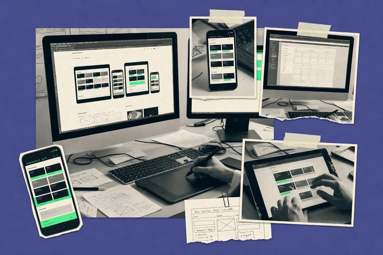
Technology Digital MediaTop 10 Best Responsive Web Design Software of 2026
Discover the top 10 best responsive web design software—find tools to build sleek, mobile-friendly sites.

How we ranked these tools
Core product claims cross-referenced against official documentation, changelogs, and independent technical reviews.
Analyzed video reviews and hundreds of written evaluations to capture real-world user experiences with each tool.
AI persona simulations modeled how different user types would experience each tool across common use cases and workflows.
Final rankings reviewed and approved by our editorial team with authority to override AI-generated scores based on domain expertise.
Score: Features 40% · Ease 30% · Value 30%
Gitnux may earn a commission through links on this page — this does not influence rankings. Editorial policy
Editor’s top 3 picks
Three quick recommendations before you dive into the full comparison below — each one leads on a different dimension.
Webflow
Visual responsive designer with breakpoint-specific styling
Built for design teams building responsive marketing sites with visual CMS workflows.
Adobe Dreamweaver
Editor pickBuilt-in CSS media query support with responsive breakpoints in the visual editor
Built for established web teams needing mixed visual and code editing for responsive sites.
Framer
Editor pickLive breakpoints with direct manipulation on the Framer canvas
Built for design-led teams shipping responsive marketing sites with lightweight interactivity.
Related reading
Comparison Table
This comparison table evaluates responsive web design software tools for building mobile-friendly sites, including Webflow, Adobe Dreamweaver, Framer, Figma, Wix, and more. Each row highlights what the tool supports for layout control, design-to-code or visual editing, collaboration workflows, and practical use for responsive breakpoints.
Webflow
visual editorA visual web design platform that builds responsive layouts with a drag-and-drop designer and publishes sites from generated code.
Visual responsive designer with breakpoint-specific styling
Webflow stands out by pairing a visual designer with code-like control over layout, interactions, and responsive styling. Core capabilities include a component-based page builder, a visual CMS for structured content, and responsive breakpoints that let layouts adapt across devices.
The tool also supports designer-led animations and interactions, plus clean HTML, CSS, and JavaScript export through its hosted publishing workflow. Limitations show up in advanced engineering workflows, because deeper custom behavior often requires custom code and more manual setup than template-first builders.
- +Visual layout builder with precise responsive breakpoint controls
- +CMS supports structured collections, templates, and dynamic pages
- +Designer-friendly interactions and animations without heavy coding
- +Exports and publishes real HTML and CSS workflows
- +Reusable components speed up consistent multi-page builds
- –Advanced custom functionality often needs custom code and testing
- –Complex multi-variant pages can become harder to manage over time
- –Some behaviors require workarounds versus full development frameworks
Best for: Design teams building responsive marketing sites with visual CMS workflows
More related reading
Adobe Dreamweaver
code editorA code-and-design web editor that supports responsive page building with HTML, CSS, and frameworks and provides live editing workflows.
Built-in CSS media query support with responsive breakpoints in the visual editor
Adobe Dreamweaver stands out for pairing a classic visual editor workflow with a code-focused workspace for building responsive websites. It supports CSS media queries, responsive layouts, and site management features that help teams keep projects organized across pages. The tool integrates with Adobe-centric development workflows and includes FTP and SFTP publishing options for deploying changes to live sites.
- +Visual layout editing with CSS authoring for responsive page structures
- +Site-wide file management and publishing workflows for multi-page sites
- +FTP and SFTP deployment options support direct updates to servers
- +Code editor features help refine HTML, CSS, and JavaScript inline
- –Responsive design tooling is less modern than component-first editors
- –Drag-and-drop workflows can create less predictable CSS outcomes
- –Collaboration and workflow features lag behind dedicated web IDEs
- –Learning curve is higher for full responsive control
Best for: Established web teams needing mixed visual and code editing for responsive sites
Framer
interactive builderA responsive website builder that designs and publishes interactive sites using components and generates production-ready output.
Live breakpoints with direct manipulation on the Framer canvas
Framer stands out for building responsive websites through live, code-aware visual design and direct manipulation of layouts. Its canvas-driven workflow supports breakpoints, reusable components, and interactive prototypes, so design decisions translate quickly into production-ready pages. Framer also includes CMS and animation tools that help create dynamic sections without switching to separate software.
- +Visual canvas makes responsive layout adjustments fast and intuitive
- +Built-in animations and interactions reduce the need for external tooling
- +CMS workflows help connect design components to dynamic content
- –Advanced responsive edge cases can require manual intervention
- –Exporting or integrating with non-Framer stacks can be limiting
- –Highly complex design systems may feel harder than in full component platforms
Best for: Design-led teams shipping responsive marketing sites with lightweight interactivity
Figma
design systemA design tool for responsive UI that supports reusable components and exports design specifications for web development handoff.
Auto Layout for responsive stacking, resizing, and alignment rules
Figma stands out with real-time collaborative design and commenting directly on the canvas. It supports responsive web design through Auto Layout, constraints, and component-based systems that keep spacing and typography consistent across breakpoints.
Teams can prototype interactions with clickable flows and handoff specs that connect design structure to implementation-ready assets. The workflow is strongest for iterative UI and layout design, not for code-level responsive testing and browser performance validation.
- +Auto Layout keeps responsive spacing consistent across variants
- +Component and variant workflows speed up breakpoint-aware UI iteration
- +Real-time collaboration and comments reduce design-to-design handoffs
- –Breakpoint behavior can require careful layout discipline to avoid drift
- –Limited native tooling for cross-browser responsive performance verification
- –Complex component systems can slow navigation and increase maintenance
Best for: Product and web teams collaborating on responsive UI design systems
Wix
website builderA website builder that creates responsive pages using templates and automated layout behavior across mobile and desktop.
Wix Editor mobile view for adjusting layout separately across device breakpoints
Wix stands out with a drag-and-drop site builder that generates responsive layouts from its design templates. It offers mobile editing controls, image and media management, and built-in SEO and performance tools for publish-ready responsive pages.
The editor supports animations, reusable sections, and dynamic content elements without requiring front-end code. Wix also includes hosting, domain setup, and compliance-oriented publishing workflows that keep responsive deployment within one platform.
- +Drag-and-drop editor builds responsive layouts with minimal technical setup
- +Mobile-specific page editing helps fine-tune breakpoints and spacing
- +Template library covers many industries with responsive-ready sections
- –Advanced responsive control can feel limiting versus direct code workflows
- –Complex layouts may require repeated manual adjustments across screen sizes
- –Performance tuning options are less granular than developer-focused toolchains
Best for: Small teams needing fast responsive sites with strong template and mobile editing
Squarespace
hosted builderA hosted website builder that outputs responsive templates and supports mobile-friendly editing for page layouts.
Squarespace Fluid Engine editor for responsive layout adaptation during editing
Squarespace stands out with a design-first site builder that focuses on responsive templates and visual layout controls. It supports drag-and-drop page editing, custom CSS injection, and mobile-friendly rendering across common breakpoints.
Core tools include SEO settings, form handling, blog publishing, and integrations for payments and marketing workflows. The platform is best suited for responsive marketing sites where content speed and visual consistency matter more than deep front-end engineering.
- +Responsive templates update cleanly across mobile, tablet, and desktop
- +Drag-and-drop editor enables fast layout changes without code
- +Built-in SEO controls cover titles, descriptions, and social previews
- +App integrations support payments, email capture, and analytics
- +Custom CSS injection allows targeted responsive styling fixes
- –Advanced responsive behavior needs custom CSS workarounds
- –Template constraints limit complex multi-page design systems
- –Editing shared design styles can be less precise for edge cases
- –Performance tuning options are limited compared with code-first workflows
Best for: Marketing teams needing responsive templates and quick visual site iteration
Canva
template-basedA visual design platform that creates responsive website pages from templates and enables publishing workflows for mobile-friendly layouts.
Brand Kit with reusable fonts, colors, and templates for consistent responsive web design
Canva stands out for turning design work into a drag-and-drop workflow with reusable brand assets and templates. For responsive web design, it supports building pages for landing and marketing layouts with layout-aware editing, grid controls, and export options for web-friendly assets.
Teams can collaborate through shared folders, comments, and versioned design histories while maintaining consistent typography, color, and spacing via brand kits. The experience emphasizes visual layout creation rather than code-level control of responsive breakpoints and layout behavior.
- +Drag-and-drop editor with strong grid and alignment tools for responsive layouts
- +Brand Kit centralizes fonts, colors, and templates for consistent page designs
- +Collaboration tools support shared projects, comments, and approvals
- +Export and asset management speed up building marketing pages with reusable creatives
- –Responsive behavior has limits compared with breakpoint-driven code workflows
- –Custom HTML and CSS control remains constrained for complex interactive layouts
- –Component-level reuse for full site systems is weaker than dedicated design-to-code stacks
Best for: Marketing and design teams creating responsive landing pages without heavy coding
Bootstrap Studio
bootstrap editorA desktop visual editor for Bootstrap that generates responsive HTML and CSS for building mobile-friendly sites.
Responsive breakpoint preview and CSS generation tightly aligned with Bootstrap markup
Bootstrap Studio centers on visual building for responsive layouts with direct control over Bootstrap components. It offers a desktop design workflow with a live preview, drag-and-drop layout, and responsive breakpoints for generating front-end HTML and CSS.
The tool also includes asset management for images, icons, and styles, plus export-ready code that can be integrated into existing projects. Designers who want to stay close to Bootstrap markup gain speed, while complex custom interactions still require manual coding.
- +Visual editor for Bootstrap components with breakpoint-aware layout controls
- +Live preview helps validate responsiveness without constant context switching
- +Exports clean HTML and CSS for use in real codebases
- +Style editor supports reusable design tweaks across sections
- –Advanced behavior still depends on hand-coding for interactive features
- –Custom UI beyond Bootstrap patterns can feel slower than code-first design
- –Project syncing and team workflows are weaker than full cloud editors
- –Large sites may require manual organization of generated assets
Best for: Designers crafting Bootstrap-based responsive sites with minimal coding
Silex
visual builderA visual web builder that supports responsive editing and exports code for custom layout control.
Live visual editor with instant responsive preview
Silex stands out for visual, direct-to-website editing with live previews while building responsive layouts. It supports HTML, CSS, and JavaScript authoring through an editor that mixes design and code access.
For responsive web design work, it focuses on arranging elements and exporting a working site rather than managing complex component libraries. The workflow fits teams that want fast iteration on page structure and interactions without heavy frontend frameworks.
- +Live visual editing shows responsive changes immediately
- +Exports clean static assets for straightforward hosting
- +Direct access to HTML and CSS supports custom styling
- –Responsive controls are less advanced than dedicated UI layout builders
- –Component reuse and design-system workflows stay limited
- –Large apps need manual structure to avoid page complexity
Best for: Designers building small to mid-size responsive sites with light interactivity
React Developer Tools
responsive debuggingA browser tool for inspecting React component rendering that helps validate responsive behavior through layout and component inspection.
React Profiler with per-component render timings and rerender causes
React Developer Tools is distinct because it provides React-specific inspection inside the browser, with component trees and state visibility designed for React rendering behavior. It supports profiling to measure rendering frequency and identify wasted renders, and it shows Hooks state to speed up debugging of UI logic.
For responsive web design, it helps diagnose how layout-affecting component props and state drive reflows, rerenders, and conditional rendering across breakpoints. It does not replace responsive layout tooling like CSS inspection or breakpoint emulation, so it works best as a companion for UI and rendering diagnosis.
- +Shows live component tree and props, making rendering causes visible during responsive changes
- +Hooks inspection reveals state that drives conditional layout and breakpoint behavior
- +Profiler highlights which components rerender and why, supporting performance-focused responsive tuning
- –Focused on React, so it misses non-React layout diagnostics in CSS and HTML
- –Breakpoint emulation depends on the browser devtools, not React Developer Tools
- –Large apps can produce noisy component trees that slow targeted inspection
Best for: React teams debugging responsive rendering and performance regressions
Conclusion
After evaluating 10 technology digital media, Webflow stands out as our overall top pick — it scored highest across our combined criteria of features, ease of use, and value, which is why it sits at #1 in the rankings above.
Use the comparison table and detailed reviews above to validate the fit against your own requirements before committing to a tool.
How to Choose the Right Responsive Web Design Software
This buyer's guide explains what responsive web design software does and how to pick the right tool for real projects. It covers Webflow, Adobe Dreamweaver, Framer, Figma, Wix, Squarespace, Canva, Bootstrap Studio, Silex, and React Developer Tools. The guide focuses on breakpoint control, responsive layout workflow, content and publishing needs, export and code access, and debugging support for responsive behavior.
What Is Responsive Web Design Software?
Responsive web design software helps teams build pages that adapt layouts across device sizes using breakpoint rules, responsive layout behavior, and reusable components. It reduces the need to hand-code layout changes for every screen width. Tools like Webflow and Adobe Dreamweaver support responsive styling and breakpoint workflows that translate into published HTML, CSS, and JavaScript. Design and collaboration tools like Figma use Auto Layout and components to keep spacing and alignment consistent across responsive variants.
Key Features to Look For
The features below map to the way top tools in this set handle responsive breakpoints, component reuse, and publishing or export.
Breakpoint-specific responsive styling
Webflow provides a visual responsive designer with breakpoint-specific styling so layout changes can be made per range. Adobe Dreamweaver includes built-in CSS media query support with responsive breakpoints in the visual editor for teams who author CSS directly.
Responsive layout automation with Auto Layout rules
Figma uses Auto Layout and constraints so responsive stacking, resizing, and alignment follow rules instead of manual rework. This helps product and web teams keep spacing and typography consistent across variants while iterating rapidly.
Live visual editing with direct manipulation
Framer uses a canvas workflow with live, code-aware visual editing so responsive layout adjustments happen during design. Silex also provides live visual editing with instant responsive preview so layout changes can be validated quickly without switching tools.
Reusable components and design-system workflows
Webflow and Framer both emphasize reusable components to speed up consistent multi-page responsive builds. Figma doubles down with component and variant workflows that keep breakpoint-aware UI iteration aligned for collaborative design systems.
Structured content and responsive-ready publishing or CMS workflows
Webflow includes a visual CMS for structured collections, templates, and dynamic pages so responsive design can stay tied to real content models. Framer adds CMS workflows that connect components to dynamic content while animations and interactions remain in the same environment.
Responsive export and developer-friendly code access
Webflow supports publish workflows that output clean HTML, CSS, and JavaScript so responsive pages can be integrated into real front-end stacks. Bootstrap Studio generates responsive HTML and CSS aligned with Bootstrap markup so teams can carry the responsive output into existing codebases.
How to Choose the Right Responsive Web Design Software
Selecting the right tool depends on where responsive layout logic will be authored, how breakpoints are managed, and whether the workflow needs publishing, export, or React-specific debugging.
Choose the breakpoint workflow that matches the team’s design process
If breakpoint control must be visual and precise, Webflow fits teams that want breakpoint-specific styling in a drag-and-drop responsive designer. If responsive control must be expressed as CSS media queries inside a classic editor workflow, Adobe Dreamweaver provides built-in media query support within the visual editor. For direct, canvas-based breakpoint tuning, Framer offers live breakpoints with direct manipulation so changes appear immediately during layout work.
Decide whether responsive layout should be rule-driven or manual
Figma’s Auto Layout and constraints keep stacking, resizing, and alignment consistent across breakpoints, which reduces drift when multiple variants evolve. Wix and Squarespace handle responsive layout with editor-level controls that can be simpler to operate, but advanced responsive behavior often requires extra adjustment across sizes. This matters most for complex multi-variant pages where manual tuning can compound over time in template-first builders like Wix.
Match export or publishing needs to the chosen toolchain
Webflow publishes from its visual workspace and outputs real HTML and CSS workflows that support developer handoff and code-level continuity. Bootstrap Studio exports responsive HTML and CSS tied to Bootstrap components, which suits workflows that already use Bootstrap-based front ends. If the workflow is about authoring and maintaining React UI logic, React Developer Tools serves as a diagnosis companion by exposing component trees, props, Hooks state, and per-component rerender behavior.
Use the right tool for interactive motion and animation scope
Framer includes built-in animations and interactions so responsive marketing pages can keep motion work inside the same design environment. Webflow supports designer-friendly interactions and animations without heavy coding, which helps marketing teams ship rich pages faster. For UI teams that need interaction prototyping tied to component variants, Figma supports clickable flows and interaction prototypes with handoff specs, but it is not built for browser performance validation of responsive behavior.
Validate collaboration and content workflows before committing
Figma supports real-time collaboration and commenting directly on the canvas, which reduces miscommunication during responsive variant reviews. Webflow pairs a visual CMS with templates and dynamic pages so content models remain structured while the responsive layout evolves. Squarespace and Wix both provide hosted, responsive page building with mobile editing controls so teams can iterate quickly on common marketing page structures.
Who Needs Responsive Web Design Software?
Different teams need responsive web design software for different outcomes, such as breakpoint authoring, content-driven responsive publishing, or responsive rendering debugging.
Design teams building responsive marketing sites with visual CMS workflows
Webflow excels because it combines a visual responsive designer with breakpoint-specific styling and a visual CMS for structured collections and dynamic pages. Framer also fits because it includes CMS workflows and built-in animations so interactive responsive marketing sections stay in one canvas.
Established web teams that mix visual editing with responsive CSS authoring
Adobe Dreamweaver fits teams that need classic visual layout editing plus explicit responsive control through CSS media queries. Bootstrap Studio also fits designers working with Bootstrap markup who want visual breakpoint preview and responsive HTML and CSS generation.
Product and web teams collaborating on responsive UI design systems
Figma is a strong match because Auto Layout and constraints enforce responsive stacking and alignment rules across variants. Its component and variant workflows support consistent breakpoint-aware UI iteration while real-time collaboration and comments reduce handoff friction.
Small marketing teams that want fast responsive publishing with editor-level mobile controls
Wix is a fit because it provides a drag-and-drop builder with a mobile view for adjusting layout separately across device breakpoints. Squarespace also fits because it uses responsive templates and the Fluid Engine editor for responsive layout adaptation during editing.
Common Mistakes to Avoid
Several recurring pitfalls appear across this set of tools, and the fixes depend on choosing the right responsive workflow for the project’s complexity.
Selecting a template-first builder for highly complex responsive systems
Wix and Squarespace can make responsive iteration fast, but advanced responsive control can feel limiting and complex layouts can require repeated manual adjustments across screen sizes. Webflow and Framer handle breakpoint-specific styling and component reuse more directly when multi-variant page management becomes the main challenge.
Ignoring breakpoint discipline in rule-based design systems
Figma can keep responsive behavior consistent with Auto Layout, but breakpoint behavior still requires layout discipline to avoid drift across variants. Teams that rely on manual rework after layout drift appears will spend more time fixing alignment issues than designing new sections.
Assuming visual export eliminates the need for responsive testing
Visual tools like Framer and Webflow generate responsive output, but advanced responsive edge cases can still require manual intervention. React Developer Tools helps validate responsive rendering causes in React by showing component trees, Hooks state, and per-component rerender timings, which prevents chasing purely visual symptoms.
Building an interaction-heavy experience in a tool that limits integration options
Framer is built for interactive responsive prototypes, while exporting or integrating into non-Framer stacks can be limiting for edge integration scenarios. Webflow can keep interactions inside its designer workflow, but deeper custom behavior often needs custom code and testing beyond template-first behavior.
How We Selected and Ranked These Tools
we evaluated every tool on three sub-dimensions with fixed weights. Features scored at 0.4 because responsive breakpoint authoring, responsive layout automation, CMS workflows, and export behaviors define what teams can ship. Ease of use scored at 0.3 because designers need fast breakpoint iteration through canvas editing, mobile controls, or Auto Layout constraints. Value scored at 0.3 because teams need a workflow that reduces rework and supports output that fits the target toolchain. Webflow separated from lower-ranked tools through stronger breakpoint-specific responsive design paired with a visual CMS for structured collections, which boosted both features and the practical ease of managing responsive multi-page builds.
Frequently Asked Questions About Responsive Web Design Software
Which responsive web design tool is best for a visual designer who still wants code-level export control?
What software supports responsive layout behavior without requiring manual breakpoint testing in the browser?
Which option is strongest for teams that need collaborative responsive UI design and structured handoff?
Which tool fits marketing teams that want responsive publishing inside a single hosted platform?
How do Webflow, Adobe Dreamweaver, and Wix differ in responsive workflow for content-heavy sites?
Which tool is best when responsive pages must be built on top of an existing Bootstrap codebase?
What software helps debug responsive layout issues caused by component props, state, and rerender behavior in React?
Which option suits teams that want direct-to-website editing with instant responsive preview, without full framework complexity?
Which tool supports responsive brand consistency and repeatable layout creation for landing pages?
Tools reviewed
Primary sources checked during evaluation.
squarespace.comReferenced in the comparison table and product reviews above.
Keep exploring
Comparing two specific tools?
Software Alternatives
See head-to-head software comparisons with feature breakdowns, pricing, and our recommendation for each use case.
Explore software alternatives→In this category
Technology Digital Media alternatives
See side-by-side comparisons of technology digital media tools and pick the right one for your stack.
Compare technology digital media tools→FOR SOFTWARE VENDORS
Not on this list? Let’s fix that.
Our best-of pages are how many teams discover and compare tools in this space. If you think your product belongs in this lineup, we’d like to hear from you—we’ll walk you through fit and what an editorial entry looks like.
Apply for a ListingWHAT THIS INCLUDES
Where buyers compare
Readers come to these pages to shortlist software—your product shows up in that moment, not in a random sidebar.
Editorial write-up
We describe your product in our own words and check the facts before anything goes live.
On-page brand presence
You appear in the roundup the same way as other tools we cover: name, positioning, and a clear next step for readers who want to learn more.
Kept up to date
We refresh lists on a regular rhythm so the category page stays useful as products and pricing change.