GITNUXSOFTWARE ADVICE
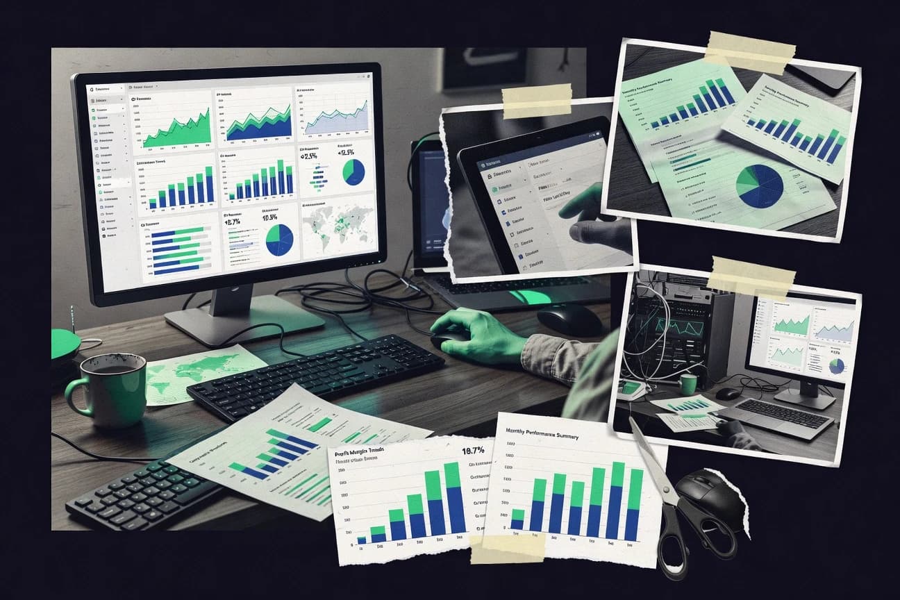
Data Science AnalyticsTop 10 Best Reporting Analytics Software of 2026
Discover the top 10 reporting analytics software tools to streamline data insights.

How we ranked these tools
Core product claims cross-referenced against official documentation, changelogs, and independent technical reviews.
Analyzed video reviews and hundreds of written evaluations to capture real-world user experiences with each tool.
AI persona simulations modeled how different user types would experience each tool across common use cases and workflows.
Final rankings reviewed and approved by our editorial team with authority to override AI-generated scores based on domain expertise.
Score: Features 40% · Ease 30% · Value 30%
Gitnux may earn a commission through links on this page — this does not influence rankings. Editorial policy
Editor’s top 3 picks
Three quick recommendations before you dive into the full comparison below — each one leads on a different dimension.
Microsoft Power BI
Power BI DAX for semantic measures and reusable business logic
Built for teams building governed dashboards and interactive reporting on mixed data sources.
Tableau
Editor pickTableau’s drag-and-drop dashboard authoring with interactive parameters and drill-through
Built for organizations building governed, interactive reporting dashboards from multiple data sources.
Sisense
Editor pickSenseGPT natural-language querying and analytics within embedded dashboards
Built for organizations embedding governed reporting into apps and scaling analytics beyond static dashboards.
Related reading
Comparison Table
This comparison table evaluates reporting and analytics platforms including Microsoft Power BI, Tableau, Sisense, Domo, MicroStrategy, and others. It summarizes how each tool handles core reporting workflows like dashboarding, data modeling, visualization, and sharing so teams can match platform capabilities to their reporting needs.
Microsoft Power BI
enterprise BIPower BI builds interactive dashboards and paginated reports from connected data sources with scheduled refresh, row-level security, and dataset governance for reporting analytics.
Power BI DAX for semantic measures and reusable business logic
Microsoft Power BI stands out for turning model-first analytics into shareable dashboards with interactive report experiences. It provides strong self-service reporting with data modeling, DAX-based measures, and a large connector library for importing and shaping data. Power BI also supports enterprise reporting needs through governed workspaces, row-level security, and automated refresh pipelines for scheduled datasets.
- +DAX measures and semantic modeling enable precise, reusable business logic.
- +Interactive dashboards support slicers, drillthrough, and cross-filtering.
- +Row-level security and governed workspaces support controlled report access.
- +Strong connector ecosystem covers common data warehouses and SaaS sources.
- –Complex DAX and modeling can be slow to master for new teams.
- –Performance tuning across large datasets requires dedicated governance and monitoring.
- –Advanced visual customization has limits without specialized development skills.
Best for: Teams building governed dashboards and interactive reporting on mixed data sources
More related reading
Tableau
visual analyticsTableau Server and Tableau Cloud generate governed dashboards and analytics from relational and cloud data with strong visualization authoring and sharing controls.
Tableau’s drag-and-drop dashboard authoring with interactive parameters and drill-through
Tableau stands out with an interactive visual analytics workflow built around drag-and-drop dashboards and fast data exploration. It supports rich reporting capabilities through calculated fields, parameterized views, and a wide library of built-in chart types.
Tableau Server and Tableau Cloud enable governed sharing with interactive filters, scheduled extracts, and role-based access controls for enterprise reporting. Strong ecosystem coverage includes integrations for data connectors, plus support for spatial and time-series visualizations.
- +Interactive dashboards with strong filtering, highlighting, and drill-down behavior
- +Extensive chart variety plus calculated fields and parameters for reusable reporting
- +Enterprise sharing via Tableau Server with governance tools and role-based permissions
- +Large connector ecosystem supports many common databases and file sources
- –Complex data modeling often requires extra preparation to avoid brittle dashboards
- –Collaboration and content lifecycle management can feel heavier than lighter BI tools
- –Advanced analytics beyond visualization typically needs external tooling or scripting
Best for: Organizations building governed, interactive reporting dashboards from multiple data sources
Sisense
embedded BISisense provides embedded and enterprise reporting analytics with data preparation, live and in-memory analytics, and dashboard publishing.
SenseGPT natural-language querying and analytics within embedded dashboards
Sisense stands out for embedding analytics directly into business apps with guided, interactive reporting and dashboarding. It combines in-database analytics and flexible data modeling to support report performance across large datasets. Users can build visual dashboards, schedule refreshed reports, and share governed insights through a centralized analytics experience.
- +Embedded analytics supports delivery of reports inside external business apps
- +In-database processing improves responsiveness for large reporting datasets
- +Flexible modeling enables consistent metrics across dashboards and reports
- +Robust dashboarding supports interactive exploration and scheduled distribution
- –Setup and modeling complexity can slow teams without analytics engineering support
- –Advanced configurations often require deeper platform knowledge than basic reporting tools
- –Performance tuning may be necessary for highly customized, wide analytic workloads
Best for: Organizations embedding governed reporting into apps and scaling analytics beyond static dashboards
Domo
all-in-one reportingDomo consolidates business data into reports and KPI dashboards with connectors, automated data refresh, and workflow-ready visualizations.
Business application framework for reports and KPIs with built-in collaboration workflows
Domo stands out for connecting business data into a single, shareable workspace with strong workflow around reporting. It delivers dashboards, automated reports, and a broad set of connectors for pulling data from cloud apps and databases. Reporting is supported by visual discovery and governed sharing, with monitoring of content performance across teams.
- +Strong connector library for bringing operational and analytical data together
- +Dashboards support interactive drill paths and dashboard-level sharing
- +Automated report scheduling helps teams keep metrics current
- +Workflow tools support review, distribution, and collaboration around reports
- –Modeling and report setup can feel heavy for simple reporting needs
- –Some advanced visualizations require more configuration time than expected
- –Governance and permissions can be complex to align across teams
Best for: Mid-size to enterprise teams needing governed reporting with workflow
MicroStrategy
enterprise analyticsMicroStrategy delivers enterprise reporting and analytics with governed data, interactive dashboards, and scalable performance for large deployments.
MicroStrategy Security Privilege model with fine-grained access control for reports and data
MicroStrategy stands out for combining enterprise-grade analytics with governance controls for large BI deployments. It delivers dashboarding, ad hoc analysis, and enterprise reporting through a centralized platform that integrates with common data warehouses and platforms. Its analytics layer also supports advanced capabilities like data discovery, location-aware reporting, and automated report distribution to business users.
- +Enterprise governance features for security, lineage, and controlled content delivery
- +Strong dashboarding and reporting with scheduled distribution and refresh
- +Flexible analysis workflows spanning dashboards, drill paths, and ad hoc exploration
- –High setup and administration overhead for large-scale deployments
- –Report and model building can feel heavy without dedicated platform expertise
- –User self-service speed depends on prebuilt datasets and governed objects
Best for: Enterprises standardizing governed BI reporting and dashboards at scale
Zoho Analytics
self-service BIZoho Analytics creates drag-and-drop reports and dashboards with scheduled refresh, data prep, and sharing for reporting analytics across teams.
Scheduled report and dashboard refresh with workflow-style automation across connected data sources
Zoho Analytics stands out by combining self-service reporting with an analytics automation layer inside the same workspace. It delivers guided report building, interactive dashboards, and strong data preparation tools for SQL-like querying and visualization.
It also supports scheduled refreshes and sharing so stakeholders receive updated reports without manual rebuilds. Connectors for common data sources and Zoho applications make it suited for reporting workflows across teams.
- +Interactive dashboards with drill-down and dynamic filtering for stakeholder self-serve views
- +Scheduling and automated refresh keep reports current without manual intervention
- +Broad data import connectors for databases, files, and Zoho apps reduce integration effort
- +Built-in data prep for cleaning, shaping, and calculated fields before visualization
- –Complex modeling and transformations can feel slower than purpose-built BI modeling tools
- –Advanced custom visuals and layout control can be limited versus leading dashboard builders
- –Administration for large deployments requires more effort to manage permissions and users
Best for: Teams needing governed self-serve dashboards with scheduled reporting and Zoho ecosystem integration
Grafana
dashboard analyticsGrafana builds operational dashboards and reporting views from metrics, logs, and traces using pluggable data sources and alerting.
Dashboard templating with variables enables reusable, parameterized reporting across datasets
Grafana stands out for interactive dashboards that pull data from many sources using a unified query model. It supports time-series exploration, alerting, and dashboard variables for reusable reporting views.
Reporting workflows benefit from powerful visualization plugins and the ability to embed dashboards into other apps. Governance is strengthened by folder-based organization, role-based access control, and audit-friendly provisioning through configuration and APIs.
- +Strong visualization library with many community and native dashboard panels
- +Flexible data source querying for time-series reporting and operational analytics
- +Powerful dashboard variables and templating for reusable report views
- +Integrated alerting tied to queries and time windows for near-real-time notifications
- –Reporting for complex cross-tab layouts needs careful panel composition
- –Large dashboard performance can degrade without query tuning and caching strategy
- –Styling and layout control across panels can be limiting for print-style reports
- –Alert troubleshooting can be difficult when many queries and rules interact
Best for: Teams building interactive operational reports with multiple data sources and alerts
Apache Superset
open-source BIApache Superset provides web-based dashboards and SQL-driven reporting analytics with custom charts and role-based access control.
SQL Lab for interactive querying with saved datasets and chart-ready results
Apache Superset stands out for turning SQL-first exploration into shareable dashboards using a web interface. It supports a wide set of chart types, interactive filtering, and dashboard layouts that can pull from multiple database backends through its database connectors. Semantic layers and dataset modeling capabilities help standardize metrics, while role-based access controls support governed reporting across teams.
- +Interactive dashboards with cross-filtering across charts and table components
- +Large chart catalog plus native support for SQL datasets and saved queries
- +Strong role-based access controls for multi-user reporting governance
- +Integrates with many data sources through configurable database connections
- –SQL and dataset modeling complexity rises as semantic layers mature
- –Front-end customization can feel limited versus purpose-built BI report tools
- –Admin setup and tuning are required for stable performance on large datasets
Best for: Analytics teams building governed, SQL-driven dashboards across shared datasets
Metabase
open-source BIMetabase generates shareable dashboards and question-based reporting from SQL and supported data warehouses with governed permissions.
Semantic models with metrics and field definitions for consistent reporting across dashboards
Metabase stands out for turning SQL-first analytics into shareable dashboards, charts, and ad hoc questions with minimal setup. It supports data exploration via native query and a question builder, then delivers curated metrics through dashboards and saved models. Role-based access controls and alerting options help teams operationalize reporting without building custom applications.
- +SQL-native exploration with a question interface for quick dashboard creation
- +Powerful dashboard layouts with filters, drill-through, and saved segments
- +Dataset semantic modeling improves consistency across charts and teams
- –Advanced governance features lag behind enterprise BI suites
- –Performance can degrade on complex queries without careful database tuning
- –Embedding and customization options require more setup for polished UX
Best for: Teams sharing governed dashboards from shared data sources without custom BI builds
Kibana
log analytics dashboardsKibana visualizes Elasticsearch and Elastic data with dashboards, saved searches, and reporting-style insights over logs and analytics.
Dashboard reporting with scheduled exports to PDF and CSV
Kibana stands out for pairing interactive dashboards with tight integration to Elasticsearch data stores. It delivers reporting-style analytics through saved visualizations, dashboard sharing, and scheduled exports via built-in reporting workflows. Powerful query and filtering controls support drilldowns and time-based exploration across log, metric, and event datasets.
- +Tight Elasticsearch integration enables near-real-time dashboard updates
- +Saved visualizations and dashboards support repeatable reporting workflows
- +Built-in reporting exports cover common sharing and distribution needs
- +Advanced filters and drilldowns speed investigation from dashboards
- –Setup and tuning depends on Elasticsearch data modeling and indexing choices
- –Reporting configuration can feel fragmented across dashboard and reporting features
- –Large dashboards can become slow without careful performance practices
- –Some advanced report interactions require deeper Elastic Stack knowledge
Best for: Teams reporting operational analytics from Elasticsearch-based logs and metrics
Conclusion
After evaluating 10 data science analytics, Microsoft Power BI stands out as our overall top pick — it scored highest across our combined criteria of features, ease of use, and value, which is why it sits at #1 in the rankings above.
Use the comparison table and detailed reviews above to validate the fit against your own requirements before committing to a tool.
How to Choose the Right Reporting Analytics Software
This buyer’s guide helps teams choose Reporting Analytics Software that turns data connections into shareable dashboards, reports, and scheduled outputs. It covers Microsoft Power BI, Tableau, Sisense, Domo, MicroStrategy, Zoho Analytics, Grafana, Apache Superset, Metabase, and Kibana. It focuses on decision criteria that map directly to governance, interactivity, automation, and operational reporting workflows.
What Is Reporting Analytics Software?
Reporting Analytics Software connects to data sources and produces dashboards, interactive reports, and repeatable exports that business users can access. It solves common problems like stale metrics, inconsistent calculations, and limited self-service reporting by combining dataset logic, interactive filtering, and scheduled refresh. Microsoft Power BI builds governed dashboards with semantic modeling and DAX-based measures that support controlled access. Grafana and Kibana focus more on operational reporting by turning time-series or Elastic data into interactive dashboards with alerting or scheduled exports.
Key Features to Look For
The right feature set determines whether reporting becomes governed and reusable or stays brittle and manual across teams.
Semantic modeling and reusable measures
Reusable business logic matters because it keeps definitions consistent across dashboards and reports. Microsoft Power BI delivers DAX measures and semantic modeling for precise, repeatable calculations, and Metabase provides semantic models with metrics and field definitions for consistency. Tableau and Apache Superset also support calculated fields and dataset modeling, but teams typically need to manage modeling effort to avoid brittle reporting.
Interactive dashboard filtering and drill behavior
Interactive filters, drill-through, and cross-filtering help users investigate the same metrics from multiple angles without rebuilding reports. Tableau emphasizes drag-and-drop dashboards with interactive parameters and drill-through, and Microsoft Power BI supports slicers, drillthrough, and cross-filtering. Grafana adds dashboard variables for reusable views, while Kibana provides drilldowns and time-based exploration for investigation.
Governed access controls and role-based permissions
Governance features prevent sensitive metrics from leaking across teams and keep reporting assets organized at scale. Microsoft Power BI uses row-level security and governed workspaces, and MicroStrategy provides fine-grained control through its Security Privilege model. Tableau Server and Tableau Cloud add role-based access controls, and Apache Superset and Grafana support role-based access with folder organization for governance.
Scheduled refresh and automated report distribution
Scheduled refresh and automated distribution keep dashboards current and reduce manual export work. Microsoft Power BI supports scheduled datasets and automated refresh pipelines, and Zoho Analytics delivers scheduled report and dashboard refresh with workflow-style automation. Domo also emphasizes automated report scheduling, while Kibana includes dashboard reporting with scheduled exports to PDF and CSV.
SQL-native exploration with saved datasets
SQL-first workflows speed up analysis for teams that want chart-ready outputs from queries and saved datasets. Apache Superset includes SQL Lab for interactive querying with saved datasets, and Metabase offers a question interface backed by SQL-native exploration. Grafana can also drive operational reporting from a unified query model, which supports time-series exploration.
Operational reporting and alerting workflows
Operational reporting requires time-based exploration and alerting behavior tied to data queries. Grafana includes integrated alerting tied to queries and time windows for near-real-time notifications, and Kibana provides repeatable reporting workflows over logs and analytics. Apache Superset supports event-driven alerts and scheduled refresh, while Grafana and Kibana both rely on careful query tuning to keep dashboards responsive.
How to Choose the Right Reporting Analytics Software
A good choice maps reporting requirements like governance, interactivity, automation, and SQL workflows to a tool’s specific strengths.
Match the reporting interaction style to user behavior
If users need interactive parameters and drill-through navigation, Tableau is built around drag-and-drop dashboards with interactive parameterized views. If users need tightly governed semantic logic with cross-filtering and slicers, Microsoft Power BI supports interactive exploration with slicers, drillthrough, and cross-filtering. If the goal is operational investigation over time-series or Elastic data, Grafana and Kibana provide dashboard variables, filtering, and time-based exploration.
Decide how governance will be enforced
If fine-grained access needs to control who can see which rows and which report content, Microsoft Power BI row-level security and MicroStrategy’s Security Privilege model are direct fits. If governance centers on dashboard sharing and role-based permissions at the platform level, Tableau Server and Tableau Cloud support enterprise sharing with role-based access controls. If governance must be applied across multi-user dashboards, Apache Superset and Grafana both support role-based access control with structured organization.
Pick the data preparation and modeling approach the team can sustain
If the organization can support semantic modeling and DAX development, Microsoft Power BI delivers reusable measures that reduce calculation drift. If the team wants SQL-first exploration with saved query results, Apache Superset SQL Lab and Metabase question-based reporting provide chart-ready outputs. If the workload demands flexible modeling and in-database responsiveness, Sisense combines in-database processing and flexible data modeling for large reporting datasets.
Align automation requirements with scheduled refresh and distribution workflows
If stakeholders must receive updated dashboards on a schedule, Zoho Analytics supports scheduled refresh and workflow-style automation across connected sources. If report distribution needs to align with broader dashboard sharing workflows, Domo includes automated report scheduling and workflow tools for review and collaboration. If repeatable exports are required for sharing, Kibana’s scheduled exports to PDF and CSV provide a direct reporting-style distribution mechanism.
Evaluate embedding and reuse versus standalone dashboard needs
If reporting analytics must be embedded into business apps, Sisense emphasizes embedded analytics with SenseGPT natural-language querying inside embedded dashboards. If reuse depends on parameterized templates, Grafana dashboard templating with variables supports reusable reporting views across datasets. If the organization prefers a centralized BI platform for governed enterprise reporting at scale, MicroStrategy focuses on centralized governance, scheduled distribution, and controlled content delivery.
Who Needs Reporting Analytics Software?
These tools fit different reporting teams based on how they publish, govern, and operationalize metrics.
Teams building governed, interactive dashboards on mixed data sources
Microsoft Power BI is a strong fit because it combines row-level security, governed workspaces, and interactive reporting features like slicers, drillthrough, and cross-filtering. Tableau is also a fit for governed interactive reporting because it supports enterprise sharing with role-based permissions and interactive dashboards built with parameters.
Organizations embedding reporting analytics into external business applications
Sisense is the direct match because it is built for embedded analytics and guided, interactive reporting inside business apps. Sisense also pairs embedding with flexible modeling and in-database processing to keep embedded dashboards responsive.
Mid-size to enterprise teams that need reporting workflows around KPIs
Domo fits teams that need a business application framework for reports and KPIs with built-in collaboration workflows. Domo also supports automated report scheduling and interactive drill paths to keep KPI reporting current and navigable.
Enterprises standardizing governed BI reporting at scale
MicroStrategy fits organizations that must enforce governed security and controlled content delivery across large BI deployments. MicroStrategy also supports scheduled refresh and distribution and uses a fine-grained Security Privilege model for report and data access.
Common Mistakes to Avoid
Several recurring pitfalls appear across these tools when teams treat reporting analytics as a one-off dashboard project instead of a governed system.
Underestimating semantic modeling effort
Power BI can slow teams when DAX and modeling expertise are missing, and Tableau often needs extra data preparation to prevent brittle dashboards. Apache Superset also grows SQL and semantic complexity as dataset modeling matures, and Zoho Analytics can feel slower when transformations and modeling are heavy.
Relying on dashboard styling and layout as a primary requirement
Tableau’s authoring excels for interactive exploration but advanced visual customization can require specialized development skills, and Grafana styling and layout control can feel limiting for print-style reports. Kibana’s reporting configuration can feel fragmented between dashboard and reporting features, which can slow teams trying to standardize layout-heavy deliverables.
Skipping query tuning for performance-sensitive dashboards
Grafana dashboard performance can degrade without query tuning and caching strategy, and Kibana dashboards can become slow without careful performance practices. Microsoft Power BI and Apache Superset also require governance and tuning for stable performance on large datasets.
Building operational alerts without managing query and rule complexity
Grafana alert troubleshooting can be difficult when many queries and rules interact, and Kibana and Superset require careful configuration to keep alerting reliable. Teams that skip validation of time windows and query logic often end up with alerts that are hard to interpret or stabilize.
How We Selected and Ranked These Tools
We evaluated every tool on three sub-dimensions. Features carry a weight of 0.4, ease of use carries a weight of 0.3, and value carries a weight of 0.3. The overall rating is a weighted average computed as overall = 0.40 × features + 0.30 × ease of use + 0.30 × value. Microsoft Power BI separated itself on features and governance by combining DAX-based semantic measures with row-level security and governed workspaces, which supports both reusable business logic and controlled access for reporting analytics.
Frequently Asked Questions About Reporting Analytics Software
Which reporting analytics tool best supports governed self-service dashboards with strong semantic modeling?
How do Power BI, Tableau, and Apache Superset differ for SQL and data-query-first workflows?
Which tool is strongest for embedding reporting analytics inside internal or customer-facing applications?
What option handles large-scale data refresh and automated reporting pipelines for scheduled datasets?
Which reporting analytics platforms best integrate with data sources and tools for mixed environments?
Which tools offer the most fine-grained security controls for row-level or report-level governance?
What is the best fit for operational dashboards that need alerting and time-series exploration?
Which platforms excel at collaborative reporting with workflow features beyond static dashboards?
How do Metabase and Sisense differ for SQL-first exploration and consistent metrics across dashboards?
Which tool is best when the data stack is centered on Elasticsearch for log and metrics reporting?
Tools reviewed
Primary sources checked during evaluation.
Referenced in the comparison table and product reviews above.
Keep exploring
Comparing two specific tools?
Software Alternatives
See head-to-head software comparisons with feature breakdowns, pricing, and our recommendation for each use case.
Explore software alternatives→In this category
Data Science Analytics alternatives
See side-by-side comparisons of data science analytics tools and pick the right one for your stack.
Compare data science analytics tools→FOR SOFTWARE VENDORS
Not on this list? Let’s fix that.
Our best-of pages are how many teams discover and compare tools in this space. If you think your product belongs in this lineup, we’d like to hear from you—we’ll walk you through fit and what an editorial entry looks like.
Apply for a ListingWHAT THIS INCLUDES
Where buyers compare
Readers come to these pages to shortlist software—your product shows up in that moment, not in a random sidebar.
Editorial write-up
We describe your product in our own words and check the facts before anything goes live.
On-page brand presence
You appear in the roundup the same way as other tools we cover: name, positioning, and a clear next step for readers who want to learn more.
Kept up to date
We refresh lists on a regular rhythm so the category page stays useful as products and pricing change.