GITNUXSOFTWARE ADVICE
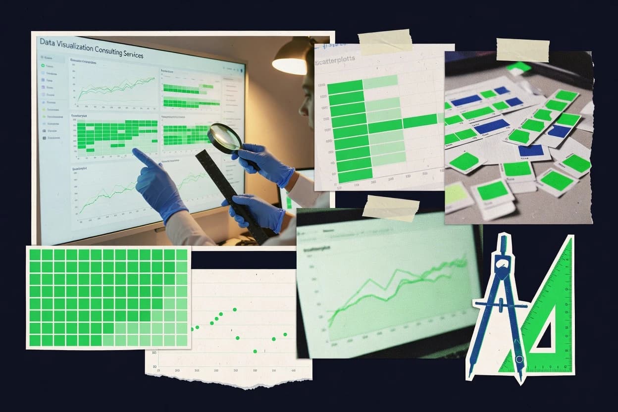
Data Science AnalyticsTop 10 Best Data Visualization Consulting Services of 2026
Compare the top Data Visualization Consulting Services and ranked picks from Slalom, Deloitte, and Accenture. Explore the best fit now.

How we ranked these tools
Core product claims cross-referenced against official documentation, changelogs, and independent technical reviews.
Analyzed video reviews and hundreds of written evaluations to capture real-world user experiences with each tool.
AI persona simulations modeled how different user types would experience each tool across common use cases and workflows.
Final rankings reviewed and approved by our editorial team with authority to override AI-generated scores based on domain expertise.
Score: Features 40% · Ease 30% · Value 30%
Gitnux may earn a commission through links on this page — this does not influence rankings. Editorial policy
Editor’s top 3 picks
Three quick recommendations before you dive into the full comparison below — each one leads on a different dimension.
Slalom
KPI-driven dashboard design with visualization engineering and governance for production reporting
Built for enterprises needing visualization builds plus data modeling and delivery execution.
Deloitte
Editor pickDeloitte’s KPI and data governance approach aligns visualization metrics with organizational decision processes
Built for large enterprises needing governed, end-to-end visualization delivery and adoption support.
Accenture
Editor pickKPI governance plus BI implementation delivered through cross-functional analytics squads
Built for enterprises needing governed, multi-team dashboard delivery and platform integration.
Related reading
Comparison Table
This comparison table evaluates data visualization consulting service providers such as Slalom, Deloitte, Accenture, Capgemini, and PwC across delivery capabilities, typical use cases, and engagement patterns. Readers can use the side-by-side format to compare how each provider approaches dashboard and analytics strategy, data modeling, and visualization development.
Slalom
agencySlalom delivers data visualization design, dashboard development, and analytics storytelling tied to enterprise BI and decision-making workflows.
KPI-driven dashboard design with visualization engineering and governance for production reporting
Slalom stands out for combining data visualization delivery with full-stack analytics execution, from discovery through production deployment. Teams get end-to-end support that covers dashboard design, data modeling, and visualization engineering tied to business KPIs.
The service also emphasizes governance, accessibility, and performance so reporting stays consistent across audiences and systems. Slalom’s consulting delivery model fits organizations that need both visual storytelling and durable implementation work.
- +End-to-end dashboard delivery from requirements through implementation
- +Strong KPI alignment across executive and operational visualization use cases
- +Visualization engineering that prioritizes performance and usability
- +Governed reporting outputs that stay consistent across data sources
- –Larger consulting footprint can add overhead for narrow dashboard requests
- –Success depends on availability of clean, modeled source data
Best for: Enterprises needing visualization builds plus data modeling and delivery execution
More related reading
Deloitte
enterprise_vendorDeloitte provides data analytics and visualization consulting that turns complex data into governance-ready dashboards and decision support.
Deloitte’s KPI and data governance approach aligns visualization metrics with organizational decision processes
Deloitte stands out with enterprise-grade analytics delivery that blends data strategy, governance, and advanced visualization engineering. The firm supports interactive dashboards, KPI frameworks, and executive reporting that connect to governed data sources across business functions.
Deloitte teams also build advanced analytics enablement through end-to-end design, data modeling alignment, and implementation governance for large-scale rollouts. Delivery typically includes stakeholder discovery and adoption planning to ensure the visuals match decision workflows, not just charts.
- +Enterprise governance focus improves metric consistency across dashboards
- +Strong end-to-end delivery from data modeling to visualization build
- +Proven support for executive reporting and KPI standardization
- +Expertise in integrating BI visuals with governed data platforms
- –Best suited for large programs with complex stakeholder groups
- –Visualization outcomes depend heavily on upfront data readiness work
- –Engagement timelines can be lengthy for multi-system dashboard ecosystems
Best for: Large enterprises needing governed, end-to-end visualization delivery and adoption support
Accenture
enterprise_vendorAccenture builds analytics and data visualization solutions for executive reporting, operational dashboards, and advanced insight delivery programs.
KPI governance plus BI implementation delivered through cross-functional analytics squads
Accenture stands out for large-scale data visualization programs that connect analytics strategy to delivery across business units. Core capabilities include dashboard design, KPI model definition, and governance for data quality and visualization consistency.
Delivery quality is reinforced through industry-focused analytics teams and implementation of BI tooling such as Power BI, Tableau, and Qlik for interactive reporting. Engagements often extend into data platform integration so charts reflect governed, timely data rather than disconnected extracts.
- +Enterprise-grade dashboard programs with clear KPI definitions and governance
- +Strong BI implementation across Power BI, Tableau, and Qlik
- +Deep integration support from data sources to governed reporting outputs
- +Industry expertise for visualization patterns and stakeholder-ready storytelling
- –Project delivery can require significant coordination across multiple stakeholders
- –Visualization outcomes depend on data readiness and governance maturity
- –Standardization may reduce flexibility for highly experimental visual designs
Best for: Enterprises needing governed, multi-team dashboard delivery and platform integration
Capgemini
enterprise_vendorCapgemini consults on analytics platforms and delivers visualization layers that improve data accessibility, performance, and usability for business teams.
Enterprise BI modernization combining data governance, visualization design, and self-service enablement
Capgemini stands out with an enterprise-scale delivery model that blends data engineering, analytics, and industry domain expertise for visualization programs. The firm builds end-to-end BI and data visualization solutions that connect data pipelines to dashboards, interactive reporting, and performance monitoring.
Capgemini also supports migration and modernization efforts that standardize metrics, improve data governance, and expand self-service analytics across teams. Engagement teams typically incorporate visualization design, KPI modeling, and user adoption to keep reporting aligned with operational decision-making.
- +Delivers enterprise BI with governed KPI definitions and consistent reporting logic
- +Connects data engineering pipelines directly to dashboard and reporting layers
- +Supports modernization of legacy analytics with controlled migration paths
- +Applies domain knowledge to visualize metrics for operations and customer contexts
- –Works best with complex, large-scope programs and may feel heavy for small teams
- –Visualization outcomes depend on upstream data quality and model readiness
- –Delivery cadence can vary based on stakeholder alignment and data sourcing complexity
Best for: Large enterprises modernizing BI platforms and scaling governed dashboards
PwC
enterprise_vendorPwC supports visualization and analytics initiatives that translate data into clear reporting, KPIs, and managed decision support.
Visualization governance and KPI alignment across reporting frameworks and analytics layers
PwC stands out with enterprise-grade analytics delivery backed by consulting governance and cross-functional data expertise. Services span dashboard and reporting design, performance and usability tuning, and end-to-end data modeling to support trustworthy visuals.
Client engagements commonly include requirements discovery, KPI definitions, visualization architecture, and stakeholder-ready story development for business audiences. Delivery often emphasizes secure data handling and scalable deployment patterns for analytics consumption across teams.
- +End-to-end visualization design from KPI definition through model and dashboards.
- +Strong governance for consistent metrics across reporting layers.
- +Expertise in secure analytics delivery for regulated enterprise environments.
- +Proven facilitation for turning data findings into stakeholder narratives.
- –Heavier consulting approach can slow quick, prototype-focused dashboard cycles.
- –Visualization work depends on detailed upstream data modeling and governance inputs.
- –Complex delivery may require dedicated internal champions to keep momentum.
Best for: Large enterprises needing governed, scalable visualization and analytics implementation
KPMG
enterprise_vendorKPMG delivers data analytics and visualization engagements that strengthen reporting frameworks and dashboard capabilities across functions.
KPI framework and reporting governance for audit-ready, cross-team visualization consistency
KPMG distinguishes itself through enterprise delivery capacity that blends analytics engineering, governance, and regulated-data experience with data visualization consulting. Core services include dashboard design, KPI framework definition, executive reporting, and dashboard optimization for performance and usability.
The firm supports end-to-end implementation involving data model alignment, visualization tooling standards, and adoption planning across business units. This capability set fits organizations that need consistent reporting semantics across multiple teams and geographies.
- +Strong enterprise governance for consistent KPI definitions across stakeholder groups
- +End-to-end delivery from data modeling to dashboard usability and rollout
- +Deep experience with regulated data workflows and audit-ready documentation
- +Facilitates adoption through training assets and stakeholder-specific reporting
- –Engagements can be heavy on process and slower for rapid prototyping
- –Dashboard customization may lag behind vendor-first visualization specialists
- –May require significant internal data readiness to realize full value
- –Visualization scope can broaden into broader analytics programs
Best for: Large enterprises standardizing executive dashboards and governance across multiple business units
Boston Consulting Group
enterprise_vendorBCG assists clients with analytics and visualization to support executive decision-making, operating model performance, and value tracking.
Data visualization embedded within enterprise analytics and transformation governance
Boston Consulting Group delivers data visualization consulting by pairing enterprise analytics strategy with design-led implementation across large-scale stakeholder ecosystems. Core capabilities include turning business and operational data into decision-ready dashboards, performance reporting, and interactive visual analytics.
The service emphasizes governance, taxonomy, and stakeholder alignment to reduce dashboard sprawl and improve adoption. Delivery typically fits complex transformation programs where visualization is part of a broader analytics and change agenda.
- +Exec-ready dashboard design grounded in measurable business outcomes
- +Strong data governance and metric alignment for consistent reporting
- +Experience building visualization programs across large enterprise stakeholders
- +Clear roadmap from insights definition to delivery and adoption
- –Best results require substantial client data readiness and change capacity
- –Visualization work may move slower due to multi-stakeholder governance
- –Less suited for quick prototype-only engagements without transformation scope
- –Customization depth can feel heavy for small teams with narrow needs
Best for: Large enterprises modernizing analytics reporting and decision dashboards
Palantir
enterprise_vendorPalantir delivers visualization-heavy intelligence platforms and consulting services that create operational dashboards and decision workflows.
Foundry’s ontology-driven data model powering governed, interactive visual analytics
Palantir stands out for turning complex, multi-source data into operational decision support using a consulting-led delivery model. Its data visualization work emphasizes wiring data pipelines, building governed analytics layers, and shipping role-specific dashboards for operations, risk, and customer-facing workflows.
Teams commonly get interactive visual interfaces tied to curated datasets, with strong focus on access controls and data lineage to support regulated environments. Delivery often includes rapid prototypes that evolve into production-grade visualization assets integrated with enterprise systems.
- +Consulting delivery tightly couples data preparation with visualization usability
- +Strong governed analytics design supports regulated access and audit needs
- +Interactive, role-based dashboards connect visuals to curated datasets
- +Enterprise integration focus reduces time spent rebuilding data plumbing
- –Implementation complexity can slow early experimentation for small teams
- –Dashboard customization may require extensive dataset and governance work
- –Visualization outcomes depend heavily on available data quality and ownership
Best for: Large enterprises needing governed visualization tied to operational decision workflows
Thoughtworks
agencyThoughtworks designs and delivers end-to-end data visualization and analytics experiences that combine UX, data engineering, and governance.
Discovery-to-prototype delivery that validates visualization intent before full implementation
Thoughtworks delivers data visualization consulting through end-to-end discovery, design, and engineering for analytics products and decision dashboards. The team supports modern BI and visualization stacks using user-centered design, prototype-driven delivery, and data pipeline integration.
Engagements typically combine visualization design with governance, performance tuning, and iterative refinement based on stakeholder feedback. Visual outputs often extend beyond charts into interactive experiences that connect metrics to business workflows.
- +User-centered visualization design with clear interaction and layout standards
- +Strong integration of visualization with underlying data models and pipelines
- +Iterative delivery using prototypes to validate meaning and usability early
- +Expertise across BI tools and custom visualization development
- +Governance and accessibility practices baked into dashboard implementation
- –Best fit for product-style analytics work over quick one-off charts
- –Requires active stakeholder participation during iterative discovery and feedback cycles
- –Visualization customization can add complexity beyond standard BI templates
- –Engagement success depends on data readiness and instrumentation quality
Best for: Enterprises building analytics products needing design, engineering, and integration
NielsenIQ
enterprise_vendorNielsenIQ offers consulting and analytics visualization services that convert consumer data into reporting, insights, and decision tools.
KPI and metric governance embedded into dashboard and reporting design
NielsenIQ stands out by pairing data visualization delivery with deep retail and consumer measurement expertise across syndicated and client-specific datasets. The consulting teams support analytics storytelling that ties KPI definitions to clear visual narratives for executives and analysts.
Visualization work typically spans dashboard design, metric governance, and decision-ready reporting workflows that reduce interpretation gaps. Engagements often align graphics with merchandising, media, and category performance use cases where measurement rigor matters.
- +Strong domain mapping from retail KPIs to dashboard visual structures
- +Guidance on metric definitions helps keep visuals consistent across teams
- +Experience building decision-focused executive reporting narratives
- +Clear governance practices reduce conflicting interpretations of charts
- –Visualization outcomes depend heavily on availability of clean, governed inputs
- –Dashboard customization can lag behind rapid ad hoc analyst requests
- –Less suited for purely experimental visuals without measurement context
Best for: Retail and CPG organizations needing visualization backed by measurement expertise
How to Choose the Right Data Visualization Consulting Services
This buyer’s guide helps teams choose Data Visualization Consulting Services providers with capabilities that match production dashboard delivery, governance, and platform integration needs across Slalom, Deloitte, Accenture, Capgemini, PwC, KPMG, Boston Consulting Group, Palantir, Thoughtworks, and NielsenIQ. It maps concrete strengths like KPI governance, modernization, and prototype-driven discovery to specific buyer scenarios and common delivery pitfalls.
What Is Data Visualization Consulting Services?
Data Visualization Consulting Services are delivery and advisory engagements that design dashboards, define KPI logic, and engineer visualization layers that connect to modeled data sources. These services solve recurring problems like inconsistent metrics across dashboards, slow dashboard adoption, and reporting that fails under performance or governance requirements. Providers often combine stakeholder discovery with visualization engineering so the visuals support real decision workflows. Slalom and Deloitte illustrate this category by tying governed dashboard outputs to data modeling, accessibility, performance, and executive adoption planning.
Key Capabilities to Look For
The right capabilities determine whether visualization work stays consistent across teams, scales in enterprise ecosystems, and ships into production workflows instead of stopping at charts.
KPI-driven dashboard design with visualization engineering
Slalom pairs KPI-driven dashboard design with visualization engineering that prioritizes performance and usability so dashboards work in production. Accenture also couples KPI definition and visualization governance with BI implementation across Power BI, Tableau, and Qlik.
Data and KPI governance that keeps metrics consistent across dashboards
Deloitte aligns visualization metrics with organizational decision processes through a KPI and data governance approach. PwC, KPMG, and NielsenIQ also emphasize governance so reporting semantics stay consistent across reporting layers and stakeholder groups.
End-to-end delivery from discovery to production deployment
Slalom delivers from requirements through implementation and also governs reporting outputs across data sources. Deloitte and Accenture extend end-to-end delivery by taking work from data modeling alignment to visualization build and implementation governance.
BI tool and platform integration to connect visuals to governed data
Accenture supports interactive reporting by implementing BI tooling such as Power BI, Tableau, and Qlik tied to governed, timely data. Capgemini and Palantir also focus on connecting data pipelines and enterprise systems so dashboards reflect the right curated datasets.
Modernization, migration, and self-service enablement for scalable reporting
Capgemini modernizes BI platforms and improves accessibility and performance while standardizing metrics and expanding self-service analytics. Slalom and PwC support scalable governance patterns so dashboards remain consistent as organizations expand analytics usage.
User-centered visualization discovery and iterative prototyping
Thoughtworks uses prototype-driven delivery that validates visualization intent before full implementation. Boston Consulting Group supports design-led implementation that includes governance and adoption roadmaps, which reduces dashboard sprawl and improves uptake across stakeholder ecosystems.
How to Choose the Right Data Visualization Consulting Services
A practical selection process compares the provider’s delivery model to the governance maturity, data readiness, and dashboard scale required by the target stakeholders.
Match governance depth to the number of stakeholders and metric ownership rules
Choose Deloitte for large programs that require governed, end-to-end visualization delivery and adoption planning across complex stakeholder groups. Choose KPMG or PwC when audit-ready documentation, regulated workflows, and cross-team KPI consistency are central to standardizing executive dashboards.
Confirm the provider can connect visualization to modeled data sources
Select Slalom when durable implementation is needed alongside dashboard design and data modeling so governed reporting stays consistent across data sources. Select Accenture or Capgemini when the engagement must integrate dashboards with governed data platform outputs rather than relying on disconnected extracts.
Choose a delivery motion that matches speed versus transformation scope
Pick Thoughtworks when iterative prototypes and user-centered discovery are needed to validate visualization meaning early. Choose Boston Consulting Group when the dashboards are part of a broader transformation and operating model performance effort with multi-stakeholder governance.
Align the provider’s dashboard role model to how work will be used operationally
Choose Palantir when operational decision workflows need interactive, role-based dashboards connected to curated datasets with access controls and lineage. Choose NielsenIQ for retail and CPG measurement use cases where KPI definitions must map to decision-ready reporting narratives.
Require evidence of performance, usability, and governance in production-ready outputs
Prioritize Slalom for performance and usability-focused visualization engineering and governed outputs that stay consistent across audiences and systems. Prioritize Capgemini or PwC when visualization architecture includes secure handling, scalable deployment patterns, and modernization efforts that improve data accessibility and self-service enablement.
Who Needs Data Visualization Consulting Services?
Data Visualization Consulting Services providers fit different buyer profiles based on whether visualization is a narrow request or part of a governed, multi-team analytics transformation.
Enterprises needing end-to-end visualization builds plus data modeling and durable implementation
Slalom is a strong fit because it delivers from requirements through implementation with visualization engineering, governance, and KPI alignment tied to production reporting. Deloitte and Accenture also fit when visualization must connect to data modeling and governed decision workflows across multiple teams.
Large enterprises modernizing BI platforms and scaling governed dashboards
Capgemini fits modernization programs because it connects data pipelines to dashboards, supports migration and modernization, and expands self-service analytics while standardizing metrics. Boston Consulting Group and KPMG also fit modernization efforts when governance and stakeholder alignment reduce dashboard sprawl across geographies and business units.
Enterprises building analytics products that require UX, iterative prototyping, and engineering integration
Thoughtworks is tailored for analytics product-style work because it combines UX, prototype-driven delivery, and data pipeline integration with governance and accessibility practices. Slalom can also fit when product-like dashboards require KPI-driven design and governed visualization engineering from discovery to production.
Retail and CPG organizations that need visualization grounded in measurement rigor
NielsenIQ is the best fit because it pairs visualization delivery with retail and consumer measurement expertise so KPI definitions translate into decision-focused executive narratives. KPMG and Deloitte also work when metric governance must stay consistent across stakeholder groups and regulated reporting contexts.
Common Mistakes to Avoid
Common failures come from underestimating governance needs, overfocusing on quick prototypes, and neglecting upstream data readiness that visualization depends on.
Treating visualization as a chart-only effort with no KPI governance
This mistake causes inconsistent metrics across dashboards and stakeholder groups. Deloitte, PwC, and NielsenIQ emphasize KPI and data governance so visualization metrics align with decision processes and measurement narratives.
Picking a provider that cannot connect visuals to modeled, governed data sources
Dashboards fail under performance and accuracy pressure when visuals rely on disconnected extracts. Slalom and Accenture prioritize governed data alignment by tying dashboard builds to data modeling and implementation governance.
Optimizing for speed while ignoring multi-stakeholder governance requirements
Fast prototypes often stall when governance, adoption, and stakeholder alignment are not handled. Boston Consulting Group and Deloitte work better when transformation scope and stakeholder coordination are explicitly planned.
Underestimating the data readiness and dataset ownership work required for governed visual analytics
Governed visualization outputs depend on clean, modeled inputs and clear ownership of curated datasets. Palantir and Capgemini both connect governed analytics layers to visualization usability, so data readiness must be actively managed early.
How We Selected and Ranked These Providers
We evaluated each service provider on three sub-dimensions using the same scoring structure across capabilities (weight 0.4), ease of use (weight 0.3), and value (weight 0.3). The overall rating equals the weighted average of those three sub-dimensions using overall = 0.40 × features + 0.30 × ease of use + 0.30 × value. Slalom separated itself from lower-ranked providers through the strength of production delivery capability that pairs KPI-driven dashboard design with visualization engineering and governed reporting outputs. This capability dimension also supported strong outcomes for KPI alignment, performance, and usability across enterprise dashboard audiences.
Frequently Asked Questions About Data Visualization Consulting Services
Which provider is best for end-to-end dashboard delivery tied to KPI definitions and governed data sources?
How do Slalom and Accenture differ in delivery model when multiple teams need consistent dashboard semantics?
Which consulting firm fits BI modernization when reporting must be rebuilt around pipelines, governance, and self-service?
What’s the strongest option for regulated or audit-ready visualization governance across regions and business units?
Which provider excels at turning complex multi-source operational data into interactive role-specific decision support?
Which firms are best for adoption planning so dashboards match decision workflows instead of becoming unused charts?
What is the most common onboarding and discovery-to-delivery approach across these consulting services?
How do these providers handle the technical requirement that dashboards reflect timely, governed data rather than disconnected extracts?
Which provider is best suited for executive reporting that needs strong metric governance and usability tuning?
Which firm fits retail and CPG organizations where measurement rigor and KPI narratives must align to merchandising and media use cases?
Conclusion
After evaluating 10 data science analytics, Slalom stands out as our overall top pick — it scored highest across our combined criteria of features, ease of use, and value, which is why it sits at #1 in the rankings above.
Use the comparison table and detailed reviews above to validate the fit against your own requirements before committing to a tool.
Tools reviewed
Primary sources checked during evaluation.
Referenced in the comparison table and product reviews above.
Keep exploring
Comparing two specific tools?
Software Alternatives
See head-to-head software comparisons with feature breakdowns, pricing, and our recommendation for each use case.
Explore software alternatives→In this category
Data Science Analytics alternatives
See side-by-side comparisons of data science analytics tools and pick the right one for your stack.
Compare data science analytics tools→FOR SOFTWARE VENDORS
Not on this list? Let’s fix that.
Our best-of pages are how many teams discover and compare tools in this space. If you think your product belongs in this lineup, we’d like to hear from you—we’ll walk you through fit and what an editorial entry looks like.
Apply for a ListingWHAT THIS INCLUDES
Where buyers compare
Readers come to these pages to shortlist software—your product shows up in that moment, not in a random sidebar.
Editorial write-up
We describe your product in our own words and check the facts before anything goes live.
On-page brand presence
You appear in the roundup the same way as other tools we cover: name, positioning, and a clear next step for readers who want to learn more.
Kept up to date
We refresh lists on a regular rhythm so the category page stays useful as products and pricing change.