GITNUXSOFTWARE ADVICE
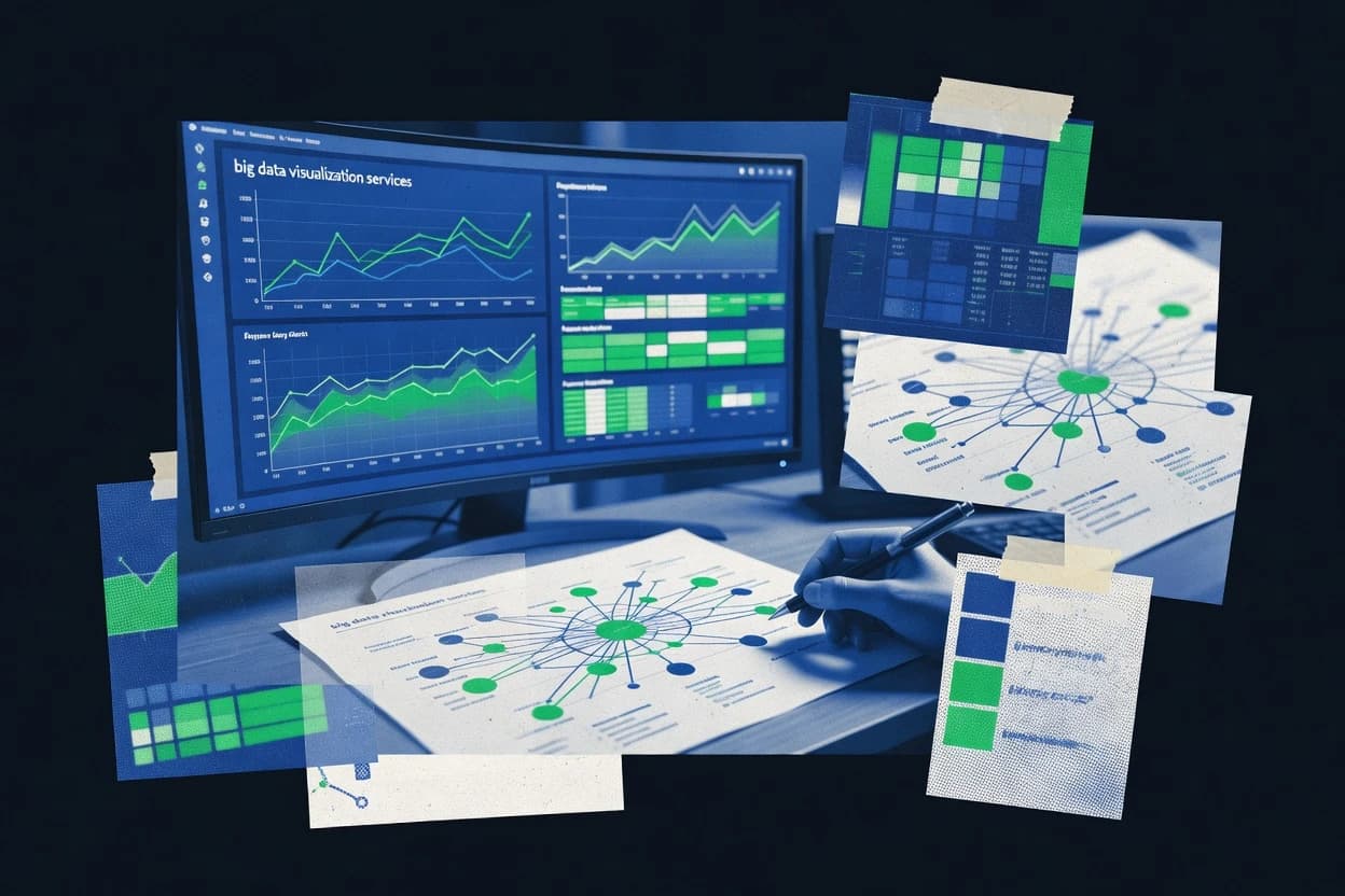
Data Science AnalyticsTop 10 Best Big Data Visualization Services of 2026
Compare top Big Data Visualization Services providers with a ranked list of the best options. Explore picks from Slalom, Accenture, Deloitte.

How we ranked these tools
Core product claims cross-referenced against official documentation, changelogs, and independent technical reviews.
Analyzed video reviews and hundreds of written evaluations to capture real-world user experiences with each tool.
AI persona simulations modeled how different user types would experience each tool across common use cases and workflows.
Final rankings reviewed and approved by our editorial team with authority to override AI-generated scores based on domain expertise.
Score: Features 40% · Ease 30% · Value 30%
Gitnux may earn a commission through links on this page — this does not influence rankings. Editorial policy
Editor’s top 3 picks
Three quick recommendations before you dive into the full comparison below — each one leads on a different dimension.
Slalom
Dashboard and analytics application implementation with UX-driven iteration and enterprise governance
Built for enterprises needing managed visualization programs with data engineering and UX alignment.
Accenture
Editor pickDesign governance for visualization standards tied to data lineage and access controls
Built for large enterprises needing governed, scaled visualization programs across multiple teams.
Deloitte
Editor pickGoverned analytics operating models tied to visualization standards and data quality controls
Built for large enterprises needing governed, multi-stakeholder visualization delivery and adoption.
Related reading
Comparison Table
This comparison table evaluates Big Data Visualization service providers including Slalom, Accenture, Deloitte, Capgemini, PwC, and additional firms. It summarizes each provider’s delivery strengths across BI and analytics visualization, data engineering and governance support, and integration capabilities for common big data platforms.
Slalom
enterprise_vendorSlalom designs end-to-end analytics and data visualization solutions, including governed BI reporting and interactive dashboards for enterprise decision making.
Dashboard and analytics application implementation with UX-driven iteration and enterprise governance
Slalom stands out for combining data engineering delivery with hands-on visualization build work across enterprise environments. The firm supports end-to-end analytics programs, from requirements and data modeling through dashboard and data app development.
Delivery emphasizes stakeholder alignment, iterative UX refinement, and governance-friendly implementation for big data sources. Strong integration patterns cover common BI and analytics ecosystems where performance and usability both matter.
- +End-to-end analytics delivery from data modeling to dashboard implementation
- +Clear UX and stakeholder workshops that reduce rework during build cycles
- +Strong engineering patterns for performance and scalability on large datasets
- +Repeatable governance practices for charts, metrics, and access control
- –Engagements can feel heavy when teams need quick one-off visualizations
- –Advanced visualization work may require ongoing data engineering alignment
- –Custom builds can reduce flexibility versus fully self-serve BI configurations
Best for: Enterprises needing managed visualization programs with data engineering and UX alignment
More related reading
Accenture
enterprise_vendorAccenture delivers enterprise data visualization programs that combine data engineering, analytics platforms, and dashboarding for business users.
Design governance for visualization standards tied to data lineage and access controls
Accenture stands out for delivering end-to-end big data visualization programs that connect data engineering, governance, and interactive analytics delivery across enterprise portfolios. Its delivery model typically covers dashboard and report design, visualization implementation, and adoption support using major data platforms and analytics stacks. The company also brings strong change management and visualization design governance, which reduces rework when requirements span multiple business units.
- +Strong visualization delivery with enterprise-grade data governance integration
- +Cross-platform implementation across common analytics and data environments
- +Proven stakeholder adoption support through change management and design governance
- +Ability to scale reporting from pilot to multi-team rollouts
- –Engagements can feel heavyweight for small visualization-only scopes
- –Speed depends on client data readiness and decision cadence
Best for: Large enterprises needing governed, scaled visualization programs across multiple teams
Deloitte
enterprise_vendorDeloitte builds analytical visualization and reporting solutions that translate big data into governed insights across the enterprise.
Governed analytics operating models tied to visualization standards and data quality controls
Deloitte stands out for delivering enterprise-grade big data visualization alongside rigorous governance, including data quality, lineage, and security controls. The firm supports end-to-end analytics experiences such as dashboard design, interactive reporting, and executive KPI frameworks tied to governed data sources.
Deloitte also brings strong delivery capacity for complex environments that combine cloud data platforms, warehouse modernization, and visualization enablement for multiple business units. Engagements typically emphasize measurable adoption through design standards, training assets, and ongoing operating model alignment.
- +Enterprise visualization programs with strong governance, lineage, and access controls
- +Expert dashboard design for exec KPIs and operational performance monitoring
- +Integration support across warehouses, lakes, and governed data pipelines
- –Structured delivery can slow iteration for teams needing rapid visualization tweaks
- –Cross-team alignment requirements increase coordination overhead for smaller projects
- –Visualization outcomes may depend heavily on upstream data modeling maturity
Best for: Large enterprises needing governed, multi-stakeholder visualization delivery and adoption
Capgemini
enterprise_vendorCapgemini delivers big data analytics visualization services that connect data platforms to interactive reporting and executive dashboards.
Visualization delivery tied to Capgemini’s data governance and integration approach for enterprise-scale controls
Capgemini stands out for combining enterprise delivery scale with end-to-end big data visualization support across data engineering, analytics, and governance. Its core capability centers on turning event, telemetry, and operational datasets into interactive dashboards and decision-ready views using common BI and data platform integrations. The service also emphasizes visualization design for usability, performance, and access control in large organizations.
- +Enterprise-grade dashboard builds with strong data lineage and governance practices
- +Proven integration patterns for big data stacks feeding visualization and reporting layers
- +Focus on performance tuning for large datasets and responsive interactive views
- –Visualization workflows can be heavier for teams needing rapid solo dashboard iteration
- –Engagement setup can require more upfront alignment on requirements and data ownership
- –Custom UI complexity may lag behind specialized front-end visualization boutiques
Best for: Large enterprises needing governed big data dashboard programs and integration-heavy delivery
PwC
enterprise_vendorPwC provides data analytics visualization and reporting engagements that turn large-scale data into decision-ready views.
PwC-led data governance and visualization standards to ensure consistent, audit-ready dashboards
PwC stands out for enterprise-grade big data visualization programs that connect data engineering, governance, and executive reporting into a single delivery track. Core offerings center on turning complex data pipelines into interactive dashboards, visual analytics, and decision-ready narratives for regulated and large organizations.
The service delivery emphasizes data quality controls, privacy-aware design, and measurable stakeholder adoption through structured workshops and prototype-to-build transitions. Engagements often leverage common BI ecosystems while adding PwC-led architecture, visualization standards, and operating model support for long-term rollout.
- +Strong governance for trustworthy visualizations across regulated enterprise data
- +End-to-end delivery links analytics design with upstream data pipelines
- +Clear visualization standards support consistent dashboards across teams
- +Executive-ready storytelling improves stakeholder adoption beyond metrics
- –Enterprise process depth can slow early iterations on prototypes
- –Visualization outcomes depend on strong client data readiness and ownership
- –Customization effort can rise for highly bespoke interactive experiences
Best for: Large enterprises needing governed BI rollout and stakeholder-driven dashboard adoption
IBM Consulting
enterprise_vendorIBM Consulting delivers big data visualization and analytics solutions that integrate data pipelines with tailored reporting and dashboard layers.
Governed visualization delivery tied to enterprise integration and deployment lifecycle
IBM Consulting stands out with deep enterprise consulting delivery that aligns data visualization with governance, security, and operational deployment. Its offerings combine big data engineering and analytics modernization with dashboard and reporting development across common enterprise BI ecosystems. Visualizations are typically delivered as part of end-to-end solutions that include data modeling, performance tuning, and lifecycle support for business stakeholders.
- +Strong enterprise data governance supporting visualization-ready, trustworthy datasets
- +End-to-end delivery links pipelines, modeling, and dashboards for consistent outcomes
- +Enterprise-grade integration across data platforms and BI tooling for durable deployments
- –Visualization delivery can feel implementation-heavy compared with light BI-only vendors
- –Project success depends on structured stakeholder requirements and data readiness
- –Customization timelines can expand when multiple BI tools and user groups are involved
Best for: Large enterprises modernizing analytics stacks with governed, production-ready dashboards
Thoughtworks
enterprise_vendorThoughtworks engineers data visualization and analytics experiences using evidence-driven design and robust data modeling for large datasets.
Iterative discovery and prototyping that turns stakeholder questions into validated dashboard models
Thoughtworks stands out for pairing data visualization delivery with engineering-led practices and iterative discovery workshops. The team supports end to end visualization work that spans data modeling, pipeline integration, and dashboard front ends for analytic and operational use cases.
Visualization engagements emphasize design collaboration, governance for shared metrics, and pragmatic use of modern BI and custom UI patterns. The service fits complex environments where trust in data definitions matters as much as chart aesthetics.
- +Engineering rigor improves visualization reliability through tested data contracts
- +Strong design collaboration produces dashboards aligned to decision workflows
- +Prototyping in short cycles reduces misalignment between stakeholders and visuals
- –Delivery timelines can feel heavy without an internal design and data owner
- –Visualization customization may require strong engineering participation from the client
- –Tooling choices can be opinionated for teams expecting a single BI stack
Best for: Enterprises needing visualization programs with data governance and engineering oversight
EPAM Systems
enterprise_vendorEPAM builds scalable analytics and visualization systems that support fast exploration and governed business reporting on big data.
Data-to-dashboard delivery that aligns visualization requirements with upstream data pipelines and governance
EPAM Systems stands out for end-to-end delivery that combines data engineering with visualization engineering across enterprise-grade environments. The provider supports Big Data Visualization by implementing analytics platforms, building dashboards, and enabling interactive reporting on large-scale datasets.
EPAM also brings UI engineering and design systems work that helps teams standardize visualizations across multiple product lines. Delivery teams commonly align visualization requirements with upstream data pipelines and governance to reduce mismatch between data definitions and chart outputs.
- +Strong delivery across the data-to-visualization lifecycle for enterprise platforms
- +Proven dashboard engineering with attention to UI patterns and reusable components
- +Capability to connect BI visuals to governed, pipeline-backed datasets
- –Complex engagements can require more internal coordination than smaller vendors
- –Visualization workflows may feel heavyweight for rapid self-serve iteration
- –Front-end customization often depends on deeper engineering involvement
Best for: Large enterprises needing customized Big Data dashboards tied to governed pipelines
Tata Consultancy Services
enterprise_vendorTCS implements big data visualization and BI programs that standardize reporting, dashboarding, and insight delivery across enterprises.
Enterprise analytics program delivery that links governed data pipelines to dashboard experiences
Tata Consultancy Services stands out for delivering enterprise-grade big data visualization alongside broader analytics engineering through its consulting and systems integration strengths. It supports end-to-end visualization projects that connect data platforms, build dashboards, and enable governance for analytics consumers.
Services commonly span data modeling, BI and reporting UX, and integration with cloud and enterprise data ecosystems. Delivery focus typically aligns to complex environments with multiple stakeholders and legacy-to-modern data transitions.
- +Strong BI and analytics delivery across enterprise data platforms
- +End-to-end builds that connect visualization to governed data pipelines
- +Proven experience modernizing dashboards during platform migrations
- +Works well with multi-team analytics programs and stakeholder alignment
- –Visualization UX iterations can lag during complex program governance
- –Speed of initial prototype delivery can be slower than boutique specialists
- –Tooling choices may feel rigid when requirements are not fully locked
- –Self-serve optimization for analysts may require additional enablement
Best for: Large enterprises needing governed big data visualization in complex environments
KPMG
enterprise_vendorKPMG supports big data visualization initiatives that connect analytics, reporting, and performance insights with governance.
Audit-focused data lineage and controls mapped to visualization metrics
KPMG stands out through governance-led big data visualization delivery that connects reporting visuals to audit-ready controls and enterprise risk needs. Core services span data strategy, analytics modernization, and visualization enablement for decision dashboards built on common enterprise analytics stacks.
Delivery emphasis typically includes stakeholder management for business requirements, plus reusable data models and documentation to support long-term adoption. Visualization outputs often focus on traceability from source data to presented metrics, which suits regulated environments and executive reporting workflows.
- +Strong data governance practices for audit-ready visualization outputs
- +Expertise in turning complex analytics requirements into stakeholder-ready dashboards
- +Experience integrating enterprise data sources into consistent metric definitions
- –Engagement structure can slow rapid prototyping for fast-changing visualization ideas
- –Tooling outcomes may feel heavier for teams seeking lightweight self-serve builds
Best for: Enterprises needing governed, audit-ready big data dashboards and long-term adoption
How to Choose the Right Big Data Visualization Services
This buyer's guide explains how to evaluate Big Data Visualization Services providers using concrete strengths from Slalom, Accenture, Deloitte, Capgemini, PwC, IBM Consulting, Thoughtworks, EPAM Systems, Tata Consultancy Services, and KPMG. It focuses on governed visualization delivery, data-to-dashboard engineering practices, and adoption-focused design methods that reduce rework across large datasets and multi-team programs. It also covers common selection pitfalls tied to scope mismatch, slow iteration, and tooling complexity seen across enterprise consulting and engineering providers.
What Is Big Data Visualization Services?
Big Data Visualization Services deliver dashboards, interactive reporting, and executive KPI reporting that turn governed big data into decision-ready views. The services typically connect visualization UX and dashboard implementation to upstream data pipelines, data modeling, and access controls so metrics stay consistent across teams. Providers like Slalom deliver end-to-end analytics programs that span data modeling and dashboard application builds with iterative UX refinement. Providers like Deloitte deliver governed analytics operating models tied to visualization standards, data quality controls, and lineage-aware reporting.
Key Capabilities to Look For
These capabilities determine whether a visualization program ships quickly, stays trustworthy on large datasets, and scales across stakeholders without breaking metric definitions.
End-to-end analytics delivery from data modeling to dashboards
Slalom excels at delivering end-to-end solutions from requirements and data modeling through dashboard and data app development, which keeps chart logic aligned with the underlying datasets. IBM Consulting also links data pipelines, modeling, performance tuning, and dashboard layers for production-ready outcomes.
Governed visualization standards tied to lineage and access controls
Accenture stands out for design governance for visualization standards tied to data lineage and access controls, which reduces rework across business units. PwC and KPMG both emphasize governance patterns that support trustworthy, audit-ready visuals mapped to lineage and controls.
Governed analytics operating models and reusable design standards
Deloitte focuses on governed analytics operating models tied to visualization standards and data quality controls, which supports consistent executive and operational KPIs. Thoughtworks supports shared metrics governance through tested data contracts and design collaboration, which improves reliability when multiple teams depend on the same definitions.
Data-to-dashboard engineering that connects pipeline definitions to chart outputs
EPAM Systems delivers data-to-dashboard work that aligns visualization requirements with upstream data pipelines and governance, which reduces mismatch between data definitions and chart outputs. Capgemini also ties visualization delivery to enterprise governance and integration approaches that feed interactive reporting and executive dashboards.
Performance-focused dashboard implementation for large datasets
Capgemini highlights performance tuning for responsive interactive views on large datasets, which matters when event, telemetry, or operational data is used for dashboards. Slalom emphasizes strong engineering patterns for performance and scalability, which helps dashboards remain usable as data volumes grow.
Iterative discovery, prototyping, and stakeholder-driven refinement
Thoughtworks uses iterative discovery and short-cycle prototyping to validate stakeholder questions into dashboard models, which reduces misalignment between visuals and decision workflows. Slalom also uses stakeholder workshops and UX-driven iteration, which reduces rework during enterprise dashboard build cycles.
How to Choose the Right Big Data Visualization Services
A practical selection approach matches the provider’s delivery model to the program’s governance depth, data readiness, and required speed of iteration.
Match governance requirements to governance-led delivery
If audit-ready lineage, access controls, and controlled metric definitions are central, prioritize providers like KPMG, PwC, Accenture, and Deloitte that emphasize governance-led visualization delivery. KPMG maps visualization metrics to audit-focused lineage and controls, while Accenture links visualization standards to lineage and access controls so stakeholders can safely reuse dashboards across teams.
Confirm the provider can connect pipelines, modeling, and dashboards
For big data dashboards that must reflect governed datasets, choose providers that connect data pipelines and modeling to dashboard implementation rather than treating visualization as a late-stage UI exercise. Slalom and IBM Consulting deliver end-to-end analytics and reporting layers that integrate modeling, performance tuning, and dashboard builds so the chart logic follows the pipeline. EPAM Systems and Capgemini also align visualization requirements with upstream data pipelines and governance.
Plan for iterative UX refinement when stakeholders need fast alignment
If the program requires rapid iteration with business users, favor providers that run workshops and prototyping to validate dashboards early. Thoughtworks turns stakeholder questions into validated dashboard models using iterative discovery and prototyping, while Slalom reduces rework by using UX-driven iteration and stakeholder alignment workshops.
Evaluate delivery weight versus your required speed for prototypes
When the goal is quick visualization tweaks, avoid providers that emphasize heavy governance and structured delivery that can slow early iterations. Deloitte, Capgemini, Accenture, and PwC emphasize governed, multi-stakeholder programs that can feel structured for fast-changing ideas, while Slalom still supports iteration but can require data engineering alignment for advanced visualization work.
Assess tooling and coordination needs for your target environment
For multi-tool or complex enterprise environments, confirm the provider can integrate across warehouses, lakes, governed pipelines, and BI ecosystems. Deloitte and Tata Consultancy Services support visualization programs across complex environments and modernization efforts, while EPAM Systems and IBM Consulting handle durable deployments across enterprise BI and data platforms with integration-heavy delivery.
Who Needs Big Data Visualization Services?
Big Data Visualization Services providers fit organizations that need governed, large-dataset dashboards plus the engineering work to keep metrics consistent and usable across teams.
Enterprises needing managed visualization programs with data engineering and UX alignment
Slalom is the best match when the organization needs end-to-end analytics delivery from data modeling to interactive dashboards with UX-driven iteration. Thoughtworks also fits when visualization reliability depends on engineering oversight and evidence-driven dashboard models.
Large enterprises running governed, scaled visualization programs across multiple teams
Accenture is a strong fit for scaled rollout with visualization standards tied to data lineage and access controls. Deloitte and PwC also fit when multi-stakeholder governance and adoption support are required for executive KPIs and operational monitoring.
Enterprises building governed big data dashboards with integration-heavy delivery
Capgemini fits when the program requires strong performance tuning and integration patterns feeding visualization layers in large organizations. IBM Consulting also fits when modernization includes governed, production-ready dashboards backed by pipeline, modeling, and lifecycle support.
Enterprises needing audit-ready big data dashboards and long-term adoption
KPMG fits when traceability from source data to presented metrics must support risk and regulated reporting. PwC fits when governance and privacy-aware design must support consistent, audit-ready dashboards with measurable stakeholder adoption.
Common Mistakes to Avoid
Common pitfalls come from picking a visualization partner without the right governance depth, engineering integration, or iteration model for the program scope.
Choosing a visualization-only partner for a governed big data problem
Visualization work without deep pipeline, modeling, and governance integration increases the risk of mismatched metrics across dashboards. Slalom, IBM Consulting, and EPAM Systems reduce this risk by linking data-to-dashboard delivery to governed datasets and performance tuning rather than treating dashboards as a standalone UI layer.
Underestimating how structured governance slows early prototypes
Providers like Deloitte, Capgemini, and PwC emphasize governance and structured delivery that can slow iteration when visualization ideas change quickly. Thoughtworks and Slalom help counter this by using prototyping and stakeholder workshops to validate models early.
Expecting one vendor to deliver across complex multi-team stakeholder environments without coordination
Enterprise coordination overhead can become a bottleneck when many BI tools, user groups, and ownership boundaries are involved. Accenture, Deloitte, and Tata Consultancy Services handle multi-team programs well, but selection should account for the coordination required for alignment and adoption.
Assuming customization will be lightweight across custom UI and advanced visuals
Advanced visualization customization often depends on deeper engineering participation, which increases timelines if the client expects quick solo dashboard iteration. Slalom, EPAM Systems, and Thoughtworks deliver customization through engineering rigor, but they are best matched to teams prepared for engineering collaboration.
How We Selected and Ranked These Providers
we evaluated every service provider on three sub-dimensions. The first sub-dimension is capabilities with weight 0.4 because governed big data visualization requires pipeline linkage, governance practices, and dashboard implementation. The second sub-dimension is ease of use with weight 0.3 because visualization adoption depends on how reliably stakeholders can use the outputs once delivered. The third sub-dimension is value with weight 0.3 because the provider needs to deliver outcomes that avoid rework and misalignment across teams. The overall rating is the weighted average of those three using overall = 0.40 × features + 0.30 × ease of use + 0.30 × value. Slalom separated from lower-ranked providers through its combination of end-to-end analytics delivery from data modeling to dashboard implementation and UX-driven iteration tied to enterprise governance, which strengthened capabilities while still supporting usability-focused build cycles.
Frequently Asked Questions About Big Data Visualization Services
Which provider best fits an enterprise that needs data engineering plus hands-on visualization builds under a single program?
How do Slalom and Accenture differ when governance and visualization standards must scale across multiple business units?
Which service provider is strongest for audit-ready executive KPI frameworks tied to data quality, lineage, and security controls?
Which provider is best suited for complex data modernization programs that require dashboards built alongside warehouse and cloud changes?
When interactive reporting needs to connect regulated data sources to consistent decision narratives, which provider stands out?
What provider approach works best when shared metrics trust depends on engineering-led discovery and prototyping before full buildout?
Which provider is most effective for organizations that need reusable visualization patterns and standardized UI design across product lines?
Which service provider best fits event, telemetry, and operational data turned into interactive decision dashboards with usability, performance, and access control?
What should teams expect for onboarding and delivery structure when transitioning from legacy to modern data ecosystems?
How do governance-led visualization programs differ between KPMG and IBM Consulting when both must support security and operational deployment?
Conclusion
After evaluating 10 data science analytics, Slalom stands out as our overall top pick — it scored highest across our combined criteria of features, ease of use, and value, which is why it sits at #1 in the rankings above.
Use the comparison table and detailed reviews above to validate the fit against your own requirements before committing to a tool.
Tools reviewed
Primary sources checked during evaluation.
Referenced in the comparison table and product reviews above.
Keep exploring
Comparing two specific tools?
Software Alternatives
See head-to-head software comparisons with feature breakdowns, pricing, and our recommendation for each use case.
Explore software alternatives→In this category
Data Science Analytics alternatives
See side-by-side comparisons of data science analytics tools and pick the right one for your stack.
Compare data science analytics tools→FOR SOFTWARE VENDORS
Not on this list? Let’s fix that.
Our best-of pages are how many teams discover and compare tools in this space. If you think your product belongs in this lineup, we’d like to hear from you—we’ll walk you through fit and what an editorial entry looks like.
Apply for a ListingWHAT THIS INCLUDES
Where buyers compare
Readers come to these pages to shortlist software—your product shows up in that moment, not in a random sidebar.
Editorial write-up
We describe your product in our own words and check the facts before anything goes live.
On-page brand presence
You appear in the roundup the same way as other tools we cover: name, positioning, and a clear next step for readers who want to learn more.
Kept up to date
We refresh lists on a regular rhythm so the category page stays useful as products and pricing change.