GITNUXSOFTWARE ADVICE
Supply Chain In IndustryTop 10 Best Supply Chain Visualization Software of 2026
Discover top supply chain visualization software to streamline operations. Compare features, find the best fit—start optimizing today.

How we ranked these tools
Core product claims cross-referenced against official documentation, changelogs, and independent technical reviews.
Analyzed video reviews and hundreds of written evaluations to capture real-world user experiences with each tool.
AI persona simulations modeled how different user types would experience each tool across common use cases and workflows.
Final rankings reviewed and approved by our editorial team with authority to override AI-generated scores based on domain expertise.
Score: Features 40% · Ease 30% · Value 30%
Gitnux may earn a commission through links on this page — this does not influence rankings. Editorial policy
Editor’s top 3 picks
Three quick recommendations before you dive into the full comparison below — each one leads on a different dimension.
Blue Yonder
Control-tower exception dashboards with KPI drill-down to planning and execution causes
Built for large enterprises needing control-tower visibility across planning and execution.
SAP Integrated Business Planning
Editor pickConstrained, multi-echelon optimization with integrated scenario-based simulation and visualization
Built for large enterprises needing constrained supply chain visualization tied to integrated planning.
Oracle Supply Chain Planning
Editor pickException Management in planning to surface constraint-driven plan breaks
Built for enterprise supply planning teams needing optimization-linked planning dashboards and exceptions.
Related reading
- Supply Chain In IndustryTop 10 Best Online Supply Chain Management Software of 2026
- Sustainability In IndustryTop 10 Best Sustainable Supply Chain Software of 2026
- Supply Chain In IndustryTop 10 Best Supply Chain Risk Assessment Software of 2026
- Healthcare MedicineTop 10 Best Hospital Supply Chain Management Software of 2026
Comparison Table
This comparison table evaluates supply chain visualization software from Blue Yonder, SAP Integrated Business Planning, Oracle Supply Chain Planning, Manhattan Associates, and IBM Supply Chain Intelligence Suite, plus additional options, across planning and execution visibility. The rows break down how each platform supports analytics, control-tower style dashboards, scenario planning, and data integration so teams can compare capabilities for end-to-end supply chain monitoring.
Blue Yonder
enterprise planningProvides supply chain planning and execution capabilities with visualization features for end-to-end network, inventory, and fulfillment performance.
Control-tower exception dashboards with KPI drill-down to planning and execution causes
Blue Yonder stands out with a visualization-first approach built around end-to-end supply chain planning signals and operational execution views. It connects demand, inventory, fulfillment, and network constraints into interactive dashboards that support scenario analysis and operational decision making. The solution emphasizes control-tower style visibility with drill-down from KPIs to exception causes across planning and execution workflows.
- +Control-tower style dashboards link KPIs to supply chain root-cause details
- +Scenario and constraint visibility supports planning decisions across the supply network
- +Interactive drill-down helps operations investigate exceptions faster than static reports
- +Strong integration with planning and execution data improves consistency of views
- +Network and fulfillment visibility supports faster issue detection and prioritization
- –Effective use depends on data readiness and clean master data
- –Dashboard configuration can require specialist help for complex exception logic
- –Visualization breadth increases workflow complexity for new users
- –Deep drill-down is strongest when planning and execution systems are fully integrated
Best for: Large enterprises needing control-tower visibility across planning and execution
More related reading
SAP Integrated Business Planning
enterprise analyticsDelivers supply chain planning with dashboards and visual analytics for demand, supply, and inventory synchronization.
Constrained, multi-echelon optimization with integrated scenario-based simulation and visualization
SAP Integrated Business Planning stands out for linking planning and simulation across functions using a shared optimization and planning-data model. It supports multi-echelon supply chain planning with what-if scenario analysis, demand planning integration, and constrained planning that accounts for capacity and supply limits.
Visualization for scenarios and plan results helps teams understand trade-offs between service levels, inventory, and transportation or production constraints. Strong connectivity to SAP data makes it effective for enterprises that already run core operations on SAP systems.
- +Constrained multi-echelon planning supports capacity, supply, and service-level trade-offs
- +Scenario simulation visualizes plan impacts across demand, inventory, and supply constraints
- +Deep SAP connectivity helps keep planning and execution data aligned
- –Implementation and model setup require strong planning and data governance
- –Visualization depends on configured planning objects and dashboards
- –Complex planning scope can overwhelm teams without established planning processes
Best for: Large enterprises needing constrained supply chain visualization tied to integrated planning
Oracle Supply Chain Planning
enterprise planningSupports supply planning workflows with visual dashboards for constraints, service levels, and plan changes.
Exception Management in planning to surface constraint-driven plan breaks
Oracle Supply Chain Planning centers forecasting and replenishment logic around optimization workflows that connect demand, supply, and constraints to actionable plans. Visualization supports planning collaboration through interactive dashboards for demand signals, supply commitments, and exception management across planning scenarios. The product’s visualization strength is tied to its planning engine, so insights appear most useful when users already operate in Oracle planning data models and processes.
- +Scenario planning dashboards show constraint impacts across demand and supply
- +Exception management highlights plan breaks tied to specific materials and locations
- +Deep integration with Oracle planning data reduces reconciliation effort
- +Optimization-driven visual insights support faster planning iteration
- –Visualization depends on Oracle planning configuration and data readiness
- –Setup and model tuning add complexity for smaller planning teams
- –User navigation can feel heavy due to dense planning workspaces
- –Visualization depth lags behind specialized BI tools for ad hoc analytics
Best for: Enterprise supply planning teams needing optimization-linked planning dashboards and exceptions
Manhattan Associates
logistics visualizationProvides supply chain and logistics execution capabilities with operational views that visualize warehouse and transportation performance.
Operational event-based visibility with exception and performance dashboards
Manhattan Associates’ supply chain visualization capabilities are anchored in its broader supply chain execution and optimization suite, with visibility designed to reflect real operational data. It supports network and process-level views that connect planning, transportation, and warehouse execution signals into shared operational dashboards.
Visualization is strongest for performance monitoring and exception visibility across fulfillment and logistics workflows rather than for standalone, generic diagramming. Integration depth with Manhattan products typically drives the most complete end-to-end visibility story.
- +End-to-end visibility across transportation and warehouse execution workflows
- +Exception and performance monitoring built around operational events
- +Dashboards align with Manhattan operational data models
- –Best results require strong integration into Manhattan-centric systems
- –Visualization configuration can be complex for highly customized views
- –Less suited for quick, standalone visualization outside enterprise suite
Best for: Enterprises needing visualization tied to execution data and exception monitoring
IBM Supply Chain Intelligence Suite
risk and visibilityVisualizes supply chain risk, network signals, and logistics visibility with analytics for planning and operational decisions.
Network and geographic shipment visibility dashboards with interactive performance analytics
IBM Supply Chain Intelligence Suite stands out for combining network and operations visualization with decision-ready analytics across planning and logistics domains. Core capabilities include supply chain dashboards, geographic views of inventory and shipments, and performance analytics tied to planning signals.
It also supports integration with IBM data and event sources to update views as operational data changes. The suite emphasizes visibility for end-to-end execution, not just static maps or reporting.
- +End-to-end supply chain dashboards with network and operations drilldowns
- +Strong geographic views for shipment and inventory visibility
- +Analytics connect planning signals to operational performance metrics
- –Visualization setup can require significant data modeling and integration
- –Advanced views depend on well-governed master data quality
- –Interface complexity rises when enabling many interactive layers
Best for: Enterprises needing integrated network visibility and analytics for supply operations
FourKites
shipment visibilityDelivers shipment-level supply chain visibility with maps, milestones, and exception views for tracking in transit.
Real-time shipment visibility with exception management driven by event stream updates
FourKites stands out with real-time shipment visibility powered by sensor and event data aggregation. It provides interactive logistics views across lanes, milestones, and exception states, with workflow support for proactive resolution. The platform connects to carrier networks and logistics systems to enrich status updates and visualize changes as they occur.
- +Real-time shipment and location visualization with event-level updates
- +Strong exception detection with actionable views for operational follow-up
- +Lane, milestone, and trend insights to support planning and monitoring
- –Best results depend on data quality from connected partners
- –Setup and configuration require integration effort and process alignment
- –Advanced analytics can feel less intuitive than the core visibility views
Best for: Logistics and visibility teams needing proactive exception monitoring at scale
project44
transport visibilityVisualizes transportation execution with real-time ETAs, lane performance, and event-driven exception management views.
Real-time milestone timelines with disruption detection and exception workflows
project44 stands out with visibility built around carrier and shipment event data feeding interactive lane and milestone timelines. It supports supply chain visualization through real-time status views, exception signals, and performance analytics tied to shipments and carriers. The platform visualizes disruptions across logistics networks so teams can investigate root causes and coordinate downstream actions.
- +Real-time shipment event timelines with clear milestone visualization
- +Robust exception and disruption signals mapped to supply chain visibility workflows
- +Carrier and network performance analytics that link impact to specific lanes
- –Visualization depth depends on data coverage and integration quality
- –Dashboard configuration can require specialist knowledge for best results
- –Advanced views may feel complex for teams focused on basic tracking
Best for: Logistics and supply chain teams needing event-driven shipment visibility dashboards
o9 Solutions
optimization visualizationGenerates demand and supply plans and visualizes planning outcomes with optimization dashboards and insights.
Scenario visualization that links network impacts to constraint-driven optimization decisions
o9 Solutions stands out with supply chain network and planning visualization built from optimization outputs, not just static dashboards. Core capabilities include visualizing scenarios across demand, inventory, and distribution decisions while linking visuals to underlying constraints and tradeoffs.
The solution emphasizes interactive what-if analysis for planners who need to compare plans and spot drivers behind service and cost impacts. Visualization is therefore tied to planning execution and decisioning workflows rather than serving as a standalone BI layer.
- +Visualizes optimization tradeoffs across demand, inventory, and distribution
- +Scenario comparisons surface plan drivers tied to constraints and impacts
- +Connects network-level views with planning decisions for faster analysis
- +Interactive drilldowns help planners validate service and cost outcomes
- –Visualization depth depends on data model quality and integration maturity
- –Power users can move faster than casual planners with limited guidance
- –Some visualization needs require configuration and domain setup
Best for: Supply chain planning teams needing scenario visualization tied to optimization outputs
Airtable
low-code dashboardsBuilds supply chain data apps and dashboards with visual views like grids, maps, and kanban boards.
Relational database modeling with configurable views and automations across linked records
Airtable stands out for turning spreadsheet-like work into linked, visual data experiences using configurable interfaces. Teams build supply chain views with tables, records, and relational fields, then visualize progress through grid, calendar, kanban, and map-style layouts. Automation rules connect events like status changes to downstream updates across procurement, logistics, and inventory workflows.
- +Relational fields model suppliers, SKUs, orders, and locations with joined data
- +Multiple view types like kanban, calendar, grid, and forms support day-to-day operations
- +Automation can trigger updates across linked records to keep workflows synchronized
- –Complex supply chain schemas can become hard to maintain across many linked tables
- –Visualization depth for network optimization is limited compared to dedicated logistics platforms
- –Large datasets can slow interactive views and filtering during heavy usage
Best for: Operations teams visualizing procurement, orders, and inventory workflows without custom software
Microsoft Power BI
BI visualizationCreates interactive supply chain dashboards with visual analytics for KPIs like fill rate, inventory turns, and lead time.
DAX calculated measures for custom supply chain KPIs like lead time and inventory coverage
Microsoft Power BI stands out with tightly integrated analytics across Microsoft ecosystems and direct use of enterprise data models. Supply chain visualization is supported through interactive dashboards, drill-through exploration, and mapping visuals for shipment and location context.
Report design can connect to Excel, SQL, and cloud sources, then apply calculated measures for inventory, lead time, and order status views. Governance features like row-level security help control who can see which supply chain records.
- +Strong interactive dashboards with drill-through for root-cause analysis
- +Geospatial maps support lane and facility visibility for shipment context
- +DAX measures enable tailored inventory and lead-time calculations
- +Row-level security supports role-based supply chain visibility
- –Supply chain KPI templates are not specialized beyond generic modeling
- –Complex data modeling can require DAX skill for accurate calculations
- –Real-time logistics event streaming depends on upstream setup
- –High-detail visuals can become slow with large fact tables
Best for: Teams building KPI dashboards for inventory, orders, and locations using Microsoft data
Conclusion
After evaluating 10 supply chain in industry, Blue Yonder stands out as our overall top pick — it scored highest across our combined criteria of features, ease of use, and value, which is why it sits at #1 in the rankings above.
Use the comparison table and detailed reviews above to validate the fit against your own requirements before committing to a tool.
How to Choose the Right Supply Chain Visualization Software
This buyer's guide explains how to select supply chain visualization software for planning, logistics execution, and operational control-tower monitoring using Blue Yonder, SAP Integrated Business Planning, Oracle Supply Chain Planning, Manhattan Associates, IBM Supply Chain Intelligence Suite, FourKites, project44, o9 Solutions, Airtable, and Microsoft Power BI. It maps specific visualization capabilities like control-tower exception drill-down and real-time shipment milestone timelines to the teams that need them. It also lists common implementation pitfalls such as master-data readiness, dashboard configuration complexity, and data-model governance gaps.
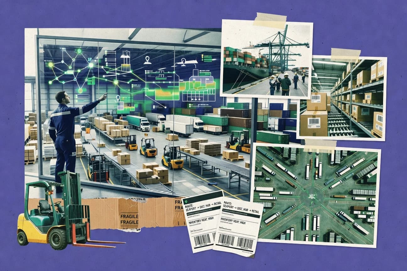
What Is Supply Chain Visualization Software?
Supply chain visualization software turns supply chain data like demand signals, inventory positions, fulfillment performance, and transportation milestones into interactive dashboards, maps, and operational views. It helps teams move from KPI summaries to exception investigation by linking visuals to root-cause details or event streams. Blue Yonder exemplifies control-tower style visualization that connects KPIs to planning and execution causes. FourKites exemplifies real-time shipment visualization that updates lane and milestone status based on event stream inputs.
Key Features to Look For
The right visualization features determine whether teams can quickly diagnose exceptions, compare scenarios, and act on logistics or planning signals instead of staring at static charts.
Control-tower exception dashboards with KPI drill-down
Blue Yonder links control-tower style dashboards to exception investigation by drilling from KPIs to planning and execution causes. This reduces time-to-root-cause versus dashboard-only monitoring in environments with frequent supply network and fulfillment issues.
Constrained multi-echelon scenario visualization tied to optimization
SAP Integrated Business Planning visualizes constrained multi-echelon trade-offs by running scenario simulation across demand, supply, and inventory constraints. o9 Solutions similarly visualizes optimization outcomes for scenarios by linking network impacts to constraint-driven decisions.
Exception management that surfaces constraint-driven plan breaks
Oracle Supply Chain Planning uses exception management to surface constraint-driven plan breaks tied to specific materials and locations. This visualization becomes most useful when planners already operate in Oracle planning data models and workflows.
Operational event-based visibility across warehouse and transportation workflows
Manhattan Associates anchors visualization in execution data with operational event-based visibility and exception and performance dashboards. This approach connects planning-to-execution visibility when Manhattan-centric systems are in place.
Network and geographic shipment or inventory visibility with interactive performance analytics
IBM Supply Chain Intelligence Suite combines network dashboards with geographic views of inventory and shipments and performance analytics tied to planning signals. This gives visibility beyond generic mapping by connecting location context to operational metrics.
Real-time shipment and milestone timelines with event-driven disruption detection
project44 visualizes real-time shipment event timelines with milestone visualization plus disruption detection and exception workflows. FourKites provides real-time shipment visibility driven by sensor and event data aggregation with actionable exception views across lanes.
How to Choose the Right Supply Chain Visualization Software
A practical selection process matches visualization depth to the decision type the organization needs to improve, then validates data readiness and integration maturity against tool strengths.
Map the visualization goal to the right tool type
Organizations needing KPI-to-root-cause investigation for planning and execution should evaluate Blue Yonder because its control-tower dashboards drill into planning and execution causes. Teams needing constrained scenario simulation across multi-echelon networks should evaluate SAP Integrated Business Planning because it visualizes plan impacts across demand, inventory, and supply constraints.
Choose event stream visualization only if shipment event coverage will be strong
Logistics visibility teams should evaluate FourKites for real-time shipment and location visualization with exception management driven by event stream updates. Logistics and supply chain teams needing carrier and lane milestone timelines should evaluate project44 because it emphasizes real-time ETAs and event-driven disruption signals.
Pick optimization-linked dashboards for planners who need scenario trade-offs
Supply chain planning teams comparing service and cost impacts should evaluate o9 Solutions because it visualizes scenarios across demand, inventory, and distribution while linking visuals to constraint trade-offs. Enterprise planning teams that require constraint-driven exception surfacing tied to planning configuration should evaluate Oracle Supply Chain Planning for exception management that highlights plan breaks.
Select execution-centric visualization when warehouse and transport events are the primary data
Enterprises focused on warehouse and transportation operational performance should evaluate Manhattan Associates because it visualizes end-to-end visibility across transportation and warehouse execution workflows using operational events. For organizations seeking geographic shipment and inventory visualization plus performance analytics connected to planning signals, IBM Supply Chain Intelligence Suite is designed for those linked network and location views.
Use general-purpose visualization tools only for dashboard-led KPI work
Operations teams that need configurable visual apps for procurement, orders, and inventory workflow tracking should evaluate Airtable because it provides relational fields and multiple view types like kanban, calendar, grid, and maps with automation across linked records. Teams that need interactive KPI dashboards using Microsoft data should evaluate Microsoft Power BI because DAX measures support custom supply chain KPIs like lead time and inventory coverage with drill-through and row-level security.
Who Needs Supply Chain Visualization Software?
Supply chain visualization software fits different organizational roles depending on whether the visualization must drive planning decisions, execution monitoring, or real-time logistics exception workflows.
Large enterprises needing control-tower visibility across planning and execution
Blue Yonder is the best match for large enterprises because its control-tower exception dashboards link KPIs to planning and execution root causes and support interactive drill-down for exception investigation.
Large enterprises needing constrained supply chain visualization tied to integrated planning
SAP Integrated Business Planning fits teams that already run integrated planning because it provides constrained multi-echelon visualization with scenario-based simulation and trade-off understanding across demand, inventory, and supply constraints.
Enterprise supply planning teams focused on optimization-linked dashboards and planning exceptions
Oracle Supply Chain Planning fits enterprise planning teams because its visualization centers on optimization workflows and highlights exception management that surfaces constraint-driven plan breaks by material and location.
Enterprises needing visualization tied to execution data and exception monitoring
Manhattan Associates fits enterprises because it builds operational dashboards from transportation and warehouse execution signals with exception and performance monitoring that depends on Manhattan-centric integration.
Common Mistakes to Avoid
Most implementation failures come from mismatched visualization depth to data readiness, insufficient integration coverage for real-time views, or underestimating dashboard configuration effort for advanced exception logic.
Assuming visualization works without master data readiness
Blue Yonder depends on data readiness and clean master data for effective use of control-tower exception dashboards. IBM Supply Chain Intelligence Suite also requires well-governed master data quality for advanced views that join network and performance signals.
Underestimating specialist effort for complex exception dashboard configuration
Blue Yonder can require specialist help to implement dashboard configuration for complex exception logic. project44 and FourKites also require integration and configuration effort for advanced views that deliver the full value of exception workflows.
Expecting generic dashboarding to replace optimization-linked visualization for planning decisions
Microsoft Power BI delivers interactive KPI dashboards with DAX measures but it does not specialize in constrained multi-echelon planning visualization. o9 Solutions and SAP Integrated Business Planning connect scenario visualization directly to optimization trade-offs and constraint impacts.
Building real-time shipment views without sufficient event and partner coverage
FourKites produces best results when connected-partner data quality supports accurate shipment status updates. project44 also depends on data coverage and integration quality so lane and milestone timelines reflect real disruptions.
How We Selected and Ranked These Tools
We evaluated every tool on three sub-dimensions with features weighted at 0.40, ease of use weighted at 0.30, and value weighted at 0.30. The overall rating for each tool equals 0.40 times features plus 0.30 times ease of use plus 0.30 times value. Blue Yonder separated itself from lower-ranked tools through features that directly connect control-tower dashboards to KPI drill-down for planning and execution causes, which strengthens exception investigation speed compared with dashboards that focus only on surface-level visuals.
Frequently Asked Questions About Supply Chain Visualization Software
Which supply chain visualization tools provide control-tower style exception visibility with drill-down to causes?
What’s the difference between visualization tied to optimization outputs versus dashboards built on operational event data?
Which tools connect planning visualizations to multi-echelon constraints and what-if simulation?
Which platform is strongest for execution-focused visibility across transportation and warehouse operations?
Which solutions are best for real-time shipment milestone timelines and proactive exception workflows?
Which tools support scenario comparisons that help planners understand drivers behind cost and service impacts?
How do teams build custom, spreadsheet-like supply chain visualizations without full custom software development?
Which toolset is best suited for analytics and dashboarding in a Microsoft-centric data environment with governed access?
Why do some visualization deployments underperform, and what design choice typically causes the issue?
Tools reviewed
Primary sources checked during evaluation.
Referenced in the comparison table and product reviews above.
Keep exploring
Comparing two specific tools?
Software Alternatives
See head-to-head software comparisons with feature breakdowns, pricing, and our recommendation for each use case.
Explore software alternatives→In this category
Supply Chain In Industry alternatives
See side-by-side comparisons of supply chain in industry tools and pick the right one for your stack.
Compare supply chain in industry tools→FOR SOFTWARE VENDORS
Not on this list? Let’s fix that.
Our best-of pages are how many teams discover and compare tools in this space. If you think your product belongs in this lineup, we’d like to hear from you—we’ll walk you through fit and what an editorial entry looks like.
Apply for a ListingWHAT THIS INCLUDES
Where buyers compare
Readers come to these pages to shortlist software—your product shows up in that moment, not in a random sidebar.
Editorial write-up
We describe your product in our own words and check the facts before anything goes live.
On-page brand presence
You appear in the roundup the same way as other tools we cover: name, positioning, and a clear next step for readers who want to learn more.
Kept up to date
We refresh lists on a regular rhythm so the category page stays useful as products and pricing change.