GITNUXSOFTWARE ADVICE
Business FinanceTop 10 Best Performance Metrics Software of 2026
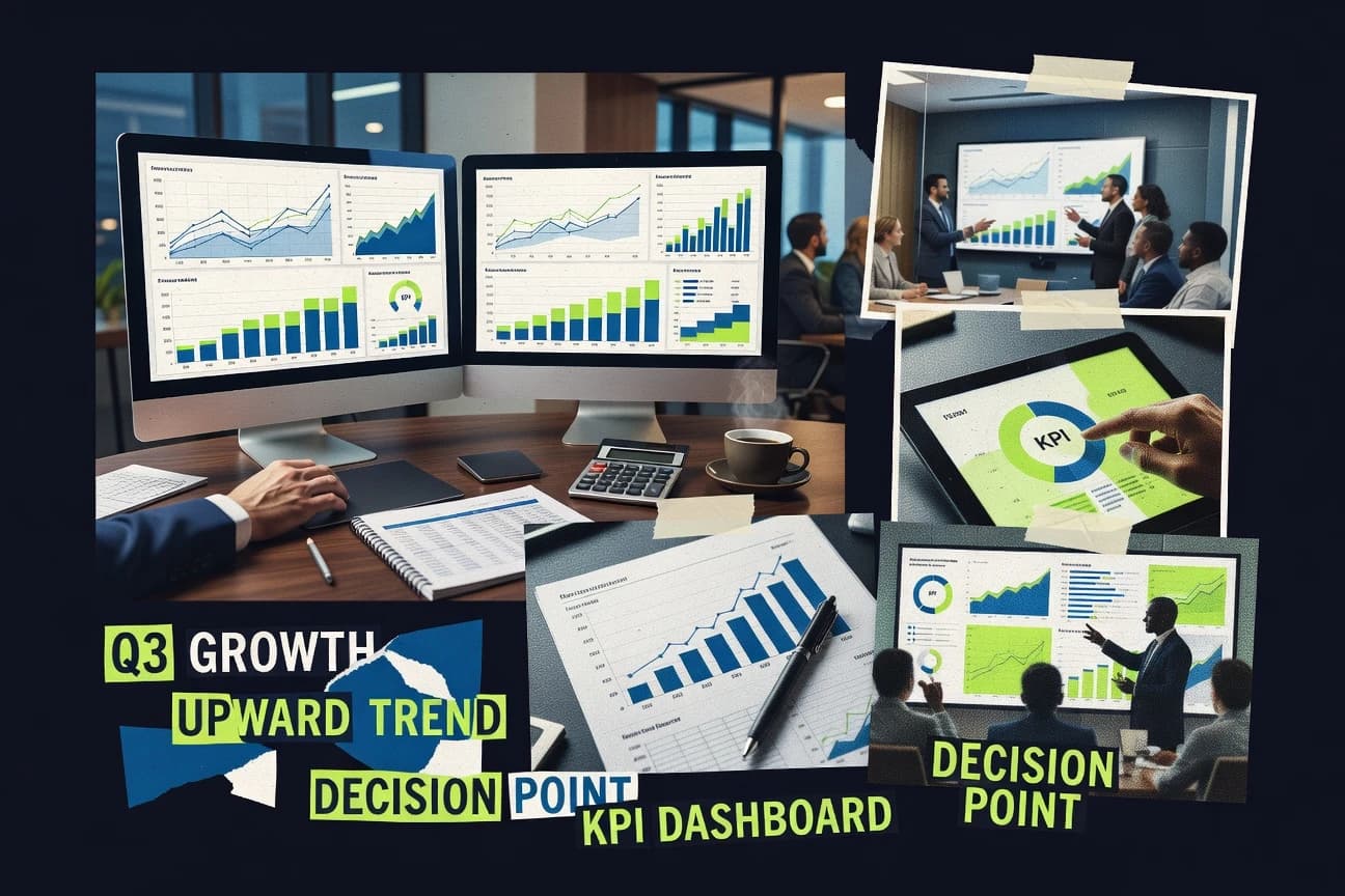
Discover top performance metrics software to track business efficiency. Compare tools and find the best fit—start now.

How we ranked these tools
Core product claims cross-referenced against official documentation, changelogs, and independent technical reviews.
Analyzed video reviews and hundreds of written evaluations to capture real-world user experiences with each tool.
AI persona simulations modeled how different user types would experience each tool across common use cases and workflows.
Final rankings reviewed and approved by our editorial team with authority to override AI-generated scores based on domain expertise.
Score: Features 40% · Ease 30% · Value 30%
Gitnux may earn a commission through links on this page — this does not influence rankings. Editorial policy
Editor’s top 3 picks
Three quick recommendations before you dive into the full comparison below — each one leads on a different dimension.
Databox
Dashboard templates plus scheduled reporting for automated KPI recaps
Built for teams needing automated KPI dashboards and recurring stakeholder reporting.
Klipfolio
Editor pickKPI alerting on dashboard metrics tied to connected data sources
Built for teams needing KPI dashboards with integrations and alerting across multiple departments.
Geckoboard
Editor pickBoard boards with automated goal tracking and alerting from connected KPI data
Built for teams monitoring KPIs in shared visual dashboards without heavy analytics engineering.
Related reading
Comparison Table
This comparison table evaluates performance metrics software used to aggregate KPIs, visualize dashboards, and monitor business operations across teams. Databox, Klipfolio, Geckoboard, Cyfe, and Looker are compared on dashboard capabilities, data connectivity, and reporting workflows so buyers can match features to their tracking needs.
Databox
KPI dashboardsConnect business data sources to build performance scorecards and real-time KPI dashboards for teams.
Dashboard templates plus scheduled reporting for automated KPI recaps
Databox stands out for turning performance data into shareable dashboards and scheduled reports across marketing, sales, and operations. It supports metric integrations from common SaaS tools and lets teams build KPI dashboards with tiles, filters, and goal views. Built-in reporting workflows reduce manual spreadsheet work by automating recap emails and multi-metric summaries for stakeholders.
- +Prebuilt KPI dashboard templates for marketing, sales, and ops workflows
- +Connects to many common data sources to reduce manual data stitching
- +Automates scheduled reports with recurring delivery to stakeholders
- +Goal and target visualizations make progress tracking straightforward
- +Shareable dashboards support collaboration without exporting spreadsheets
- –Dashboard tile setup can feel limiting for highly custom layouts
- –Complex transformations require more effort than straightforward mappings
- –Some advanced governance features for large organizations are not the focus
Best for: Teams needing automated KPI dashboards and recurring stakeholder reporting
More related reading
Klipfolio
Analytics dashboardsCreate and share KPI dashboards and performance scorecards from connected data sources with scheduled reporting.
KPI alerting on dashboard metrics tied to connected data sources
Klipfolio stands out with a dashboard-first approach that connects many business data sources into a single performance view. It supports metric tracking with customizable dashboards, scheduled updates, and alerting for KPI changes. The platform also offers robust visualization options like filters, drilldowns, and shareable dashboard layouts for stakeholder consumption.
- +Large catalog of built-in connectors for common SaaS and data sources
- +Dashboard builder supports filters, interactive layouts, and KPI-focused visuals
- +Scheduled refresh and alerting help teams react to metric changes
- +Strong governance features for sharing dashboards and managing access
- –Complex data modeling can become time-consuming for multi-source KPI logic
- –Advanced customization may require deeper platform know-how to maintain
- –Some workflows are less flexible than custom-built BI for niche metrics
Best for: Teams needing KPI dashboards with integrations and alerting across multiple departments
Geckoboard
Live KPI displayDisplay live KPI metrics on dashboards and TV-style screens using connected data sources and prebuilt widgets.
Board boards with automated goal tracking and alerting from connected KPI data
Geckoboard stands out with an outlet-like dashboard builder that turns metrics into live visual boards for teams and stakeholders. It supports connection to common data sources and schedules updates to keep KPIs fresh, with layouts designed for wallboards, exec views, and team screens.
Core capabilities include metric tiles, goal tracking, automated alerts, and a variety of chart types for performance monitoring. Strong emphasis goes to sharing boards across roles without requiring dashboard rebuilds for every audience.
- +Live KPI dashboards with visual tile layouts and board templates
- +Connectors for common analytics and data sources to reduce manual updates
- +Automated scheduling and alerting to keep stakeholders informed
- +Role-friendly sharing for broadcasting dashboards on team and exec screens
- –Advanced modeling and complex transformations can require external tooling
- –Some customization needs extra configuration versus fully custom analytics apps
- –Alert logic may feel limited for multi-step operational workflows
Best for: Teams monitoring KPIs in shared visual dashboards without heavy analytics engineering
Cyfe
All-in-one dashboardsBuild all-in-one business dashboards that monitor KPIs across sales, marketing, support, and finance data sources.
Scheduled dashboard reporting that delivers KPI updates on a recurring cadence
Cyfe stands out with a dashboard-first performance metrics setup that aggregates data from many services into shared widgets. It supports multi-dashboard monitoring, KPI tiles, and scheduled reporting so teams can track metrics without building custom analytics pipelines. Cyfe also includes alerting-style monitoring and report sharing to keep performance reviews consistent across stakeholders.
- +Prebuilt dashboard widgets simplify KPI tracking across multiple data sources
- +Centralized multi-dashboard views support role-based reporting workflows
- +Scheduled reports keep performance updates consistent without manual exports
- –Complex dashboard layouts can become harder to manage at scale
- –Limited advanced analytics controls compared with specialized BI platforms
- –Data modeling flexibility is constrained by connector-driven metrics
Best for: Teams monitoring operational KPIs across multiple tools with dashboard sharing
looker
BI metrics modelingModel and visualize performance metrics with Looker dashboards and governed data access for business finance reporting.
LookML semantic layer for governed metrics and reusable performance definitions
Looker stands out with modeling-driven analytics through LookML that standardizes metrics across dashboards and reports. It supports performance and operational monitoring via Explore-based query building, scheduled report delivery, and drill-down analysis on dimensional data.
Native integrations with Google Cloud services simplify data warehouse connectivity, while row-level security and fine-grained access controls help maintain governance. The platform focuses on transforming and governing business metrics rather than building raw monitoring collectors for infrastructure signals.
- +LookML enforces consistent metric definitions across reports and teams.
- +Explores enable fast ad hoc analysis with guided fields and filters.
- +Row-level and column-level security supports controlled self-service access.
- –LookML modeling requires disciplined development workflows and reviews.
- –Performance depends heavily on warehouse design and query efficiency.
- –Advanced analytics often needs external tooling beyond standard dashboards.
Best for: Analytics teams standardizing performance metrics and governance with governed BI modeling
Tableau
BI analyticsCreate interactive performance metric visualizations and dashboards for finance and operational reporting.
Tableau Desktop and Tableau Server interactive dashboards with drill-down, parameters, and calculated fields
Tableau stands out with interactive dashboarding and fast visual exploration built around its drag-and-drop authoring. It connects to many data sources and supports calculated fields, parameters, and story-driven presentation for performance metrics. Governance features like role-based access and workbook controls help teams standardize metric definitions across reports.
- +Highly interactive dashboards with responsive filtering and drill-down
- +Strong calculation and parameter tools for metric definitions and scenario views
- +Wide data-source connectivity supports many analytics pipelines
- +Role-based access and workbook governance for controlled sharing
- +Visual analytics workflow reduces time from data to insights
- –Complex performance tuning can be difficult for large datasets
- –Metric consistency requires disciplined governance across workbooks
- –Advanced analytics often needs external tooling beyond visualization
Best for: Teams building executive dashboards and KPI drill-downs with strong data visualization
Power BI
BI dashboardsBuild performance KPI reports with interactive dashboards and governed data models for finance teams.
DAX for measures and time intelligence across reusable data models.
Power BI stands out for turning performance metrics into interactive dashboards through direct integration with Microsoft ecosystem data sources. It supports data modeling, DAX measures, scheduled refresh, and row-level security for metric governance.
Visuals include KPIs, drill-through, and paginated reports that support detailed operational reporting and leadership views from the same model. Performance monitoring workflows are strengthened by exportable visuals and cross-report filtering for faster root-cause analysis.
- +Strong DAX modeling for complex KPI calculations and time intelligence
- +Row-level security supports governed metrics across teams and departments
- +Interactive drill-through and cross-filtering speed investigation of performance drops
- +Broad connector library for ingesting metrics from common business systems
- +Scheduled refresh and incremental load options support operational dashboard freshness
- –DAX complexity increases sharply for advanced measures and modeling patterns
- –Performance can degrade on large models without careful design and tuning
- –Native visual customization is limited compared to fully custom visualization platforms
- –Data preparation often needs external tooling for heavily transformed metric pipelines
Best for: Organizations standardizing performance dashboards with governed metrics and Microsoft-aligned data.
Qlik Sense
BI analyticsAnalyze business performance metrics with associative analytics and interactive dashboards for finance stakeholders.
Associative data model with selections that automatically link related values across fields
Qlik Sense stands out for associative analytics that connects related data fields without requiring rigid join paths. It delivers interactive dashboards, self-service exploration, and in-memory performance for KPI monitoring and metric drill-down.
The platform also supports data integration and governance through Qlik Data Integration and security controls for governed performance reporting. Strong visualization capabilities exist, but complex metric models can become harder to maintain as logic and datasets grow.
- +Associative engine enables rapid, flexible drill-down across related fields
- +Interactive dashboarding supports KPI exploration with dynamic filters and selections
- +Strong visualization library covers common performance reporting needs
- –Semantic and metric modeling complexity increases effort for large KPI libraries
- –Associative behavior can confuse teams expecting strict relational query paths
Best for: Teams building governed KPI dashboards with associative self-service exploration
Sigma Computing
Modern BIDeliver self-service KPI dashboards and analytics with semantic metrics for business reporting on finance performance.
Governed semantic layer for reusable metrics across dashboards and analyses
Sigma Computing emphasizes self-service analytics with governed semantic modeling, which turns raw warehouse data into reusable business metrics. The platform supports interactive dashboards, ad hoc exploration, and scheduled distribution for performance monitoring.
Security controls and workspace management help teams standardize definitions while collaborating across departments. Visual query building and metric reuse reduce the need for repeated SQL writing for common KPIs.
- +Governed metric definitions keep KPI logic consistent across reports
- +Interactive dashboards support drilldowns without requiring SQL for users
- +Semantic modeling streamlines reuse of business dimensions and measures
- –Complex metric relationships can require careful modeling design
- –Advanced calculations may feel constrained versus direct SQL flexibility
- –Collaboration workflows can be heavier than lightweight BI tools
Best for: Teams standardizing performance KPIs in a governed semantic analytics workflow
OpenMetadata
Metric governanceUse a data catalog to track datasets, dashboards, and metric definitions used in business performance reporting.
Integrated metadata ingestion with lineage and usage context for performance attribution
OpenMetadata stands out for unifying metadata, observability signals, and governance across data platforms into one metadata layer. It supports metadata ingestion from common warehouses and catalogs, then applies assets, lineage, and usage context that help teams connect performance symptoms to data changes.
For performance metrics specifically, it delivers operational dashboards and SLA-style tracking signals tied to datasets and pipelines through its ingestion and monitoring integrations. It also centralizes documentation and ownership so performance findings can be acted on by the right teams.
- +Connects performance signals to datasets using lineage and usage context
- +Ingests metadata from multiple data systems into a unified catalog model
- +Supports governance workflows with ownership, documentation, and quality signals
- –Performance-metrics setup depends on integrating the right monitoring sources
- –Customizing dashboards and metadata mappings can require platform expertise
- –Out-of-the-box performance views may not match every organization's KPIs
Best for: Data teams needing governed metadata context for performance metrics and lineage
Conclusion
After evaluating 10 business finance, Databox stands out as our overall top pick — it scored highest across our combined criteria of features, ease of use, and value, which is why it sits at #1 in the rankings above.
Use the comparison table and detailed reviews above to validate the fit against your own requirements before committing to a tool.
How to Choose the Right Performance Metrics Software
This buyer’s guide explains how to evaluate Performance Metrics Software using specific tools across dashboarding, governed metric modeling, KPI alerting, and performance metadata lineage. It covers Databox, Klipfolio, Geckoboard, Cyfe, Looker, Tableau, Power BI, Qlik Sense, Sigma Computing, and OpenMetadata. Each section maps concrete selection criteria to the capabilities and constraints of these platforms.
What Is Performance Metrics Software?
Performance Metrics Software connects business data sources and turns them into KPI dashboards, scorecards, and scheduled performance updates for stakeholders. These tools reduce manual spreadsheet reporting by automating recap workflows and by standardizing how metrics are defined and calculated. Databox and Klipfolio show the KPI dashboard pattern with scheduled reporting, connectors, and stakeholder sharing. Looker and Sigma Computing show a governed metric modeling pattern where business definitions are standardized through a semantic layer.
Key Features to Look For
These features determine whether a team can deliver accurate KPIs quickly, share them safely, and keep metric logic consistent across dashboards and departments.
Scheduled KPI recap reporting and recurring delivery
Databox automates scheduled report delivery for recurring KPI recaps and multi-metric summaries so stakeholders do not rely on manual exports. Cyfe also focuses on scheduled dashboard reporting that delivers KPI updates on a recurring cadence for operational performance reviews.
Dashboard-first KPI alerting tied to connected metrics
Klipfolio provides KPI alerting on dashboard metrics that come from connected data sources, which supports faster reactions when performance changes. Geckoboard adds automated scheduling and alerting to keep live board viewers informed without rebuilding views for each audience.
Shareable dashboard layouts built for teams, exec views, and wallboards
Geckoboard emphasizes TV-style dashboards that use board layouts and templates for role-friendly sharing across team and exec screens. Databox supports shareable dashboards and reduces spreadsheet workflows by letting teams collaborate through dashboards.
Governed semantic layers for reusable metric definitions
Looker uses LookML to enforce consistent metric definitions across dashboards and reports with governed data access. Sigma Computing provides a governed semantic layer so business metric definitions are reused across dashboards and analyses without repeated SQL writing.
Interactive drill-down with governed access controls
Power BI supports drill-through and cross-filtering to speed investigation of performance drops while row-level security governs who can see specific data. Tableau supports interactive filtering and drill-down with calculated fields, parameters, and role-based access for controlled sharing.
Performance metadata, lineage, and usage context for governance and attribution
OpenMetadata unifies metadata, observability signals, and governance into a metadata layer that links performance findings to datasets and pipelines through ingestion and lineage context. This helps teams attribute performance symptoms to upstream data changes instead of guessing which pipeline caused a KPI movement.
How to Choose the Right Performance Metrics Software
The selection process should match dashboard delivery needs, metric governance requirements, and team workflows for exploration, alerting, and performance attribution.
Pick the dashboard delivery pattern that fits team workflows
For teams that need automated KPI recaps and stakeholder-ready dashboards, Databox and Cyfe match the recurring reporting workflow. For teams that need KPI screens and shared boards for monitoring without heavy analytics engineering, Geckoboard fits board-first wallboard usage.
Match alerting and “what changed” needs to platform alert logic
Klipfolio is a strong fit when KPI alerting must trigger on dashboard metrics tied to connected data sources. Geckoboard is a strong fit when alerting and automated scheduling are used to keep viewers aligned across multiple roles with the same live board view.
Set governance expectations before building metric logic
For organizations that must standardize metric definitions across teams, Looker and Sigma Computing provide semantic layer governance through LookML and governed metric reuse. For organizations in a Microsoft-aligned ecosystem, Power BI provides DAX-based measures plus row-level security for governed metric access.
Validate exploration and drill-down behavior with real KPI scenarios
For guided ad hoc exploration across dimensional fields, Looker Explore supports fast query building with guided fields and filters. For highly interactive drill-down with scenario parameters and calculated fields, Tableau Desktop and Tableau Server provide responsive filtering and parameter-driven analysis.
Plan for performance attribution using metadata and lineage
When teams need to connect KPI movements back to the datasets and pipelines that caused them, OpenMetadata provides lineage and usage context tied to ingestion and monitoring integrations. When associative self-service exploration is central to how analysts investigate KPIs, Qlik Sense supports associative selections that link related values across fields.
Who Needs Performance Metrics Software?
Performance Metrics Software serves multiple roles from operations teams that need recurring KPI reporting to analytics teams that need governed metric definitions and traceable performance attribution.
Teams needing automated KPI dashboards and recurring stakeholder reporting
Databox is a strong match because it builds KPI dashboards with shareable reporting and automated scheduled recap delivery. Cyfe also fits when the priority is consistent scheduled dashboard reporting across multiple tools without manual spreadsheet exports.
Teams needing KPI dashboards with alerting across multiple departments
Klipfolio fits teams that want KPI alerting tied to connected data sources and governance features for sharing access. Geckoboard also fits teams that want automated goal tracking and alerting on connected KPI data displayed across shared boards.
Analytics teams standardizing governed performance metrics with reusable definitions
Looker fits analytics teams that need LookML to enforce consistent metric definitions across dashboards and reports. Sigma Computing fits teams that want a governed semantic layer that supports reusable business metrics without repeated SQL writing.
Data teams that need performance metrics context tied to lineage and usage
OpenMetadata fits teams that want centralized documentation, ownership, and governance workflows tied to lineage and usage context. This is most valuable when performance symptoms must be traced back to datasets and pipelines instead of treated as isolated dashboard events.
Common Mistakes to Avoid
Common buying errors come from choosing the wrong governance model, underestimating complexity in modeling and transformations, or expecting every platform to handle metric logic and attribution end to end.
Building KPI logic in a dashboard tool without a governed semantic layer
Power BI and Tableau can enforce governance through row-level security and workbook controls, but complex metric consistency still requires disciplined governance across models and workbooks. Looker and Sigma Computing reduce consistency drift by standardizing reusable metric definitions through LookML and governed semantic modeling.
Overrelying on board customization when advanced KPI logic needs transformation work
Databox and Geckoboard accelerate dashboard tile delivery, but complex transformations can require extra effort beyond straightforward mappings and widget configuration. Klipfolio and Cyfe also rely heavily on connector-driven metric modeling, which can become time-consuming for multi-source KPI logic.
Expecting alerting to cover multi-step operational workflows
Klipfolio and Geckoboard support alerting tied to connected KPI metrics, but multi-step operational workflows often require deeper workflow logic than KPI threshold alerts. This is a key gap when alerts must incorporate multi-condition business processes.
Ignoring performance attribution and lineage for KPI investigations
Dashboards alone can show that a KPI changed without showing why, which becomes a blocker during root-cause work. OpenMetadata addresses this by linking performance signals to datasets and pipelines using lineage and usage context.
How We Selected and Ranked These Tools
We evaluated each tool on three sub-dimensions with fixed weights. Features received a weight of 0.4, ease of use received a weight of 0.3, and value received a weight of 0.3. The overall rating is the weighted average of those three with overall = 0.40 × features + 0.30 × ease of use + 0.30 × value. Databox separated itself on features because its dashboard templates plus scheduled reporting for automated KPI recaps directly reduce manual reporting work while keeping dashboards shareable for stakeholders.
Frequently Asked Questions About Performance Metrics Software
Which tool is best for automated KPI reporting that replaces recurring spreadsheet recap work?
What solution provides dashboard alerts when KPI values change based on live data sources?
Which platform is strongest for building governed metric definitions before exposing dashboards to many teams?
Which tool fits teams that need interactive drill-down and executive storytelling in a single authoring workflow?
What is the best option for wallboard-style visual dashboards shared across roles without rebuilding per audience?
Which platform helps teams explore related data without rigid join paths?
How do analytics-focused platforms differ from monitoring-first tools for performance metrics collection?
Which tool is best for Microsoft-centric organizations that want governed performance dashboards from the same data model?
What platform is strongest for connecting performance symptoms to data changes using lineage and operational context?
Which solution reduces repeated SQL work by making KPI logic reusable across dashboards and analyses?
Tools reviewed
Primary sources checked during evaluation.
Referenced in the comparison table and product reviews above.
Keep exploring
Comparing two specific tools?
Software Alternatives
See head-to-head software comparisons with feature breakdowns, pricing, and our recommendation for each use case.
Explore software alternatives→In this category
Business Finance alternatives
See side-by-side comparisons of business finance tools and pick the right one for your stack.
Compare business finance tools→FOR SOFTWARE VENDORS
Not on this list? Let’s fix that.
Our best-of pages are how many teams discover and compare tools in this space. If you think your product belongs in this lineup, we’d like to hear from you—we’ll walk you through fit and what an editorial entry looks like.
Apply for a ListingWHAT THIS INCLUDES
Where buyers compare
Readers come to these pages to shortlist software—your product shows up in that moment, not in a random sidebar.
Editorial write-up
We describe your product in our own words and check the facts before anything goes live.
On-page brand presence
You appear in the roundup the same way as other tools we cover: name, positioning, and a clear next step for readers who want to learn more.
Kept up to date
We refresh lists on a regular rhythm so the category page stays useful as products and pricing change.