GITNUXSOFTWARE ADVICE
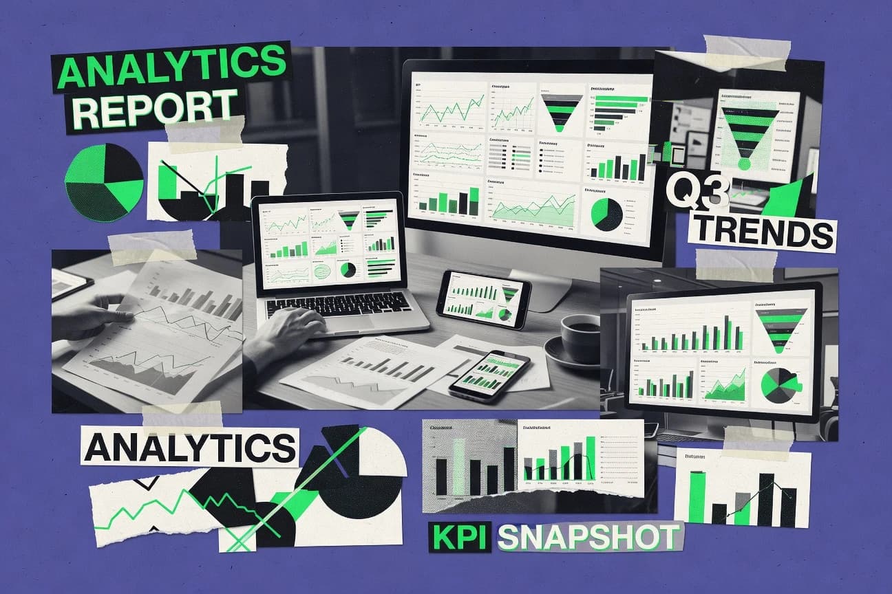
Data Science AnalyticsTop 9 Best Marketing Report Software of 2026
Discover the top 10 marketing report software tools to simplify data analysis. Compare features, streamline processes & boost ROI—find your best fit today.

How we ranked these tools
Core product claims cross-referenced against official documentation, changelogs, and independent technical reviews.
Analyzed video reviews and hundreds of written evaluations to capture real-world user experiences with each tool.
AI persona simulations modeled how different user types would experience each tool across common use cases and workflows.
Final rankings reviewed and approved by our editorial team with authority to override AI-generated scores based on domain expertise.
Score: Features 40% · Ease 30% · Value 30%
Gitnux may earn a commission through links on this page — this does not influence rankings. Editorial policy
Editor’s top 3 picks
Three quick recommendations before you dive into the full comparison below — each one leads on a different dimension.
Microsoft Power BI
Power BI semantic model with DAX measures and row-level security
Built for marketing teams standardizing KPI reporting with interactive dashboards and governed metrics.
Tableau
Editor pickDashboard actions for cross-filtering and navigation across sheets and pages
Built for marketing analytics teams needing governed, interactive dashboards over multiple data sources.
ThoughtSpot
Editor pickSpotIQ semantic search that answers questions directly from curated metrics and dimensions
Built for marketing analytics teams needing governed, search-first KPI reporting.
Related reading
Comparison Table
This comparison table evaluates leading marketing report software for turning campaign, channel, and audience data into consistent dashboards and scheduled reports. It covers options such as Microsoft Power BI, Tableau, ThoughtSpot, Sisense, and Databox, with side-by-side notes on analytics capabilities, data integration, and reporting workflows so teams can match the tool to reporting needs.
Microsoft Power BI
BI analyticsCreate marketing analytics reports with interactive dashboards, DAX measures, and governed data models deployed to web, mobile, and workspaces.
Power BI semantic model with DAX measures and row-level security
Power BI stands out with end-to-end self-service analytics that connects marketing data to interactive dashboards and governed sharing. It delivers fast visual exploration, reusable semantic models, and scheduled refresh for data pipelines that feed reporting. It also supports drill-through from executive KPIs to underlying campaign and channel metrics through filters, relationships, and measures.
- +Rich dashboard visuals with interactive drill-through for campaign and channel analysis
- +Strong semantic modeling with reusable measures and consistent metric definitions
- +Automated refresh and workflow support for scheduled, reliable reporting updates
- –Complex DAX can slow development when building advanced marketing calculations
- –Dataset governance and capacity planning can become challenging at scale
- –Design control for pixel-perfect layouts requires extra effort and tuning
Best for: Marketing teams standardizing KPI reporting with interactive dashboards and governed metrics
More related reading
Tableau
visual analyticsDesign and publish marketing performance visual analytics with calculated fields, row-level security, and embedded dashboards.
Dashboard actions for cross-filtering and navigation across sheets and pages
Tableau stands out for fast, interactive visual analytics that turn marketing metrics into drillable dashboards. It supports data blending, live connections, and extracted datasets, which helps teams keep campaign reporting responsive.
Marketing reporting is strengthened by strong filter controls, scheduled dashboard publishing, and robust calculated fields for metric definitions. Collaboration is enabled through shared workbooks and governed content libraries built around permissions.
- +Interactive dashboards with drill-down filters for campaign performance exploration
- +Strong calculated fields for reusable marketing KPIs and consistent metric logic
- +Flexible data connections with live queries and extracts for different performance needs
- +Central governance features for controlled sharing of reports and dashboards
- –Dashboard authoring can be complex for non-technical marketing analysts
- –Governed sharing requires careful permissions design to avoid access friction
- –High interactivity can increase load times with large datasets
Best for: Marketing analytics teams needing governed, interactive dashboards over multiple data sources
ThoughtSpot
NL analyticsDeliver marketing report experiences through natural language search over governed datasets and automatically generated insights.
SpotIQ semantic search that answers questions directly from curated metrics and dimensions
ThoughtSpot stands out for enabling search-driven analytics with natural language queries over business metrics and reports. It combines interactive dashboards with governed insights that can be shared across marketing, finance, and operations.
Teams can create calculated fields and pin answers into collaborative views, which supports recurring marketing performance reporting. The product’s analytics depth is strong, but marketing-specific workflows still require thoughtful data modeling to deliver consistently reliable metrics.
- +Natural language search turns marketing questions into clickable, explainable results
- +Interactive dashboards support drilldowns from KPI tiles to underlying dimensions
- +Row-level security and curated semantic layers improve governed marketing reporting
- –Accurate marketing metrics depend heavily on clean data modeling and definitions
- –Complex calculated fields can slow discovery for less technical marketing users
- –Embedding and workflow automation are not as focused as pure reporting suites
Best for: Marketing analytics teams needing governed, search-first KPI reporting
Sisense
embedded analyticsGenerate marketing dashboards and reporting using an analytics platform that unifies data modeling and high-performance in-dashboard exploration.
Analytics app development with semantic models for governed marketing metrics
Sisense stands out with its end-to-end analytics workflow that turns marketing data into interactive dashboards and embedded reporting. It supports building analytics apps with governed metrics, scheduled refresh, and strong dataset modeling for cross-channel attribution analysis.
Visual exploration and report authoring are coupled with automation options like alerts and recurring report delivery. Collaboration features help marketing teams share insights while keeping definitions consistent across teams.
- +In-product analytics app builder supports governed, reusable marketing metrics
- +Powerful semantic modeling helps unify messy campaign and CRM datasets
- +Embedded dashboards enable self-serve reporting inside marketing portals
- +Scheduled refresh and delivery reduce manual reporting for recurring KPIs
- +Robust filtering and drill paths support channel, campaign, and audience breakdowns
- –Complex data modeling can slow teams without analytics engineering support
- –Advanced customization increases setup effort for straightforward reporting needs
- –Performance tuning may be required for large multi-source marketing datasets
- –Governance and role setup adds overhead for small marketing orgs
Best for: Marketing analytics teams building governed dashboards and embedded reporting experiences
Databox
KPI reportingTrack marketing KPIs in live dashboards and automated reports by connecting sources like ads, analytics, and CRM to performance metrics.
Scheduled KPI reports with automated metric refresh across connected data sources
Databox stands out with a no-code KPI dashboard builder focused on marketing performance reporting. It aggregates metrics from common marketing and analytics sources into reusable dashboards and scheduled report delivery.
Strong metric coverage and visual report layouts support both executives and channel managers, with automation reducing manual spreadsheet work. Collaboration and guided insights help users spot metric changes and share reporting outputs consistently.
- +No-code dashboard builder for marketing KPIs and performance trends
- +Connector-based data pulls reduce manual spreadsheet updates
- +Scheduled reporting automates recurring marketing performance delivery
- +Metric thresholds and alerts highlight changes in key KPIs
- +Shareable dashboards support consistent stakeholder reporting
- –Complex multi-team layouts can require extra configuration time
- –Some advanced visualization customization options feel limited
- –Data troubleshooting can be challenging when connectors fail
Best for: Marketing teams needing automated KPI dashboards and scheduled reporting
Supermetrics
data pipelineAutomate marketing data collection for reporting by extracting performance data from ad and analytics platforms into analytics tools.
Supermetrics connectors with scheduled data refresh into Google Sheets and BI destinations
Supermetrics stands out for turning marketing data pulls into reusable reporting pipelines across common analytics and spreadsheets. It supports connector-based extraction for ads and analytics sources, then delivers scheduled refresh and clean exports into tools like Google Sheets, Looker Studio, and data warehouses. Teams can map fields, filter by dates and campaign attributes, and blend metrics before sharing standardized reports.
- +Broad connector coverage for major ad platforms and analytics data sources
- +Scheduled data pulls keep reports up to date without manual exports
- +Field mapping and metric selection reduce report cleanup work
- +Works cleanly with spreadsheets and BI tools for fast stakeholder sharing
- –Connector setup and field mapping can feel technical for non-technical users
- –Complex blending across many dimensions may require careful configuration
Best for: Marketing teams standardizing multi-channel dashboards with connector-driven automation
ReportGarden
client reportingCreate client-ready marketing reports with automated templates that pull from common analytics and ad platforms for recurring exports.
Scheduled template reports for recurring marketing performance delivery
ReportGarden focuses on automating marketing report creation through reusable templates and scheduled delivery. The system supports data import from common sources and lets teams assemble recurring performance reports with consistent formatting. Visual report outputs can be shared with stakeholders on a cadence without manual rebuilding for every reporting cycle.
- +Template-driven marketing reports reduce repetitive build work across campaigns
- +Scheduling and distribution help keep stakeholders aligned on a fixed cadence
- +Designed for recurring reporting workflows with consistent formatting
- –Customization depth can feel limited for complex, highly bespoke layouts
- –Data source setup may require more effort than simple drag-and-drop
- –Collaboration and review workflows are not as robust as dedicated BI tools
Best for: Marketing teams needing scheduled, template-based reporting without heavy analytics work
Looker (Google Cloud)
semantic layer BIModel marketing metrics with LookML and deliver governed dashboards and scheduled reporting through an analytics layer built on Google Cloud.
LookML semantic modeling for defining reusable, governed metrics and dimensions
Looker stands out with its semantic modeling layer that turns raw warehouse data into governed business definitions for reporting and analytics. Marketing reporting is supported through reusable dashboards, scheduled delivery, and governed dimensions that keep campaign metrics consistent across teams.
Tight integration with BigQuery and other data sources supports interactive exploration with drill-downs and embedded analytics via Looker applications. Collaboration features like comments on explorations and versioned assets help teams refine reports without breaking shared metric logic.
- +Semantic model keeps marketing metrics consistent across dashboards and explorers
- +Strong BigQuery and data warehouse integration for fast, scalable marketing reporting
- +Reusable dashboards and explores speed up creation of campaign performance views
- +Scheduled delivery and alerting support recurring marketing reporting workflows
- –Modeling requires LookML expertise for best results and governance quality
- –Advanced customization can slow down iteration compared with simpler BI tools
- –Workspace permissions and governed metrics add setup overhead for smaller teams
Best for: Marketing analytics teams needing governed dashboards over warehouse data
Grafana
dashboardingBuild marketing and attribution reporting dashboards by visualizing time-series metrics from data sources with alerting and templated queries.
Annotations that mark timeline events directly on dashboards
Grafana stands out with a unified dashboard and observability approach that blends metrics, logs, and traces into one reporting surface. For marketing report software, it can pull KPI time series from multiple data stores, transform them with query functions, and publish interactive dashboards for campaigns and channels.
Its alerting and annotation features help track events like launches and outages while keeping dashboards current for stakeholders. The tool also supports embedding dashboards in internal portals so marketing reporting can stay close to the source of truth.
- +Strong dashboarding with interactive filters, drilldowns, and reusable panels
- +Wide data source support enables marketing KPIs from separate analytics systems
- +Alerting plus dashboard annotations connect KPI changes to specific events
- –More setup and configuration than purpose-built marketing reporting tools
- –Dashboard design requires meaningful query and data model understanding
- –Large-scale governance can be complex without standardized dashboard conventions
Best for: Marketing and analytics teams standardizing KPI dashboards across diverse data sources
Conclusion
After evaluating 9 data science analytics, Microsoft Power BI stands out as our overall top pick — it scored highest across our combined criteria of features, ease of use, and value, which is why it sits at #1 in the rankings above.
Use the comparison table and detailed reviews above to validate the fit against your own requirements before committing to a tool.
How to Choose the Right Marketing Report Software
This buyer’s guide helps teams compare Microsoft Power BI, Tableau, ThoughtSpot, Sisense, Databox, Supermetrics, ReportGarden, Looker, and Grafana for marketing report delivery and KPI governance. It covers what these tools do best, which capabilities matter most, and how to avoid implementation pitfalls. It also includes a selection methodology explanation and a tool-specific FAQ.
What Is Marketing Report Software?
Marketing report software turns marketing performance data into dashboards, interactive analysis views, scheduled exports, and recurring stakeholder updates. The core problem it solves is consistent reporting on campaign and channel metrics without manual spreadsheet rebuilds. Tools like Microsoft Power BI and Looker focus on governed metric definitions and interactive exploration for teams that share KPIs across multiple dashboards. Tools like Databox and ReportGarden focus on automated KPI updates and recurring report delivery so channel and leadership stakeholders receive the same reports on a fixed cadence.
Key Features to Look For
Marketing reporting succeeds when governance, metric definition reuse, and automation work together across dashboards, scheduled refresh, and stakeholder sharing.
Governed semantic metric layers with reusable definitions
Microsoft Power BI uses a semantic model with DAX measures and row-level security so KPI logic stays consistent across filters and drill-through. Looker provides LookML semantic modeling with governed dimensions so campaign metrics remain aligned across dashboards and explores. Sisense also emphasizes semantic models for governed marketing metrics, which helps unify messy campaign and CRM datasets.
Interactive drill-down and cross-filtering across campaign performance
Power BI supports drill-through from executive KPIs into campaign and channel dimensions using filters, relationships, and measures. Tableau provides dashboard actions for cross-filtering and navigation across sheets and pages, which makes performance exploration feel cohesive. Grafana adds interactive filtering with reusable panels built from time-series queries for marketing KPIs.
Scheduled refresh and recurring reporting delivery
Power BI supports scheduled refresh for data pipelines feeding reporting dashboards. Databox automates scheduled KPI reports by refreshing connected marketing sources and delivering dashboards consistently to stakeholders. ReportGarden focuses on scheduled template reports that assemble recurring performance exports with consistent formatting.
Search-first answer generation over governed metrics
ThoughtSpot uses SpotIQ semantic search to answer marketing questions directly from curated metrics and dimensions. It combines natural language query experiences with interactive dashboards that support drilldowns from KPI tiles. This makes recurring performance reporting faster when stakeholders ask questions instead of navigating fixed dashboard layouts.
Embedded and shareable reporting experiences
Sisense supports analytics app development with semantic models so governed dashboards can be embedded inside marketing portals. Tableau enables collaboration through shared workbooks and governed content libraries built on permissions. Looker supports reusable dashboards and explores plus governed assets that teams refine with comments on explorations and versioned assets.
Connector-driven data collection and field mapping for multi-channel reporting
Supermetrics automates marketing data collection using connectors and scheduled data pulls into destinations like Google Sheets and BI tools. It includes field mapping and metric selection so teams reduce report cleanup work after extraction. This is a practical option when the primary challenge is getting multi-source marketing data into a consistent reporting format before dashboards are built.
How to Choose the Right Marketing Report Software
A good choice matches governance needs, reporting workflows, and dashboard interaction requirements to the tool’s actual strengths.
Define who must share the same marketing metrics and how those metrics are governed
Teams that need one consistent KPI definition across dashboards and departments should prioritize Microsoft Power BI with row-level security and DAX-based semantic modeling, or Looker with LookML semantic modeling. Teams building governed dashboards over warehouse data should evaluate Looker first, because it keeps metric definitions reusable across explorers and dashboards. Teams that embed reporting into internal marketing portals should also consider Sisense for governed semantic models used in analytics app development.
Choose the dashboard experience based on how stakeholders explore performance
Stakeholders who drill into campaign and channel performance from executive KPIs should evaluate Power BI for drill-through behavior and Tableau for cross-filtering navigation. Teams that prefer asking questions in plain language should evaluate ThoughtSpot for SpotIQ semantic search over curated metrics and dimensions. Teams that want timeline context inside dashboards should evaluate Grafana for dashboard annotations that mark events directly on KPI graphs.
Match automation to reporting cadence and delivery method
If recurring KPI delivery is the bottleneck, Databox supports scheduled KPI reports with automated refresh across connected sources. If the requirement is consistent template-driven reporting with recurring exports, ReportGarden focuses on scheduled template reports that reduce repetitive rebuild work. If the requirement is fully governed dashboards with scheduled refresh in a controlled data pipeline, Power BI and Looker fit that workflow.
Decide whether data extraction is part of the tool or a separate workflow
When marketing teams need connector-based extraction and scheduled refresh into spreadsheets and BI destinations, Supermetrics is designed for scheduled data pulls with field mapping. When marketing performance data already lives in a warehouse or curated datasets, Looker and Power BI can focus on semantic modeling and governed reporting experiences. When embedding and self-serve reporting inside a portal matters, Sisense can combine modeling and dashboard delivery in one workflow.
Validate setup complexity against available analytics engineering capacity
Tools like Power BI, Tableau, Looker, and Sisense can deliver strong governance and interaction but require careful metric modeling, permissions design, and performance tuning. Tableau’s authoring and permission design can add friction when teams need governed sharing across many users. Looker’s modeling typically needs LookML expertise for best results, while Grafana requires more setup and query understanding than purpose-built marketing report tools.
Who Needs Marketing Report Software?
Marketing report software benefits teams that must standardize KPI definitions, automate recurring reporting, or enable interactive exploration across channels and stakeholders.
Marketing analytics teams standardizing KPI reporting with governed, interactive dashboards
Microsoft Power BI is a strong fit because it pairs a semantic model with DAX measures and row-level security with drill-through from executive KPIs into campaign and channel details. Tableau also fits teams that need governed sharing and interactive dashboards across multiple data sources using dashboard actions for cross-filtering.
Teams that want governed metrics and dashboards over warehouse data
Looker is designed around LookML semantic modeling and governed dimensions, which keeps marketing metrics consistent across dashboards and explores. Teams that need the same metric logic across warehouse-backed views should prioritize Looker’s reusable dashboards and explores plus scheduled delivery.
Marketing teams that need automated KPI dashboards and scheduled stakeholder reporting
Databox focuses on a no-code KPI dashboard builder with scheduled report delivery and metric thresholds and alerts for KPI changes. ReportGarden complements this approach with scheduled template reports that assemble recurring exports with consistent formatting.
Teams that must build reporting experiences through search or embedded analytics
ThoughtSpot fits teams that want natural language search over curated marketing metrics using SpotIQ semantic search and governed row-level access. Sisense fits teams that need embedded reporting experiences by building analytics apps with semantic models and governed, reusable metrics.
Common Mistakes to Avoid
Several recurring pitfalls appear across these tools, especially when governance, modeling complexity, and data extraction steps are mismatched to team capability.
Building advanced metric logic without governance support
Complex marketing calculations can slow development when semantic definitions are not designed for reuse, which shows up as DAX complexity in Microsoft Power BI and calculated-field complexity in Tableau. Teams that rely on search or repeatable KPI answers should ensure metric definitions are curated, which ThoughtSpot supports through SpotIQ semantic search over curated metrics and dimensions.
Assuming interactive authoring will be effortless for non-technical analysts
Tableau dashboard authoring can become complex for non-technical marketing analysts, especially when governed sharing requires careful permissions design. Looker modeling also requires LookML expertise for best results, which can slow iteration if analytics engineering support is not available.
Ignoring the data extraction layer before building dashboards
Supermetrics field mapping and scheduled data pulls are designed to reduce cleanup work after extraction, so skipping this step can lead to inconsistent exports and messy joins. Databox and ReportGarden depend on connector-based or import-based data sourcing, so connector failures can make troubleshooting necessary during scheduled refresh.
Forgetting performance and design constraints as dashboards scale
Large datasets can increase load times when Tableau dashboards run high interactivity, which can harm stakeholder experience. Power BI can require extra effort for pixel-perfect layouts and can be affected by complex DAX measures during development.
How We Selected and Ranked These Tools
We evaluated each marketing report software tool on three sub-dimensions, features with weight 0.4, ease of use with weight 0.3, and value with weight 0.3. The overall rating is computed as overall = 0.40 × features + 0.30 × ease of use + 0.30 × value. Microsoft Power BI separated itself on the features dimension because its governed semantic model uses DAX measures and row-level security plus drill-through from executive KPIs to campaign and channel metrics. Lower-ranked tools still delivered strong reporting in specific workflows, but they did not match the same combined governance and interactive drill-through workflow strength.
Frequently Asked Questions About Marketing Report Software
Which marketing report tool is best for governed KPI definitions and role-based access across teams?
Which option supports fast drill-down from executive KPIs to campaign and channel metrics?
Which tool works best for search-first reporting when stakeholders ask questions in plain language?
Which marketing report software is designed for building embedded, reusable reporting experiences?
How can teams automate recurring marketing reports without manually rebuilding spreadsheets every cycle?
Which tool is strongest for connector-based data pipelines from ad platforms into reporting sheets and BI tools?
What tool best supports interactive dashboard publishing and collaboration with governed content libraries?
Which platform fits warehouse-centric marketing analytics where semantic modeling must sit close to the source of truth?
Which tool is best when marketing reporting needs operational context like launch and incident timelines?
Which approach is best for standardizing multi-channel marketing dashboards with consistent metric transformations?
Tools reviewed
Primary sources checked during evaluation.
Referenced in the comparison table and product reviews above.
Keep exploring
Comparing two specific tools?
Software Alternatives
See head-to-head software comparisons with feature breakdowns, pricing, and our recommendation for each use case.
Explore software alternatives→In this category
Data Science Analytics alternatives
See side-by-side comparisons of data science analytics tools and pick the right one for your stack.
Compare data science analytics tools→FOR SOFTWARE VENDORS
Not on this list? Let’s fix that.
Our best-of pages are how many teams discover and compare tools in this space. If you think your product belongs in this lineup, we’d like to hear from you—we’ll walk you through fit and what an editorial entry looks like.
Apply for a ListingWHAT THIS INCLUDES
Where buyers compare
Readers come to these pages to shortlist software—your product shows up in that moment, not in a random sidebar.
Editorial write-up
We describe your product in our own words and check the facts before anything goes live.
On-page brand presence
You appear in the roundup the same way as other tools we cover: name, positioning, and a clear next step for readers who want to learn more.
Kept up to date
We refresh lists on a regular rhythm so the category page stays useful as products and pricing change.