GITNUXSOFTWARE ADVICE
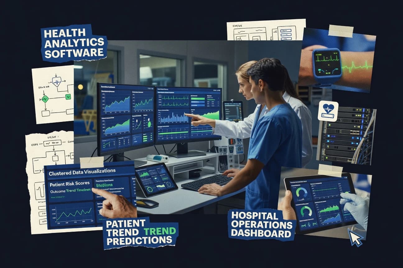
Healthcare MedicineTop 10 Best Health Analytics Software of 2026
Discover the top 10 health analytics software for powerful insights. Explore tools to drive data-driven decisions—find your fit today.

How we ranked these tools
Core product claims cross-referenced against official documentation, changelogs, and independent technical reviews.
Analyzed video reviews and hundreds of written evaluations to capture real-world user experiences with each tool.
AI persona simulations modeled how different user types would experience each tool across common use cases and workflows.
Final rankings reviewed and approved by our editorial team with authority to override AI-generated scores based on domain expertise.
Score: Features 40% · Ease 30% · Value 30%
Gitnux may earn a commission through links on this page — this does not influence rankings. Editorial policy
Editor’s top 3 picks
Three quick recommendations before you dive into the full comparison below — each one leads on a different dimension.
Tableau
Row-level security controls which patient and facility data each user can see
Built for health analytics teams needing governed dashboards and rapid visual investigation.
Power BI
Editor pickPower Query for data shaping and DAX for custom health metrics
Built for healthcare analytics teams building secure KPI dashboards from multi-source datasets.
Qlik Sense
Editor pickAssociative data model with in-memory engine for guided, cross-linked healthcare exploration
Built for health analytics teams needing fast self-service visual discovery without fixed queries.
Related reading
Comparison Table
This comparison table evaluates health analytics software used to analyze clinical, operational, and claims data with dashboards, self-service exploration, and governed reporting. It benchmarks tools including Tableau, Power BI, Qlik Sense, Looker, and Apache Superset across common evaluation points so teams can match each platform to data sources, visualization needs, and deployment constraints.
Tableau
BI and dashboardsProvides governed dashboards, interactive analytics, and data prep for healthcare reporting and operational performance tracking.
Row-level security controls which patient and facility data each user can see
Tableau stands out for turning messy, multi-source health and operational data into interactive dashboards with fast visual exploration. It supports calculated fields, row-level security, and scheduled data refresh so analysts can share controlled views across clinical, payer, and operations teams.
Its Tableau Prep workflows help standardize data for care pathways, utilization, and quality metrics before visualization. The platform also supports governed sharing through Tableau Server and Tableau Cloud for consistent reporting.
- +Highly interactive dashboards for exploring health KPics and outcomes
- +Powerful visual analytics with calculated fields and flexible parameters
- +Strong governance with row-level security and governed publishing
- +Integrates well with common healthcare data sources and warehouses
- –Complex data modeling can be hard to replicate across teams
- –Performance depends on extract design and underlying warehouse tuning
- –Advanced health-specific analytics often require building custom logic
- –Large workbook governance can become difficult without strong conventions
Best for: Health analytics teams needing governed dashboards and rapid visual investigation
More related reading
Power BI
BI and self-serviceDelivers healthcare analytics with interactive reports, semantic models, and managed data connectivity for clinical and operational metrics.
Power Query for data shaping and DAX for custom health metrics
Power BI stands out for turning health data into interactive dashboards through direct connectivity to common data sources and strong visual storytelling. It supports building clinical and operational views with DAX measures, Power Query transformations, and scheduled data refresh.
For health analytics workflows, it offers secure sharing, row-level security, and embedding for stakeholder-specific reporting. Its Microsoft ecosystem integration also helps teams blend patient, claims, and resource utilization datasets into consistent reports.
- +Rich interactive dashboards with drill-through suited for care and operations reviews
- +Power Query and DAX enable repeatable ETL and metric logic for health KPIs
- +Row-level security supports audience control for sensitive clinical reporting
- +Strong connectivity to SQL, files, and cloud data for unified analytics
- –Complex healthcare models require advanced DAX and data modeling skill
- –Governance across many datasets can become heavy without disciplined standards
- –Some advanced analytics depends on external tools rather than built-in modeling
- –Large, high-frequency refresh loads can stress performance if modeled poorly
Best for: Healthcare analytics teams building secure KPI dashboards from multi-source datasets
Qlik Sense
Associative analyticsEnables associative analytics and governed dashboards for healthcare insights across quality, utilization, and population health datasets.
Associative data model with in-memory engine for guided, cross-linked healthcare exploration
Qlik Sense stands out for its associative data modeling that lets analysts explore complex health datasets without rigid query paths. It supports interactive dashboards, governed data connections, and in-memory analytics that help spot care gaps and operational bottlenecks. Health analytics teams can combine external clinical and operational sources and then build self-service visual discovery with consistent logic and reusable assets.
- +Associative engine enables flexible exploration across linked health datasets
- +Self-service dashboards support rapid iteration on clinical and operational metrics
- +Strong governance options improve trust in shared health analytics views
- +Scalable in-memory analytics supports responsive exploration on large datasets
- –Model design still requires skill to avoid misleading associations
- –Advanced scripting and load logic can slow down new health analytics teams
- –Complex healthcare data prep is still required before analysis-ready insights
- –Performance tuning may be needed for very large extracts and heavy visualizations
Best for: Health analytics teams needing fast self-service visual discovery without fixed queries
Looker
Modeling and BIUses governed data modeling and reusable dashboards to produce consistent healthcare analytics and executive reporting.
LookML semantic layer for governed metric definitions and consistent health analytics
Looker stands out for its semantic modeling layer that centralizes health and analytics definitions across metrics. It delivers BI dashboards and interactive exploration built on governed datasets, with role-based access controls for sensitive patient and claims data. For health analytics teams, it supports embedded analytics through Looker extensions and developer-friendly APIs, which helps operationalize reporting into clinical and payer workflows.
- +Semantic layer enforces consistent health metrics across dashboards and reports
- +Strong governance with row-level security for patient and claims datasets
- +Reusable LookML models speed iteration for new health analytics views
- +Embedded analytics support for clinical and operations workflows
- –Modeling in LookML adds learning overhead for non-technical analysts
- –Dashboard creation can feel rigid without disciplined data modeling
- –Performance depends heavily on warehouse design and query optimization
Best for: Health analytics teams standardizing metrics with governed BI and embedded dashboards
Apache Superset
Open-source BIRuns a web-based BI tool to visualize healthcare datasets with SQL-based exploration and dashboard sharing.
SQL Lab plus interactive dashboard filters for rapid cohort and metric exploration
Apache Superset stands out as a flexible, open-source BI and analytics workbench built for building interactive dashboards on top of existing data warehouses and operational databases. It supports SQL-driven exploration, rich charting, dashboard filters, and scheduled refresh so teams can deliver consistent health metrics like readmission rates and cohort trends.
Users can extend functionality with custom visualizations and plugins, which supports specialized analytics workflows common in healthcare reporting. Superset also integrates with common authentication and data connectivity patterns used in healthcare data stacks.
- +Strong interactive dashboards with cross-filtering and drill-down behavior
- +SQL lab enables direct exploration and quick health metric iteration
- +Works across many backends through flexible SQLAlchemy database connectivity
- +Scheduled dashboards support recurring clinical and operational reporting
- –Complex governance needs extra effort for role-based access and auditing
- –Setting up models, caching, and performance tuning can be operationally heavy
- –Advanced self-service modeling often requires SQL and configuration work
Best for: Healthcare analytics teams needing dashboarding and SQL-based exploration on existing data
Redash
Query and dashboardingProvides shared dashboards and query cards for healthcare analytics teams to standardize reporting from multiple data sources.
Scheduled queries plus threshold-based alerting on health KPIs
Redash stands out by combining SQL-based data querying with a self-serve dashboard layer for cross-team analytics. The platform supports building charts, tables, and dashboards from scheduled or on-demand queries and sharing results through a permissions model.
It also offers alerting on query outcomes so health metrics can trigger notifications when thresholds are breached. Connectors for common data warehouses and databases make it practical for clinical, operations, and population health reporting pipelines.
- +SQL-first querying enables precise health metric definitions
- +Scheduled queries refresh dashboards for time-based reporting
- +Alerting triggers notifications when result thresholds are met
- +Shareable dashboards support collaboration across departments
- –Complex dashboards require more SQL skill than point-and-click BI
- –Modeling layered metrics can feel clunky without a semantic layer
- –Performance tuning depends heavily on query quality and indexing
Best for: Teams needing SQL-driven health dashboards with scheduled refresh and alerts
Domo
Enterprise analyticsCentralizes healthcare data into connected dashboards with automated reporting and KPI monitoring for operational and clinical workflows.
Domo Data Apps for packaging datasets and dashboards into reusable, governed workflows
Domo stands out with an all-in-one data operations experience that combines ingestion, modeling, and governed reporting in a single workspace. For health analytics, it supports dashboards, KPIs, and role-based visualizations connected to EHR, claims, and operational data sources through its connectors and APIs.
Its workflow tools help turn analytics into repeatable monitoring processes, while data governance features support controlled access to sensitive datasets. Advanced teams can extend the platform with custom integrations and calculated datasets for clinical and operational reporting.
- +Centralized dashboards for clinical and operational KPIs with fast data refresh
- +Strong connector coverage for pulling health, claims, and operational data together
- +Built-in governance controls for limiting access to sensitive health datasets
- +Workflow automation features support consistent monitoring and follow-up reporting
- –Healthcare data modeling can require specialist effort for reliable metric definitions
- –Advanced configuration and integrations can feel heavy for small analytics teams
- –Performance tuning across large datasets often needs platform knowledge
- –Less focused out-of-the-box clinical analytics than vertical-focused health tools
Best for: Organizations standardizing health and operational analytics across multiple teams
Sisense
Embedded BIDelivers analytics and embedded BI for healthcare organizations needing fast dashboarding and governed data access.
Sisense Embed enables interactive BI delivery inside health operations applications
Sisense stands out for embedding analytics into operational workflows while serving healthcare data with guided exploration. It combines a modern analytics UI with governed data pipelines and interactive dashboards for clinical, claims, and patient analytics use cases. The platform supports semantic modeling to standardize measures like readmissions and length of stay across multiple data sources.
- +Embedded analytics for patient, claims, and operations dashboards in real workflows
- +Strong semantic modeling standardizes healthcare KPIs like readmissions and LOS
- +Flexible connectivity supports common healthcare data sources and warehouses
- +Interactive dashboards support drilldowns for care management and utilization analysis
- –Advanced modeling and performance tuning can require specialized admin expertise
- –Self-service exploration still depends on well-prepared healthcare data structures
- –Large healthcare environments may need careful governance for consistent definitions
Best for: Healthcare analytics teams needing governed KPIs and embeddable dashboards
MicroStrategy
Enterprise analyticsSupports enterprise healthcare reporting with analytics, dashboards, and advanced data platform capabilities.
MicroStrategy’s Enterprise Manager governed deployment and lifecycle management
MicroStrategy stands out with deep enterprise BI capabilities combined with a governed analytics workflow for large deployments. It supports interactive dashboards, ad hoc analysis, and mobile reporting connected to enterprise data sources. The platform also offers advanced data modeling, metrics management, and role-based access controls that help standardize health KPIs across teams.
- +Strong enterprise dashboarding with governed metrics and consistent KPI definitions
- +Robust data modeling and lineage-friendly analytics across multiple health data sources
- +Detailed security controls for row-level and attribute-based access to sensitive datasets
- –Advanced configuration and administration require specialized analytics engineering skills
- –Health analytics workflows can feel heavy for smaller teams needing quick iteration
- –Dashboard and semantic customization may increase project delivery time
Best for: Large health analytics teams needing governed BI, security, and standardized KPIs
Arcadia Data
Healthcare data analyticsStreamlines healthcare analytics by providing secure data integration and analytics infrastructure for clinical and claims data.
Governed metric measurement design that standardizes quality and performance outputs across sources
Arcadia Data focuses on turning clinical and operational data into analytics through a governed data workflow that connects patient, claims, and quality sources. Core capabilities center on data ingestion, transformation, and building analytics-ready datasets for health performance reporting.
The platform also emphasizes standardized measurement design so teams can produce consistent metrics across programs. Overall, Arcadia Data is geared toward health analytics teams that need repeatable reporting pipelines rather than ad hoc spreadsheets.
- +Health-focused data pipelines that support repeatable measurement outputs
- +Governance-oriented workflow for transforming raw data into analytics-ready datasets
- +Supports standardized quality and performance metric definitions across reporting
- –Setup and metric configuration can require more technical effort than BI-only tools
- –Limited evidence of self-serve dashboarding depth for complex stakeholder views
- –Workflow is strongest for pipelines, weaker for one-off exploratory analysis
Best for: Health analytics teams building governed metrics pipelines for reporting and quality programs
Conclusion
After evaluating 10 healthcare medicine, Tableau stands out as our overall top pick — it scored highest across our combined criteria of features, ease of use, and value, which is why it sits at #1 in the rankings above.
Use the comparison table and detailed reviews above to validate the fit against your own requirements before committing to a tool.
How to Choose the Right Health Analytics Software
This buyer’s guide helps teams evaluate health analytics software for governed dashboards, secure metrics, and repeatable measurement pipelines. It covers Tableau, Power BI, Qlik Sense, Looker, Apache Superset, Redash, Domo, Sisense, MicroStrategy, and Arcadia Data so selection can match real clinical, payer, and operations workflows.
What Is Health Analytics Software?
Health analytics software turns patient, claims, and operational data into interactive reporting, self-service exploration, and standardized performance metrics. These tools solve problems like inconsistent KPI definitions, slow time-to-insight for quality and utilization reporting, and insecure access to sensitive health records. In practice, Tableau delivers governed dashboards with row-level security, while Looker centralizes health metric logic in a semantic layer with LookML for consistent executive reporting. Teams also use Redash for SQL-first querying with scheduled refresh and threshold alerting for health KPIs.
Key Features to Look For
The best health analytics platforms combine governance, metric consistency, and the right level of SQL, modeling, and embedding for clinical and operational stakeholders.
Row-level security for sensitive patient and facility data
Row-level security controls which user can see specific patient and facility records. Tableau provides row-level security in governed sharing, and Power BI also supports row-level security for audience-specific clinical reporting.
Governed metric definitions through a semantic layer
A semantic modeling layer enforces consistent health metrics across dashboards and teams. Looker uses a LookML semantic layer to standardize governed metric definitions, and Sisense includes semantic modeling to standardize KPIs like readmissions and length of stay across multiple data sources.
Self-service exploration using an associative or SQL-driven workflow
Exploration needs either flexible associative modeling or SQL-driven iteration depending on analyst skills and data complexity. Qlik Sense uses an associative data model with an in-memory engine for guided, cross-linked healthcare exploration, while Apache Superset uses SQL Lab plus interactive dashboard filters for rapid cohort and metric exploration.
Data shaping and custom health KPI logic using transformations and measures
Custom health metrics require controlled transformations and reusable calculation logic. Power BI combines Power Query for data shaping with DAX for custom health metrics, and Tableau supports calculated fields for flexible visual analytics driven by healthcare KPIs.
Scheduled data refresh and recurring reporting delivery
Scheduled refresh keeps clinical and operations dashboards aligned with evolving source data. Tableau supports scheduled data refresh and governed publishing via Tableau Server or Tableau Cloud, and Redash supports scheduled queries that refresh dashboards on time-based health reporting cycles.
Operational alerts for threshold-based health KPIs
Threshold alerting turns KPI dashboards into monitoring systems for quality and utilization. Redash triggers notifications when query results breach configured thresholds, and Domo supports workflow automation so KPI reporting can drive consistent monitoring and follow-up tasks.
How to Choose the Right Health Analytics Software
Selection should match governance requirements, metric standardization needs, and the skill mix between BI users and analytics engineering.
Match governance needs to the right security model
If access control must limit users to specific patient or facility records, Tableau is a strong fit because it provides row-level security tied to governed publishing. If the organization already relies on a Microsoft stack and needs secure clinical KPI reporting, Power BI also supports row-level security for sensitive clinical datasets.
Standardize metrics with a semantic layer when definitions must stay consistent
When teams need shared KPI definitions across dashboards and business units, Looker supports centralized metric logic in LookML. When embedded KPI delivery into operational workflows matters, Sisense standardizes healthcare KPIs with semantic modeling for metrics like readmissions and length of stay.
Choose the exploration style based on analyst workflow and data readiness
For analysts who want flexible exploration without fixed query paths, Qlik Sense uses an associative data model with an in-memory engine to connect linked health datasets quickly. For teams that iterate metrics directly in SQL, Apache Superset offers SQL Lab plus interactive dashboard filters for rapid cohort and metric exploration.
Build KPI logic using the modeling tools that fit the team’s skill set
For teams with strong data transformation and measurement skills, Power BI’s Power Query plus DAX supports repeatable ETL and metric logic for health KPIs. For teams focused on governed dashboards with calculated fields and parameter-driven exploration, Tableau’s calculated fields and governed dashboards can reduce the need for extensive custom tooling.
Decide between dashboarding plus alerts versus pipeline-focused measurement design
If health monitoring needs threshold alerts tied to specific queries, Redash supports scheduled queries and threshold-based alerting on health KPIs. If the primary challenge is producing analytics-ready datasets with standardized measurement outputs, Arcadia Data provides governed workflows centered on ingestion, transformation, and governed metric measurement design.
Who Needs Health Analytics Software?
Health analytics software fits teams that must transform sensitive clinical and claims data into consistent, governed reporting and operational decision support.
Health analytics teams needing governed dashboards and rapid visual investigation
Tableau fits this audience because it delivers interactive analytics with calculated fields plus row-level security for controlled sharing. Tableau also supports scheduled data refresh through Tableau Server or Tableau Cloud so dashboards stay current for clinical, payer, and operational teams.
Healthcare analytics teams building secure KPI dashboards from multi-source datasets
Power BI fits because it supports Power Query for data shaping and DAX for custom health metrics while also enabling row-level security. Microsoft ecosystem connectivity helps blend patient, claims, and resource utilization datasets into consistent reporting.
Health analytics teams needing fast self-service visual discovery without fixed queries
Qlik Sense fits this audience because its associative engine supports flexible exploration across linked health datasets. Qlik Sense also targets governed data connections so shared views remain trustworthy for quality, utilization, and population health analysis.
Large health analytics teams needing governed KPIs, security, and lifecycle management
MicroStrategy fits because it provides enterprise BI with governed analytics workflows and detailed security controls for row-level and attribute-based access. MicroStrategy also supports Enterprise Manager governed deployment and lifecycle management to reduce governance drift across large deployments.
Common Mistakes to Avoid
Common failure points come from mismatching security and metric governance to the selected tool and underestimating the modeling work required for reliable healthcare analytics.
Choosing dashboards without enforcing patient-level access control
Tools that lack governance discipline can expose sensitive health records if row-level controls are not designed. Tableau provides row-level security for governed dashboards, while Power BI supports row-level security for audience-specific reporting.
Trying to standardize KPIs without a semantic or governed metric layer
If KPI definitions vary by workbook or report, stakeholders get conflicting readmission or length-of-stay metrics. Looker centralizes metric definitions in LookML, and Sisense standardizes measures through semantic modeling for healthcare KPIs like readmissions and LOS.
Under-scoping data modeling work for complex healthcare transformations
Complex healthcare models often require advanced DAX or semantic modeling skills, which can slow delivery if the team expects point-and-click results. Power BI depends on Power Query and DAX, while Looker requires LookML modeling skill for consistent governed definitions.
Assuming self-serve analytics works without query tuning and data readiness
Performance and correctness can suffer when extracts, indexing, or dataset structures are not engineered for healthcare workloads. Apache Superset performance depends on warehouse design and query optimization, while Redash performance depends on query quality and indexing.
How We Selected and Ranked These Tools
We evaluated Tableau, Power BI, Qlik Sense, Looker, Apache Superset, Redash, Domo, Sisense, MicroStrategy, and Arcadia Data by scoring every tool on three sub-dimensions. Features received a weight of 0.4, ease of use received a weight of 0.3, and value received a weight of 0.3. The overall rating equals 0.40 × features + 0.30 × ease of use + 0.30 × value. Tableau separated itself most clearly on the features dimension by combining interactive governed dashboards with row-level security and scheduled refresh through Tableau Server or Tableau Cloud, which supports both secure access and rapid visual investigation for health analytics teams.
Frequently Asked Questions About Health Analytics Software
Which health analytics platform best supports governed dashboards with row-level controls?
How do Tableau and Power BI differ for transforming health data before visualization?
Which tool is strongest for self-serve exploration when analysts need flexible querying of complex datasets?
What option helps standardize health metrics definitions across many teams?
Which software works best for embedding health analytics into other operational applications?
Which platform is better for SQL-based dashboards with alerting on healthcare KPIs?
What tool fits teams that already have a warehouse and want to build dashboards with minimal data pipeline changes?
Which option helps package repeatable health analytics workflows and datasets for multiple stakeholders?
How should healthcare teams choose between Qlik Sense and Tableau for cohort and care-gap analysis?
Tools reviewed
Primary sources checked during evaluation.
Referenced in the comparison table and product reviews above.
Keep exploring
Comparing two specific tools?
Software Alternatives
See head-to-head software comparisons with feature breakdowns, pricing, and our recommendation for each use case.
Explore software alternatives→In this category
Healthcare Medicine alternatives
See side-by-side comparisons of healthcare medicine tools and pick the right one for your stack.
Compare healthcare medicine tools→FOR SOFTWARE VENDORS
Not on this list? Let’s fix that.
Our best-of pages are how many teams discover and compare tools in this space. If you think your product belongs in this lineup, we’d like to hear from you—we’ll walk you through fit and what an editorial entry looks like.
Apply for a ListingWHAT THIS INCLUDES
Where buyers compare
Readers come to these pages to shortlist software—your product shows up in that moment, not in a random sidebar.
Editorial write-up
We describe your product in our own words and check the facts before anything goes live.
On-page brand presence
You appear in the roundup the same way as other tools we cover: name, positioning, and a clear next step for readers who want to learn more.
Kept up to date
We refresh lists on a regular rhythm so the category page stays useful as products and pricing change.