GITNUXSOFTWARE ADVICE
Finance Financial ServicesTop 10 Best Financial Presentation Software of 2026
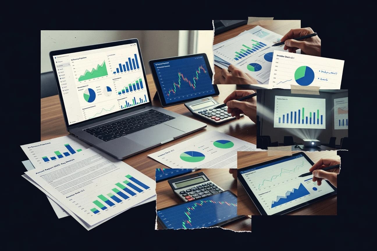
Discover top financial presentation software to create stunning slides.

How we ranked these tools
Core product claims cross-referenced against official documentation, changelogs, and independent technical reviews.
Analyzed video reviews and hundreds of written evaluations to capture real-world user experiences with each tool.
AI persona simulations modeled how different user types would experience each tool across common use cases and workflows.
Final rankings reviewed and approved by our editorial team with authority to override AI-generated scores based on domain expertise.
Score: Features 40% · Ease 30% · Value 30%
Gitnux may earn a commission through links on this page — this does not influence rankings. Editorial policy
Editor’s top 3 picks
Three quick recommendations before you dive into the full comparison below — each one leads on a different dimension.
Beautiful.ai
Smart Layout that automatically reflows slide elements when financial content changes
Built for teams creating polished investor and board decks with controlled branding and fast iteration.
Pitch
Editor pickPitch reusable components with data linking for faster updates across multi-deck financial narratives
Built for finance teams building investor decks with reusable, data-linked slide components.
Canva
Editor pickBrand Kit with reusable styles for consistent charts, typography, and colors across financial decks
Built for teams creating polished financial slide decks with strong branding and quick iteration.
Related reading
Comparison Table
This comparison table evaluates financial presentation software used to build slide decks for earnings updates, investor pitches, and recurring reporting. It compares tools such as Beautiful.ai, Pitch, Canva, Microsoft PowerPoint, and Google Slides across key presentation capabilities so readers can match software to their workflow and collaboration needs.
Beautiful.ai
AI slide designGenerates and edits presentation slides with automated layout, style, and data-driven visuals.
Smart Layout that automatically reflows slide elements when financial content changes
Beautiful.ai stands out with layout automation that keeps financial slides aligned as content changes. It delivers chart-friendly design blocks, brand controls, and reusable themes for fast turnaround on investor and board decks.
Core workflows include live editing of visuals, consistent typography and spacing, and export-ready slide outputs for common presentation formats. Collaboration tools support versioned iteration across teams building recurring financial narratives.
- +AI-driven layout rules keep charts and tables visually consistent during edits
- +Brand kit controls typography, colors, and logo placement for finance storytelling
- +Reusable slide templates speed creation of repeatable quarterly reporting decks
- +Automated chart formatting reduces manual spacing work for financial slides
- +Collaboration supports reviewing and refining slide sets with fewer layout regressions
- –Highly custom layouts can require workarounds against strict design automation
- –Complex financial visuals may need manual adjustment beyond standard blocks
- –Advanced data modeling stays limited compared to dedicated BI tools
- –Presentation logic for multi-scenario reporting can become cumbersome
Best for: Teams creating polished investor and board decks with controlled branding and fast iteration
More related reading
Pitch
collaborative decksCreates collaborative pitch decks with reusable themes and smart design assistance.
Pitch reusable components with data linking for faster updates across multi-deck financial narratives
Pitch stands out by turning slide creation into a structured, template-driven workflow with reusable components. It provides financial presentation support through data-linked visuals, dynamic layouts, and animated storyboarding for investor-ready decks.
Presenters can collaborate in real time and manage versioned content inside a single document. Exports and sharing options support distributing decks outside the editor.
- +Template and component system keeps financial decks consistent across sections
- +Data-linked visuals reduce manual updates during forecasting and scenario reviews
- +Presenter controls and animations support clear narrative flow for investor meetings
- +Real-time collaboration speeds review cycles for finance and leadership stakeholders
- –Advanced modeling still depends on external tools for complex financial logic
- –Formatting for unusual chart styles can require workarounds in the slide editor
- –Export fidelity can limit pixel-perfect layouts for downstream brand systems
Best for: Finance teams building investor decks with reusable, data-linked slide components
Canva
template-based designBuilds presentation slides from templates and design assets with team collaboration and export controls.
Brand Kit with reusable styles for consistent charts, typography, and colors across financial decks
Canva stands out with a design-first canvas that blends slide building and graphic design in one workflow. Financial presentations benefit from prebuilt templates, drag-and-drop layout tools, and a large asset library for charts, icons, and branded visuals.
Presentations export cleanly to common formats and support live collaboration with versioned editing. The tool is strongest for visually rich decks where storytelling and styling matter more than strict finance-specific modeling.
- +Drag-and-drop slide building with extensive template variety for business storytelling
- +Chart and diagram components speed up visualizing financial concepts without coding
- +Brand Kit and reusable styles keep financial decks visually consistent across teams
- +Collaboration tools support real-time editing and comment-driven feedback on slides
- +Exports cover common presentation formats for sharing with executives and clients
- –No native spreadsheet-grade modeling for financial statements beyond basic visuals
- –Complex multi-step chart transformations require manual workarounds
- –Data refresh automation is limited for frequent updates to underlying numbers
- –Advanced presentation governance tools like strict approvals are not as granular
Best for: Teams creating polished financial slide decks with strong branding and quick iteration
Microsoft PowerPoint
enterprise slidesProduces finance-ready slide decks with advanced charting, formatting, and corporate file management.
Excel data link for updating charts and tables inside PowerPoint
PowerPoint stands out for its deep integration with Microsoft 365 apps and corporate file standards, plus broad compatibility with shared slide formats. It supports financial storytelling with charts, tables, and live-linked objects that can reflect updated Excel data.
Strong accessibility tools like alt text and keyboard navigation help teams meet review and compliance needs. Collaboration features cover co-authoring and review workflows that fit finance teams preparing investor and board decks.
- +Excel-linked charts update instantly for refreshed quarterly metrics
- +Reusable templates and themes speed creation of consistent financial decks
- +Co-authoring and comments streamline board-ready review cycles
- +Built-in export to PDF and image formats supports secure sharing
- –Large decks with heavy media can slow editing on mid-range hardware
- –Data modeling requires Excel work, so it lacks native financial analytics
- –Version control can be harder when multiple authors edit complex layouts
Best for: Finance teams building investor and board decks with Excel-linked data
Google Slides
cloud collaborationCreates and shares slide presentations with real-time collaboration and integrated chart workflows.
Linked charts from Google Sheets that update in slides when underlying data changes
Google Slides is tightly integrated with Google Drive and Google Docs, which simplifies sharing and version management for financial decks. It supports charts built from Sheets data, speaker notes, and presentation formats like PDF and PPTX for investor-ready exports.
Collaboration tools enable real-time co-editing, comments, and chat tied to specific slides. Its strength is fast iteration on visuals and narratives, while advanced finance-specific modeling and controls are limited.
- +Real-time co-authoring with slide-level comments supports rapid financial reviews
- +Linked charts from Google Sheets keep KPIs consistent across versions
- +Export to PPTX and PDF works well for board packs and investor decks
- –No native budgeting or forecasting engine for financial model behavior
- –Chart styling and layout control can be limiting for complex KPI dashboards
- –Master slide automation is weaker than specialized design tooling for templates
Best for: Finance teams collaborating on investor decks and KPI presentations in shared documents
Prezi
storytellingPresents financial stories using zoomable, non-linear layouts that render into shareable presentations.
Zooming canvas presentation with path-based transitions
Prezi stands out with zooming canvas presentations that keep financial narratives visually dynamic. It supports slide-like content plus paths for transitions, which can help explain trends and KPI changes with spatial context.
Collaboration and export options support internal finance reviews and client-ready sharing, though strict template-driven reporting can feel less direct than in slide-first editors. Built-in media tools and design controls help teams assemble charts and visuals into cohesive storylines.
- +Zooming canvas makes complex financial stories easier to navigate visually
- +Path-based transitions connect KPIs with consistent movement and pacing
- +Strong collaboration tools support review cycles for finance stakeholders
- –Less intuitive for strictly grid-based financial slide layouts
- –Charting workflows are not as robust as dedicated BI or spreadsheet tooling
- –Zoom transitions can distract in executive one-message decks
Best for: Finance teams creating visual KPI narratives with zoom-style storytelling
Visme
data visualizationDesigns data-rich presentations with chart widgets, dashboard-style visuals, and reusable brand templates.
Brand Kit that enforces consistent styling across charts, infographics, and slide templates
Visme distinguishes itself with a visual design workflow that blends presentation building with dashboard-style components and data-driven visuals. It supports slide creation, brand styling controls, and embedding interactive elements like links and media for stakeholder-ready financial narratives. Charting, iconography, and template libraries help teams turn spreadsheet figures into consistent charts and infographic-style slides.
- +Large template library for turning financial content into polished slide decks
- +Chart and data visualization blocks speed up building recurring financial visuals
- +Brand kit controls keep typography and colors consistent across investor updates
- –Advanced layout control can feel less precise than dedicated slide editors
- –Data-driven updates require more setup than simple spreadsheet linking
- –Collaboration features lag behind specialized productivity and presentation stacks
Best for: Finance teams creating repeatable investor decks with strong visual design
Zoho Show
business presentationCreates slideshow presentations with templates, collaboration features, and export options for business decks.
Spreadsheet-style layout and chart integration for quickly updating financial visuals
Zoho Show stands out with a spreadsheet-like build experience and tight Zoho ecosystem integration for creating presentation content from structured data. It supports slide templates, charts, and media embedding suited for investor and board materials.
Financial teams can import and reuse numbers via compatible Zoho tools, then format visuals quickly for recurring reporting packs. Collaboration and versioning features help multiple contributors refine the same deck.
- +Chart and visualization workflows fit recurring financial reporting
- +Zoho ecosystem connections speed reuse of structured data
- +Templates and themes reduce formatting time for standard decks
- –Advanced finance-specific visuals require more manual setup
- –Granular governance controls for decks are limited compared to enterprise suites
- –Complex animations and transitions can become harder to manage
Best for: Finance teams building reusable investor decks with light collaboration
LibreOffice Impress
open-source desktopBuilds slide decks with offline editing, chart support, and document compatibility for finance presentations.
Master Slides for consistent layouts across large financial presentation libraries
LibreOffice Impress stands out for delivering a full desktop presentation suite with deep slide editing and compatibility-friendly formats. It supports creating financial decks with master slides, reusable themes, speaker notes, and chart objects for common business visualizations.
Impress also offers exporting to PDF and basic animation and transition controls, plus offline editing without browser constraints. Collaboration relies on file sharing and standard document formats rather than real-time coauthoring workflows.
- +Master slides and layout templates speed consistent financial branding
- +Chart objects support editable data sources inside slides
- +Strong PDF and Office-compatible export for board-ready sharing
- –Advanced animation and transitions can feel less polished than premium editors
- –Object alignment and spacing tools require more manual adjustment
- –File-based collaboration lacks real-time review and version control
Best for: Finance teams creating slide decks with offline editing and chart-heavy reporting
Apple Keynote
desktop presentationDesigns polished finance presentations with built-in themes, charts, and smooth rendering on Apple devices.
Presenter Display and speaker notes that keep complex financial walkthroughs on track
Keynote stands out for producing polished slides with strong Apple-native design tools and presentation polish. It supports data-driven visuals through charts and table-based layouts, plus smooth animations and speaker notes for guided financial narratives.
It also integrates closely with macOS workflows and can export to common file formats for client sharing. Financial teams can build reusable slide layouts and master styling to keep earnings decks and forecasts visually consistent.
- +High-quality chart formatting for KPI, trend, and comparison slides
- +Master slides and reusable layouts speed repeat earnings and forecast decks
- +Smooth animations and speaker notes improve delivery of financial walkthroughs
- –Limited advanced financial modeling features compared with dedicated FP&A tools
- –Collaboration controls are less robust than enterprise slide and workflow platforms
- –Data linking and refresh workflows can become manual for frequent updates
Best for: Finance teams creating visually consistent earnings and investor presentation decks
Conclusion
After evaluating 10 finance financial services, Beautiful.ai stands out as our overall top pick — it scored highest across our combined criteria of features, ease of use, and value, which is why it sits at #1 in the rankings above.
Use the comparison table and detailed reviews above to validate the fit against your own requirements before committing to a tool.
How to Choose the Right Financial Presentation Software
This buyer's guide covers how to select financial presentation software for investor decks, board packs, and KPI storytelling. It compares tools including Beautiful.ai, Pitch, Canva, Microsoft PowerPoint, Google Slides, Prezi, Visme, Zoho Show, LibreOffice Impress, and Apple Keynote. The guide focuses on slide automation, data linking, collaboration, and export workflows that match recurring financial reporting needs.
What Is Financial Presentation Software?
Financial presentation software is a tool used to create and refine slide decks with charts, tables, and narrative layouts for financial audiences. It solves layout drift when numbers change, reduces manual reformatting across recurring reporting cycles, and supports collaboration through comments, co-authoring, or versioned review. Tools like Microsoft PowerPoint support Excel data links for updating charts and tables, while Google Slides supports linked charts from Google Sheets that refresh inside slides. Design-driven options like Canva combine branded visual layouts with chart and diagram components for finance storytelling.
Key Features to Look For
The right combination of these capabilities prevents rework when financial content changes and speeds review cycles for investor and board stakeholders.
Smart layout reflow for changing charts and tables
Beautiful.ai uses Smart Layout to automatically reflow slide elements when financial content changes, which keeps tables and charts aligned during edits. Pitch also relies on template-driven components that maintain structure across multi-deck narratives when content updates.
Data-linked visuals that refresh from spreadsheets
Microsoft PowerPoint provides an Excel data link so charts and tables update inside PowerPoint when Excel data is refreshed. Google Slides provides linked charts from Google Sheets that update in slides when underlying KPI values change.
Reusable components and templates for recurring financial decks
Pitch uses reusable components with data linking so quarterly and scenario decks keep consistent formatting across sections. Beautiful.ai offers reusable slide templates for repeatable quarterly reporting decks with fewer layout regressions.
Brand kit controls for typography, colors, and logo placement
Beautiful.ai includes brand controls that govern typography, colors, and logo placement for finance storytelling. Canva and Visme also enforce brand consistency through Brand Kit features that keep charts and slide styling uniform across teams.
Collaboration that supports finance review workflows
Google Slides delivers real-time co-authoring with slide-level comments for rapid financial reviews. Pitch supports real-time collaboration with versioned content inside a single document, which helps leadership and finance stakeholders refine the same investor deck.
Storytelling transitions for visual KPI narratives
Prezi provides a zooming canvas with path-based transitions that connect KPIs with visible movement for non-linear financial storytelling. Apple Keynote adds smooth animations and speaker notes that keep complex financial walkthroughs on track during delivery.
How to Choose the Right Financial Presentation Software
Selection should start with how financial numbers move into slides and how the team reviews and updates decks over time.
Start with the update method for financial numbers
If spreadsheet-linked charts must refresh automatically, Microsoft PowerPoint with Excel data link updates charts and tables in place. If work is managed in Google Sheets, Google Slides provides linked charts that update in slides when KPI data changes.
Choose automation depth based on the typical layout workload
Teams that frequently edit financial tables and charts should prioritize Beautiful.ai because Smart Layout reflows slide elements automatically during edits. Teams that rely on structured templates and repeating sections should consider Pitch because reusable components keep deck sections consistent while content changes.
Match the tool to deck style and visualization complexity
Design-first teams creating visually rich financial decks should evaluate Canva since it combines drag-and-drop slide building with extensive template variety and chart and diagram components. For dashboard-style, data-rich layouts with infographic-style slides, Visme offers chart widgets and dashboard-like visual components.
Confirm collaboration fit for finance and leadership review
For real-time co-editing with targeted feedback, Google Slides supports slide-level comments tied to the deck. For structured review cycles inside a single deck document, Pitch supports real-time collaboration and versioned content that teams can refine together.
Plan for export and delivery requirements
If board packs and investor decks require reliable PDF and Office-compatible exports, LibreOffice Impress provides PDF and Office-compatible export with master slides and chart objects. For live delivery flow, Apple Keynote includes Presenter Display and speaker notes that guide complex financial walkthroughs.
Who Needs Financial Presentation Software?
Financial presentation software fits teams that repeatedly turn metrics into slide-ready narratives with charts, tables, and consistent branding.
Finance teams creating investor and board decks with controlled branding and fast iteration
Beautiful.ai is designed for polished investor and board decks with Smart Layout that keeps charts and tables aligned during edits. Pitch also fits this work with reusable components and data-linked visuals that reduce manual updates across multi-deck narratives.
Finance teams that run reporting inside spreadsheets and need refreshable charts
Microsoft PowerPoint supports Excel data link so quarterly numbers refresh directly inside slides. Google Slides supports linked charts from Google Sheets so KPI updates propagate into deck visuals.
Teams prioritizing visual storytelling style for KPI explanations
Prezi fits teams that want zoomable, non-linear presentations with path-based transitions to connect KPIs. Apple Keynote fits teams that want smooth animations and speaker notes with Presenter Display for guided financial walkthroughs.
Finance teams building repeatable, design-consistent reporting decks with dashboard-style visuals
Visme fits recurring investor updates with chart and data visualization blocks plus a Brand Kit for consistent typography and colors. Canva fits visually rich financial decks with Brand Kit controls and reusable styles for charts and deck elements.
Common Mistakes to Avoid
Common issues come from mismatched automation, weak data refresh workflows, and collaboration patterns that do not match how finance teams review decks.
Building complex financial layouts that fight the tool’s automation
Beautiful.ai can require workarounds for highly custom layouts that challenge strict design automation, which can add manual editing. Visme can feel less precise than dedicated slide editors for advanced layout control, which can create alignment rework for dense financial grids.
Relying on slide tools for deep financial modeling
Pitch depends on external tools for complex financial logic, which limits native advanced modeling. Canva and Keynote also provide charts and visuals, but they do not replace spreadsheet-grade budgeting or forecasting engines for model behavior.
Forgetting how chart styling and unusual chart formats behave in the editor
Pitch can require workarounds for unusual chart styles, which can slow preparation for niche finance visuals. Google Slides can limit chart styling and layout control for complex KPI dashboards, which can create manual adjustments.
Choosing a workflow that does not match review and versioning needs
LibreOffice Impress relies on file-based collaboration instead of real-time coauthoring, which can slow version control across distributed finance teams. Prezi can be less intuitive for strictly grid-based financial slide layouts, which can hurt teams preparing one-message executive decks.
How We Selected and Ranked These Tools
We evaluated every tool on three sub-dimensions with features weighted at 0.4, ease of use weighted at 0.3, and value weighted at 0.3. The overall rating equals the weighted average of those three dimensions using overall = 0.40 × features + 0.30 × ease of use + 0.30 × value. Beautiful.ai separated itself from lower-ranked tools on features by delivering Smart Layout that automatically reflows slide elements when financial content changes. That automation directly reduces layout regressions during iterative updates, which improves both practical deck-building speed and edit confidence for finance teams.
Frequently Asked Questions About Financial Presentation Software
Which tool best keeps slide layouts aligned when financial data changes mid-review?
What option is strongest for updating the same set of financial visuals across many decks?
Which software provides the most direct Excel-connected workflow for charts and tables?
Which platform is most efficient for co-authoring a financial deck with comments tied to specific slides?
Which tool is best for building visually rich financial decks that rely on strong branding and graphics assets?
Which software helps explain KPI trends using spatial or transition-based storytelling?
What is the best choice for spreadsheet-style content building inside a presentation editor?
Which option is strongest for offline, compatibility-friendly editing with consistent master-slide layouts?
Which tool is most suitable for polished earnings walkthroughs with guided speaker notes and presentation polish?
Tools reviewed
Primary sources checked during evaluation.
Referenced in the comparison table and product reviews above.
Keep exploring
Comparing two specific tools?
Software Alternatives
See head-to-head software comparisons with feature breakdowns, pricing, and our recommendation for each use case.
Explore software alternatives→In this category
Finance Financial Services alternatives
See side-by-side comparisons of finance financial services tools and pick the right one for your stack.
Compare finance financial services tools→FOR SOFTWARE VENDORS
Not on this list? Let’s fix that.
Our best-of pages are how many teams discover and compare tools in this space. If you think your product belongs in this lineup, we’d like to hear from you—we’ll walk you through fit and what an editorial entry looks like.
Apply for a ListingWHAT THIS INCLUDES
Where buyers compare
Readers come to these pages to shortlist software—your product shows up in that moment, not in a random sidebar.
Editorial write-up
We describe your product in our own words and check the facts before anything goes live.
On-page brand presence
You appear in the roundup the same way as other tools we cover: name, positioning, and a clear next step for readers who want to learn more.
Kept up to date
We refresh lists on a regular rhythm so the category page stays useful as products and pricing change.