GITNUXSOFTWARE ADVICE
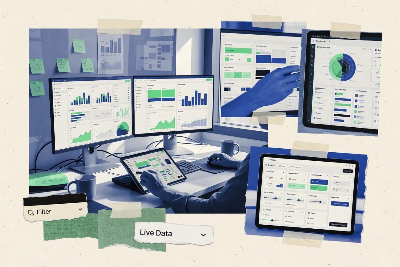
Data Science AnalyticsTop 10 Best Custom Dashboard Software of 2026
Discover leading custom dashboard software tools to build analytics dashboards. Compare features, pick the best, boost data insights today.

How we ranked these tools
Core product claims cross-referenced against official documentation, changelogs, and independent technical reviews.
Analyzed video reviews and hundreds of written evaluations to capture real-world user experiences with each tool.
AI persona simulations modeled how different user types would experience each tool across common use cases and workflows.
Final rankings reviewed and approved by our editorial team with authority to override AI-generated scores based on domain expertise.
Score: Features 40% · Ease 30% · Value 30%
Gitnux may earn a commission through links on this page — this does not influence rankings. Editorial policy
Editor’s top 3 picks
Three quick recommendations before you dive into the full comparison below — each one leads on a different dimension.
Apache Superset
Native SQL Lab plus semantic dataset layers for reusable metrics and dashboard consistency
Built for teams building interactive, shareable dashboards from existing SQL data pipelines.
Metabase
Editor pickNative SQL querying with semantic modeling that standardizes metrics across dashboards
Built for teams needing SQL-backed dashboards with governed sharing and alerting.
Grafana
Editor pickUnified alerting that evaluates rules against dashboard queries and sends notifications.
Built for teams building query-driven dashboards and alerts across multiple data sources.
Related reading
Comparison Table
This comparison table evaluates Custom Dashboard Software platforms such as Apache Superset, Metabase, Grafana, Microsoft Power BI, Tableau, and others across common selection criteria. You can use the side-by-side layout to compare dashboard creation workflows, data connectivity options, permissions and governance features, and operational fit for teams building and maintaining analytics views.
Apache Superset
open-source BIApache Superset lets you build and share custom dashboards with SQL queries, interactive charts, and role-based access on top of many data sources.
Native SQL Lab plus semantic dataset layers for reusable metrics and dashboard consistency
Apache Superset stands out as an open source BI dashboarding platform with SQL-first workflows and a large set of built-in visualization types. It connects to many data sources, supports interactive filters and drill-through, and lets you publish dashboards for shared analytics. You can embed dashboards via supported visualization APIs, and you can manage permissions with role-based access for teams and projects.
- +SQL-based modeling with rich chart types and dashboard interactions
- +Strong data connector ecosystem across common databases and engines
- +Role-based access controls for governed sharing across teams
- +Works well for embedding dashboards into internal web apps
- –Advanced setup and tuning can require data and admin expertise
- –Complex dashboards can become slower without careful caching and query optimization
- –Governance and asset lifecycle features are weaker than dedicated enterprise BI suites
Best for: Teams building interactive, shareable dashboards from existing SQL data pipelines
More related reading
Metabase
BI dashboardsMetabase enables teams to create custom dashboards and explore data with a simple query experience and strong sharing controls.
Native SQL querying with semantic modeling that standardizes metrics across dashboards
Metabase stands out for turning SQL-first analytics into shareable dashboards for business users. It supports interactive filters, drill-through, and scheduled email or Slack delivery of dashboard views.
Built-in modeling and alerting help teams standardize metrics across reports without building a custom BI application. Its strongest fit is self-serve analytics with governed access rather than pixel-perfect dashboard design tooling.
- +SQL-powered datasets keep metric logic close to the data
- +Interactive dashboards include filters, drill-through, and saved questions
- +Role-based permissions support governed sharing across teams
- +Alerting and scheduled delivery keep stakeholders updated automatically
- –Advanced customization requires SQL and model work for many teams
- –Highly bespoke UI layouts can feel limited versus custom front ends
- –Dashboards depend on well-structured data models to avoid confusion
Best for: Teams needing SQL-backed dashboards with governed sharing and alerting
Grafana
observability dashboardsGrafana provides highly customizable dashboards and alerting for metrics, logs, and traces with a large plugin ecosystem.
Unified alerting that evaluates rules against dashboard queries and sends notifications.
Grafana stands out for turning many data sources into a single, customizable observability dashboard experience. It supports powerful dashboard building with panels, variables, and reusable templates, plus alerting tied to query results.
Grafana integrates well with time series and metrics stacks and offers mature governance via folder permissions and team access. It is strongest when you need repeatable dashboard patterns across services, environments, and teams.
- +Rich dashboard customization with panels, transformations, and template variables
- +Strong alerting linked directly to dashboard queries
- +Reusable dashboard infrastructure with folders, permissions, and provisioning
- –Dashboard creation can feel complex for users new to query-driven panels
- –Advanced features often require deeper understanding of data source queries
- –Managing large dashboard fleets needs deliberate conventions and governance
Best for: Teams building query-driven dashboards and alerts across multiple data sources
Microsoft Power BI
enterprise BIPower BI supports custom dashboard creation with rich visuals, interactive filtering, and enterprise governance features.
DirectQuery mode for near-real-time dashboards without importing full datasets
Power BI stands out with deep Microsoft ecosystem integration through Microsoft Fabric, Excel, and Azure services. It delivers end-to-end dashboard creation with interactive reports, dashboards, data modeling, and scheduled data refresh for many common sources. Strong governance features like row-level security and organizational sharing make it suitable for departmental and enterprise reporting.
- +Tight integration with Excel, Azure, and Microsoft Fabric
- +Robust semantic modeling with calculated measures and relationships
- +Row-level security for governed, per-user data access
- +Scheduled refresh supports large-scale automated updates
- +Interactive drill-through and cross-filtering on dashboards
- –Modeling complexity increases quickly for advanced scenarios
- –Custom visuals add variability and can require extra maintenance
- –RLS and permissions management can be harder than users expect
Best for: Organizations building governed, interactive dashboards with Microsoft-centric data workflows
Tableau
enterprise analyticsTableau helps you build customized dashboards with strong data visualization tooling and governed sharing for teams.
VizQL and high-performance interactive dashboards with drill-down, filters, and parameters
Tableau stands out for turning large, messy datasets into interactive dashboards with fast visual exploration. It supports drag-and-drop building, calculated fields, parameter-driven views, and a wide set of native chart types for business reporting.
Tableau Server and Tableau Cloud enable governed sharing, scheduled refresh, and role-based access across teams. It also connects to many data sources with strong data modeling options through Tableau’s relationships and extracts.
- +Powerful interactive dashboards with rich filters and drill-down behavior
- +Strong data connectivity plus extracts for responsive, high-volume exploration
- +Governed sharing with Tableau Server or Tableau Cloud and role-based access
- –Advanced modeling and performance tuning can require specialist skills
- –License costs rise quickly for scaling across many editors and viewers
- –Calculated logic and parameters can get complex in large workbook estates
Best for: Organizations building governed, interactive BI dashboards with complex calculations
Zoho Analytics
self-serve BIZoho Analytics offers dashboard building with data preparation, scheduled refresh, and sharing for business reporting workflows.
Scheduled data refresh with governed dashboard publishing and drill-down reporting
Zoho Analytics stands out for its strong Zoho ecosystem integration and flexible dashboard building from prepared data models. It supports visual dashboarding, scheduled data refresh, and drill-down reporting with filters and interactive widgets.
Analysts can build reports from multiple sources using Zoho connectors and data prep features, then publish dashboards for teams. It also offers role-based access controls for governed sharing across organizations.
- +Interactive dashboards with drill-down charts and filter controls
- +Scheduled refresh keeps dashboards current without manual rework
- +Strong connectors for common data sources and Zoho products
- +Role-based sharing supports governed visibility for teams
- +Data preparation tools improve modeling before dashboarding
- –Dashboard design can feel less intuitive than simpler BI tools
- –Advanced modeling workflows take time to learn effectively
- –Performance tuning can be necessary for large datasets
Best for: Teams needing governed, connector-rich dashboards with scheduled refresh
Qlik Sense
associative BIQlik Sense delivers interactive custom dashboards driven by associative analytics and governed enterprise deployment options.
Associative indexing and in-memory search power flexible, relationship-based exploration.
Qlik Sense stands out with associative analytics that lets users explore linked data without predefined drill paths. It delivers self-service dashboards with interactive visualizations, guided data prep, and real-time style updates through its Qlik engine.
You can publish and govern apps across teams using role-based access and centralized management of sheets and data models. Integration with common data sources and scripting-based transformations supports repeatable, scalable dashboard builds.
- +Associative data model enables intuitive cross-filtering across related fields
- +Interactive dashboards with rich visualization options and drilldown behavior
- +Robust data load scripting supports reusable transformations
- +Strong governance with role-based access and managed app distribution
- –Data modeling and load scripting add complexity for non-technical teams
- –Licensing and deployment options can raise total cost for small teams
- –Advanced app performance tuning can be required on large datasets
Best for: Teams needing associative analytics dashboards with controlled governance and data modeling
Redash
lightweight BIRedash lets you build shareable custom dashboards by composing queries and visualizations with SQL and dashboard widgets.
SQL query scheduling that refreshes dashboard cards and pinned results on a set cadence
Redash centers custom dashboards on reusable SQL queries connected to supported data sources. It lets teams build visualizations, pin question-driven results, and schedule queries so dashboards stay fresh without manual refreshes.
You can share dashboards and results across the organization with role-based access controls. Redash also supports alerting on query outcomes for faster operational response to changing metrics.
- +SQL-first dashboards for teams that already standardize on database queries
- +Scheduled queries refresh dashboards automatically without external orchestration
- +Alerting triggers from query results for operational monitoring workflows
- +Share dashboards with teammates using access controls
- +Query results can be visualized in multiple chart types
- –Less friendly for non-technical users compared with drag-and-drop builders
- –Dashboard UX can feel query-centric instead of dashboard-centric
- –Managing many data sources and permissions can become operational overhead
Best for: Data teams building SQL-driven dashboards and alerts from existing warehouses
Apache ECharts
frontend chartsApache ECharts provides a flexible JavaScript charting system for building custom interactive dashboards in web applications.
ECharts option model enables deep chart customization with interactive behaviors
Apache ECharts stands out for delivering high-quality, interactive charts through a lightweight, code-first JavaScript visualization engine. It supports dashboard building with many built-in chart types, powerful customization via options, and responsive rendering across browsers.
The library also enables rich interactivity such as tooltips, legends, brushing, and event-driven updates for custom dashboards. ECharts focuses on visualization rather than end-to-end dashboard workflows like user management or report scheduling.
- +Large set of chart types including maps, sankey, and heatmaps
- +Highly configurable chart options with strong theming support
- +Interactive features like tooltips, zooming, and clickable series events
- +Responsive rendering fits dashboard layouts without heavy tooling
- –No native dashboard builder or drag-and-drop layout editor
- –Requires JavaScript development for real dashboard workflows
- –Data querying and backend integration are left to your stack
- –Cross-team governance needs custom implementation for roles and audit
Best for: Teams building custom, code-driven dashboards with complex chart interactivity
Kibana
search dashboardsKibana creates custom dashboards for search and observability data with interactive visualizations backed by Elasticsearch.
Lens for drag-and-drop visualization building with interactive filtering and drilldowns
Kibana turns Elasticsearch and data from Elastic apps into interactive dashboards with real-time filters, drilldowns, and time-series visualizations. You can build custom dashboards with Lens, classic visualizations, and map panels, then share them through embedded views and saved objects.
Its alerting and reporting features support operational monitoring use cases by connecting dashboards to thresholds and scheduled exports. The workflow is strongest when your data is already in Elasticsearch and you accept Elastic-specific configuration.
- +Tight Elasticsearch integration delivers fast dashboard queries
- +Lens and classic visualizations cover common chart types
- +Saved searches and drilldowns speed navigation across dashboards
- +Built-in alerting links dashboard context to operational events
- –Dashboard creation feels complex without Elastic data modeling
- –Custom UI beyond Kibana visuals requires separate development
- –Embedding and permissions setup can be nontrivial
- –Large deployments add overhead for index management
Best for: Teams building Elasticsearch-backed monitoring dashboards with interactive exploration
Conclusion
After evaluating 10 data science analytics, Apache Superset stands out as our overall top pick — it scored highest across our combined criteria of features, ease of use, and value, which is why it sits at #1 in the rankings above.
Use the comparison table and detailed reviews above to validate the fit against your own requirements before committing to a tool.
How to Choose the Right Custom Dashboard Software
This buyer's guide helps you choose custom dashboard software by mapping real dashboard capabilities to real use cases. It covers Apache Superset, Metabase, Grafana, Microsoft Power BI, Tableau, Zoho Analytics, Qlik Sense, Redash, Apache ECharts, and Kibana. You will learn what features to require, how to validate them in practice, and which mistakes to avoid across these platforms.
What Is Custom Dashboard Software?
Custom dashboard software lets teams build interactive dashboards that combine data visualizations, filters, drilldowns, and sharing controls. It solves the problem of turning repeated analytics into reusable screens for stakeholders and operational teams. Many teams use SQL-first tools like Apache Superset and Metabase to keep metric logic close to the database. Other teams use visualization and alerting-centric platforms like Grafana and Kibana to run queries and attach notifications to dashboard results.
Key Features to Look For
The right feature set determines whether your dashboards stay consistent, performant, and governable as the number of dashboards and users grows.
SQL-first dashboard building with reusable semantic datasets
Look for SQL-based workflows plus a way to standardize metrics across dashboards so teams stop recreating the same logic. Apache Superset delivers native SQL Lab with semantic dataset layers for reusable metrics, and Metabase uses native SQL querying with semantic modeling to standardize metrics across dashboards.
Governed sharing with role-based access and managed distribution
Choose tools that support role-based permissions and controlled sharing so dashboards work for teams without exposing sensitive data. Apache Superset provides role-based access controls, and Tableau Server or Tableau Cloud supports governed sharing with role-based access. Qlik Sense also supports role-based access with centralized management of sheets and data models.
Interactive filters, drill-through, and cross-filtering
Interactive exploration reduces analyst requests because users can narrow results in the dashboard itself. Apache Superset supports interactive filters and drill-through, and Tableau provides rich filters and drill-down behavior with high-performance interactivity. Qlik Sense adds associative analytics so cross-filtering follows relationships across fields.
Dashboard-linked alerting and query-based notifications
Operational teams need alerts tied to the same query logic that powers the dashboards. Grafana offers unified alerting that evaluates rules against dashboard queries and sends notifications, and Redash supports alerting on query outcomes for operational monitoring. Kibana also links alerting and reporting to dashboard context for operational events.
Scheduled refresh and automated dashboard updates
Scheduled refresh keeps dashboards current without manual rework and reduces stale reporting. Zoho Analytics provides scheduled data refresh with governed dashboard publishing and drill-down reporting. Redash schedules queries so dashboard cards and pinned results update on a set cadence. Power BI supports scheduled refresh for automated updates across common sources.
Embedding and code-driven customization for web and custom UI
If you need dashboards inside custom applications, embedding support and code-driven control matter. Apache Superset supports embedding dashboards via supported visualization APIs, and Apache ECharts provides a code-first JavaScript charting engine for custom interactive dashboards inside web apps. Grafana also supports reusable dashboard infrastructure through provisioning, folders, and permissions.
How to Choose the Right Custom Dashboard Software
Use a validation workflow that starts with your data workflow and ends with governance, interactivity, alerting, and performance constraints.
Match the tool to your data workflow and query style
If your team already standardizes on SQL queries and wants metric logic near the database, prioritize SQL-first platforms like Apache Superset, Metabase, and Redash. If your environment is observability-heavy across metrics logs and traces, Grafana’s query-driven panels and unified alerting align well with repeatable dashboard patterns. If your data is already in Elasticsearch, Kibana’s Lens and classic visualizations deliver fast dashboard queries tied to Elastic-specific modeling.
Require governed sharing for every dashboard you plan to scale
Confirm that role-based access and controlled sharing match your org’s workflow, especially for multi-team visibility. Apache Superset focuses on role-based access controls for governed sharing across teams and projects, and Tableau Server or Tableau Cloud provides governed sharing with role-based access. Qlik Sense adds centralized management of sheets and data models with role-based access for governed app distribution.
Design for interactivity users will actually use
Validate that your dashboards support interactive filters and drill-through so users can answer questions without requesting new reports. Apache Superset supports interactive filters and drill-through, and Tableau delivers rich filters and drill-down with parameters. Qlik Sense provides associative cross-filtering driven by linked data so exploration follows relationships instead of predefined drill paths.
Add alerting and automation tied to the same dashboard queries
For operational monitoring, verify alerting is evaluated against dashboard queries and triggers notifications. Grafana’s unified alerting ties rules to query results, and Redash can alert on query outcomes for operational response. For business reporting freshness, validate scheduled refresh like Power BI scheduled refresh and Zoho Analytics scheduled data refresh.
Plan performance and customization based on how complex your dashboards are
If you expect complex multi-panel dashboards, test query performance and caching behavior early in Apache Superset and Tableau because complex dashboards can slow down without careful tuning. If you need high customization inside custom front ends, Apache Superset embedding and Apache ECharts code-first interactivity shift complexity into your development stack. If you plan to maintain dashboard fleets, confirm provisioning and governance tooling in Grafana and folder permissions across teams.
Who Needs Custom Dashboard Software?
Custom dashboard software fits teams that need repeatable, interactive analytics screens with consistent metric logic and governed sharing.
Analytics teams building SQL-backed dashboards for shared business reporting
Apache Superset and Metabase fit teams that want SQL-driven dashboards with interactive filters and drill-through while keeping metric logic standardized using semantic dataset layers or semantic modeling. Redash fits teams that want SQL query scheduling so dashboard cards refresh on a cadence with alerting tied to query outcomes.
Engineering and DevOps teams running query-driven monitoring dashboards with alerting
Grafana is the strongest match when you need unified alerting evaluated against dashboard queries across multiple data sources. Kibana fits when your monitoring data is in Elasticsearch and you want Lens-based drag-and-drop building with interactive filtering and drilldowns tied to dashboard context.
Microsoft-centric organizations standardizing on Fabric, Excel, and Azure workflows
Microsoft Power BI matches organizations building governed interactive dashboards with row-level security and scheduled refresh integrated with Microsoft Fabric and Azure services. Tableau Server or Tableau Cloud can also work well for interactive governed dashboards when complex calculations and high-performance interactivity are central.
Data visualization developers who want code-driven interactivity inside web applications
Apache ECharts is a strong choice when you want a flexible JavaScript option model with deep chart customization and event-driven interactivity. Apache Superset is a better match when you want both SQL-based dashboard creation and embedding dashboards into internal web apps using supported visualization APIs.
Common Mistakes to Avoid
These pitfalls show up repeatedly when teams scale dashboarding and add governance, interactivity, and automation requirements.
Relying on a dashboard tool that can’t standardize metric logic across teams
Avoid treating dashboards as one-off screens when you need consistent definitions. Apache Superset uses semantic dataset layers and Metabase uses semantic modeling to standardize metrics across dashboards, which reduces confusion from inconsistent calculations.
Skipping role-based access design until after dashboards multiply
Avoid onboarding users before you lock down governance because dashboards with weak lifecycle controls become hard to manage. Apache Superset, Metabase, and Tableau Server or Tableau Cloud provide role-based access patterns, and Qlik Sense supports managed app distribution with role-based access.
Building complex dashboards without validating performance and tuning approach
Avoid deploying large dashboard fleets without testing how query-heavy panels behave under load. Apache Superset can become slower without careful caching and query optimization, Tableau may need performance tuning for advanced modeling and calculations, and Qlik Sense can require performance tuning on large datasets.
Treating alerting and refresh as separate projects from dashboard queries
Avoid implementing alerts on unrelated schedules or stale extracts when you need operational confidence in the dashboard logic. Grafana ties unified alerting directly to dashboard queries, Redash evaluates alert triggers from query results, and Power BI and Zoho Analytics provide scheduled refresh so dashboards stay current.
How We Selected and Ranked These Tools
We evaluated Apache Superset, Metabase, Grafana, Microsoft Power BI, Tableau, Zoho Analytics, Qlik Sense, Redash, Apache ECharts, and Kibana using four rating dimensions: overall, features, ease of use, and value. We prioritized concrete dashboard construction capabilities like interactive filters and drill-through, governance like role-based access, and operational readiness like scheduled refresh and dashboard-linked alerting. Apache Superset separated itself by combining SQL Lab plus semantic dataset layers for reusable metrics with role-based access and embedding support for internal web apps, which reduces both inconsistency and integration friction. Lower-ranked tools still excel in specific environments like Kibana for Elasticsearch-backed monitoring or Apache ECharts for code-driven visualization, but they did not cover as many end-to-end dashboard workflow needs in one platform.
Frequently Asked Questions About Custom Dashboard Software
Which custom dashboard tool is best when you want SQL-first workflows with reusable metrics?
How do Grafana and Redash differ when you need dashboards that refresh from queries automatically?
What should you choose for observability dashboards that span many services and environments?
Which tools support interactive drill-through and governed sharing for teams?
Which option fits dashboards that need near-real-time updates from a data source without full dataset imports?
Which tool is better when you want to build highly customized, code-driven visualizations rather than full BI workflows?
Which platforms are strongest for self-serve analytics with alerting and governed distribution to business users?
How do Qlik Sense and Tableau differ for exploring linked data without predefined drill paths?
What’s the most common reason dashboards break after data model changes, and how can tools reduce that risk?
If you need custom dashboards embedded into other applications, which tools support that workflow?
Tools reviewed
Primary sources checked during evaluation.
Referenced in the comparison table and product reviews above.
Keep exploring
Comparing two specific tools?
Software Alternatives
See head-to-head software comparisons with feature breakdowns, pricing, and our recommendation for each use case.
Explore software alternatives→In this category
Data Science Analytics alternatives
See side-by-side comparisons of data science analytics tools and pick the right one for your stack.
Compare data science analytics tools→FOR SOFTWARE VENDORS
Not on this list? Let’s fix that.
Our best-of pages are how many teams discover and compare tools in this space. If you think your product belongs in this lineup, we’d like to hear from you—we’ll walk you through fit and what an editorial entry looks like.
Apply for a ListingWHAT THIS INCLUDES
Where buyers compare
Readers come to these pages to shortlist software—your product shows up in that moment, not in a random sidebar.
Editorial write-up
We describe your product in our own words and check the facts before anything goes live.
On-page brand presence
You appear in the roundup the same way as other tools we cover: name, positioning, and a clear next step for readers who want to learn more.
Kept up to date
We refresh lists on a regular rhythm so the category page stays useful as products and pricing change.