GITNUXSOFTWARE ADVICE
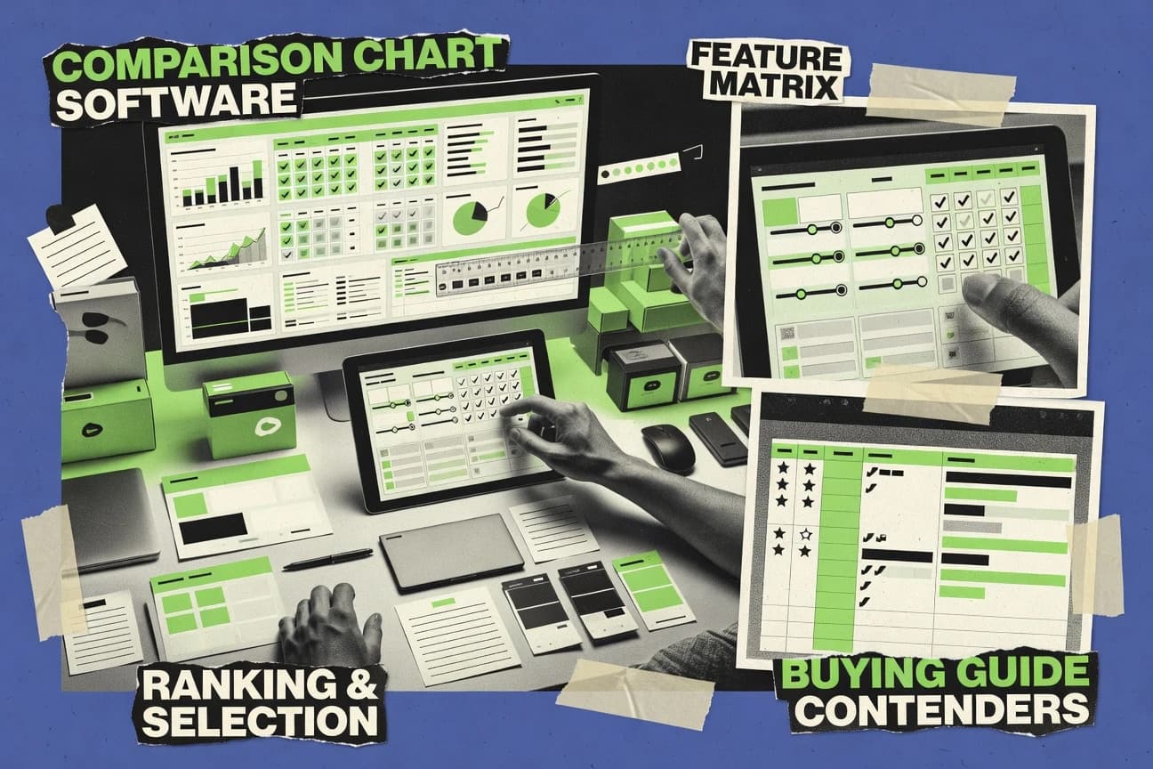
Digital Products And SoftwareTop 10 Best Comparison Chart Software of 2026
Discover top 10 comparison chart software tools for streamlined data visualization.

How we ranked these tools
Core product claims cross-referenced against official documentation, changelogs, and independent technical reviews.
Analyzed video reviews and hundreds of written evaluations to capture real-world user experiences with each tool.
AI persona simulations modeled how different user types would experience each tool across common use cases and workflows.
Final rankings reviewed and approved by our editorial team with authority to override AI-generated scores based on domain expertise.
Score: Features 40% · Ease 30% · Value 30%
Gitnux may earn a commission through links on this page — this does not influence rankings. Editorial policy
Editor picks
Three quick recommendations before you dive into the full comparison below — each one leads on a different dimension.
Canva
Thousands of professionally designed, fully customizable comparison chart templates
Built for marketers, educators, and small teams needing fast, visually polished comparison charts without design skills..
Google Sheets
Real-time collaborative editing where multiple users can build and refine comparison charts live with comments and version history
Built for teams and individuals seeking a free, collaborative spreadsheet-based solution for creating and sharing customizable comparison charts..
Microsoft Excel
Dynamic PivotCharts with slicers that allow interactive filtering and real-time updates for multifaceted data comparisons
Built for data analysts and business professionals who need robust, spreadsheet-integrated comparison charts with deep customization and collaboration..
Related reading
Comparison Table
Comparison chart software simplifies data visualization, and this table compares top tools like Canva, Google Sheets, Microsoft Excel, Visme, Piktochart, and more. It outlines key features, ease of use, and ideal scenarios, helping readers identify their best fit.
| # | Tool | Category | Overall | Features | Ease of Use | Value |
|---|---|---|---|---|---|---|
| 1 | Canva Design professional comparison charts and infographics using drag-and-drop templates and customizable visuals. | creative_suite | 9.4/10 | 9.2/10 | 9.8/10 | 9.5/10 |
| 2 | Google Sheets Create collaborative comparison tables, matrices, and charts with formulas, pivot tables, and real-time sharing. | enterprise | 8.7/10 | 8.5/10 | 9.2/10 | 9.8/10 |
| 3 | Microsoft Excel Build advanced comparison spreadsheets with pivot tables, conditional formatting, and dynamic charts for in-depth analysis. | enterprise | 8.7/10 | 9.2/10 | 7.8/10 | 8.5/10 |
| 4 | Visme Produce interactive and animated comparison charts, timelines, and data visualizations for presentations and reports. | creative_suite | 8.4/10 | 8.7/10 | 9.2/10 | 7.8/10 |
| 5 | Piktochart Transform data into visually appealing comparison infographics, charts, and reports with easy templates. | creative_suite | 8.2/10 | 7.8/10 | 9.1/10 | 8.0/10 |
| 6 | Venngage Craft customizable comparison charts, mind maps, and infographics optimized for marketing and business use. | creative_suite | 8.1/10 | 8.3/10 | 9.0/10 | 7.6/10 |
| 7 | Infogram Generate responsive, embeddable comparison charts and interactive data stories from spreadsheets or databases. | creative_suite | 8.1/10 | 8.4/10 | 9.0/10 | 7.7/10 |
| 8 | Lucidchart Visualize comparisons through diagrams, flowcharts, organizational charts, and feature matrices collaboratively. | enterprise | 8.5/10 | 9.0/10 | 8.8/10 | 8.0/10 |
| 9 | Tableau Analyze and create interactive comparison dashboards and visualizations from large datasets. | enterprise | 8.7/10 | 9.4/10 | 7.8/10 | 7.2/10 |
| 10 | Airtable Organize product or feature comparisons in customizable database views like grids, kanban, and charts. | enterprise | 7.2/10 | 8.1/10 | 7.4/10 | 6.8/10 |
Design professional comparison charts and infographics using drag-and-drop templates and customizable visuals.
Create collaborative comparison tables, matrices, and charts with formulas, pivot tables, and real-time sharing.
Build advanced comparison spreadsheets with pivot tables, conditional formatting, and dynamic charts for in-depth analysis.
Produce interactive and animated comparison charts, timelines, and data visualizations for presentations and reports.
Transform data into visually appealing comparison infographics, charts, and reports with easy templates.
Craft customizable comparison charts, mind maps, and infographics optimized for marketing and business use.
Generate responsive, embeddable comparison charts and interactive data stories from spreadsheets or databases.
Visualize comparisons through diagrams, flowcharts, organizational charts, and feature matrices collaboratively.
Analyze and create interactive comparison dashboards and visualizations from large datasets.
Organize product or feature comparisons in customizable database views like grids, kanban, and charts.
Canva
creative_suiteDesign professional comparison charts and infographics using drag-and-drop templates and customizable visuals.
Thousands of professionally designed, fully customizable comparison chart templates
Canva is a user-friendly graphic design platform that shines in creating stunning comparison charts, tables, and infographics through its vast template library and drag-and-drop editor. It allows users to visualize data comparisons using bar charts, pie charts, matrices, and custom layouts, with easy customization of colors, fonts, and branding. Ideal for transforming raw data into professional visuals without design expertise, it supports collaboration and exports to various formats. While not a dedicated data analytics tool, its visual focus makes it perfect for marketing, presentations, and reports.
Pros
- Massive library of pre-built comparison chart templates
- Intuitive drag-and-drop interface for quick edits
- Real-time collaboration and brand kit integration
Cons
- Limited advanced data import and manipulation compared to spreadsheet tools
- Free version includes watermarks on premium elements
- Performance can lag with very complex designs
Best For
Marketers, educators, and small teams needing fast, visually polished comparison charts without design skills.
More related reading
Google Sheets
enterpriseCreate collaborative comparison tables, matrices, and charts with formulas, pivot tables, and real-time sharing.
Real-time collaborative editing where multiple users can build and refine comparison charts live with comments and version history
Google Sheets is a free, cloud-based spreadsheet platform from Google that excels in data organization, analysis, and visualization, including creating comparison charts like bar graphs, column charts, and tables for side-by-side evaluations. Users can import data from CSV, Google Forms, or external sources, apply formulas, pivot tables, and conditional formatting to highlight differences dynamically. Its strength lies in seamless real-time collaboration, making it suitable for teams building and sharing comparison charts without software installation.
Pros
- Completely free with robust charting tools including sparklines and pivot-based comparisons
- Real-time collaboration allows multiple users to edit charts simultaneously
- Integrates seamlessly with Google Workspace for data import/export and automation via Apps Script
Cons
- Lacks advanced specialized comparison chart templates found in dedicated tools
- Manual setup required for complex dynamic comparisons using formulas
- Performance can lag with very large datasets or heavy visualizations
Best For
Teams and individuals seeking a free, collaborative spreadsheet-based solution for creating and sharing customizable comparison charts.
Microsoft Excel
enterpriseBuild advanced comparison spreadsheets with pivot tables, conditional formatting, and dynamic charts for in-depth analysis.
Dynamic PivotCharts with slicers that allow interactive filtering and real-time updates for multifaceted data comparisons
Microsoft Excel on office.com is a versatile web-based spreadsheet application that excels in creating comparison charts through its extensive charting tools, data tables, and visualization capabilities. Users can build side-by-side bar charts, radar charts, combo charts, and more to compare datasets effectively, leveraging formulas, pivot tables, and dynamic updates. Ideal for data-driven comparisons, it supports real-time collaboration and integration with the Microsoft 365 ecosystem for professional workflows.
Pros
- Highly customizable chart types including radar and waterfall for precise comparisons
- Powerful data analysis tools like pivot tables and slicers for interactive visuals
- Seamless cloud collaboration and integration with Power BI for advanced reporting
Cons
- Steeper learning curve for non-experts creating complex comparison charts
- Web version lacks some advanced desktop features like full VBA support
- Overkill for simple visual comparisons compared to dedicated design tools
Best For
Data analysts and business professionals who need robust, spreadsheet-integrated comparison charts with deep customization and collaboration.
More related reading
Visme
creative_suiteProduce interactive and animated comparison charts, timelines, and data visualizations for presentations and reports.
Interactive data-driven widgets for dynamic, embeddable comparison charts
Visme is a versatile online design platform that excels in creating visually stunning comparison charts, tables, and infographics through its drag-and-drop editor and extensive template library. It supports data import from spreadsheets, customizable widgets for feature comparisons, pricing matrices, and more, with options for interactivity and animations. Ideal for transforming static data into engaging visuals for presentations, websites, and reports.
Pros
- Vast library of pre-designed comparison chart templates
- Intuitive drag-and-drop editor with real-time collaboration
- Interactive elements like animations and embeddable widgets
Cons
- Overkill for simple static comparison tables
- Free plan limits exports and advanced features
- Higher cost for teams needing full functionality
Best For
Marketing teams and businesses needing professional, interactive comparison visuals for presentations and websites.
Piktochart
creative_suiteTransform data into visually appealing comparison infographics, charts, and reports with easy templates.
Extensive template library with AI-powered design suggestions for rapid, professional comparison visuals
Piktochart is a versatile visual design platform that allows users to create infographics, presentations, reports, and comparison charts using drag-and-drop tools and customizable templates. It excels in transforming data comparisons into visually appealing formats like tables, bar charts, and feature matrices with icons and graphics. While not exclusively a comparison chart tool, its extensive library makes it suitable for marketers and educators presenting side-by-side analyses.
Pros
- Intuitive drag-and-drop interface for quick chart creation
- Vast library of templates, icons, and customizable elements
- Strong export options including interactive HTML and PDF
Cons
- Limited native data import and automation for complex comparisons
- Watermarks and limited exports on free plan
- Less specialized for pure tabular comparisons than dedicated tools
Best For
Marketers, educators, and small teams needing visually engaging comparison charts without design expertise.
Venngage
creative_suiteCraft customizable comparison charts, mind maps, and infographics optimized for marketing and business use.
Vast collection of pre-designed comparison infographic templates with AI-powered customization suggestions
Venngage is a versatile online design platform focused on creating infographics, charts, and visual reports, with a strong selection of templates specifically for comparison charts like feature matrices, Venn diagrams, and pros/cons tables. It enables users to import data from spreadsheets, customize visuals with drag-and-drop tools, and generate professional comparisons without advanced design skills. Ideal for businesses presenting product or service comparisons, it supports team collaboration and various export formats.
Pros
- Extensive library of customizable comparison chart templates
- Intuitive drag-and-drop editor with real-time previews
- Data import from CSV/Excel for easy population of charts
Cons
- Free plan includes watermarks and limited templates
- Lacks advanced interactive features like dynamic filtering
- Higher pricing for teams and advanced exports
Best For
Marketers, educators, and small teams needing quick, visually engaging comparison charts for presentations and reports.
More related reading
Infogram
creative_suiteGenerate responsive, embeddable comparison charts and interactive data stories from spreadsheets or databases.
Hundreds of professionally designed infographic templates optimized for side-by-side data comparisons
Infogram is a user-friendly data visualization platform that enables the creation of interactive charts, infographics, maps, and reports, with strong support for comparison charts such as bar graphs, tables, radar charts, and grouped visuals. It allows easy data import from spreadsheets, APIs, or databases, and offers real-time updates for dynamic comparisons. Ideal for transforming complex datasets into shareable, embeddable visuals without coding expertise.
Pros
- Extensive library of customizable templates for quick comparison chart creation
- Interactive elements like animations and tooltips enhance viewer engagement
- Seamless data import and live connections from multiple sources
Cons
- Free plan includes watermarks and limited exports
- Advanced customization and private publishing require paid plans
- Less depth in statistical analysis compared to specialized BI tools
Best For
Marketers, journalists, and small teams needing visually appealing, embeddable comparison charts without a steep learning curve.
Lucidchart
enterpriseVisualize comparisons through diagrams, flowcharts, organizational charts, and feature matrices collaboratively.
Data-linked diagrams that sync live data from spreadsheets for real-time, automated comparison updates
Lucidchart is a cloud-based diagramming platform renowned for creating professional visuals, including comparison charts like matrices, feature tables, Venn diagrams, and mind maps. It offers an extensive library of templates, drag-and-drop editing, and data import from spreadsheets for easy comparison visualization. The tool emphasizes real-time collaboration and integrates with tools like Google Workspace, Microsoft Office, and Slack, making it suitable for team-based chart creation.
Pros
- Vast library of templates and shapes for quick comparison chart creation
- Real-time multiplayer collaboration and commenting
- Dynamic data linking from Excel/Google Sheets for auto-updating visuals
Cons
- Pricing escalates quickly for teams and advanced features
- Free plan limits exports, shapes, and document count
- Performance can lag with very large or complex diagrams
Best For
Collaborative teams and businesses needing versatile, data-driven comparison charts integrated into existing workflows.
More related reading
Tableau
enterpriseAnalyze and create interactive comparison dashboards and visualizations from large datasets.
Show Me AI-driven chart recommendations that instantly suggest optimal comparison visualizations based on selected data
Tableau is a premier data visualization platform that allows users to connect to diverse data sources and create interactive dashboards featuring comparison charts like bar graphs, bullet charts, heatmaps, and treemaps. It transforms raw data into compelling visual stories, enabling dynamic exploration and side-by-side comparisons without extensive coding. Ideal for business intelligence, it supports real-time updates and sharing across teams.
Pros
- Extensive library of comparison chart types including grouped bars, scatter plots, and advanced dual-axis visuals
- Seamless integration with hundreds of data sources for real-time comparisons
- Highly interactive dashboards with drill-down and filtering capabilities
Cons
- Steep learning curve for non-experts creating complex comparisons
- High pricing that may not suit small teams or individuals
- Performance can lag with very large datasets during intensive comparisons
Best For
Enterprise analysts and BI teams requiring sophisticated, interactive comparison visualizations at scale.
Airtable
enterpriseOrganize product or feature comparisons in customizable database views like grids, kanban, and charts.
Interface Designer for building app-like, interactive comparison dashboards without coding
Airtable is a flexible low-code platform that combines spreadsheet simplicity with database power, enabling users to create customizable bases for data organization and visualization. As a comparison chart software, it supports dynamic tables, linked records, and multiple views like grids, kanbans, and galleries to compare features, products, or options side-by-side. While versatile for building custom comparison tools, it lacks specialized templates or automated scoring native to dedicated comparison platforms.
Pros
- Highly customizable views and interfaces for tailored comparison charts
- Real-time collaboration and integrations with 300+ apps
- Automations to streamline data updates for comparisons
Cons
- Steep learning curve for non-technical users building complex charts
- Limited native visualization options compared to dedicated tools
- Pricing scales quickly for teams needing pro features
Best For
Teams requiring a customizable database-driven approach to create and share interactive comparison charts within broader workflows.
Conclusion
After evaluating 10 digital products and software, Canva stands out as our overall top pick — it scored highest across our combined criteria of features, ease of use, and value, which is why it sits at #1 in the rankings above.
Use the comparison table and detailed reviews above to validate the fit against your own requirements before committing to a tool.
Tools reviewed
Referenced in the comparison table and product reviews above.
How to Choose the Right Comparison Chart Software
This buyer’s guide covers comparison chart software built for side-by-side evaluation and feature matrices across Canva, Google Sheets, Microsoft Excel, Visme, Piktochart, Venngage, Infogram, Lucidchart, Tableau, and Airtable. It maps concrete charting, template, interactivity, and collaboration capabilities to the work people actually do with comparison charts.
What Is Comparison Chart Software?
Comparison chart software creates visual layouts that compare products, features, options, or performance side by side. These tools solve the problem of turning scattered attributes into charts, tables, matrices, and embeddable visuals that teams can understand quickly. Canva and Visme focus on drag-and-drop templates for polished comparison charts and interactive visuals. Tableau and Lucidchart focus on data-connected dashboards and live synchronization so comparisons update as the underlying data changes.
Keep exploring
Comparing two specific tools?
Software Alternatives
See head-to-head software comparisons with feature breakdowns, pricing, and our recommendation for each use case.
Explore software alternatives→In this category
Digital Products And Software alternatives
See side-by-side comparisons of digital products and software tools and pick the right one for your stack.
Compare digital products and software tools→FOR SOFTWARE VENDORS
Not on this list? Let’s fix that.
Our best-of pages are how many teams discover and compare tools in this space. If you think your product belongs in this lineup, we’d like to hear from you—we’ll walk you through fit and what an editorial entry looks like.
Apply for a ListingWHAT THIS INCLUDES
Where buyers compare
Readers come to these pages to shortlist software—your product shows up in that moment, not in a random sidebar.
Editorial write-up
We describe your product in our own words and check the facts before anything goes live.
On-page brand presence
You appear in the roundup the same way as other tools we cover: name, positioning, and a clear next step for readers who want to learn more.
Kept up to date
We refresh lists on a regular rhythm so the category page stays useful as products and pricing change.