GITNUXSOFTWARE ADVICE
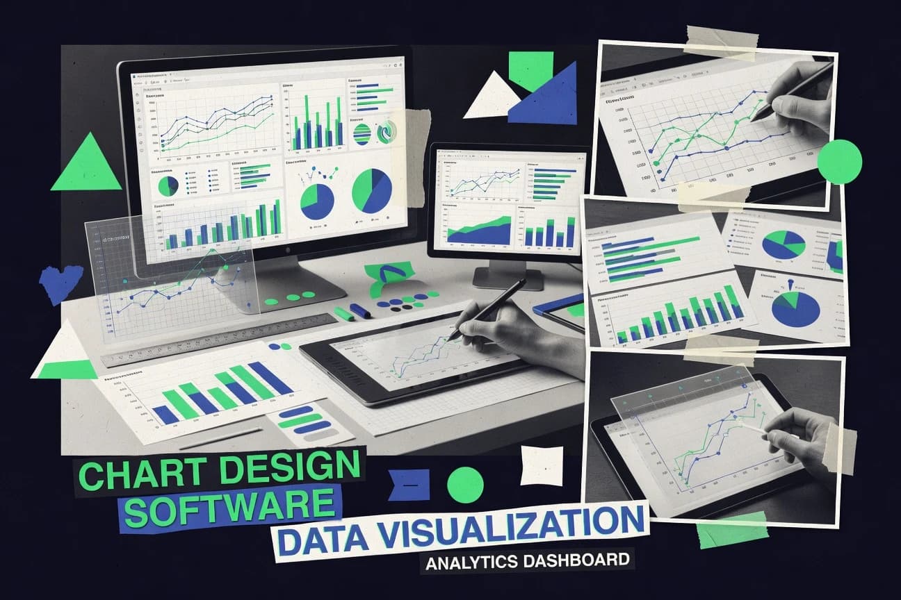
Digital Products And SoftwareTop 10 Best Chart Design Software of 2026
Discover top chart design software tools to create stunning visuals. Compare features, read reviews, and find the best for your needs.

How we ranked these tools
Core product claims cross-referenced against official documentation, changelogs, and independent technical reviews.
Analyzed video reviews and hundreds of written evaluations to capture real-world user experiences with each tool.
AI persona simulations modeled how different user types would experience each tool across common use cases and workflows.
Final rankings reviewed and approved by our editorial team with authority to override AI-generated scores based on domain expertise.
Score: Features 40% · Ease 30% · Value 30%
Gitnux may earn a commission through links on this page — this does not influence rankings. Editorial policy
Editor’s top 3 picks
Three quick recommendations before you dive into the full comparison below — each one leads on a different dimension.
Figma
Auto Layout combined with component libraries for consistent, responsive chart layouts
Built for design teams producing bespoke chart dashboards and interactive prototypes.
Adobe Illustrator
Editor pickEditable vector artwork with precision tools like Pen, Alignment, and grid-based snapping
Built for design teams creating branded vector charts for editorial and marketing layouts.
Canva
Editor pickTemplate-driven chart layouts with in-editor styling controls and brand kit assets
Built for marketing teams creating attractive charts inside reports and presentations.
Related reading
Comparison Table
This comparison table evaluates chart design software used to build visuals for reports, dashboards, and presentations, including Figma, Adobe Illustrator, Canva, Microsoft Power BI, Tableau, and other popular tools. It summarizes how each platform handles chart creation, data binding, styling control, collaboration, and export options so readers can match the right workflow to their use case.
Figma
design-firstFigma enables interactive chart and data visualization design with reusable components, vector editing, and design-to-prototype workflows.
Auto Layout combined with component libraries for consistent, responsive chart layouts
Figma stands out for chart design workflows driven by reusable components and real-time collaboration on a shared canvas. It supports vector editing for custom chart elements, Auto Layout for responsive layout structures, and libraries for consistent styling across dashboards.
Interactive prototypes enable clickable chart stories that simulate data drilldowns and state changes. Design handoff with Inspect and developer-friendly CSS snippets helps translate chart styling into implementation artifacts.
- +Auto Layout builds responsive chart frames and legends consistently
- +Component libraries enforce uniform axes, labels, and color scales across dashboards
- +Interactive prototypes simulate tooltip, filter, and drilldown chart states
- +Inspect mode accelerates handoff for precise spacing, typography, and CSS values
- +Vector tools support bespoke chart marks beyond standard chart types
- –No native data-to-chart engine for generating charts from datasets
- –Versioned chart variants can become heavy without strict component discipline
- –Advanced chart interactions still require manual prototyping setup
- –Large, complex dashboard files can slow editing in crowded workspaces
Best for: Design teams producing bespoke chart dashboards and interactive prototypes
More related reading
Adobe Illustrator
vector illustrationAdobe Illustrator provides professional vector chart creation with precise typography, scalable shapes, and export-ready artwork for dashboards and reports.
Editable vector artwork with precision tools like Pen, Alignment, and grid-based snapping
Adobe Illustrator stands out for chart-ready vector design that stays editable for layout, typography, and brand consistency. It delivers precise control of shapes, grids, and text so charts can match design systems far beyond template styling. Illustrator also supports importing tabular data workflows through linked assets and exporting publication-grade SVG and PDF for print and web layouts.
- +Pixel-perfect vector editing for custom chart geometry and spacing.
- +Powerful typography controls for axis labels, legends, and annotations.
- +Clean SVG and PDF exports for crisp charts in print and web.
- –No native data-to-chart pipeline for rapid updates from datasets.
- –Manual work is required for scales, ticks, and responsive chart layouts.
- –Complex projects need careful layer management to avoid visual inconsistencies.
Best for: Design teams creating branded vector charts for editorial and marketing layouts
Canva
template-drivenCanva offers drag-and-drop chart templates and presentation-ready layouts with built-in styling controls and export options.
Template-driven chart layouts with in-editor styling controls and brand kit assets
Canva stands out for turning chart creation into a design workflow that shares templates, brand assets, and layout tools with general graphic design. It provides chart types like bar, line, pie, and donut plus a visual editor for colors, typography, legends, and annotations.
Data can be imported via supported spreadsheet connections, and charts can be embedded in wider presentations, infographics, and reports. Export options cover common share formats like PNG, PDF, and presentation decks.
- +Drag-and-drop chart styling with consistent control over fonts, colors, and spacing
- +Large template library for charts, reports, and infographics that accelerates production
- +Fast editing workflow for chart labels, legends, and annotations inside the same canvas
- –Advanced statistical charting options like custom scales are limited versus BI tools
- –Large data handling and complex transformations feel constrained compared with analytics software
- –Precision layout for dense or highly customized charts can require extra manual tweaking
Best for: Marketing teams creating attractive charts inside reports and presentations
Microsoft Power BI
BI dashboardsPower BI builds interactive charts from connected data sources and supports custom visuals, theming, and dashboard publishing.
DAX measures with calculated tables driving dynamic visuals across slicers
Power BI stands out with end-to-end report building that mixes chart design with data modeling and interactive storytelling. It delivers a large visual gallery, supports custom visuals, and enables advanced formatting like conditional color and axis control. Its strong focus on filtering, cross-highlighting, and publishing makes charts work inside dashboards rather than as isolated graphics.
- +Rich visual library with responsive interactivity and drill-through
- +Powerful data modeling with DAX for measure-driven chart behavior
- +Advanced formatting controls for axes, legends, and conditional styling
- –Layout freedom for chart canvas is limited versus design-first tools
- –Complex DAX can slow chart iteration for non-modelers
- –Some custom visual types lag in polish and interaction consistency
Best for: Teams building interactive dashboards with charts, measures, and drill workflows
Tableau
data visualizationTableau generates interactive charts and visual analytics with strong formatting controls, calculated fields, and shareable dashboards.
Dashboard actions with parameters for interactive drill-down across views
Tableau stands out for turning connected data into interactive, high-impact dashboards without requiring code. It delivers a broad set of chart types with drag-and-drop layout tools, strong filtering, and interactive drill-down via parameters and linked views. Its design workflow supports reusable components like dashboards and sheets, which helps teams standardize visuals across reports and sites.
- +Interactive dashboards with drill-down and linked filters
- +Wide chart and visual design options for analysis-first storytelling
- +Calculated fields and parameters enable reusable, dynamic charts
- –Advanced visual tuning can require deeper Tableau-specific skills
- –Design consistency across many dashboards needs careful governance
- –Performance can degrade with complex interactions on large datasets
Best for: Teams building interactive dashboards and reusable analytic charts
Looker Studio
dashboardingLooker Studio creates chart reports and dashboards with configurable visual properties, connectors, and collaborative sharing.
Dashboard filters and drill-down interactions controlled directly inside the report editor
Looker Studio stands out with tight integration to Google data sources and a browser-first report builder. It supports chart creation with configurable dimensions, metrics, date controls, and extensive visualization options.
It also enables interactive dashboards with filters, drill-down, and shared publishing, making it useful for recurring reporting and self-service analytics. Chart design is achieved through a visual editor that pairs field mapping with style controls for axes, legends, and data labels.
- +Visual editor builds charts by mapping fields to dimensions and metrics
- +Interactive dashboards include filters, drill-down, and parameter-driven controls
- +Works smoothly with Google Sheets, BigQuery, and other Google data sources
- +Strong style controls for axes, legends, and data labels
- +Sharing and publishing workflows support broad stakeholder access
- –Advanced chart customization options can be limited versus custom design tools
- –High-density dashboards can become slow to render with many tiles and visuals
- –Complex modeling often requires external preparation instead of native transformations
Best for: Teams building interactive dashboards from Google-backed data with minimal coding
Highcharts
web chartsHighcharts delivers customizable JavaScript charting for web applications with extensive chart types, theming, and accessible rendering.
Highcharts configuration-driven rendering with extensive series options and event hooks
Highcharts stands out for its chart-focused JavaScript library approach that turns data into interactive visuals with minimal custom UI work. It supports a wide set of chart types, strong styling and theming options, and rich interactivity features like tooltips, legends, and events. The tool also enables fine control through a comprehensive configuration model and an API-driven update flow for dynamic dashboards.
- +Broad chart type coverage with consistent configuration patterns
- +High-quality built-in interactions like tooltips, zoom, and legends
- +Extensive theming and styling controls for brand-aligned visuals
- +Efficient updates via API-driven data refresh without full redraw
- –Deep customization often requires JavaScript knowledge
- –Complex layouts can become configuration-heavy for non-developers
- –Advanced edge-case visuals may require custom render logic
Best for: Teams building interactive dashboards and data visuals with code-first control
D3.js
custom visualizationD3.js enables fully custom, data-driven chart visuals by binding data to DOM and scalable SVG and Canvas rendering.
Data binding with selections enables declarative enter-update-exit chart updates
D3.js is distinct because it treats charts as data-driven document transformations built directly on web standards. Core capabilities include SVG and HTML rendering, flexible layout composition, and interactive behaviors driven by bound data.
It supports common visualization patterns like axes, scales, and transitions, but it does not provide a dedicated point-and-click chart builder. Chart design happens through code that defines scales, marks, and interactions rather than through packaged components.
- +Fine-grained control over SVG, HTML, and CSS for custom chart rendering
- +Data binding model enables concise updates and interactive state changes
- +Powerful scales, axes, and transitions built for dynamic storytelling
- –Requires JavaScript coding to design charts and manage interactions
- –No built-in chart templates or drag-and-drop layout tools
- –Large customizations require more engineering effort than component libraries
Best for: Developers building bespoke interactive charts with direct control over rendering
R Shiny
interactive appsShiny renders interactive charts in R applications using charting libraries and reactive updates for dashboards and data tools.
Shiny reactivity links chart outputs to inputs with automatic recomputation
R Shiny stands out for turning interactive R outputs into shareable web apps with low friction for custom chart logic. It supports chart-heavy dashboards through reactive programming, HTML layouts, and flexible integration with ggplot2, plotly, and data tables.
Chart design benefits from full R control over scales, annotations, and theming, plus live updates via user inputs and filters. Distribution is strong for teams that can run Shiny Server or deploy to a managed environment.
- +Reactive chart updates driven by user inputs and filtering
- +Deep ggplot2 theming control for publication-quality static visuals
- +Interactive charts via plotly and custom tooltips
- +Reusable UI and server patterns for consistent dashboard builds
- +Strong integration with R data wrangling packages
- –Chart-only workflows still require app structure and reactive wiring
- –Complex layout and state management can become difficult to maintain
- –Browser performance may degrade with heavy datasets and many re-rendered components
Best for: Data teams building interactive R dashboards with custom chart logic
Plotly
interactive plottingPlotly generates interactive charts across Python, JavaScript, and other environments with theming controls and dashboard embeddings.
plotly.js rendering in-browser for responsive interactive charts
Plotly stands out for combining code-driven chart design with interactive, publication-ready figures. It supports building complex charts using Python, JavaScript, and R with fine-grained control over traces, axes, legends, and styling.
The platform exports to static images and shareable interactive outputs with hover, zoom, and selection behaviors built in. Layout and theming features help standardize dashboards across projects.
- +Highly customizable chart configuration with precise control of traces and layout
- +Built-in interactivity like hover, zoom, and selection without extra tooling
- +Strong export options for static images and interactive sharing
- +Reusable templates and consistent theming across figures
- –Best results require coding discipline rather than purely visual editing
- –Large dashboards can become slow and harder to maintain as complexity grows
- –Some styling edge cases need manual work across multiple trace types
Best for: Data teams needing interactive, highly customizable charts with developer control
Conclusion
After evaluating 10 digital products and software, Figma stands out as our overall top pick — it scored highest across our combined criteria of features, ease of use, and value, which is why it sits at #1 in the rankings above.
Use the comparison table and detailed reviews above to validate the fit against your own requirements before committing to a tool.
How to Choose the Right Chart Design Software
This buyer’s guide covers ten chart design software tools including Figma, Adobe Illustrator, Canva, Microsoft Power BI, Tableau, Looker Studio, Highcharts, D3.js, R Shiny, and Plotly. It maps each tool to concrete chart design workflows like reusable component systems, vector artwork export, template-driven chart layout, and code-first interactive rendering. It also explains how to choose based on interaction goals, data connection needs, and the level of manual versus automated chart building.
What Is Chart Design Software?
Chart design software helps create charts and dashboard visuals using either visual layout tools or code-driven rendering. It solves problems like making charts consistent across a brand, building interactive drilldowns and hover behaviors, and translating design work into publishable outputs such as SVG, PDF, and in-browser figures. Figma represents the design-first workflow with Auto Layout, component libraries, and interactive prototypes that simulate tooltip and filter states. Microsoft Power BI represents the data-first workflow where charts are built from connected data sources with DAX-driven measures and dashboard publishing.
Key Features to Look For
The strongest chart design platforms match the way teams build charts, either through reusable design components, automated data-driven visuals, or code-driven interactivity.
Reusable component systems for consistent axes, labels, and layout
Figma enforces uniform axes, labels, and color scales across dashboards by using component libraries. This lowers visual drift when teams update chart frames and legends using Auto Layout.
Precision vector editing for publication-ready chart geometry and typography
Adobe Illustrator delivers pixel-perfect vector editing with Pen, Alignment, and grid-based snapping for custom chart shapes. Its typography controls support axis labels, legends, and annotations that must match brand guidelines.
Template-driven chart creation with brand kits and in-editor styling controls
Canva accelerates production using drag-and-drop chart templates for bar, line, pie, and donut charts. It supports in-editor controls for colors, typography, legends, and annotations while letting charts embed into presentations, infographics, and reports.
Interactive dashboard building driven by measures and calculated tables
Microsoft Power BI ties chart behavior to DAX measures and calculated tables so visuals update dynamically across slicers. It also includes advanced formatting for axes, legends, and conditional color.
Interactive drill-down with dashboard actions and parameters
Tableau supports dashboard actions with parameters that enable interactive drill-down across linked views. This helps teams build reusable analytic charts that behave consistently across dashboard pages.
Code-first chart configuration with event hooks and responsive in-browser rendering
Highcharts supports configuration-driven rendering with extensive series options and event hooks for interactive behaviors. Plotly supports plotly.js in-browser rendering for responsive hover, zoom, and selection behaviors built into the chart output.
How to Choose the Right Chart Design Software
The selection starts with deciding whether the primary job is design and interaction prototyping, data-driven analytics, or code-first rendering.
Pick the workflow model: design-first, data-first, or code-first
Choose Figma if chart design needs reusable components plus interactive prototypes on a shared canvas. Choose Power BI or Tableau if dashboards must be generated from connected data sources with measures, parameters, slicers, and drill-through workflows. Choose D3.js, Highcharts, or Plotly if chart rendering must be controlled through code with direct control over marks, scales, events, and in-browser responsiveness.
Match interaction requirements to the tool’s interaction primitives
Figma supports clickable chart stories and simulated tooltip, filter, and drilldown chart states using interactive prototypes. Power BI and Tableau support interactive drill and filtering patterns inside dashboards via slicers, drill-through, and linked filters. Highcharts and Plotly provide built-in hover, zoom, legends, and selection behaviors that work without building custom interaction UI.
Confirm whether chart outputs need exportable artwork
Use Adobe Illustrator when charts must ship as clean SVG and PDF with editable vector artwork for print and web layouts. Use Figma when design handoff must include Inspect mode with precise spacing, typography, and CSS values. Use Canva when charts must be embedded quickly into decks and reports with common export formats like PNG and PDF.
Plan for layout governance across many charts and dashboards
Figma addresses governance using component libraries and Auto Layout to standardize chart frames and legends across a dashboard system. Tableau improves reuse using sheets and dashboards and supports governance through dashboard actions with parameters. Looker Studio limits advanced chart customization so teams rely more on the report editor’s field mapping and style controls to keep layouts consistent.
Align with data integration and modeling responsibilities
Choose Power BI when DAX measures and calculated tables drive dynamic visuals across slicers. Choose Looker Studio when Google-backed data sources like Google Sheets and BigQuery drive self-service reporting with dashboard filters and drill-down controlled inside the editor. Choose R Shiny when interactive charts must be part of a reactive R application where user inputs trigger recomputation and chart outputs update automatically.
Who Needs Chart Design Software?
Chart design software fits specific teams based on whether they need bespoke design control, data-driven analytics, or code-driven interactive rendering.
Design teams building bespoke interactive chart dashboards and prototypes
Figma fits this workflow because Auto Layout and component libraries keep axes, labels, and color scales consistent while interactive prototypes simulate tooltip, filter, and drilldown states. Adobe Illustrator also fits when bespoke vector chart geometry and typography must remain fully editable for branded editorial and marketing layouts.
Marketing teams creating charts for reports and presentations
Canva is purpose-built for template-driven chart creation with in-editor styling controls and brand kit assets. Canva’s fast editing workflow for labels, legends, and annotations supports chart visuals that are meant to live inside decks and infographics.
Analytics teams building interactive dashboards with reusable analytic charts
Power BI fits when charts must be driven by DAX measures and calculated tables so visuals respond to slicers and conditional formatting. Tableau fits when dashboards need parameter-based drill-down with dashboard actions and linked views for interactive storytelling.
Developers and data teams implementing interactive charts inside applications or custom dashboards
Highcharts fits for teams wanting configuration-driven chart rendering with event hooks and efficient API-driven updates. D3.js fits for developers who need fully custom data-driven charts by binding data to DOM and building axes, scales, and transitions in code.
Common Mistakes to Avoid
Several recurring pitfalls show up across chart tools when teams mismatch interaction complexity, layout governance, and data-to-chart automation expectations.
Assuming the tool will generate charts directly from datasets without modeling work
Figma and Adobe Illustrator excel at design and vector editing, but neither provides a native data-to-chart engine for generating charts from datasets. Highcharts, Plotly, and D3.js can connect data to visual output through configuration or code, but Figma still requires manual setup for advanced interactions.
Overbuilding interaction states without a reusable component or configuration strategy
Figma can become heavy when versioned chart variants expand without strict component discipline, especially in large dashboard files. Highcharts and Plotly can also become configuration-heavy or harder to maintain as dashboard complexity grows across many series and trace types.
Treating layout customization freedom as unlimited canvas control
Power BI limits layout freedom for the chart canvas compared with design-first tools, so teams that need pixel-level placement usually prefer Figma or Illustrator. Looker Studio offers strong style controls, but advanced chart customization can feel constrained versus custom design tools.
Ignoring performance risks from dense dashboards and complex interactions
Looker Studio can slow to render with high-density dashboards using many tiles and visuals. Tableau performance can degrade with complex interactions on large datasets, while R Shiny browser performance can degrade with heavy datasets and many re-rendered components.
How We Selected and Ranked These Tools
We evaluated each chart design software tool on three sub-dimensions: features with weight 0.4, ease of use with weight 0.3, and value with weight 0.3. The overall rating for each tool is the weighted average of those three scores using overall = 0.40 × features + 0.30 × ease of use + 0.30 × value. Figma separated itself with a clear features advantage tied to Auto Layout and component libraries that enforce consistent, responsive chart layouts across dashboards. That combination of reusable design governance and interactive prototyping supported higher feature performance than tools that focus more on data modeling or code-only rendering.
Frequently Asked Questions About Chart Design Software
Which chart design tool is best for collaborative, reusable chart components?
Which tool is better for pixel-perfect, editable vector chart artwork for brand guidelines?
Which chart design software works well for creating charts inside reports and slide decks?
What tool best combines chart design with data modeling and interactive dashboard logic?
Which option is best for building interactive dashboards without code?
Which tool is the best fit for browser-first dashboard creation with Google data sources?
Which chart design approach is best when developers need code-first control over interactivity and rendering?
How can teams publish interactive chart logic from R as a web app?
Which tool helps create interactive, publication-ready charts with fine-grained trace and layout control?
What common chart-design problem occurs when styles don’t carry into implementation, and which tool helps most?
Tools reviewed
Primary sources checked during evaluation.
Referenced in the comparison table and product reviews above.
Keep exploring
Comparing two specific tools?
Software Alternatives
See head-to-head software comparisons with feature breakdowns, pricing, and our recommendation for each use case.
Explore software alternatives→In this category
Digital Products And Software alternatives
See side-by-side comparisons of digital products and software tools and pick the right one for your stack.
Compare digital products and software tools→FOR SOFTWARE VENDORS
Not on this list? Let’s fix that.
Our best-of pages are how many teams discover and compare tools in this space. If you think your product belongs in this lineup, we’d like to hear from you—we’ll walk you through fit and what an editorial entry looks like.
Apply for a ListingWHAT THIS INCLUDES
Where buyers compare
Readers come to these pages to shortlist software—your product shows up in that moment, not in a random sidebar.
Editorial write-up
We describe your product in our own words and check the facts before anything goes live.
On-page brand presence
You appear in the roundup the same way as other tools we cover: name, positioning, and a clear next step for readers who want to learn more.
Kept up to date
We refresh lists on a regular rhythm so the category page stays useful as products and pricing change.