GITNUXSOFTWARE ADVICE
Technology Digital MediaTop 10 Best Bubble Map Software of 2026
Explore the top 10 bubble map software tools to visualize data effectively.

How we ranked these tools
Core product claims cross-referenced against official documentation, changelogs, and independent technical reviews.
Analyzed video reviews and hundreds of written evaluations to capture real-world user experiences with each tool.
AI persona simulations modeled how different user types would experience each tool across common use cases and workflows.
Final rankings reviewed and approved by our editorial team with authority to override AI-generated scores based on domain expertise.
Score: Features 40% · Ease 30% · Value 30%
Gitnux may earn a commission through links on this page — this does not influence rankings. Editorial policy
Editor’s top 3 picks
Three quick recommendations before you dive into the full comparison below — each one leads on a different dimension.
Miro
Infinite canvas plus templates and smart alignment for rapid bubble-map layout
Built for teams running collaborative bubble-map workshops and visual planning sessions at scale.
Lucidchart
Editor pickReal-time co-editing with inline comments in Lucidchart
Built for teams creating collaborative bubble maps for product, strategy, and process planning.
draw.io
Editor pickAutomatic connector routing and styling keep bubble relationships clear during rearranging
Built for teams producing shareable bubble maps in editable diagram formats.
Related reading
Comparison Table
This comparison table evaluates leading bubble map and mind-mapping tools, including Miro, Lucidchart, draw.io, Whimsical, and MindManager, to help match features to specific visualization needs. Each row highlights how the software supports node clustering, collaboration, template and import options, and export formats, so teams can compare workflow fit rather than marketing claims.
Miro
collaborative whiteboardProvides an interactive online whiteboard with bubble-style layouts, sticky-note clustering, and collaboration features for visual mapping of ideas and relationships.
Infinite canvas plus templates and smart alignment for rapid bubble-map layout
Miro stands out for turning bubble-map style ideation into a live canvas with fast visual collaboration. It supports sticky notes, frames, shapes, connectors, and templates that map cleanly to mind-mapping and bubble diagram workflows.
Real-time cursors, commenting, and version history make it effective for iterative workshops and stakeholder reviews. Export options like image, PDF, and presentation modes help teams share bubble maps beyond the board.
- +Instant bubble-map creation with sticky notes, connectors, and automatic alignment tools
- +Real-time collaboration with cursors, comments, and activity history for workshop continuity
- +Template library and smart diagram elements speed up repeatable bubble-map structures
- +Frames enable logical grouping for themes, scenarios, and phased refinement
- –Large boards can become sluggish when many elements and connectors are present
- –Precise spacing and layout control still needs manual tuning for polished diagrams
- –Advanced diagramming workflows require learning multiple toolbar and selection modes
Best for: Teams running collaborative bubble-map workshops and visual planning sessions at scale
More related reading
Lucidchart
diagrammingDelivers web-based diagramming tools that support bubble charts, node-link diagrams, and structured visualizations for mapping data and concepts.
Real-time co-editing with inline comments in Lucidchart
Lucidchart stands out for its collaborative diagramming that turns bubble maps into shared visual thinking spaces. It provides drag-and-drop shapes, flexible containers, and alignment tools that support clear bubble grouping and nested ideas.
Real-time commenting and version history help teams iterate on structure without losing context. Diagram links to external data and tight integrations with Google Workspace and Microsoft tools support workflows that extend beyond static maps.
- +Real-time collaboration with comments keeps bubble maps reviewable and actionable
- +Smart layout helpers and snapping speed up spacing and grouping of bubbles
- +Extensive shape library and custom styling support consistent bubble map branding
- +Import and export options fit handoffs to slide decks and documents
- +Integrations with Google and Microsoft workflows reduce tool switching
- –Complex diagrams can feel slower to edit as bubble counts grow
- –Advanced layout control takes more clicks than dedicated mind-mapping tools
Best for: Teams creating collaborative bubble maps for product, strategy, and process planning
draw.io
free diagram editorGives a free browser diagram editor that supports node-and-edge diagrams and custom shape work for bubble-map style layouts.
Automatic connector routing and styling keep bubble relationships clear during rearranging
draw.io stands out for letting users create bubble maps with a fast drag-and-drop canvas and rich diagram tooling in one editor. It supports entity styling, connector routing, and layer-style organization using shapes, groups, and links.
Export options cover common formats like PNG, PDF, SVG, and XML for later editing. Collaboration depends on the storage backend used to open the file, rather than built-in real-time co-authoring.
- +Drag-and-drop bubble mapping with snapping, alignment, and auto-layout helpers
- +Connector styles and routing make relationships readable even in dense maps
- +Rich export formats including PDF, PNG, SVG, and editable XML
- +Reusable libraries, templates, and styles speed up consistent diagrams
- +Works with multiple storage backends for file-based diagram workflows
- –No true real-time multi-user editing inside the editor
- –Advanced diagram logic takes setup and can feel technical
- –Large maps can become slower when many shapes and edits accumulate
- –Bubble-specific features like swimlanes and brainstorming timers are missing
Best for: Teams producing shareable bubble maps in editable diagram formats
Whimsical
fast visual diagramsCreates quick visual diagrams with swimlane and mapping-style canvases that can be arranged into bubble-map layouts.
Real-time collaborative Bubble Maps with threaded comments
Whimsical stands out with a lightweight drawing experience that makes Bubble Maps quick to draft and easy to iterate. It provides freeform bubble canvas tools, flexible text and styling, and connectors that help organize ideas into structured relationships.
Collaboration features support shared editing and commenting so teams can refine a map without switching tools. Export options cover common handoff formats for documentation and presentation workflows.
- +Fast bubble map editing with smooth canvas navigation
- +Connectors and auto-aligned layouts keep relationships readable
- +Live collaboration with comments reduces review back-and-forth
- +Simple styling controls help maintain visual consistency
- +Clear exporting for sharing in docs and presentations
- –Limited advanced diagram semantics compared with purpose-built mapping tools
- –Big maps can feel harder to manage than in structured diagramming suites
- –Fewer automation options than workflow-focused diagram platforms
Best for: Teams creating collaborative Bubble Maps for ideation and structured brainstorming
MindManager
mind mappingBuilds mind maps and concept maps with bubble-like grouping via nodes and branches for organizing related information.
Map-to-outline and outline-to-map conversion for fast bidirectional structuring
MindManager stands out for mapping mind plans with a structured workflow that blends brainstorming, research capture, and execution views. The tool supports bubble-style diagrams with drag-and-drop nodes, fast reorganization, and connector-based relationships for building clear visual hierarchies. Exports to common office formats and integration options help when bubble maps must feed reports or presentations.
- +Rapid bubble map building with drag-and-drop node editing
- +Strong outlining-to-map support for turning notes into structure
- +Export options suitable for sharing maps in office workflows
- +Filters and views help manage large diagrams without losing focus
- +Relationship connectors clarify dependencies between ideas
- –Diagram complexity increases navigation friction in large projects
- –Customization depth can feel heavy compared with simpler mappers
- –Collaboration features are less central than diagram creation
- –Formatting control can require extra steps for polished layouts
Best for: Project teams translating brainstorming into structured plans and deliverables
MindMeister
collaborative mind mappingSupports collaborative mind maps and concept organization that can be structured into bubble-map style clusters of ideas.
Real-time co-editing for shared mind maps
MindMeister stands out for turn-key mind mapping that quickly becomes structured concept maps with minimal setup. It supports drag-and-drop nodes, central topics, and rich formatting so bubble maps can be reorganized as ideas evolve.
Collaboration features include real-time co-editing and commenting, which helps teams iterate on the same visual layout. Export options cover common formats for sharing and offline review.
- +Fast bubble-map creation with drag-and-drop node management
- +Real-time collaboration with comments keeps stakeholders aligned
- +Clean visuals with themes and node formatting for clarity
- –Bubble-map styling options are less flexible than diagram tools
- –Advanced layout control for complex maps can feel limited
- –Workflow automation and integrations are not as deep as whiteboard platforms
Best for: Teams creating clear visual idea structures with lightweight collaboration
Creately
template-based diagramsProvides an online diagramming workspace with templates and shape-based layout that can be used for bubble-map data visualization.
Smart layout alignment tools for auto-arranging clustered bubble-map nodes
Creately focuses on visual diagramming with a bubble-map style canvas that supports fast grouping, resizing, and alignment of nodes. It combines sticky-note style elements, connectors, and templates for brainstorming, idea clustering, and relationship mapping.
Collaboration features support real-time co-editing and commenting so teams can refine maps without switching tools. Export options and share links make it usable for presenting and circulating bubble maps to stakeholders.
- +Bubble-map canvases with quick grouping and connector routing
- +Template library accelerates ideation and structured clustering
- +Real-time collaboration with comments for map refinement
- –Advanced layout controls can feel heavy on large diagrams
- –Customization for diagram styling takes multiple editing steps
- –Export fidelity for complex layouts depends on output format
Best for: Teams creating bubble maps for brainstorming, clustering, and stakeholder reviews
Coggle
mind mappingCreates mind maps with central-node expansion that can be arranged into bubble-like hierarchical clusters for visual mapping.
Bubble Map focused editor with fast node and connection building
Coggle focuses on fast creation of bubble maps with a clean visual editor geared toward mapping ideas and relationships. It supports draggable nodes, linking, and structured canvas organization so mind maps and concept clusters stay readable.
Collaboration workflows exist through shareable maps and multi-user editing, which helps teams refine content together. Export options support using the diagrams in documents and presentations.
- +Quick bubble map building with drag-and-drop node placement
- +Linking and canvas organization keep complex idea clusters navigable
- +Shareable diagrams support collaborative refinement in real time
- –Advanced diagram controls are limited compared with full whiteboard suites
- –Styling and theme customization can feel basic for brand-heavy outputs
- –Export formats may require manual adjustments for polished slide decks
Best for: Small teams creating visual concept maps without diagramming complexity
SankeyMATIC
flow visualizationGenerates interactive Sankey-style flow diagrams that can be adapted into bubble-map style relationship views by mapping nodes to sources and targets.
Import-based Sankey diagram generation from structured source-target flow data
SankeyMATIC distinguishes itself with browser-based Sankey diagram creation that works directly from structured input data. It supports building Bubble Map style relationship visuals by converting node and link definitions into connected flow layouts.
Core capabilities include exporting diagrams as image formats and customizing labels, colors, and layout behaviors. The tool focuses on diagram generation rather than full-featured drag-and-drop map editing.
- +Creates connected relationship diagrams from node-link data quickly
- +Color and label controls help diagrams communicate hierarchy
- +Exports deliver shareable image outputs for reports and presentations
- +Runs in a browser with no desktop installation
- –Limited interactive editing after diagram generation
- –Fine-tuning layout spacing and node positioning is constrained
- –Not designed for freeform Bubble Map clustering workflows
Best for: Teams needing fast Sankey-style relationship visuals from data inputs
Visme
infographic visualizationCreates infographic-style visualizations with chart and diagram tools that can be configured into bubble-map layouts for data storytelling.
Interactive hotspots and links embedded in diagrams for clickable bubble maps
Visme stands out for building interactive, shareable visual maps and diagrams inside a unified editor that targets more than static diagrams. Its drag-and-drop canvas supports bubble maps with shapes, connectors, and flexible styling for clear concept relationships. Visme also adds presentation and interactivity features like hotspots, links, and embed-ready exports that work well for stakeholder sharing.
- +Interactive exports with links and hotspots improve stakeholder walkthroughs
- +Drag-and-drop bubble map layout with connectors supports quick concept mapping
- +Extensive visual styling controls make diagrams easier to brand consistently
- +Reusable templates speed up repeat diagram creation
- –Diagram-specific functions lag dedicated mind-mapping tools for fast ideation
- –Advanced auto-layout and relationship management remain limited for complex maps
Best for: Teams creating branded, interactive bubble maps for presentations and approvals
Conclusion
After evaluating 10 technology digital media, Miro stands out as our overall top pick — it scored highest across our combined criteria of features, ease of use, and value, which is why it sits at #1 in the rankings above.
Use the comparison table and detailed reviews above to validate the fit against your own requirements before committing to a tool.
How to Choose the Right Bubble Map Software
This buyer’s guide explains how to select Bubble Map Software that supports bubble-style clustering, relationship connectors, and collaborative editing. It covers Miro, Lucidchart, draw.io, Whimsical, MindManager, MindMeister, Creately, Coggle, SankeyMATIC, and Visme. The guidance focuses on which tools fit workshop mapping, diagramming workflows, and interactive stakeholder sharing.
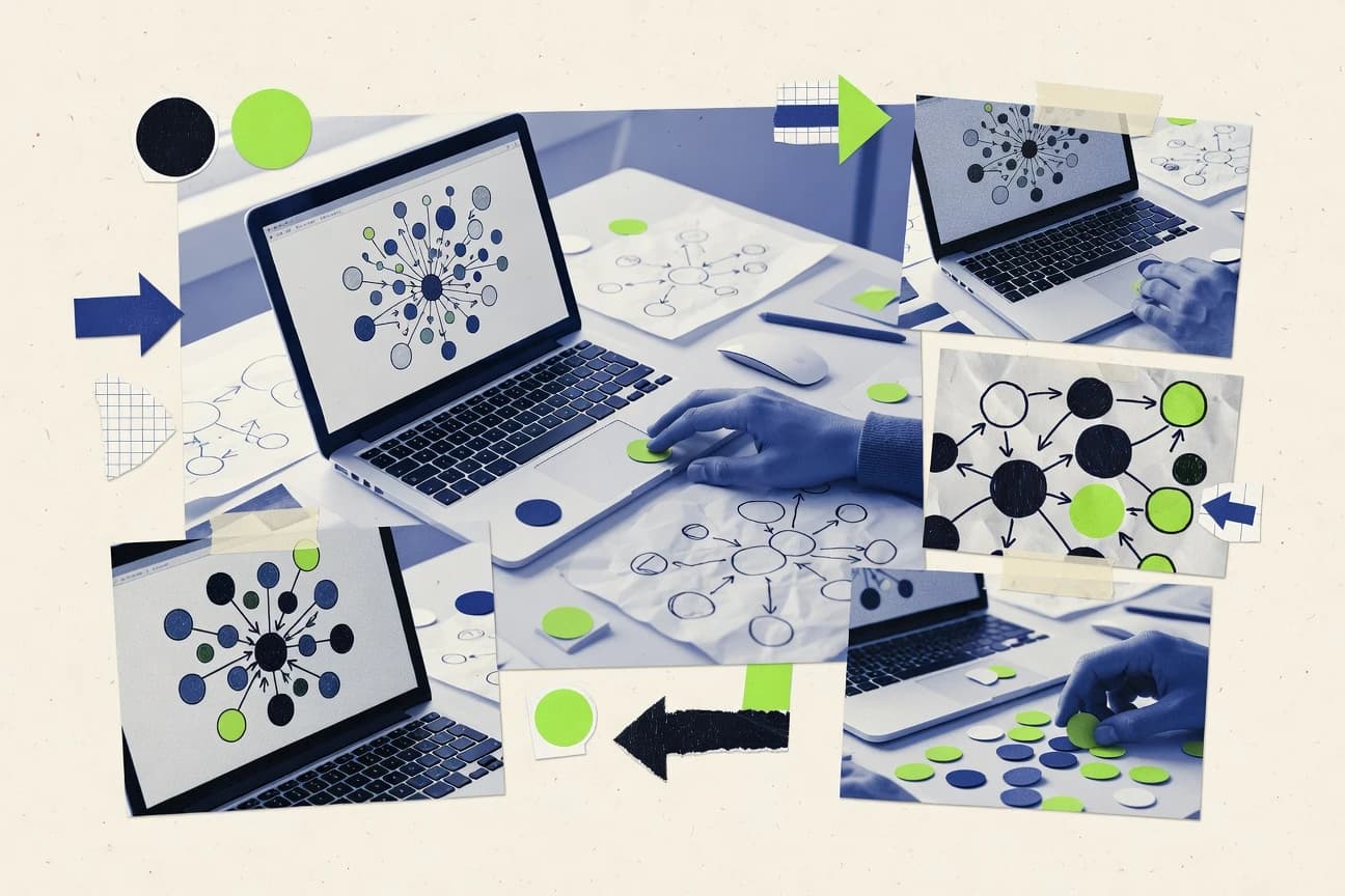
What Is Bubble Map Software?
Bubble Map Software is a visual mapping editor that lets users arrange ideas into clustered bubbles connected by links or connectors to show relationships. These tools solve brainstorming and planning problems by turning unstructured notes into navigable structures with grouping and layout support. Teams use them to create concept relationships for product, strategy, process, and deliverables. In practice, Miro delivers a live collaborative canvas for sticky-note bubble mapping, while Lucidchart provides structured diagramming with real-time commenting and version history for shared bubble maps.
Key Features to Look For
The best Bubble Map Software options combine fast bubble creation with collaboration, clarity in dense diagrams, and export formats that preserve stakeholder-ready visuals.
Infinite or large canvas plus layout acceleration
Large canvases and smart layout tools help teams reposition and scale bubble maps without constantly reorganizing the workspace. Miro pairs an infinite canvas with templates and smart alignment to generate bubble-map structures quickly, while Creately uses smart layout alignment tools to auto-arrange clustered bubble-map nodes.
Real-time collaboration with commenting and activity context
Bubble maps often require iterative changes during workshops and stakeholder reviews, so real-time co-editing and threaded or inline comments matter. Whimsical provides real-time collaborative Bubble Maps with threaded comments, while MindMeister and Lucidchart add real-time co-editing and commenting to keep the same visual structure under review.
Connector routing that keeps relationships readable
Readable relationship lines prevent dense bubble maps from becoming ambiguous when nodes move. draw.io emphasizes automatic connector routing and connector styling, while Whimsical and Creately use connectors and auto-aligned layouts to keep bubble relationships easy to follow.
Grouping controls that support theme-level organization
Bubble maps become practical when ideas can be grouped into logical containers like phases, themes, or subtopics. Miro uses Frames to group related scenarios and phased refinement, while Lucidchart uses flexible containers for clear bubble grouping and nested ideas.
Templates and reusable structures for consistent mapping
Templates reduce setup time and keep bubble-map formatting consistent across recurring workshops. Miro’s template library and smart diagram elements accelerate repeatable bubble-map structures, while Whimsical and Creately include template-driven workflows that speed up structured brainstorming.
Stakeholder-ready exports and interactive outputs
Bubble maps often need to travel into documents, slide decks, or interactive walkthroughs. Miro supports export options like image and PDF for board outputs, while Visme adds interactive hotspots and links so bubble maps work as clickable, stakeholder-facing visuals.
How to Choose the Right Bubble Map Software
Selecting the right tool depends on whether bubble mapping is primarily a collaborative workshop activity, a structured diagramming task, or a presentation-ready storytelling output.
Pick the collaboration model that matches the workflow
If bubble maps require real-time co-editing during live sessions, prioritize tools with collaborative editing and commenting such as Miro, Whimsical, Lucidchart, MindMeister, and Creately. Whimsical supports threaded comments during real-time collaboration, while Lucidchart adds real-time commenting with version history so teams can iterate without losing map structure.
Match the layout and readability needs to connector behavior
Dense bubble maps need automatic connector routing and snapping or alignment to avoid tangled relationship lines. draw.io provides automatic connector routing and styling that stays clear during rearranging, while Whimsical and Creately use connectors with auto-aligned layouts to preserve readability as bubbles move.
Choose grouping and structure controls for how ideas are organized
When maps must reflect phases, themes, or nested concepts, choose grouping primitives like frames and containers. Miro’s Frames support logical grouping for themes and phased refinement, while Lucidchart’s flexible containers enable bubble grouping and nested ideas for structured concept relationships.
Decide whether bubble mapping needs mind-map semantics or diagram semantics
If the primary workflow is building hierarchical concept clusters with rapid node expansion, mind-mapping oriented tools fit well, including MindManager and MindMeister. MindManager adds map-to-outline and outline-to-map conversion for bidirectional structuring, while MindMeister focuses on quick turn-key mind mapping that can reorganize clusters with minimal setup.
Plan for how the bubble map will be delivered to stakeholders
For interactive walkthroughs, Visme adds hotspots and links embedded in diagrams so stakeholders can navigate bubble maps directly. For editing and format flexibility, draw.io supports exports like PNG, PDF, SVG, and editable XML, while Miro offers export options for sharing bubble maps beyond the board.
Who Needs Bubble Map Software?
Bubble Map Software benefits different teams depending on whether they prioritize live workshop collaboration, structured diagramming, data-to-visual generation, or branded interactive deliverables.
Teams running collaborative bubble-map workshops at scale
Miro is built for workshop-style visual planning with an infinite canvas, sticky-note clustering, real-time cursors, comments, and version history for iterative review cycles. For alternative workshop collaboration, Whimsical provides lightweight Bubble Maps with threaded comments for shared ideation.
Teams producing collaborative bubble maps for product, strategy, or process planning
Lucidchart supports real-time co-editing with inline comments and version history so teams can refine bubble structures without losing context. Creately also supports real-time co-editing and commenting with smart alignment that auto-arranges clustered nodes during clustering sessions.
Teams that need editable bubble maps in multiple export formats
draw.io targets teams that want shareable bubble maps as editable diagram files and export outputs like PNG, PDF, SVG, and XML. It focuses on connector routing and styling to keep relationships readable when rearranging nodes.
Small teams creating clean concept clusters without diagramming complexity
Coggle offers a bubble-map-focused editor with fast node and connection building aimed at hierarchical clusters. It provides shareable maps that support collaborative refinement without requiring advanced diagram semantics.
Common Mistakes to Avoid
Several recurring pitfalls appear across the reviewed tools, especially around collaboration expectations, diagram complexity, and deliverable requirements.
Expecting real-time co-editing when it depends on external storage
draw.io does not provide true real-time multi-user editing inside the editor because collaboration depends on the storage backend used to open the file. Miro, Whimsical, Lucidchart, MindMeister, and Creately provide real-time collaboration features like cursors or comments designed for shared editing.
Overbuilding dense maps without testing performance
Miro can become sluggish when boards contain many elements and connectors, and Lucidchart can feel slower as bubble counts grow. Creately and draw.io can also slow down as large diagrams accumulate edits, so performance testing matters for high-density workshops.
Trying to use a freeform bubble workspace for diagram-intensive semantics
Whimsical and Coggle offer lighter diagram semantics compared with purpose-built mapping suites, which can limit advanced diagram behavior in complex structures. Lucidchart provides more advanced diagramming tooling with flexible containers and alignment helpers when bubble-map semantics need to be tightly controlled.
Choosing a visual generator when a freeform editing workflow is required
SankeyMATIC is designed for import-based Sankey-style generation from structured source-target flow data and then constrained fine-tuning. Teams that need freeform clustering and iterative layout should use editors like Miro, Lucidchart, or Creately instead of a generation-first tool.
How We Selected and Ranked These Tools
We evaluated each Bubble Map Software on three sub-dimensions that map directly to how teams use bubble maps, features with weight 0.4, ease of use with weight 0.3, and value with weight 0.3. The overall score is the weighted average of those three dimensions, computed as overall = 0.40 × features + 0.30 × ease of use + 0.30 × value. Miro separated from lower-ranked tools because it combines infinite canvas capability with templates and smart alignment, which directly increases speed of creating bubble-map layouts and supports workshop-scale iteration.
Frequently Asked Questions About Bubble Map Software
Which bubble map software is best for real-time collaborative workshops on a shared canvas?
What tool is most effective for turning bubble maps into structured diagram hierarchies?
Which option works well when editable file formats must be handed off to other systems or designers?
Which tools integrate smoothly with common productivity suites for diagram workflows?
What is the best choice for teams that need interactive bubble maps with clickable elements?
Which bubble map software is strongest for organizing nodes with automatic layout and alignment?
How should teams choose between mind-mapping tools and general diagram editors for bubble maps?
What tool fits the need to generate relationship flow visuals from structured source-target data?
Why do some bubble map editors struggle with collaboration, and which one avoids that issue?
Which software is the best fit for small teams that want a fast bubble-map focused editor?
Tools reviewed
Primary sources checked during evaluation.
Referenced in the comparison table and product reviews above.
Keep exploring
Comparing two specific tools?
Software Alternatives
See head-to-head software comparisons with feature breakdowns, pricing, and our recommendation for each use case.
Explore software alternatives→In this category
Technology Digital Media alternatives
See side-by-side comparisons of technology digital media tools and pick the right one for your stack.
Compare technology digital media tools→FOR SOFTWARE VENDORS
Not on this list? Let’s fix that.
Our best-of pages are how many teams discover and compare tools in this space. If you think your product belongs in this lineup, we’d like to hear from you—we’ll walk you through fit and what an editorial entry looks like.
Apply for a ListingWHAT THIS INCLUDES
Where buyers compare
Readers come to these pages to shortlist software—your product shows up in that moment, not in a random sidebar.
Editorial write-up
We describe your product in our own words and check the facts before anything goes live.
On-page brand presence
You appear in the roundup the same way as other tools we cover: name, positioning, and a clear next step for readers who want to learn more.
Kept up to date
We refresh lists on a regular rhythm so the category page stays useful as products and pricing change.