GITNUXSOFTWARE ADVICE
Business FinanceTop 10 Best Report Creating Software of 2026
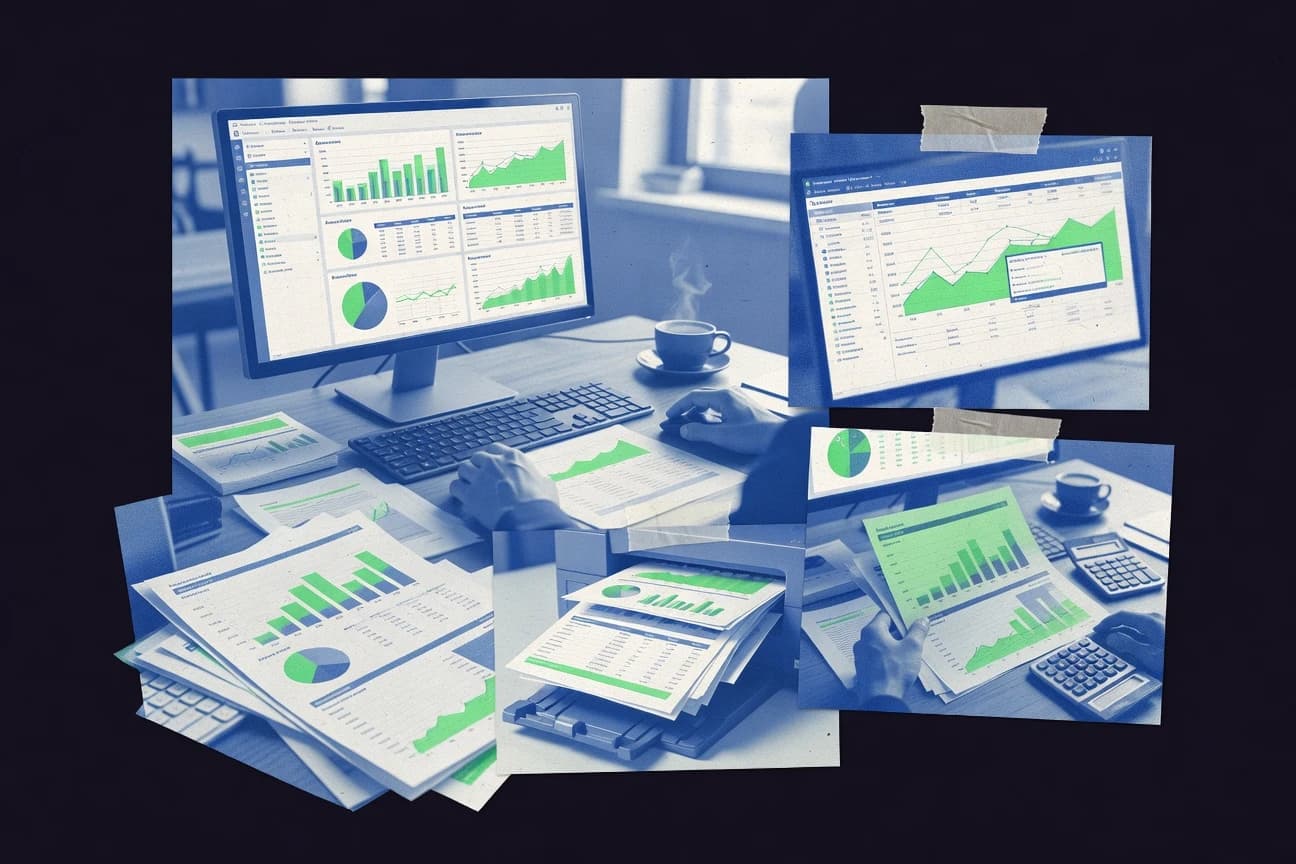
Discover the top report creating software to streamline data visualization. Find tools for efficient reporting now.

How we ranked these tools
Core product claims cross-referenced against official documentation, changelogs, and independent technical reviews.
Analyzed video reviews and hundreds of written evaluations to capture real-world user experiences with each tool.
AI persona simulations modeled how different user types would experience each tool across common use cases and workflows.
Final rankings reviewed and approved by our editorial team with authority to override AI-generated scores based on domain expertise.
Score: Features 40% · Ease 30% · Value 30%
Gitnux may earn a commission through links on this page — this does not influence rankings. Editorial policy
Editor picks
Three quick recommendations before you dive into the full comparison below — each one leads on a different dimension.
Tableau
VizQL technology for live, query-free visual analytics and instant dashboard interactivity
Built for data analysts, BI professionals, and enterprises needing sophisticated, interactive reports and dashboards..
Microsoft Power BI
Runner UpAI Visuals and natural language Q&A for instant insights from data without manual chart creation
Built for mid-to-large enterprises and teams embedded in the Microsoft ecosystem seeking scalable, interactive reporting solutions..
Google Looker Studio
Also GreatLive, native connections to Google data sources for real-time, no-ETL reporting
Built for marketing analysts, small to medium teams, and Google ecosystem users needing cost-free, collaborative reporting and dashboards..
Related reading
Comparison Table
Explore essential report creating software with this comparison, showcasing Tableau, Microsoft Power BI, Google Looker Studio, Qlik Sense, Sisense, and more. This table outlines key features, usability, and performance to help readers determine the ideal tool for their data visualization and reporting requirements.
Tableau
enterpriseA leading visual analytics platform for creating interactive dashboards and reports from diverse data sources.
VizQL technology for live, query-free visual analytics and instant dashboard interactivity
Tableau is a premier data visualization and business intelligence platform that enables users to connect to diverse data sources and create interactive dashboards and reports. Its drag-and-drop interface allows for rapid exploration and visualization of data without extensive coding. Tableau excels in transforming complex datasets into compelling, shareable stories with advanced features like forecasting, geospatial analysis, and real-time collaboration.
- +Exceptional interactive visualization capabilities
- +Seamless integration with hundreds of data sources
- +Robust sharing and collaboration tools via Tableau Server/Cloud
- –Steep learning curve for advanced features
- –High pricing, especially for full deployments
- –Performance can lag with massive unoptimized datasets
Best for: Data analysts, BI professionals, and enterprises needing sophisticated, interactive reports and dashboards.
More related reading
Microsoft Power BI
enterpriseBusiness intelligence tool that enables users to visualize and share insights through rich interactive reports.
AI Visuals and natural language Q&A for instant insights from data without manual chart creation
Microsoft Power BI is a comprehensive business analytics platform that allows users to connect to hundreds of data sources, transform data using Power Query, and create interactive reports and dashboards. It supports rich visualizations, AI-driven insights, and real-time data streaming for dynamic reporting. The tool excels in data modeling with DAX language and seamless sharing via the Power BI service, making it ideal for enterprise-level reporting.
- +Extensive data connectivity and integration with Microsoft ecosystem like Excel and Azure
- +Highly interactive and customizable visualizations with AI-powered features
- +Robust sharing, collaboration, and mobile access capabilities
- –Steep learning curve for advanced DAX and data modeling
- –Resource-intensive for large datasets on lower-end hardware
- –Limited free tier functionality for sharing and collaboration
Best for: Mid-to-large enterprises and teams embedded in the Microsoft ecosystem seeking scalable, interactive reporting solutions.
Google Looker Studio
otherFree data visualization tool for building customizable reports and dashboards integrated with Google services.
Live, native connections to Google data sources for real-time, no-ETL reporting
Google Looker Studio is a free, cloud-based data visualization platform that enables users to create interactive dashboards and reports by connecting to hundreds of data sources. It offers drag-and-drop design tools for building pixel-perfect visuals, custom themes, and calculated fields using a user-friendly formula language. The tool shines in collaborative environments with real-time sharing and editing features similar to Google Docs, making it ideal for teams within the Google ecosystem.
- +Completely free with unlimited reports and viewers
- +Seamless integration with Google Analytics, BigQuery, Sheets, and 800+ connectors
- +Real-time collaboration and easy sharing via links or embeds
- –Performance can slow with very large datasets or complex queries
- –Limited built-in advanced analytics compared to paid BI tools
- –Some customizations require SQL knowledge or community connectors
Best for: Marketing analysts, small to medium teams, and Google ecosystem users needing cost-free, collaborative reporting and dashboards.
Qlik Sense
enterpriseAI-powered analytics platform offering associative data modeling for self-service reporting and discovery.
Associative Data Engine for unique, query-free data exploration
Qlik Sense is a leading business intelligence platform from Qlik that excels in creating interactive dashboards, reports, and data visualizations through its associative data engine, enabling users to explore data relationships intuitively without rigid hierarchies. It supports self-service analytics with drag-and-drop interfaces, AI-driven insights, and seamless integration with diverse data sources like databases, cloud services, and spreadsheets. While powerful for dynamic reporting, it prioritizes exploratory analytics over traditional static report generation.
- +Associative engine for natural data discovery and no predefined paths
- +Extensive library of visualizations and AI-powered Insight Advisor
- +Robust data connectivity and scalability for enterprise use
- –Steep learning curve for non-technical users
- –Expensive pricing model unsuitable for small teams
- –Limited support for pixel-perfect, static reports compared to dedicated tools
Best for: Mid-sized to large enterprises requiring advanced, interactive BI reporting and data exploration capabilities.
Sisense
enterpriseAI-driven BI platform that fuses data and delivers embedded analytics for complex report creation.
Elasticube hypercubes for ultra-fast, in-memory data processing and real-time report generation on petabyte-scale data
Sisense is a robust business intelligence platform designed for data analysis, visualization, and report creation, allowing users to build interactive dashboards and automated reports from complex datasets. Its patented Elasticube technology powers high-performance querying on big data, enabling seamless data fusion from multiple sources. The platform supports pixel-perfect reporting and embedding analytics into applications, making it suitable for enterprise-scale reporting needs.
- +Powerful data engine for handling massive datasets and complex joins
- +Highly customizable interactive reports and dashboards
- +Strong embedding and white-labeling for customer-facing analytics
- –Steep learning curve for non-technical users
- –Enterprise pricing lacks transparency and affordability for SMBs
- –Limited native mobile reporting capabilities
Best for: Mid-to-large enterprises needing advanced, embedded reporting solutions for complex data environments.
Domo
enterpriseCloud-native BI platform connecting data sources to create real-time customizable reports and apps.
Magic ETL for no-code data transformation and blending directly within the platform
Domo is a cloud-based business intelligence platform that excels in data integration, visualization, and automated reporting, allowing users to connect to over 1,000 data sources for real-time dashboards and interactive reports. It supports advanced analytics, AI-driven insights, and app development, making it suitable for enterprise-level reporting needs. Users can share reports securely and collaborate via its social feed-like interface called Buzz.
- +Extensive data connectors for seamless integration from diverse sources
- +Real-time data processing and automated alerts for timely reporting
- +Highly customizable dashboards with AI-powered predictions
- –Steep learning curve for non-technical users
- –High cost prohibitive for small businesses
- –Complex setup for advanced customizations
Best for: Mid-to-large enterprises needing scalable, real-time BI and reporting across multiple data silos.
MicroStrategy
enterpriseEnterprise analytics and mobility platform for hyperintelligence and advanced reporting capabilities.
MicroStrategy Documents for building highly formatted, multi-page reports with embedded interactivity and zero-footprint deployment
MicroStrategy is an enterprise-grade business intelligence platform that enables users to create interactive reports, pixel-perfect documents, and advanced dashboards from diverse data sources. It supports sophisticated report design with drag-and-drop interfaces, embedding analytics, and AI-driven insights for dynamic storytelling. While broader than pure reporting tools, its robust reporting engine handles complex, scalable report generation for large organizations.
- +Extensive data connectivity and integration options
- +Pixel-perfect reporting with interactive elements
- +Scalable for enterprise-level deployments
- –Steep learning curve for non-experts
- –High cost with complex licensing
- –Overkill for basic reporting needs
Best for: Large enterprises needing integrated BI analytics with advanced, customizable report creation.
Zoho Analytics
enterpriseSelf-service BI tool for analyzing data and generating collaborative reports with AI assistance.
Zia AI assistant for conversational analytics and automated insights generation
Zoho Analytics is a cloud-based BI and analytics platform designed for creating interactive reports, dashboards, and visualizations from diverse data sources. It offers drag-and-drop report builders, pixel-perfect reporting, scheduled exports, and advanced features like data blending and forecasting. With AI-driven insights via Zia, it enables self-service analytics for teams without deep technical expertise.
- +Over 600 native data connectors for seamless integration
- +AI-powered Zia for natural language queries and auto-insights
- +Strong collaboration tools with sharing and embedding options
- –Steeper learning curve for advanced custom reports
- –Performance can lag with very large datasets
- –Some premium features locked behind higher tiers
Best for: Small to medium businesses and Zoho ecosystem users seeking affordable, collaborative report creation without enterprise complexity.
SAP Crystal Reports
specializedTraditional report design and generation tool for pixel-perfect reports from various databases.
Pixel-perfect reporting engine that maintains exact design fidelity across all export formats and devices
SAP Crystal Reports is a powerful business intelligence tool designed for creating pixel-perfect, highly formatted reports from diverse data sources including databases, spreadsheets, and enterprise applications. It offers advanced features like data blending, subreports, and interactive visualizations to deliver professional-grade reporting solutions. Widely used in enterprise environments, it supports exporting to multiple formats such as PDF, Excel, and HTML for seamless distribution.
- +Extensive connectivity to virtually any data source
- +Pixel-perfect formatting for professional reports
- +Robust visualization and interactivity options
- –Steep learning curve for new users
- –High licensing costs with ongoing maintenance fees
- –Performance challenges with very large datasets
Best for: Enterprise users and IT professionals requiring precise, customized reports from complex, multi-source data environments.
TIBCO Jaspersoft
otherOpen-source reporting and analytics engine for embedding reports in Java-based applications.
Open-source JasperReports engine enabling seamless embedding and programmatic report generation in Java applications
TIBCO Jaspersoft is a robust reporting and business intelligence platform that allows users to design pixel-perfect reports, dashboards, and visualizations from diverse data sources including databases, Big Data, and cloud services. It features JasperReports as an open-source engine for generating reports in formats like PDF, HTML, Excel, and more, with commercial server options for scheduling, security, and ad-hoc querying. Ideal for embedding reporting capabilities into enterprise applications, it supports both developers and business users through Studio designer and server-based deployment.
- +Extensive data source connectivity including SQL, NoSQL, and APIs
- +Pixel-perfect report design with advanced formatting and scripting
- +Open-source core engine for cost-effective embedding in applications
- –Steep learning curve due to Eclipse-based Studio interface
- –Somewhat dated UI compared to modern BI tools
- –Commercial editions require sales quote and can be expensive for small teams
Best for: Enterprises and developers needing highly customizable, embeddable reporting solutions with strong integration capabilities.
Conclusion
After evaluating 10 business finance, Tableau stands out as our overall top pick — it scored highest across our combined criteria of features, ease of use, and value, which is why it sits at #1 in the rankings above.
Use the comparison table and detailed reviews above to validate the fit against your own requirements before committing to a tool.
How to Choose the Right Report Creating Software
This buyer’s guide explains how to choose report creating software for interactive dashboards, pixel-perfect documents, and embedded analytics. It covers Tableau, Microsoft Power BI, Google Looker Studio, Qlik Sense, Sisense, Domo, MicroStrategy, Zoho Analytics, SAP Crystal Reports, and TIBCO Jaspersoft based on their concrete reporting capabilities. The guide focuses on what to look for, how to decide, who each tool fits best, and which buying mistakes to avoid.
What Is Report Creating Software?
Report creating software helps teams turn data from databases, spreadsheets, and SaaS apps into shareable reports, dashboards, and multi-page documents. It solves the need for faster visualization, consistent formatting, and repeatable reporting workflows without writing every report from scratch. Tools like Tableau deliver live, query-free interactivity through VizQL for dashboard experiences. Microsoft Power BI combines data connectivity and AI Visuals with natural language Q&A to generate insights inside interactive reports.
Key Features to Look For
These capabilities determine whether reporting stays fast and accurate as data volume, user skill level, and distribution requirements change.
Live, query-free interactive analytics
Tableau’s VizQL provides live, query-free visual analytics so dashboards respond instantly during exploration. Qlik Sense also supports query-free data exploration through an associative data engine that avoids rigid report paths.
AI-assisted insight discovery and natural language Q&A
Microsoft Power BI uses AI Visuals and natural language Q&A so teams can ask questions and get insights without manually building every chart. Zoho Analytics uses Zia for conversational analytics and automated insights generation.
Native real-time connections to common data sources
Google Looker Studio offers live, native connections to Google data sources for no-ETL reporting. Looker Studio is especially strong for teams already using Google Analytics, BigQuery, or Sheets.
High-performance reporting for large or complex datasets
Sisense uses Elasticube hypercubes for ultra-fast in-memory data processing to support real-time report generation at very large scale. Domo supports real-time data processing and automated alerts so reporting stays timely as new data arrives.
Pixel-perfect, highly formatted report output
SAP Crystal Reports is built for pixel-perfect, highly formatted reports that preserve exact design fidelity across export formats and devices. MicroStrategy Documents supports highly formatted, multi-page reports with embedded interactivity and zero-footprint deployment.
Embedded and application-ready reporting
TIBCO Jaspersoft centers on an open-source JasperReports engine for embedding reports in Java-based applications. Sisense supports embedding and white-labeling so customer-facing analytics can be integrated into external applications.
How to Choose the Right Report Creating Software
Selecting the right tool depends on matching the reporting workload to the platform’s interaction model, formatting needs, and deployment approach.
Pick the interaction style for how users explore data
For analysts who need instant dashboard interactivity while exploring without heavy query planning, Tableau is built around VizQL for live, query-free visual analytics. For teams that prefer exploratory discovery driven by relationships rather than predefined hierarchies, Qlik Sense uses an associative data engine for query-free exploration.
Match AI and question-answering to the reporting workflow
If business users need to ask questions in natural language and get insights without building charts manually, Microsoft Power BI provides AI Visuals and natural language Q&A. If conversational analytics and automated insights are the priority, Zoho Analytics uses Zia to generate and explain findings inside reports.
Plan for the reporting data sources and connection model
For organizations centered on Google services, Google Looker Studio is purpose-built for live, native connections to Google Analytics, BigQuery, and Sheets with no-ETL reporting. For enterprises that need broad connectivity across databases, cloud services, and spreadsheets, Tableau, Power BI, and Qlik Sense all emphasize extensive data source integration.
Choose the output format target for distribution
If stakeholders require strict layout fidelity across PDF, Excel, and HTML exports, SAP Crystal Reports focuses on pixel-perfect formatting. If stakeholders need multi-page, document-style reporting with embedded interactivity, MicroStrategy Documents provides highly formatted multi-page output with zero-footprint deployment.
Decide whether reporting must be embedded into applications
For Java application teams building embedded reporting, TIBCO Jaspersoft uses JasperReports as an open-source engine and supports programmatic report generation. For enterprises embedding analytics with white-labeling for customers, Sisense supports embedded and customized reporting experiences designed for external use.
Who Needs Report Creating Software?
These tools align to different reporting roles, from marketing dashboards and executive documents to developer-embedded analytics.
Data analysts and BI professionals who must deliver highly interactive dashboards
Tableau fits teams needing sophisticated interactive reporting and dashboards from diverse data sources with live interactivity via VizQL. Qlik Sense also fits teams who want interactive exploration driven by an associative data engine for query-free discovery.
Mid-to-large enterprises standardized on Microsoft workflows
Microsoft Power BI fits teams embedded in the Microsoft ecosystem because it connects to many data sources and supports data transformation with Power Query and modeling with DAX. Power BI also fits organizations that want AI Visuals and natural language Q&A built into interactive reports.
Marketing analysts and small to medium teams using Google data sources
Google Looker Studio fits marketing and reporting teams that need cost-free collaborative dashboards with real-time sharing and editing via links or embeds. It is especially strong for users connecting directly to Google Analytics, BigQuery, and Sheets.
Enterprises that need embedded reporting and app-ready analytics
Sisense fits mid-to-large enterprises that need embedded and white-labeled analytics with high-performance querying via Elasticube hypercubes. TIBCO Jaspersoft fits enterprise developers who want an open-source JasperReports engine and programmatic report generation for embedding into Java applications.
Common Mistakes to Avoid
Frequent buying errors come from mismatching the platform to data scale, user skill level, and the required report fidelity or output style.
Choosing a highly configurable BI platform when pixel-perfect document fidelity is the real requirement
SAP Crystal Reports and MicroStrategy are built around pixel-perfect reporting and multi-page document design with exact formatting behavior across exports. Tableau and Qlik Sense can deliver excellent dashboards, but advanced customization and formatting depth can increase complexity for users focused on strict document layouts.
Ignoring dataset size and query complexity when planning interactive dashboards
Google Looker Studio performance can slow with very large datasets or complex queries, which can disrupt interactive dashboard usage. Tableau and Qlik Sense can also lag with massive unoptimized datasets, so dataset optimization and workload testing matter.
Underestimating the learning curve for advanced modeling and report building
Power BI’s DAX and data modeling and Qlik Sense’s associative modeling both involve a steep learning curve for non-technical users. TIBCO Jaspersoft’s Eclipse-based Studio interface increases the learning effort for teams focused on fast authoring.
Selecting a tool that does not match the required embedding or distribution approach
TIBCO Jaspersoft is designed for embedding and programmatic generation in Java applications, so using it outside an embedding strategy can miss the main value. Sisense is built for embedded and white-labeling analytics, so it fits customer-facing reporting experiences better than tools aimed primarily at internal dashboards.
How We Selected and Ranked These Tools
We evaluated each tool using three sub-dimensions: features with a weight of 0.4, ease of use with a weight of 0.3, and value with a weight of 0.3. The overall rating is the weighted average of those three components, computed as overall = 0.40 × features + 0.30 × ease of use + 0.30 × value. Tableau separated itself through its VizQL live, query-free visual analytics, which directly strengthened the features score by enabling instant dashboard interactivity without query-dependent friction. Microsoft Power BI also performed strongly in features because AI Visuals and natural language Q&A reduce manual chart creation during report exploration.
Frequently Asked Questions About Report Creating Software
How do Tableau and Power BI differ for creating interactive dashboards from the same data?
Which tool is best for collaborative reporting workflows across marketing and analytics teams?
What software choice fits teams that need minimal data engineering for live reporting from Google data sources?
Which platform handles exploratory, relationship-first analysis better than static report layouts?
Which tool is most suitable for embedding analytics and automated report generation in an application?
How do Domo and Qlik Sense compare for real-time dashboards fed from many disconnected data sources?
Which reporting tool is designed for pixel-perfect document formatting and strict layout control?
What tool is a strong fit when the workflow requires scheduled exports and multi-format delivery from enterprise data?
Which platform helps teams troubleshoot complex report performance caused by large datasets and heavy querying?
Tools reviewed
Primary sources checked during evaluation.
Referenced in the comparison table and product reviews above.
Keep exploring
Comparing two specific tools?
Software Alternatives
See head-to-head software comparisons with feature breakdowns, pricing, and our recommendation for each use case.
Explore software alternatives→In this category
Business Finance alternatives
See side-by-side comparisons of business finance tools and pick the right one for your stack.
Compare business finance tools→FOR SOFTWARE VENDORS
Not on this list? Let’s fix that.
Our best-of pages are how many teams discover and compare tools in this space. If you think your product belongs in this lineup, we’d like to hear from you—we’ll walk you through fit and what an editorial entry looks like.
Apply for a ListingWHAT THIS INCLUDES
Where buyers compare
Readers come to these pages to shortlist software—your product shows up in that moment, not in a random sidebar.
Editorial write-up
We describe your product in our own words and check the facts before anything goes live.
On-page brand presence
You appear in the roundup the same way as other tools we cover: name, positioning, and a clear next step for readers who want to learn more.
Kept up to date
We refresh lists on a regular rhythm so the category page stays useful as products and pricing change.