GITNUXSOFTWARE ADVICE
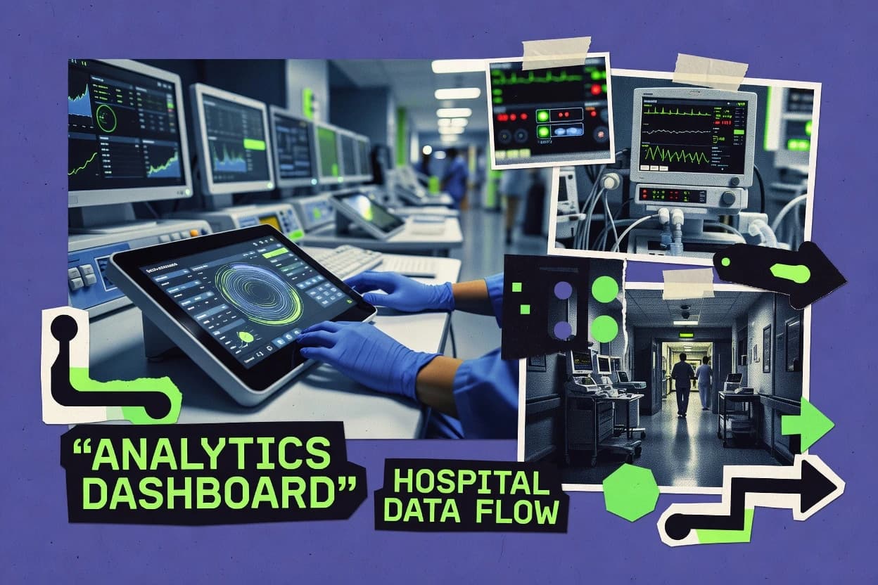
Healthcare MedicineTop 10 Best Hospital Analytics Software of 2026
Top 10 Hospital Analytics Software ranked for hospitals. Compare Tableau, Qlik Sense, and Microsoft Power BI and pick the best fit.

How we ranked these tools
Core product claims cross-referenced against official documentation, changelogs, and independent technical reviews.
Analyzed video reviews and hundreds of written evaluations to capture real-world user experiences with each tool.
AI persona simulations modeled how different user types would experience each tool across common use cases and workflows.
Final rankings reviewed and approved by our editorial team with authority to override AI-generated scores based on domain expertise.
Score: Features 40% · Ease 30% · Value 30%
Gitnux may earn a commission through links on this page — this does not influence rankings. Editorial policy
Editor’s top 3 picks
Three quick recommendations before you dive into the full comparison below — each one leads on a different dimension.
Tableau
Tableau Dashboard actions with drill-down filtering across multiple linked views
Built for hospital teams needing governed, interactive analytics across operational and clinical KPIs.
Qlik Sense
Editor pickAssociative analytics with selections across linked fields in a single interactive experience
Built for hospital analytics teams needing associative exploration across multi-system clinical and operational data.
Microsoft Power BI
Editor pickPower BI row-level security enforces user-specific access to healthcare report data
Built for hospitals needing governed dashboards and self-service analytics across departments.
Related reading
Comparison Table
This comparison table evaluates hospital analytics platforms such as Tableau, Qlik Sense, Microsoft Power BI, Looker, and Sisense against common selection criteria. It highlights how each tool supports healthcare reporting, dashboarding, data modeling, and governance so teams can compare capabilities for clinical, operational, and financial use cases.
Tableau
BI dashboardsSelf-service BI dashboards and governed analytics support hospital quality, operations, and outcomes reporting with interactive visualizations.
Tableau Dashboard actions with drill-down filtering across multiple linked views
Tableau stands out for interactive, self-service analytics that let hospital teams explore KPIs without writing queries. It connects to common healthcare data sources and builds dashboards for operational metrics like patient flow, staffing, and bed utilization.
Visual analysis features support filtering, drilldowns, and calculated fields for cohort and performance views across departments. Governance tools help manage shared workbooks and maintain consistent definitions for clinical and operational reporting.
- +Drag-and-drop dashboard building for patient flow and capacity reporting
- +Strong interactive filtering and drilldown for departmental performance analysis
- +Calculated fields and data blending for unified KPI definitions
- +Role-based access controls to secure shared hospital dashboards
- +Hyper-fast extracts for responsive use during high-demand reporting hours
- –Dashboard performance can degrade with poorly modeled or large datasets
- –Advanced analytics still requires separate tooling for predictive modeling
- –Metric governance can be difficult across many versions of workbooks
- –Embedding and mobile views can require extra design work for clarity
Best for: Hospital teams needing governed, interactive analytics across operational and clinical KPIs
More related reading
Qlik Sense
Self-service BIAssociative analytics and governed dashboards enable hospital analytics teams to explore clinical and operational data across systems.
Associative analytics with selections across linked fields in a single interactive experience
Qlik Sense stands out for its associative data modeling that links hospital datasets across clinical, operational, and financial domains without forcing a fixed drill path. It delivers self-service dashboards and guided analytics for exploring metrics like readmission rates, bed utilization, and referral flows using interactive filters and selections.
Built-in data preparation supports combining structured sources like EHR exports with curated fields for consistent reporting across departments. Governance features like role-based access control and audit-friendly deployment help support regulated hospital reporting workflows.
- +Associative engine enables cross-filter exploration across connected hospital datasets
- +Self-service dashboards let clinicians and analysts slice KPIs without building new pipelines
- +Built-in data preparation supports standardizing and joining hospital source files
- –Associative analysis can surprise users expecting strict predefined drill hierarchies
- –Advanced app design often requires skilled Qlik development expertise
- –Performance depends heavily on data modeling and reload optimization
Best for: Hospital analytics teams needing associative exploration across multi-system clinical and operational data
Microsoft Power BI
Cloud BICloud BI with dashboards, semantic models, and dataflows supports hospital performance, utilization, and quality analytics at scale.
Power BI row-level security enforces user-specific access to healthcare report data
Microsoft Power BI stands out with tight integration across Microsoft Fabric, Azure, and Excel for hospital analytics pipelines. It delivers interactive dashboards, paginated reports, and self-service data exploration across clinical, operational, and financial datasets.
Data preparation is strengthened with Power Query, which supports cleansing, shaping, and repeatable transformations for reporting. Governance features like row-level security and audit-friendly administration support controlled access to sensitive healthcare data.
- +Strong data modeling with Power Query and DAX for hospital metrics
- +Interactive dashboards with drill-through for patient flow and capacity analysis
- +Row-level security supports controlled departmental access to reports
- –Direct patient-level analytics can be complex without careful model design
- –Custom visuals sometimes require additional validation for clinical reporting
- –Performance tuning needs attention with very large or high-cardinality datasets
Best for: Hospitals needing governed dashboards and self-service analytics across departments
Looker
Governed analyticsModel-driven analytics with governed data modeling helps hospitals deliver consistent clinical and operational metrics across teams.
LookML semantic layer for governed, reusable healthcare metrics definitions
Looker stands out for delivering consistent hospital analytics through reusable governed semantic models. It combines dataset modeling, dashboarding, and scheduled delivery for clinical and operational reporting like bed status and throughput.
Its LookML layer supports standardized definitions across departments and keeps metrics aligned across reports. Advanced filtering and role-based access help control who can see PHI-adjacent operational data within analytics workflows.
- +LookML enforces consistent metrics across departments and dashboards
- +Strong role-based access supports controlled analytics for sensitive workflows
- +Scheduled report delivery enables dependable recurring operational monitoring
- +Flexible filtering supports rapid drill-down from KPIs to source data
- –Modeling requires LookML expertise for long-term maintainable governance
- –Complex dashboards can become slow without careful query optimization
- –Data integration relies on external pipelines and clean upstream schemas
Best for: Hospitals needing governed analytics with consistent metrics across clinical operations teams
Sisense
Embedded BIAnalytics with embedded dashboards and semantic indexing supports hospital analytics users with fast exploration of complex data.
In-database analytics with a governed semantic model for consistent hospital metrics
Sisense stands out for its in-database analytics approach that speeds up dashboard performance on large clinical and operational datasets. The platform unifies data preparation, semantic modeling, and governed BI so hospitals can standardize KPIs like readmissions, length of stay, and ED throughput.
It supports interactive dashboards, ad hoc exploration, and scheduled delivery across departments that need consistent reporting. Built-in connectors and integrations help bring together EHR exports, claims feeds, and operational sources into one analytics layer.
- +In-database analytics reduces extract latency for large hospital datasets
- +Strong semantic layer standardizes metrics across clinical and operations teams
- +Flexible dashboard and alerting workflows for operational KPI monitoring
- +Broad data connectors support EHR exports and operational data sources
- –Semantic modeling setup can be time-consuming for new hospital domains
- –Complex governance and role design may require specialist administration
- –Advanced customization can increase dependency on internal analytics skills
Best for: Hospital analytics teams standardizing governed KPIs with interactive BI
SAS Visual Analytics
Advanced analyticsAnalytics and visual exploration tools support hospital risk, quality, and outcomes reporting with advanced statistical capabilities.
Governed, interactive visual analytics with drill-down and spatial analytics for hospital decisioning
SAS Visual Analytics combines governed data preparation, interactive dashboards, and guided analytics in one workflow for hospital reporting. It supports clinical and operational use cases through KPI dashboards, ad hoc exploration, and configurable drill-down views tied to consistent metrics.
Visual Analytics also enables spatial and network analysis, which supports facility-level comparisons and referral or patient flow patterns. Collaboration features help teams publish governed visuals and share insights across units and leadership.
- +Governed dashboards keep hospital KPIs consistent across reporting teams
- +Interactive drill-down supports fast investigation of operational and clinical trends
- +Spatial visualizations help compare facility locations and regional outcomes
- +Strong analytical capabilities support deeper exploration beyond standard BI
- –Heavier SAS-based stack can slow early setup for smaller teams
- –Dashboard authoring requires training to use data preparation effectively
- –Complex models can increase maintenance effort across multiple departments
- –Browser performance can degrade with very large interactive datasets
Best for: Hospital analytics teams standardizing KPIs and exploring trends with governed dashboards
IBM Cognos Analytics
Enterprise BIEnterprise reporting and governed analytics provide hospital leaders with dashboards, ad hoc analysis, and metric standardization.
IBM Cognos Analytics guided analytics with governance controls for consistent self-service reporting
IBM Cognos Analytics stands out with governed self-service reporting that supports consistent clinical and operational metrics across hospitals. It combines interactive dashboards, ad hoc analysis, and managed report delivery with strong security controls for sensitive healthcare data.
The platform also supports enterprise planning style workflows through planning and forecasting features, helping teams model staffing, capacity, and demand scenarios. Integration with existing enterprise data sources enables end-to-end reporting from warehouse and operational feeds to executive-ready views.
- +Governed self-service reporting keeps metrics consistent across departments
- +Interactive dashboards support drill-through from executive views to patient-level dimensions
- +Strong role-based security supports controlled access to sensitive healthcare data
- +Enterprise report scheduling automates recurring operational and clinical updates
- +Planning and forecasting capabilities support capacity and demand scenario modeling
- –Complex administration can slow time-to-first dashboard in healthcare deployments
- –High customization effort may be needed for highly specific metric definitions
- –Performance tuning can be required for large volumes of hospital operational data
Best for: Hospitals standardizing analytics governance across clinical and operational teams
SAP Analytics Cloud
Unified analyticsPlanning, analytics, and dashboards in a unified workspace supports hospital workforce planning and performance reporting.
Integrated digital planning with structured models and scenario management
SAP Analytics Cloud stands out for combining planning, analytics, and embedded BI in one SAP-centered environment. It supports hospital reporting across operational and financial domains using live connections to SAP data and other data sources.
Built-in planning workflows enable staffing, budget, and forecast scenarios with role-based controls. Predictive and forecasting tools help surface capacity and demand trends for clinical operations and management reporting.
- +Unified BI, planning, and predictive analytics in one workspace
- +Strong integration with SAP ERP and S/4HANA data models
- +Role-based permissions support controlled hospital dashboard access
- +Interactive dashboards update from connected live data sources
- +Planning features support staffing and budget scenarios
- –Complex setup for advanced planning requires strong data governance
- –Custom visual and data modeling can be slower for non-SAP teams
- –Performance can suffer with very large datasets and heavy visuals
- –Hospital-specific KPIs may require significant configuration effort
- –Limited self-service modeling compared with specialized analytics stacks
Best for: Hospitals standardizing reporting and planning across SAP-linked operations and finance
Google Looker Studio
DashboardingReport builder for dashboards supports connecting hospital data sources and sharing interactive analytics with teams.
Calculated fields plus interactive filters across shared dashboards for consistent KPI exploration
Google Looker Studio stands out for turning healthcare and hospital metrics into interactive dashboards with fast, self-serve chart building. It connects to data sources like Google Sheets, BigQuery, and many SQL platforms, enabling near real-time reporting for clinical operations and patient throughput.
Hospital teams can publish dashboards, share them with role-based access, and drill into dimensions such as department, provider, and time. Scheduled refresh and calculated fields support consistent KPIs such as wait times, bed utilization, and readmission rates across reporting cycles.
- +Drag-and-drop dashboard builder for hospital KPI reporting
- +Connects to BigQuery and common databases for analytics pipelines
- +Interactive filters and drill-down for department and time analysis
- +Calculated fields for consistent metrics like wait time and utilization
- +Shareable dashboards with access control for internal reporting
- –Limited native statistical modeling for complex hospital research
- –Dashboard performance can degrade with very large or slow data sources
- –Advanced data governance requires careful setup across connectors
Best for: Hospital analytics teams building interactive KPI dashboards with minimal engineering
Amazon QuickSight
Cloud BIManaged BI dashboards connect to hospital datasets for cost-efficient analytics and sharing across business users.
Row-level security with SPICE in-memory acceleration for fast, governed healthcare dashboards
Amazon QuickSight stands out with fully managed analytics that connect directly to cloud and on-prem data sources without building a separate BI runtime. It supports governed dashboards, ad hoc analysis, and interactive visualizations tailored for clinical and operational metrics.
QuickSight’s machine learning insights add anomaly detection and narrative insights on top of standard charts. It also enables secure sharing of reports with role-based access and row-level security for sensitive healthcare data.
- +Managed SPOT for dashboards without provisioning BI servers
- +Direct connectors to common data stores and warehouses
- +Row-level security supports patient and cohort data segregation
- +ML insights highlight anomalies in operational and clinical KPIs
- +Interactive dashboards enable drill-down from executive to detail views
- –Dashboard performance depends heavily on model and dataset design
- –Visual customization can be limited versus fully bespoke BI tools
- –Complex healthcare data modeling often requires strong ETL discipline
- –Governance setup takes time for large user and team structures
Best for: Hospital analytics teams needing governed dashboards and managed ML insights
How to Choose the Right Hospital Analytics Software
This buyer’s guide explains how to select hospital analytics software for quality, operations, and outcomes reporting using Tableau, Qlik Sense, Microsoft Power BI, Looker, and Sisense. It also covers SAS Visual Analytics, IBM Cognos Analytics, SAP Analytics Cloud, Google Looker Studio, and Amazon QuickSight for governance, planning, and interactive KPI exploration. The guide maps concrete capabilities like row-level security, LookML semantic models, associative selections, and in-database analytics to specific hospital use cases.
What Is Hospital Analytics Software?
Hospital analytics software is BI and analytics tooling that turns healthcare and operational datasets into dashboards, governed metrics, and drill-down reporting for clinical and administrative decision-making. It helps reduce manual reporting by standardizing KPIs like bed utilization, patient flow, readmission rates, and ED throughput into repeatable views. Tools such as Tableau and Qlik Sense support interactive exploration through filtering and drilldowns across connected datasets. Tools such as Looker and Microsoft Power BI add governed metric layers and access controls so different departments can use consistent definitions without exposing sensitive data.
Key Features to Look For
The right feature set determines whether hospital teams can trust KPI definitions, explore operational trends quickly, and keep PHI-adjacent visibility controlled.
Governed semantic metrics with reusable definitions
Looker uses a LookML semantic layer to enforce consistent healthcare metrics across departments and dashboards. IBM Cognos Analytics and Tableau also support governed reporting workflows that keep metric definitions aligned for recurring operational monitoring.
Row-level security and role-based access controls
Microsoft Power BI enforces row-level security so report access can be restricted to user-specific healthcare report data. Amazon QuickSight also provides row-level security for patient and cohort data segregation and shares dashboards with role-based access.
Interactive drill-down for patient flow and operational performance
Tableau delivers dashboard actions that apply drill-down filtering across multiple linked views for departmental performance analysis. Google Looker Studio and Qlik Sense support interactive filters and drill-down by dimension such as department and time so teams can investigate KPIs without rebuilding reports.
Associative exploration across multi-system datasets
Qlik Sense uses an associative analytics engine that enables selections across linked fields in a single interactive experience. This design supports cross-filter investigation across clinical and operational domains without forcing a fixed drill path.
In-database analytics for faster performance on large hospital data
Sisense uses in-database analytics to reduce extract latency when dashboards query large clinical and operational datasets. This approach pairs with Sisense’s governed semantic model to keep KPI logic consistent while dashboards stay responsive.
Planning and scenario management for capacity and staffing
IBM Cognos Analytics includes planning and forecasting capabilities for modeling staffing, capacity, and demand scenarios. SAP Analytics Cloud combines digital planning with structured models and scenario management and also ties dashboards to live SAP data for workforce and performance reporting.
How to Choose the Right Hospital Analytics Software
Selection should start with the required governance model, then match interactivity needs, data scale behavior, and any planning requirements to specific tool capabilities.
Match governance needs to the tool’s metric layer
If consistent KPI definitions across departments are the top requirement, prioritize Looker with LookML semantic layer governance. Tableau also supports role-based access and governed analytics for quality, operations, and outcomes, while IBM Cognos Analytics supports governed self-service reporting with consistent metrics across hospitals.
Choose the access-control model based on PHI-adjacent visibility
For strict user-specific visibility, use Microsoft Power BI row-level security to enforce user-specific access to healthcare report data. For cohort and patient segregation in a managed BI workflow, Amazon QuickSight offers row-level security with SPICE in-memory acceleration for fast governed dashboards.
Decide how clinicians and analysts should explore KPIs
For guided drill-down across multiple linked views and strong interactive filtering, choose Tableau because dashboard actions can apply drill-down filtering across linked views. For associative exploration that lets users select across connected fields in one experience, Qlik Sense is designed for selections across linked fields.
Validate performance behavior on large datasets
Tableau performance depends on dataset modeling and extract design, so dashboard responsiveness can degrade with poorly modeled or very large datasets. Sisense uses in-database analytics to reduce extract latency on large datasets and tends to stay responsive when dashboards query heavy operational sources.
Add planning only if scenario modeling is required
If staffing, capacity, and demand scenario modeling is required, IBM Cognos Analytics includes planning and forecasting workflows. If workforce planning and scenario management should live alongside analytics and dashboards in one SAP-centered environment, SAP Analytics Cloud integrates planning with predictive and forecasting tools tied to live SAP models.
Who Needs Hospital Analytics Software?
Hospital analytics software benefits teams that must deliver consistent KPI reporting across departments while enabling controlled exploration of operational and clinical data.
Hospital analytics teams needing governed, interactive analytics across operational and clinical KPIs
Tableau fits this segment because it delivers governed analytics with interactive filtering and drilldown across operational metrics like patient flow and bed utilization. This also applies when secure sharing and responsive dashboard usage during high-demand reporting hours matter.
Hospital analytics teams requiring associative exploration across multi-system clinical and operational data
Qlik Sense matches because its associative analytics model supports cross-filter exploration across connected hospital datasets without a fixed drill path. This is especially useful when analysts want to investigate readmission rates, bed utilization, and referral flows across different source domains.
Hospitals standardizing metrics governance across clinical operations teams
Looker is built for consistent healthcare metrics through its LookML semantic layer, which keeps definitions aligned across reports. IBM Cognos Analytics also supports governed self-service reporting and scheduled delivery for recurring operational monitoring.
Hospital teams that need planning and forecasting alongside analytics
IBM Cognos Analytics supports planning and forecasting to model staffing, capacity, and demand scenarios using enterprise reporting workflows. SAP Analytics Cloud adds structured scenario management with integrated planning tied to SAP ERP and S/4HANA models for workforce and performance reporting.
Common Mistakes to Avoid
Common selection and rollout mistakes come from mismatching governance depth to reporting needs, underestimating data modeling impact on performance, and overextending interactive authoring without specialist support.
Choosing interactive BI without a governance approach for metric consistency
Looker’s LookML semantic layer exists to enforce consistent metrics, while Tableau provides governed analytics but can be harder to maintain across many workbook versions. Sisense and SAS Visual Analytics also emphasize governed semantic models and governed dashboards, which reduce metric drift across teams.
Underestimating performance risk from dataset modeling choices
Tableau can experience dashboard performance degradation with poorly modeled or large datasets, and Google Looker Studio can degrade with very large or slow data sources. Sisense reduces extract latency using in-database analytics, and Amazon QuickSight pairs managed BI with SPICE in-memory acceleration to support faster governed dashboards.
Assuming predictive analytics exists as a built-in replacement for specialized modeling
Tableau highlights that advanced analytics still requires separate tooling for predictive modeling beyond dashboard interactions. QuickSight provides machine learning insights for anomaly detection and narrative insights, but predictive research workflows may still require dedicated statistical or modeling tooling such as SAS Visual Analytics for deeper risk and outcomes analysis.
Overcomplicating semantic layer setup without allocating the right expertise
Looker requires LookML expertise for long-term maintainable governance, and Qlik Sense app design often needs skilled Qlik development expertise. SAS Visual Analytics dashboard authoring and data preparation also require training to use data preparation effectively.
How We Selected and Ranked These Tools
we evaluated every tool on three sub-dimensions with features weighted at 0.40, ease of use weighted at 0.30, and value weighted at 0.30. The overall rating is computed as overall = 0.40 × features + 0.30 × ease of use + 0.30 × value. Tableau separated from lower-ranked tools because it scored highest on interactive dashboard capability and usability for governed hospital reporting, including dashboard actions that apply drill-down filtering across multiple linked views while keeping operational and clinical KPI exploration fast. Tools like Qlik Sense also performed strongly on exploration quality through associative analytics, while Amazon QuickSight leaned into managed deployment with row-level security and SPICE in-memory acceleration.
Frequently Asked Questions About Hospital Analytics Software
Which hospital analytics tool is best for interactive drilldowns across multiple linked views?
Which option supports associative exploration across clinical, operational, and financial datasets without a fixed drill path?
Which platform is strongest for governed access control at the row level for sensitive healthcare data?
How do hospitals ensure consistent KPI definitions across teams and departments?
Which tool is best when dashboard performance becomes critical on very large clinical and operational datasets?
Which analytics suite supports spatial and network analysis for facility and patient flow patterns?
Which platform supports both analytics and scenario planning for capacity, demand, and staffing workflows?
Which option is best when hospital operations and finance reporting must share planning models in a single environment?
Which tool is easiest for near real-time operational dashboards with minimal engineering work?
Which managed cloud BI option adds machine learning insights like anomaly detection to hospital dashboards?
Conclusion
After evaluating 10 healthcare medicine, Tableau stands out as our overall top pick — it scored highest across our combined criteria of features, ease of use, and value, which is why it sits at #1 in the rankings above.
Use the comparison table and detailed reviews above to validate the fit against your own requirements before committing to a tool.
Tools reviewed
Primary sources checked during evaluation.
Referenced in the comparison table and product reviews above.
Keep exploring
Comparing two specific tools?
Software Alternatives
See head-to-head software comparisons with feature breakdowns, pricing, and our recommendation for each use case.
Explore software alternatives→In this category
Healthcare Medicine alternatives
See side-by-side comparisons of healthcare medicine tools and pick the right one for your stack.
Compare healthcare medicine tools→FOR SOFTWARE VENDORS
Not on this list? Let’s fix that.
Our best-of pages are how many teams discover and compare tools in this space. If you think your product belongs in this lineup, we’d like to hear from you—we’ll walk you through fit and what an editorial entry looks like.
Apply for a ListingWHAT THIS INCLUDES
Where buyers compare
Readers come to these pages to shortlist software—your product shows up in that moment, not in a random sidebar.
Editorial write-up
We describe your product in our own words and check the facts before anything goes live.
On-page brand presence
You appear in the roundup the same way as other tools we cover: name, positioning, and a clear next step for readers who want to learn more.
Kept up to date
We refresh lists on a regular rhythm so the category page stays useful as products and pricing change.