GITNUXSOFTWARE ADVICE
Science ResearchTop 10 Best Fishbone Diagram Software of 2026
Compare the Top 10 Fishbone Diagram Software picks, including Lucidchart, Miro, and Creately, for fast root-cause analysis and better decisions.

How we ranked these tools
Core product claims cross-referenced against official documentation, changelogs, and independent technical reviews.
Analyzed video reviews and hundreds of written evaluations to capture real-world user experiences with each tool.
AI persona simulations modeled how different user types would experience each tool across common use cases and workflows.
Final rankings reviewed and approved by our editorial team with authority to override AI-generated scores based on domain expertise.
Score: Features 40% · Ease 30% · Value 30%
Gitnux may earn a commission through links on this page — this does not influence rankings. Editorial policy
Editor’s top 3 picks
Three quick recommendations before you dive into the full comparison below — each one leads on a different dimension.
Lucidchart
Fishbone diagram templates with structured cause categories and configurable branch connections
Built for teams creating collaborative fishbone analyses for process and quality root-cause reviews.
Miro
Editor pickMiro whiteboards with interactive templates and connector-based fishbone layout
Built for teams running collaborative root-cause analysis sessions on shared visual boards.
Creately
Editor pickFishbone Diagram template with editable categories and auto-aligned connectors
Built for teams building and sharing fishbone root-cause diagrams with collaboration.
Related reading
Comparison Table
This comparison table evaluates fishbone diagram software used to map causes, effects, and categories in structured root-cause analysis workflows. It contrasts collaboration features, diagraming capabilities, and integrations such as Confluence and Jira across tools including Lucidchart, Miro, Creately, and diagrams.net. Readers can use the results to match each tool to team needs like real-time editing, template support, and sharing controls.
Lucidchart
diagrammingWeb-based diagramming with built-in fishbone diagram templates and fast collaboration for research workflows.
Fishbone diagram templates with structured cause categories and configurable branch connections
Lucidchart is distinct for fast diagram building with a wide, diagram-specific template library that includes fishbone layouts. It supports drag-and-drop nodes, connector routing, and swimlanes that help structure cause categories for quality and process analysis.
Collaboration features such as real-time co-editing and shared links make it practical for cross-team reviews of root-cause diagrams. Export and presentation options support taking fishbone diagrams into documents, decks, and reports.
- +Built-in fishbone and diagram templates for quick root-cause setup
- +Auto-routing connectors keep cause links readable during edits
- +Real-time collaboration enables live review of fishbone diagrams
- +Export options support sharing in common document and image formats
- +Vector editing maintains crisp lines and consistent typography
- –Advanced diagram layouts can require manual alignment tweaks
- –Complex fishbone diagrams may become dense without careful styling
- –Some formatting controls feel less granular than specialized diagram tools
- –Offline editing is limited compared with desktop-first diagramming tools
Best for: Teams creating collaborative fishbone analyses for process and quality root-cause reviews
Miro
collaborationOnline collaborative whiteboard that supports fishbone-style cause-and-effect diagrams with templates and shared boards.
Miro whiteboards with interactive templates and connector-based fishbone layout
Miro stands out for enabling fishbone diagrams alongside broad visual whiteboarding and real-time collaboration. It supports structured collaboration with sticky notes, arrows, shapes, and frames that help map root causes across categories.
Diagram building is fast via templates and freeform canvas tools that let teams rearrange and annotate relationships during sessions. Cross-team work benefits from comments and versioned editing workflows on shared boards.
- +Fishbone diagrams built from ready shapes, notes, and connectors
- +Real-time co-editing supports live root-cause workshops
- +Frames organize categories and keep complex boards navigable
- +Comments and mentions capture decisions tied to diagram elements
- –Dense fishbone boards can become cluttered without strict layout discipline
- –Advanced logic and data modeling remain limited versus diagram-specific tools
- –Export options may require cleanup to preserve layout fidelity
Best for: Teams running collaborative root-cause analysis sessions on shared visual boards
Creately
template editorDiagram builder with fishbone diagram templates and research-ready collaboration and commenting.
Fishbone Diagram template with editable categories and auto-aligned connectors
Creately supports fishbone diagrams with drag-and-drop shapes, connector lines, and configurable branch structures for cause analysis. The canvas supports collaborative editing with comments and versioned history, which helps teams converge on root-cause outcomes.
Diagram templates and reusable components make it faster to standardize recurring fishbone categories across projects. Export options like image and PDF formats support sharing fishbone findings in documents and presentations.
- +Drag-and-drop fishbone structure with flexible branch layout
- +Real-time collaboration with comments and synchronized editing
- +Reusable templates for consistent cause categories
- +Export to images and PDF for easy stakeholder sharing
- –Large fishbones can become visually crowded without strong spacing controls
- –Advanced layout automation is limited compared with dedicated diagram tools
- –Styling changes across many nodes require more manual effort
- –Canvas navigation can feel slow for very dense diagrams
Best for: Teams building and sharing fishbone root-cause diagrams with collaboration
diagrams.net
open sourceOpen and browser-based diagramming tool that can model fishbone diagrams using structured shapes and connectors.
Automatic connector behavior for maintaining consistent links between spine and bone categories
diagrams.net stands out for producing shareable fishbone diagrams using a browser or desktop editor with a canvas approach. Built-in shapes, connectors, and styles support creating main spine and bone branches with consistent formatting.
Diagram elements can be positioned precisely and grouped for easier revisions during root-cause workshops. Export to common image formats and editable files helps move diagrams into slide decks and documentation workflows.
- +Drag-and-drop fishbone templates with labeled branches
- +Connector routing keeps lines aligned as nodes move
- +Grouping and layers simplify large diagram edits
- +Wide export options for PNG and SVG workflows
- –Advanced layout automation is limited for complex fishbones
- –Large diagrams can feel sluggish during frequent edits
- –Version history and collaborative conflict handling are basic
Best for: Teams creating editable fishbone root-cause diagrams and exporting visuals
draw.io for Confluence and Jira
workflow embedAtlassian Marketplace diagram app that renders cause-and-effect and fishbone diagrams inside Jira and Confluence workspaces.
Integrated diagram editor for creating and embedding fishbone diagrams in Confluence and Jira
Draw.io for Confluence and Jira stands out with native diagram editing inside Confluence and Jira via the Atlassian Marketplace app. It supports Fishbone diagrams through standard shapes, connectors, and drag-and-drop layout that fit cause-and-effect analysis workflows.
The editor can embed or link diagrams to Confluence pages and attach diagrams to Jira issues to keep reasoning close to tickets. Built-in export and image handling help teams share diagrams in documentation and review threads.
- +Drag-and-drop canvas with swimlane-like structure for structured fishbone layouts
- +Connector snapping and routing keep reason-to-category lines visually consistent
- +Works directly inside Confluence pages and Jira issue views
- +Diagram export supports sharing in documents and review workflows
- +Templates and reusable shapes speed up repeat fishbone analyses
- –Complex fishbones can become harder to align without manual spacing tools
- –Large diagrams may feel slower when zooming and editing dense sections
- –Version history is tied to the host page or issue behavior
- –Advanced diagram semantics require extra manual organization
- –Styling consistency across multiple diagrams needs careful manual setup
Best for: Teams documenting root-cause analysis inside Confluence and Jira issues
WhatsUp Gold
systems troubleshootingNetwork monitoring platform that supports root-cause analysis visuals using diagramming exports for troubleshooting research cases.
Real-time alerting and service monitoring with topology context for structured troubleshooting inputs
WhatsUp Gold focuses on network service discovery and availability monitoring, then turns those findings into visual diagnostics useful for fishbone-style root-cause analysis. It provides device and interface monitoring with alerting that can be used to trace failures back to upstream causes. Event and performance data support grouping of symptoms by device, link, or service for structured analysis workflows.
- +Discovers network devices and services to ground root-cause diagrams
- +Generates actionable alerts tied to interfaces and monitored conditions
- +Correlates performance and availability signals for symptom grouping
- +Supports escalation workflows through event notifications
- –Fishbone diagram creation is not a primary native visualization feature
- –Analysis requires translating monitoring outputs into cause categories manually
- –Complex layouts depend on external documentation or process discipline
Best for: Network operations teams mapping alerts to root-cause fishbone categories
Ayoa
thinking mapsIdea and diagram tool that supports structured fishbone-style analysis diagrams for cause-and-effect exploration.
Interactive fishbone diagram builder with category editing and element-level collaboration
Ayoa stands out with collaborative visual workspaces that organize fishbone diagrams alongside related tasks and notes. The tool supports structured ideation using editable categories, custom nodes, and flexible layout controls.
Collaboration features include real-time co-editing and sharing that keep diagram updates tied to team context. Export and presentation-friendly output help reuse fishbone diagrams in reviews and planning sessions.
- +Real-time co-editing for fishbone diagrams with shared ownership
- +Editable bone categories and custom node content for tailored analyses
- +Flexible canvas layouts that keep large diagrams readable
- +Integrated comments and notes tied to specific diagram elements
- +Exports suitable for embedding in reviews and documentation
- –Dense diagrams can become hard to navigate without careful structure
- –Fine-grained diagram styling options feel limited versus whiteboard specialists
- –Complex workflows may require manual organization to stay consistent
Best for: Teams mapping root causes with collaboration and task-linked context
Canva
design canvasDesign and diagram canvas that enables fishbone diagram creation using built-in shapes, grids, and collaborative editing.
Templates plus editable connectors for rapid fishbone diagram layout on a single canvas
Canva stands out for turning diagram work into fast, template-driven visual design with drag-and-drop editing. It supports fishbone diagrams by combining built-in shapes, connectors, and grid-aligned layout tools on a shared canvas.
Users can reuse diagram templates, customize colors and typography, and export visuals for reports and presentations. Collaboration features enable multiple editors on the same design with version updates managed through the shared workspace.
- +Templates and shape libraries speed up fishbone layout creation
- +Drag-and-drop canvas supports quick repositioning of bones and labels
- +Connector lines help keep branch structure visually consistent
- +Export options cover common slide and image workflows
- +Team collaboration enables shared editing on a single canvas
- –Fishbone diagram elements are built from generic shapes and connectors
- –Advanced diagram logic like rule-based constraints is not included
- –Large diagrams can become harder to manage on one canvas
- –Precision alignment relies heavily on manual layout adjustments
Best for: Teams creating polished fishbone visuals for decks, reports, and workshops
SmartDraw
template automationDiagramming software with templates that can generate fishbone-style cause-and-effect diagrams quickly.
Built-in fishbone diagram templates with automatic layout and styling consistency
SmartDraw stands out for generating polished fishbone diagrams quickly using built-in diagram templates and guided editing. It supports structured cause-and-effect layouts with labeled categories, sub-causes, and consistent styling.
Collaboration is supported through share and export options that fit team review workflows. The software also integrates with common office document formats for easier reuse and reporting.
- +Fishbone templates provide ready-made cause and effect layout
- +Auto-alignment and consistent formatting keep diagrams tidy
- +Fast styling controls for topic labels and connectors
- +Export options support sharing in common office formats
- –Template-driven editing can limit fully custom layouts
- –Deep fishbone customization takes manual adjustments
- –Diagram library navigation can feel limited for large teams
Best for: Teams needing fast fishbone diagrams with consistent formatting
Genially
interactive diagramsInteractive content builder that supports structured cause-and-effect diagrams and collaborative content publishing.
Interactive Genially publishing for embedding fishbone diagrams in web-style experiences
Genially stands out for turning diagram thinking into interactive web-style visuals that embed smoothly in pages and presentations. It provides diagram building blocks and collaborative editing tools that support structured analysis layouts like fishbone diagrams.
Designers can customize shapes, colors, and text for labeled cause categories and sub-causes while keeping the output presentation-ready. Publish and share options make the finished fishbone diagram easy to view and reuse across teams and lessons.
- +Interactive publishing keeps fishbone diagrams clickable and presentation-ready
- +Drag-and-drop layout tools speed up arranging cause categories
- +Rich styling options help differentiate main bones and sub-causes
- +Multi-user collaboration supports shared diagram refinement
- –Fishbone layouts can require manual alignment for complex structures
- –Advanced fishbone-specific connectors are limited compared to diagram-first tools
- –Large diagrams may become harder to manage with many grouped elements
- –Export formats can be less faithful than native diagram editors
Best for: Teams creating interactive, shareable fishbone visuals for training and reports
How to Choose the Right Fishbone Diagram Software
This buyer’s guide explains how to choose fishbone diagram software for root-cause analysis workflows using Lucidchart, Miro, Creately, diagrams.net, draw.io for Confluence and Jira, WhatsUp Gold, Ayoa, Canva, SmartDraw, and Genially. It maps tool capabilities like fishbone templates, connector behavior, collaboration, exporting, and embedding into the environments teams actually use. It also highlights the most common selection pitfalls that show up across these specific tools.
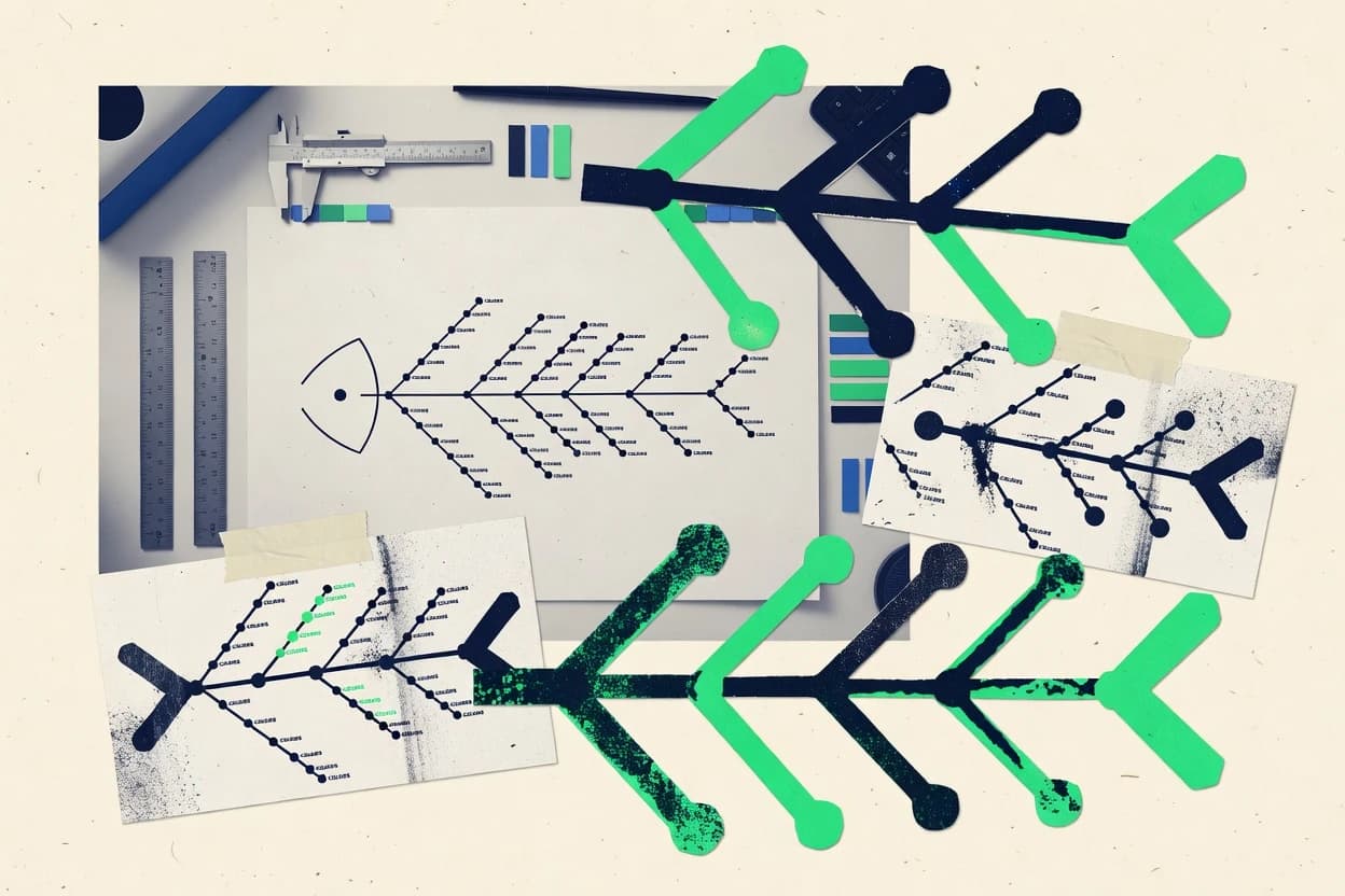
What Is Fishbone Diagram Software?
Fishbone diagram software helps teams visualize cause-and-effect relationships by placing a main problem statement on a spine and attaching labeled “bones” that represent cause categories and sub-causes. It solves root-cause analysis problems by turning brainstorming into structured categories with connectors that keep relationships readable as ideas change. Teams also use it to document conclusions and share them in reports, decks, or issue threads. Tools like Lucidchart and Creately provide dedicated fishbone templates and drag-and-drop editing, while Miro and Genially support fishbone-style analysis on collaborative canvases and interactive publishing formats.
Key Features to Look For
Fishbone diagrams only stay useful when structure, collaboration, and exporting work together for the specific kind of root-cause work being performed.
Fishbone templates with structured cause categories
Lucidchart includes fishbone diagram templates with configurable cause categories and branch connections so teams can start with a correct layout. SmartDraw also ships with built-in fishbone templates that generate tidy, consistent cause-and-effect structures for faster diagram creation.
Automatic connector behavior that preserves readability
diagrams.net maintains consistent links between the spine and bone categories through connector behavior that keeps lines aligned as nodes move. Lucidchart uses Auto-routing connectors that keep cause links readable during edits, and Creately supports auto-aligned connectors when using its fishbone template structure.
Real-time collaboration with element-level discussion
Lucidchart supports real-time co-editing with shared links, which supports live review of root-cause diagrams. Miro adds comments and mentions tied to diagram elements, and Creately adds collaboration with comments and synchronized editing to help teams converge on outcomes.
Canvas organization tools for large root-cause workshops
Miro uses frames to organize complex boards so fishbone-style cause mapping stays navigable during workshops. Ayoa keeps fishbone diagrams connected to tasks and notes inside collaborative workspaces, which helps manage complexity when root causes must tie to action.
Export and publishing paths for stakeholders
Lucidchart includes export and presentation options for moving fishbone diagrams into common document and image workflows while keeping crisp vector editing. Genially publishes interactive, clickable fishbone visuals that embed smoothly in pages and presentations, while Creately exports to images and PDF for straightforward sharing.
Embedding inside team systems like Jira and Confluence
draw.io for Confluence and Jira creates and embeds fishbone diagrams directly inside Confluence pages and Jira issue views so reasoning stays close to tickets. It also supports linking or embedding diagrams to Confluence and attaching diagrams to Jira issues, which reduces the need to maintain separate copies.
How to Choose the Right Fishbone Diagram Software
Selection works best by matching fishbone structure needs, collaboration patterns, and sharing workflows to the tool’s concrete capabilities.
Map the diagram style requirements to template and connector capabilities
Teams that need immediate fishbone correctness should start with Lucidchart or SmartDraw because both provide built-in fishbone diagram templates with labeled cause categories. Teams that expect heavy rearranging should prioritize diagrams.net for connector behavior that preserves consistent links between spine and bone categories during edits, and Lucidchart for Auto-routing connectors that keep cause links readable.
Match collaboration needs to real-time editing and review workflows
For live root-cause reviews, Lucidchart supports real-time co-editing and shared links so participants can refine the same fishbone diagram together. For workshop-style mapping on a broader canvas, Miro supports connector-based fishbone-style diagrams with comments and mentions tied to diagram elements, while Creately supports synchronized editing with comments and version history.
Choose the right canvas management approach for diagram density
When root-cause sessions generate dense diagrams, Miro’s frames help keep complex boards organized, but dense fishbone boards can still clutter without strict layout discipline. Creately and diagrams.net can also require manual spacing care for large fishbones because advanced layout automation is limited compared with specialized diagram tooling.
Pick an output path that matches how findings must be consumed
Teams building fishbone visuals for decks and reports should use Lucidchart for export and presentation workflows or Canva for fast design-ready templates with grid-aligned layout tools. Teams that need interactive learning or clickable diagrams should use Genially because it publishes fishbone visuals as interactive web-style content that embeds in pages and presentations.
If the workflow lives in specific systems, embed the diagram where work is tracked
For root-cause documentation inside issue tracking, draw.io for Confluence and Jira creates and embeds fishbone diagrams directly inside Confluence and Jira issue views so analysis stays linked to tickets. For network troubleshooting contexts, WhatsUp Gold focuses on device and service monitoring and uses monitored topology context to translate alerts into structured fishbone-style cause categories manually.
Who Needs Fishbone Diagram Software?
Fishbone diagram software benefits teams that convert complex problems into structured cause-and-effect categories and then share or operationalize those results.
Cross-team quality and process root-cause reviewers who need live diagram editing
Lucidchart excels for teams creating collaborative fishbone analyses for process and quality root-cause reviews because it combines fishbone templates, Auto-routing connectors, and real-time co-editing with shared links. Creately is also a strong fit because it supports real-time collaboration with comments and synchronized editing for converging on root-cause outcomes.
Workshop teams that run root-cause sessions on shared visual boards
Miro is built for teams running collaborative root-cause analysis sessions on shared visual boards because it provides interactive templates, frames for organizing categories, and connector-based fishbone layouts. Ayoa is a good match for teams that want fishbone work tied to related tasks and notes because it supports collaborative fishbone diagrams with element-level comments.
Teams that must document fishbone reasoning inside Confluence and Jira
draw.io for Confluence and Jira is the best fit for teams documenting root-cause analysis inside Jira and Confluence issues because the diagram editor runs natively inside those workspaces. diagrams.net also fits teams that want editable fishbone diagrams and flexible export to common image formats and editable files for documentation workflows.
Network operations teams translating monitoring signals into troubleshooting cause categories
WhatsUp Gold fits network operations teams mapping alerts to root-cause fishbone categories because it discovers network devices and services, generates alerts tied to interfaces and monitored conditions, and groups symptoms by device or service using event and performance signals. Fishbone diagram creation still requires translating monitoring outputs into cause categories manually because native fishbone creation is not its primary visualization feature.
Common Mistakes to Avoid
Several recurring selection and usage mistakes show up across these fishbone diagram tools.
Overbuilding complex layouts without connector support
Complex fishbones can become visually dense when connector behavior does not keep relationships readable, which shows up when advanced layouts require manual alignment tweaks. Lucidchart and diagrams.net reduce this risk by using Auto-routing or connector behavior that maintains consistent links between spine and bones as nodes move.
Choosing a general design canvas when diagram precision matters most
Canva’s fishbone creation uses generic shapes and connectors and relies heavily on manual precision for alignment, which can slow down complex cause structures. SmartDraw and Lucidchart provide built-in fishbone templates and consistent styling controls that reduce manual layout effort.
Embedding fishbone outputs in the wrong system for the workflow
Storing fishbone diagrams outside Jira or Confluence forces teams to maintain separate artifacts during root-cause work. draw.io for Confluence and Jira keeps the diagram editor inside Confluence pages and Jira issue views by embedding diagrams and attaching them to issues.
Assuming interactive publishing replaces diagram-first fidelity
Genially supports interactive publishing for clickable fishbone content, but export formats can be less faithful than native diagram editors and complex fishbone layouts may require manual alignment. Lucidchart and diagrams.net are better choices when the priority is diagram-first structure and connector fidelity rather than interactive web embedding.
How We Selected and Ranked These Tools
We evaluated every tool on three sub-dimensions. Features carry a weight of 0.4. Ease of use carries a weight of 0.3. Value carries a weight of 0.3. The overall rating equals 0.40 × features plus 0.30 × ease of use plus 0.30 × value. Lucidchart separated itself from lower-ranked tools because it combines fishbone templates with Auto-routing connectors and real-time collaboration, which improves both diagram correctness and collaboration efficiency under active editing.
Frequently Asked Questions About Fishbone Diagram Software
Which fishbone diagram software is fastest for building structured diagrams with templates and consistent branches?
Which tools are best for real-time collaboration on fishbone diagrams during root-cause workshops?
Which fishbone diagram software fits documentation workflows inside Confluence and Jira?
Which option exports fishbone diagrams cleanly for decks, reports, and documentation?
Which tool is best when the main goal is interactive, web-style fishbone visuals for training or lessons?
Which fishbone diagram software supports precise layout control for workshops that require re-grouping and re-linking?
Which tools are best for standardizing recurring fishbone categories across multiple projects?
How do network operations teams use fishbone-style reasoning with monitoring data?
What should be considered when importing fishbone diagrams into a shared visual workflow with tasks and notes?
Conclusion
After evaluating 10 science research, Lucidchart stands out as our overall top pick — it scored highest across our combined criteria of features, ease of use, and value, which is why it sits at #1 in the rankings above.
Use the comparison table and detailed reviews above to validate the fit against your own requirements before committing to a tool.
Tools reviewed
Primary sources checked during evaluation.
Referenced in the comparison table and product reviews above.
Keep exploring
Comparing two specific tools?
Software Alternatives
See head-to-head software comparisons with feature breakdowns, pricing, and our recommendation for each use case.
Explore software alternatives→In this category
Science Research alternatives
See side-by-side comparisons of science research tools and pick the right one for your stack.
Compare science research tools→FOR SOFTWARE VENDORS
Not on this list? Let’s fix that.
Our best-of pages are how many teams discover and compare tools in this space. If you think your product belongs in this lineup, we’d like to hear from you—we’ll walk you through fit and what an editorial entry looks like.
Apply for a ListingWHAT THIS INCLUDES
Where buyers compare
Readers come to these pages to shortlist software—your product shows up in that moment, not in a random sidebar.
Editorial write-up
We describe your product in our own words and check the facts before anything goes live.
On-page brand presence
You appear in the roundup the same way as other tools we cover: name, positioning, and a clear next step for readers who want to learn more.
Kept up to date
We refresh lists on a regular rhythm so the category page stays useful as products and pricing change.