GITNUXSOFTWARE ADVICE
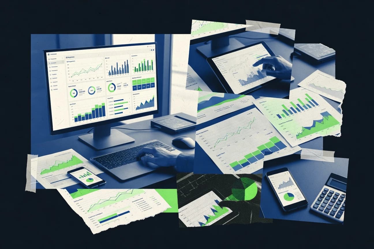
Finance Financial ServicesTop 10 Best Finance Dashboard Software of 2026
Discover top 10 best finance dashboard software for efficient tracking. Find the perfect tool to streamline workflows—start your selection now.

How we ranked these tools
Core product claims cross-referenced against official documentation, changelogs, and independent technical reviews.
Analyzed video reviews and hundreds of written evaluations to capture real-world user experiences with each tool.
AI persona simulations modeled how different user types would experience each tool across common use cases and workflows.
Final rankings reviewed and approved by our editorial team with authority to override AI-generated scores based on domain expertise.
Score: Features 40% · Ease 30% · Value 30%
Gitnux may earn a commission through links on this page — this does not influence rankings. Editorial policy
Editor’s top 3 picks
Three quick recommendations before you dive into the full comparison below — each one leads on a different dimension.
Power BI
Power BI DAX measures with calculation groups for consistent financial metric logic
Built for finance teams building interactive KPI dashboards with governed semantic models.
Tableau
Dashboard actions with drill-down and cross-filtering across measures and dimensions
Built for finance and analytics teams building interactive dashboards with guided exploration.
Looker
LookML semantic layer for metric governance across dashboards and embedded analytics
Built for finance teams needing governed KPI definitions and interactive, drillable dashboards.
Related reading
Comparison Table
This comparison table ranks finance dashboard software based on how well each tool supports reporting, data modeling, and interactive analytics for finance teams. It covers Power BI, Tableau, Looker, Qlik Sense, Domo, and additional options, with feature and workflow differences made easy to scan for shortlisting.
| # | Tool | Category | Overall | Features | Ease of Use | Value |
|---|---|---|---|---|---|---|
| 1 | Power BI Build interactive finance dashboards with self-service data modeling, scheduled refresh, and strong integration with Microsoft data sources. | enterprise BI | 8.7/10 | 9.0/10 | 8.3/10 | 8.8/10 |
| 2 | Tableau Create governed finance dashboards with interactive visual analytics, calculated measures, and robust connectors to analytics data stores. | visual analytics | 8.1/10 | 8.8/10 | 7.9/10 | 7.3/10 |
| 3 | Looker Deliver consistent finance dashboards using modeled metrics, centralized semantic layers, and scheduled or on-demand reporting. | semantic BI | 8.1/10 | 8.6/10 | 7.7/10 | 7.9/10 |
| 4 | Qlik Sense Build associative finance dashboards for fast exploration of KPIs across multiple linked datasets and data reload schedules. | associative BI | 8.1/10 | 8.6/10 | 7.8/10 | 7.6/10 |
| 5 | Domo Operate finance KPI dashboards with automated data connectivity, KPI monitoring, and collaboration workflows for business teams. | KPI dashboarding | 7.6/10 | 8.1/10 | 7.3/10 | 7.2/10 |
| 6 | Sisense Create and deploy finance dashboards with in-database analytics and governed semantic modeling for performance at scale. | embedded analytics | 8.2/10 | 8.6/10 | 7.8/10 | 8.1/10 |
| 7 | ThoughtSpot Answer finance questions in natural language and publish dashboards using search-driven analytics and governed data access. | search BI | 8.1/10 | 8.6/10 | 7.8/10 | 7.6/10 |
| 8 | Microsoft Excel Produce finance dashboards using pivot tables, Power Query, and Power Pivot models with publishable workbooks for shared reporting. | spreadsheet BI | 8.0/10 | 8.2/10 | 7.6/10 | 8.1/10 |
| 9 | Google Looker Studio Design shareable finance dashboards with drag-and-drop reporting, connector-based data ingestion, and scheduled report delivery. | self-service dashboards | 8.1/10 | 8.2/10 | 8.5/10 | 7.5/10 |
| 10 | Metabase Run SQL-powered finance dashboards and charts with role-based access, native question building, and chart embedding. | open-core analytics | 7.6/10 | 7.6/10 | 8.2/10 | 6.9/10 |
Build interactive finance dashboards with self-service data modeling, scheduled refresh, and strong integration with Microsoft data sources.
Create governed finance dashboards with interactive visual analytics, calculated measures, and robust connectors to analytics data stores.
Deliver consistent finance dashboards using modeled metrics, centralized semantic layers, and scheduled or on-demand reporting.
Build associative finance dashboards for fast exploration of KPIs across multiple linked datasets and data reload schedules.
Operate finance KPI dashboards with automated data connectivity, KPI monitoring, and collaboration workflows for business teams.
Create and deploy finance dashboards with in-database analytics and governed semantic modeling for performance at scale.
Answer finance questions in natural language and publish dashboards using search-driven analytics and governed data access.
Produce finance dashboards using pivot tables, Power Query, and Power Pivot models with publishable workbooks for shared reporting.
Design shareable finance dashboards with drag-and-drop reporting, connector-based data ingestion, and scheduled report delivery.
Run SQL-powered finance dashboards and charts with role-based access, native question building, and chart embedding.
Power BI
enterprise BIBuild interactive finance dashboards with self-service data modeling, scheduled refresh, and strong integration with Microsoft data sources.
Power BI DAX measures with calculation groups for consistent financial metric logic
Power BI stands out with its self-service modeling plus tight Microsoft ecosystem integration for finance teams. It delivers interactive dashboards, scheduled refresh, and strong data modeling tools for KPIs, variance, and trend reporting. Finance workflows benefit from native Power Query for data shaping and DAX for calculated measures. Governance features like row-level security support secure reporting across departments and cost centers.
Pros
- Strong DAX capabilities for reusable financial measures and complex KPIs
- Power Query enables repeatable transformations for cleansed, modeled finance data
- Row-level security supports department-level and user-specific reporting controls
- Rich visuals and drill-through make it practical for variance analysis
Cons
- DAX performance can degrade without careful model design and indexing
- Managing large semantic models requires discipline around relationships and refresh cadence
- Mobile and export experiences can lag behind desktop for dense finance layouts
Best For
Finance teams building interactive KPI dashboards with governed semantic models
More related reading
- Business FinanceTop 10 Best Cloud Based Financial Management Software of 2026
- Finance Financial ServicesTop 10 Best Comprehensive Financial Planning Software of 2026
- Finance Financial ServicesTop 10 Best Money Tracking Software of 2026
- Finance Financial ServicesTop 10 Best Banking Analytics Software of 2026
Tableau
visual analyticsCreate governed finance dashboards with interactive visual analytics, calculated measures, and robust connectors to analytics data stores.
Dashboard actions with drill-down and cross-filtering across measures and dimensions
Tableau stands out with its highly interactive visual exploration and reusable dashboards for business users. It connects to many data sources, supports calculated fields and parameter-driven views, and enables strong filtering and drill-down for financial reporting. Tableau also supports publishing and governed sharing through Tableau Server or Tableau Cloud, which helps standardize finance dashboards across teams. The solution is best known for rapid dashboard iteration, especially when analysts need to explore measures like revenue, margin, and cash flow through multiple dimensions.
Pros
- Strong interactive filtering and drill-down for finance KPIs and variances
- Flexible calculated fields and parameters for scenario-style financial views
- Broad data source connectivity and live query options for dashboards
Cons
- Complex workbook design can become hard to maintain at scale
- Governed sharing and performance tuning require IT and admin skills
- Advanced modeling often needs analyst involvement to avoid misleading metrics
Best For
Finance and analytics teams building interactive dashboards with guided exploration
Looker
semantic BIDeliver consistent finance dashboards using modeled metrics, centralized semantic layers, and scheduled or on-demand reporting.
LookML semantic layer for metric governance across dashboards and embedded analytics
Looker stands out with its LookML modeling layer that centralizes metric definitions and governs how finance dashboards calculate KPIs. It supports governed data exploration, interactive dashboards, and embedded analytics patterns for finance stakeholders. The platform integrates with common data warehouses and enables scheduled refresh, row-level security, and lineage-style transparency for metric logic.
Pros
- LookML enforces consistent KPI logic across finance reports
- Governed dashboards with row-level security for sensitive financial data
- Interactive drilling and filters built for KPI and variance analysis
- Native connections to data warehouses support reliable scheduled refresh
Cons
- LookML modeling adds setup effort for teams without analytics engineers
- Advanced governance features can slow iteration for ad hoc finance questions
- Dashboard performance depends heavily on upstream data modeling
Best For
Finance teams needing governed KPI definitions and interactive, drillable dashboards
Qlik Sense
associative BIBuild associative finance dashboards for fast exploration of KPIs across multiple linked datasets and data reload schedules.
Associative search for back-and-forth filtering across connected financial datasets
Qlik Sense stands out for associative analytics that help finance users explore relationships across metrics without building rigid drill paths. It supports dashboards with interactive visualizations, guided data discovery, and business rules for consistent KPI definitions. Strong data modeling and governance features like field-level security and role-based access support shared reporting across finance teams and controlled audiences.
Pros
- Associative data model enables fast cross-filter exploration of financial KPIs
- Robust governance with role-based access and field-level security controls sensitive measures
- Flexible modeling supports reusable metrics across multiple dashboards and departments
- Strong visualization controls support drill-through workflows for account analysis
Cons
- Performance can degrade with complex models and high-cardinality financial dimensions
- Dashboard authoring requires deeper data modeling skills than many BI tools
- Financial users may need additional setup for standardized calculation logic
Best For
Finance teams needing interactive KPI discovery with governed, reusable metric modeling
Domo
KPI dashboardingOperate finance KPI dashboards with automated data connectivity, KPI monitoring, and collaboration workflows for business teams.
Domo Data Apps for publishing governed, reusable financial metrics and workflows
Domo stands out with a unified analytics hub that combines data connections, dashboards, and operational monitoring in one workspace. It supports finance-focused reporting with customizable KPI dashboards, scheduled content refresh, and role-based views. Strong data ingestion and data app patterns help finance teams publish governed metrics across teams without building everything in spreadsheets. The experience can feel heavier than lighter dashboard tools because data preparation, governance, and deployment tasks often require deliberate setup.
Pros
- Strong dashboarding with interactive KPI drilldowns
- Broad connector ecosystem for pulling finance data into one place
- Scheduled refresh keeps financial views aligned with system-of-record data
- Role-based access supports controlled finance reporting
- Data app style workflow supports repeatable metric publishing
Cons
- Data modeling and governance setup can slow first-time dashboard delivery
- Complex dashboards can become harder to maintain across many metrics
- Some advanced configuration requires specialized admin knowledge
Best For
Finance analytics teams needing governed dashboards fed by many source systems
Sisense
embedded analyticsCreate and deploy finance dashboards with in-database analytics and governed semantic modeling for performance at scale.
In-database analytics with a governed semantic layer for metric standardization
Sisense stands out for turning complex finance data into interactive dashboards with built-in governed analytics. The platform supports embedded analytics, scheduled data refresh, and pixel-perfect report design for finance teams and external users. Sisense also enables search over metrics, drilldowns, and reusable semantic models that standardize KPIs across departments. Advanced data preparation and connectivity options help it support diverse finance data sources and modeling needs.
Pros
- Robust semantic modeling for consistent finance KPIs across reports
- Strong embedded analytics support for interactive finance experiences
- Efficient in-dashboard drilldowns and metric exploration
Cons
- Complex modeling can slow setup for finance teams without analytics engineers
- Dashboard performance depends heavily on data modeling choices
- Governance and role design require careful configuration
Best For
Finance teams building governed, embedded dashboards with complex KPI models
More related reading
ThoughtSpot
search BIAnswer finance questions in natural language and publish dashboards using search-driven analytics and governed data access.
Answer Search for natural-language KPI queries with instant, drillable visual results
ThoughtSpot stands out for pairing natural-language search with interactive analytics, so finance teams can ask questions and immediately explore results. The platform supports governed data access, guided workflows, and dashboard sharing designed for repeated reporting. Advanced analytics and collaboration features let users move from discovery to standardized views used for budgeting, forecasting, and performance monitoring.
Pros
- Natural-language search turns finance questions into dashboards quickly
- Robust data governance supports controlled metrics and repeatable reporting
- Interactive exploration enables drill-down from KPIs to underlying data
Cons
- Complex model setup can be heavy for finance teams without data support
- Dashboard design flexibility can feel constrained compared with custom BI tooling
- Performance depends on data quality and indexing for fast query responses
Best For
Finance teams needing governed, search-driven KPI exploration across shared dashboards
Microsoft Excel
spreadsheet BIProduce finance dashboards using pivot tables, Power Query, and Power Pivot models with publishable workbooks for shared reporting.
PivotTables with slicers for interactive drill-down on multi-period financial metrics
Microsoft Excel stands out by combining spreadsheet flexibility with built-in charting, pivot analysis, and dashboard-ready layout control. It supports finance-style reporting through pivot tables, slicers, and conditional formatting that can highlight variance and trend behavior across time periods. Dashboard workflows can be built by connecting tables to Power Query refresh and publishing outputs via Microsoft 365 tools for sharing and collaboration. Automation for finance metrics often uses formulas, Power Pivot data models, and optional scripting, which can turn a worksheet into a repeatable reporting canvas.
Pros
- Pivot tables, slicers, and conditional formatting support fast financial dashboard slicing
- Power Query refresh and Power Pivot data models improve repeatable reporting across datasets
- Chart types and custom layouts enable tailored KPI and variance visuals
- Strong Microsoft 365 integration supports shared workbooks and collaborative review
Cons
- Complex dashboard logic can become fragile and hard to audit across versions
- Large models can slow down when datasets grow and calculations multiply
- Governance features for data lineage and role-based controls are less comprehensive than BI tools
- Building robust refresh and security patterns often requires advanced spreadsheet discipline
Best For
Teams needing highly customized Excel-based finance dashboards and KPI reporting
Google Looker Studio
self-service dashboardsDesign shareable finance dashboards with drag-and-drop reporting, connector-based data ingestion, and scheduled report delivery.
Interactive dashboard filters with drilldowns that work across shared report pages
Looker Studio stands out for building interactive dashboards directly from Google data sources and many third-party connectors. It offers report pages, interactive filters, calculated fields, and scheduled email or export workflows for recurring finance updates. Users can apply role-based access and embed reports in internal portals and business systems. The strongest fit is fast dashboard iteration with lightweight modeling rather than heavy financial consolidation logic.
Pros
- Drag-and-drop dashboard builder with interactive filters and drilldowns
- Strong Google-native integration for Sheets, BigQuery, and Ads-style finance data
- Wide connector ecosystem supports common finance system data sources
- Calculated fields enable core KPI definitions without custom code
- Embeds and shared permissions support internal reporting workflows
Cons
- Data modeling and joins are limited compared with dedicated BI layers
- Advanced financial calculations require careful formulas and can get complex
- Performance can degrade with large datasets and heavily parameterized reports
- Governance features are weaker than enterprise BI platforms for regulated use
- Export and scheduling options may not cover every finance distribution need
Best For
Finance teams needing fast, interactive KPI dashboards with minimal BI engineering
Metabase
open-core analyticsRun SQL-powered finance dashboards and charts with role-based access, native question building, and chart embedding.
Natural language query for generating SQL-powered insights from connected databases
Metabase stands out for its fast path from database connection to interactive dashboards without requiring custom dashboard code. It supports SQL queries, drag-and-drop dashboard building, and scheduled reports that refresh visuals from underlying data sources. Finance teams can model metrics with saved questions, explore drill-through dashboards, and share filtered views across stakeholders. Strong governance controls exist for user permissions and audit-friendly sharing, but advanced finance modeling and tight ERP integrations need extra setup.
Pros
- Fast dashboard creation from SQL and saved questions
- Strong data exploration with drill-through and filters
- Scheduled reports deliver updated visuals to recipients
Cons
- Financial metric modeling often requires building semantic layers manually
- Complex permissions and row-level security can be difficult to design
- Deep finance-specific integrations rely on connector setup
Best For
Teams needing self-serve finance dashboards with SQL-backed exploration
Conclusion
After evaluating 10 finance financial services, Power BI stands out as our overall top pick — it scored highest across our combined criteria of features, ease of use, and value, which is why it sits at #1 in the rankings above.
Use the comparison table and detailed reviews above to validate the fit against your own requirements before committing to a tool.
How to Choose the Right Finance Dashboard Software
This buyer’s guide explains how to select finance dashboard software for interactive KPI reporting, governed metric logic, and reliable refresh workflows. It covers Power BI, Tableau, Looker, Qlik Sense, Domo, Sisense, ThoughtSpot, Microsoft Excel, Google Looker Studio, and Metabase. The guide focuses on concrete capabilities like semantic modeling, natural-language KPI exploration, drill-through analytics, and dashboard sharing controls.
What Is Finance Dashboard Software?
Finance dashboard software centralizes financial metrics like revenue, margin, cash flow, and variance into interactive dashboards that update from connected data sources. It solves problems like inconsistent KPI definitions, slow variance analysis, and manual spreadsheet refresh by providing modeled metrics and scheduled data updates. Teams use it for repeatable budgeting, forecasting, and performance monitoring workflows. Tools like Power BI deliver governed semantic models with Power Query and DAX, while Looker enforces metric consistency with a centralized LookML semantic layer.
Key Features to Look For
Finance dashboard evaluation should prioritize capabilities that keep KPI logic consistent, dashboards interactive, and data refresh dependable across stakeholders.
Governed metric definitions via a semantic layer
Power BI supports governed semantic modeling with DAX measures and row-level security so finance teams can standardize financial metric logic across departments. Looker centralizes KPI calculation logic in LookML so dashboards and embedded analytics use consistent metric definitions.
Interactive KPI exploration with drill-down and cross-filtering
Tableau enables drill-down and cross-filtering through dashboard actions so analysts can explore revenue, margin, and cash flow across dimensions. Qlik Sense uses an associative model and guided exploration so users can back-and-forth filter across connected financial datasets.
Scheduled refresh and repeatable data updates
Power BI and Looker support scheduled refresh so KPI dashboards remain aligned with system-of-record data. Sisense also provides scheduled data refresh to keep embedded dashboards current for internal and external finance stakeholders.
Data shaping and metric calculations for finance-style reporting
Power BI combines Power Query for repeatable data transformations with DAX for calculated measures used in variance and trend reporting. Microsoft Excel supports pivot tables, slicers, and Power Query refresh to turn worksheet-based finance reporting into interactive dashboard layouts.
Row-level security and role-based access controls
Power BI supports row-level security to restrict access to financial data by department and user context. Qlik Sense adds field-level security and role-based access so sensitive measures stay controlled across finance audiences.
Search-driven analytics for faster finance Q&A
ThoughtSpot pairs natural-language search with governed data access so finance teams can ask KPI questions and drill into results quickly. Metabase supports natural language query to generate SQL-powered insights and then build dashboards from saved questions.
How to Choose the Right Finance Dashboard Software
Selection should be driven by KPI governance needs, expected dashboard interactivity, and the level of modeling support required to keep finance metrics consistent.
Start with KPI governance and metric consistency requirements
Teams that need consistent KPI logic across many dashboards should compare Power BI and Looker based on semantic governance. Power BI delivers DAX measures with calculation groups for reusable financial metric logic, while Looker enforces metric definitions in LookML so every dashboard uses the same KPI rules.
Match dashboard interactivity to the finance workflow
Finance analysts who explore drivers of variance across multiple dimensions should evaluate Tableau and Qlik Sense. Tableau provides dashboard actions for drill-down and cross-filtering, while Qlik Sense provides associative search for back-and-forth filtering across connected datasets.
Plan for scheduled refresh and performance under real data models
Dashboards that must stay aligned with operational systems need scheduled refresh capabilities and predictable performance. Power BI and Looker both support scheduled refresh, while Sisense emphasizes in-database analytics to maintain performance when dashboards rely on complex finance data models.
Choose based on governance style and authoring complexity tolerance
When governance must be strong enough to support controlled finance reporting, row-level security and semantic-layer setup become deciding factors. Power BI supports row-level security, Qlik Sense supports field-level security, and Looker’s LookML modeling adds setup effort for teams without analytics engineers.
Select a discovery and sharing approach aligned to stakeholder behavior
If stakeholders want to ask questions in plain language and immediately drill into answers, ThoughtSpot and Metabase fit because they deliver natural-language KPI exploration with drill-through into underlying data. If stakeholders need governed publishing workflows, Domo Data Apps provide a metric publishing pattern, while Tableau Server or Tableau Cloud supports governed sharing for standardized finance dashboards.
Who Needs Finance Dashboard Software?
Finance dashboard software benefits teams that need repeatable KPI reporting, interactive variance analysis, and governed access to sensitive financial data.
Finance teams building governed interactive KPI dashboards
Power BI fits teams that want self-service data modeling with Power Query and governed semantic reporting using DAX measures and row-level security. Looker fits teams that need LookML-based metric governance so dashboard KPIs stay consistent across multiple reporting surfaces and embedded analytics.
Finance and analytics teams focused on guided exploration and scenario views
Tableau fits teams that want rapid dashboard iteration with strong interactivity like drill-down and cross-filtering via dashboard actions. Qlik Sense fits teams that want associative exploration so finance users can discover relationships across multiple linked datasets without rigid drill paths.
Teams embedding analytics into finance workflows and external stakeholder experiences
Sisense fits teams that need embedded analytics with pixel-perfect report design and governed semantic models for consistent KPIs. ThoughtSpot fits teams that want governed, search-driven KPI exploration so users can answer questions and then reuse the resulting dashboards.
Teams relying on spreadsheet-heavy, highly customized finance dashboard layouts
Microsoft Excel fits teams that need tailored KPI and variance visuals using pivot tables, slicers, and conditional formatting while still supporting Power Query refresh and Power Pivot data models. Looker Studio fits teams that want fast drag-and-drop dashboard iteration using interactive filters and scheduled email or export workflows with lightweight modeling.
Common Mistakes to Avoid
Finance dashboard projects often fail when KPI logic is inconsistent, governance setup slows delivery, or data modeling decisions degrade performance.
Building dashboards without a reusable metric logic strategy
Using custom calculations scattered across dashboards creates KPI inconsistency and makes variance analysis harder to audit. Power BI reduces this risk with reusable DAX measures and calculation groups, while Looker reduces it with LookML-driven metric governance.
Overlooking performance risks from complex models and dense layouts
Complex semantic models can degrade refresh or query responsiveness when dashboards grow in data volume and dimension cardinality. Power BI requires careful DAX performance design, and Qlik Sense can slow down with complex models and high-cardinality financial dimensions.
Underestimating the authoring complexity required for governed governance features
Governance features like semantic layers and role-based controls often require dedicated setup work. Looker’s LookML modeling adds setup effort for teams without analytics engineers, and Sisense requires careful configuration of governance and role design.
Treating spreadsheet-based dashboards as fully governed reporting systems
Excel dashboards can become fragile when complex logic spans formulas and Power Pivot models across multiple versions. Microsoft Excel offers interactive pivot experiences, but governance for data lineage and role-based controls is less comprehensive than BI tools like Power BI or Looker.
How We Selected and Ranked These Tools
we evaluated every tool on three sub-dimensions. Features carried weight 0.4, ease of use carried weight 0.3, and value carried weight 0.3. The overall rating is the weighted average of those three sub-dimensions, calculated as overall = 0.40 × features + 0.30 × ease of use + 0.30 × value. Power BI separated itself with strong features for governed finance modeling, including DAX measures with calculation groups for consistent financial metric logic, while also maintaining strong feature coverage for Power Query transformations and row-level security.
Frequently Asked Questions About Finance Dashboard Software
Which finance dashboard software is best for governed KPI calculations across multiple teams?
Looker is built for KPI governance with a LookML modeling layer that centralizes metric definitions and controls how dashboards calculate KPIs. Power BI also supports governed semantic modeling with row-level security and DAX measures that can standardize logic using calculation groups.
What tool offers the most interactive drill-down and cross-filtering for finance reporting?
Tableau supports dashboard actions with drill-down and cross-filtering across measures and dimensions, which speeds up variance and cash flow exploration. Qlik Sense enables back-and-forth associative filtering so users can follow relationships across connected financial datasets without rigid drill paths.
Which option is strongest for teams that need natural-language exploration of financial metrics?
ThoughtSpot pairs natural-language search with interactive analytics so finance users can ask about specific KPIs and immediately drill into the results. Metabase also supports natural language query that generates SQL-backed insights from connected databases.
Which finance dashboard software integrates tightly with the Microsoft data stack for modeling and refresh?
Power BI integrates directly with the Microsoft ecosystem and uses Power Query for data shaping plus DAX for calculated measures. Excel can act as a lightweight dashboard layer by refreshing Power Query data and building pivot-based KPI views that publish through Microsoft 365 sharing workflows.
What dashboard platform works best for publishing standardized metrics across many source systems?
Domo functions as a unified analytics hub that combines connections, dashboards, and operational monitoring in one workspace, with scheduled refresh and role-based views. Sisense supports embedded analytics and in-database analytics with a governed semantic layer that standardizes complex KPI models across departments.
Which tool is ideal for finance teams that want lightweight dashboard engineering with Google data sources?
Google Looker Studio builds interactive dashboards directly from Google data sources and many third-party connectors using report pages and interactive filters. It supports calculated fields and scheduled email or export workflows for recurring finance updates without heavy BI engineering.
How do finance teams handle secure access control in dashboard software?
Power BI supports row-level security to restrict data by department or cost center so users see only authorized records. Looker and Sisense provide governed access patterns and can enforce controlled exploration with row-level security while keeping metric logic consistent.
What common problem occurs during finance dashboard projects and how do these tools help address it?
A frequent issue is inconsistent KPI logic across dashboards, which leads to mismatched revenue or margin figures across teams. Looker prevents this with LookML centralized definitions, and Power BI reduces divergence through reusable DAX measure logic and governed semantic models.
Which software is best when the goal is rapid dashboard iteration for analysts rather than deep engineering?
Tableau is strong for rapid iteration because analysts can quickly build and refine interactive views with calculated fields, parameters, and drill-down exploration. Google Looker Studio also supports fast iteration using interactive filters and lightweight modeling when the priority is quick KPI page updates.
Tools reviewed
Referenced in the comparison table and product reviews above.
Keep exploring
Comparing two specific tools?
Software Alternatives
See head-to-head software comparisons with feature breakdowns, pricing, and our recommendation for each use case.
Explore software alternatives→In this category
Finance Financial Services alternatives
See side-by-side comparisons of finance financial services tools and pick the right one for your stack.
Compare finance financial services tools→FOR SOFTWARE VENDORS
Not on this list? Let’s fix that.
Our best-of pages are how many teams discover and compare tools in this space. If you think your product belongs in this lineup, we’d like to hear from you—we’ll walk you through fit and what an editorial entry looks like.
Apply for a ListingWHAT THIS INCLUDES
Where buyers compare
Readers come to these pages to shortlist software—your product shows up in that moment, not in a random sidebar.
Editorial write-up
We describe your product in our own words and check the facts before anything goes live.
On-page brand presence
You appear in the roundup the same way as other tools we cover: name, positioning, and a clear next step for readers who want to learn more.
Kept up to date
We refresh lists on a regular rhythm so the category page stays useful as products and pricing change.