GITNUXSOFTWARE ADVICE
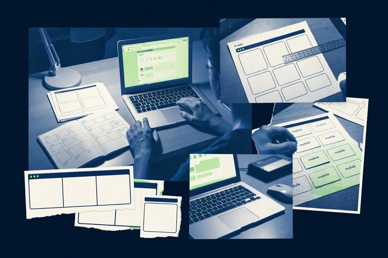
Art DesignTop 10 Best Design Your Own Software of 2026
Compare top picks for Design Your Own Software with a ranked tool roundup. Explore Figma, Illustrator, Canva and choose the right builder.

How we ranked these tools
Core product claims cross-referenced against official documentation, changelogs, and independent technical reviews.
Analyzed video reviews and hundreds of written evaluations to capture real-world user experiences with each tool.
AI persona simulations modeled how different user types would experience each tool across common use cases and workflows.
Final rankings reviewed and approved by our editorial team with authority to override AI-generated scores based on domain expertise.
Score: Features 40% · Ease 30% · Value 30%
Gitnux may earn a commission through links on this page — this does not influence rankings. Editorial policy
Editor’s top 3 picks
Three quick recommendations before you dive into the full comparison below — each one leads on a different dimension.
Figma
Components with variants and property controls for stateful UI system design
Built for teams designing interactive app interfaces and component systems without heavy coding.
Adobe Illustrator
Editor pickAppearance panel with live effects and stacked styles.
Built for design teams building logo, icon, and vector UI asset systems..
Canva
Editor pickBrand Kit
Built for teams producing branded visuals quickly without engineering custom software.
Related reading
Comparison Table
This comparison table evaluates design-your-own software tools used to create UI, illustrations, branding assets, and print-ready graphics. It contrasts Figma, Adobe Illustrator, Canva, Affinity Designer, Sketch, and other popular options across common decision points like workflow, collaboration, file compatibility, export options, and price structure. Readers can use the table to quickly narrow down which tool matches their output requirements and team collaboration needs.
Figma
prototypingBrowser-based UI and UX design tool that supports reusable components, auto layout, and interactive prototypes for building custom software designs.
Components with variants and property controls for stateful UI system design
Figma stands out as a collaborative, browser-based design workspace that doubles as a UI prototyping and spec platform. It supports component-based UI systems, interactive prototypes, and design-to-development handoff artifacts like inspectable properties.
Teams can document decisions inside files with frames, pages, and plugins that extend workflows. For designing your own software interfaces without heavy coding, Figma covers the end-to-end path from layout to clickable prototype and reusable UI building blocks.
- +Live collaborative editing with comments and versioned history across design files
- +Component system with variants enables scalable UI design and consistent states
- +Interactive prototypes with conditional interactions support realistic UX testing
- –Figma cannot replace a real app build pipeline for full software behavior
- –Complex design systems require discipline to keep tokens, components, and variants aligned
- –Auto-layout and constraints can be harder to master in edge-case layouts
Best for: Teams designing interactive app interfaces and component systems without heavy coding
More related reading
Adobe Illustrator
vector designVector design application used to create scalable UI assets, icons, and custom illustration layers for software design workflows.
Appearance panel with live effects and stacked styles.
Adobe Illustrator stands out for its precision vector toolset built around Bézier paths and robust typography tools. It supports production-ready design workflows with layers, artboards, appearance-based styling, and extensive export options for print and screen.
It also enables controlled customization through scripts, plugins, and templated styles, which supports design teams that want repeatable visual systems. Complex icon, logo, and UI asset creation is fast once the document setup is standardized.
- +Vector editing is exact with Bézier tools, anchors, and smart guides.
- +Appearance panel enables reusable, stackable styling across objects.
- +Type tools support advanced typography controls and paragraph composition.
- +Artboards and export presets streamline multi-format delivery.
- –Learning curve is steep for appearance, symbols, and complex workflows.
- –Large documents and many effects can slow down interactive editing.
- –Design system automation needs scripting discipline and governance.
Best for: Design teams building logo, icon, and vector UI asset systems.
Canva
template designDrag-and-drop design workspace that supports brand kits, templates, and custom graphics for software UI mockups and art production.
Brand Kit
Canva stands out by combining a drag-and-drop canvas with a large library of templates, brand assets, and media elements. It supports design creation for social, presentations, documents, posters, and print with reusable components like fonts, colors, and layouts.
Built-in collaboration enables shared editing, commenting, and version history without setting up separate tooling. Export options cover common formats like PNG, JPG, PDF, and MP4 for presentation and video-style designs.
- +Huge template library speeds up production for standard design tasks
- +Brand Kit standardizes colors, fonts, and logos across multiple projects
- +Collaboration tools support comments, shared access, and change history
- –Limited control over complex layout logic compared with code-based tools
- –Deep automation requires external workflows, not native app-like behavior
- –Advanced typography and print prepress workflows can be restrictive
Best for: Teams producing branded visuals quickly without engineering custom software
Affinity Designer
desktop vectorDesktop vector and pixel design software for creating UI artwork, icon sets, and production-ready assets.
Persona-based vector and pixel editing for hybrid illustration production
Affinity Designer stands out with a dual design workflow that supports both vector and pixel editing in one document. It provides a mature set of vector tools for icon, logo, and illustration creation alongside robust raster brush and layer controls.
The app’s structured layers, symbols, and export options support repeatable production for UI and marketing assets. It fits design-centered software creation where visual systems must be built and exported consistently for later implementation.
- +Dual vector and pixel workflows inside one file reduce rework
- +Non-destructive layer organization with helpful naming and grouping
- +Powerful pen tools and node editing for precise vector shapes
- +Symbols and styles support reusable visual components
- +Export presets make consistent asset generation straightforward
- –Prototyping and interactive behavior require external tooling
- –Advanced motion design is limited compared with dedicated animation tools
- –Large documents can feel slower during heavy node editing
- –Some UI layout automation tasks need manual alignment work
Best for: Designing UI visuals, icons, and component libraries without code-heavy workflows
Sketch
UI designMac design application for interface design, reusable symbols, and export workflows that support custom software art creation.
Interactive prototypes driven by linking, hotspots, and transitions between artboards
Sketch stands out as a design-first tool that lets teams create clickable prototypes and interactive UI states without extensive coding. Its core capabilities focus on vector-based UI design, componentized libraries, and export-ready assets for handoff and prototyping workflows. Real interactivity is achieved through links, hotspots, and prototype interactions that mimic user flows for stakeholder review.
- +Powerful vector editing and UI layout tools speed screen creation
- +Component libraries support consistent UI patterns across multiple screens
- +Prototype interactions enable realistic clickable user flows
- +Export options help deliver assets for design handoff workflows
- –Limited backend logic means true software behavior requires external engineering
- –Complex interaction rules can become tedious to manage at scale
- –Asset and component governance can break down without strict conventions
- –Versioning and collaboration depend on an additional workflow layer
Best for: Teams prototyping interactive interfaces and designing reusable UI components
InVision Studio
interactive prototypingDesign and prototyping environment for building interactive UI flows and exporting design assets for software interfaces.
Component and state-based interactive prototyping with motion-style transitions
InVision Studio stands out for its interactive design workflow that focuses on component-driven prototyping inside a design canvas. It supports vector editing, responsive artboards, and motion-style interactions that help teams validate UI behavior before development. The tool also includes handoff oriented features and collaboration touchpoints tied to InVision’s broader prototyping ecosystem.
- +Component-based UI building speeds consistent interface prototyping
- +Interactive prototypes support detailed transitions and state changes
- +Vector tools and auto layout-style responsiveness improve layout accuracy
- +Handoff workflow integrates with InVision prototypes and sharing
- –Limited programming extensibility compared with code-first UI tools
- –Workflow depth can feel constrained outside InVision-centric projects
- –Collaboration features rely heavily on connected InVision processes
Best for: Teams prototyping UI interactions visually inside the InVision workflow
Marvel
clickable prototypesWeb-based prototyping tool that turns designs into clickable demos for testing custom software UI ideas.
Component-based UI builder with workflow connections between screens and actions
Marvel stands out by turning application design into a visual flow of components, data, and screens that can be assembled without deep engineering. Core capabilities include configurable UI, reusable parts, and workflow-style logic to connect pages and interactions.
The tool emphasizes rapid iteration for internal tools and lightweight products, with less focus on deep systems integration. It fits teams that want a faster build loop than traditional custom development and can accept guardrails around advanced architecture.
- +Visual assembly of screens and components speeds up application iteration
- +Reusable UI patterns reduce duplication across multi-page projects
- +Workflow-style connections make interactive behavior easier to prototype
- –Advanced backend logic and complex integrations can feel constrained
- –Entity modeling and data transformations lack depth versus coding-first tools
- –Production-grade scalability controls require workarounds
Best for: Teams building internal apps with visual workflows and moderate data needs
Penpot
open-source UIOpen-source design and prototyping platform that supports components and reusable styles for software UI artwork.
Variables and design tokens that propagate through components and prototypes
Penpot stands out by combining collaborative vector design with structured prototyping artifacts for product teams. It supports component libraries, variables, styles, and interactive prototypes that link screens and states.
Designers can generate production-ready assets and manage design tokens for consistent UI behavior across projects. The workflow centers on browser-based editing with multi-user collaboration and versioned project structure.
- +Strong component system with reusable instances and variants
- +Interactive prototyping supports clickable flows and states
- +Design tokens and variables help keep UI consistent across teams
- +Browser-native collaboration enables simultaneous editing
- +Exports cover common assets and reusable libraries
- –Complex interactions can feel harder than in dedicated prototyping tools
- –Advanced auto-layout and responsive behaviors need careful setup
- –Large projects may be slower when many components and prototypes are active
- –Some developer handoff workflows still require extra mapping steps
Best for: Product teams standardizing UI with design tokens and reusable components
Vectr
simple vectorSimplified vector graphics editor for creating icons and UI illustrations with lightweight online or desktop workflows.
Instant browser-based vector editing with layers and export-ready assets
Vectr stands out as a browser-first design tool that lets users create graphics directly in a simple canvas interface. It provides core vector editing controls like shapes, text, layers, and alignment for building consistent assets.
Built-in template assets and design presets help teams move from idea to finished artwork without setting up complex tooling. Export options support common downstream uses like sharing and using designs in other workflows.
- +Intuitive vector editing with layers, alignment, and text controls
- +Browser-based workflow reduces setup friction for quick iterations
- +Templates and reusable assets speed up common design tasks
- –Advanced design automation and logic are limited for real software building
- –Fewer workflow integrations than specialized UX and design tool stacks
- –Collaboration and version control features feel basic for complex projects
Best for: Teams needing quick vector assets and simple interactive mockups without code
Boxy SVG
SVG designSVG-first drawing tool for designing crisp vector UI artwork, icons, and scalable graphics.
SVG-to-toolchain asset processing for controlled vector transformations and exports
Boxy SVG stands out by turning SVG assets into a design-time toolchain for building interactive vector UI workflows. It focuses on SVG-first authoring with transformations, styling control, and export paths that support integrating custom visuals into applications.
Core capabilities emphasize manipulating vector elements, reusing SVG structures, and packaging outputs for downstream use. The overall experience fits teams that want visual control of SVG behavior without writing full application logic from scratch.
- +SVG-first workflow makes vector customization the center of the product
- +Element-level control supports detailed styling and structural reuse
- +Export-oriented approach helps move assets into downstream interfaces
- –Limited visibility into full app architecture compared with true builders
- –Complex SVG structures can raise the learning curve
- –Toolchain depth is strongest for visuals, weaker for non-SVG logic
Best for: Designers and frontend teams building interactive vector UI workflows
How to Choose the Right Design Your Own Software
This buyer's guide covers Design Your Own Software tools including Figma, Penpot, Sketch, InVision Studio, and Marvel for turning interface ideas into clickable prototypes and reusable UI systems. It also covers vector-centric options like Adobe Illustrator, Affinity Designer, Vectr, and Boxy SVG for producing crisp assets and UI artwork. The guide explains which features matter most, which audiences each tool fits, and the common mistakes that block real software outcomes.
What Is Design Your Own Software?
Design Your Own Software tools let teams create user interface screens, reusable components, and interactive flows without writing full application code from scratch. These tools solve problems like aligning visual UI systems, validating user journeys with clickable prototypes, and accelerating asset production for later development. Figma shows this workflow by combining component-based UI design with interactive prototypes and inspectable handoff artifacts inside a browser-based workspace. Penpot shows the same category focus by providing variables and design tokens that propagate through components and prototypes for consistent UI behavior.
Key Features to Look For
The right feature set determines whether a tool stays effective for design iteration or collapses when complexity and reuse requirements increase.
Component variants and stateful property controls
Figma supports components with variants and property controls for stateful UI system design so a single UI system can represent multiple screens and states. Penpot also emphasizes component libraries with variants and interactive prototyping that link screens and states.
Design tokens and variables that propagate through UI
Penpot includes variables and design tokens that propagate through components and prototypes so color, spacing, and styling stay consistent across reuse. Figma supports scalable UI systems via components and variants so disciplined tokens and component governance can maintain consistency.
Clickable interactive prototypes with realistic user flows
Sketch enables interactive prototypes driven by linking, hotspots, and transitions between artboards so stakeholder review can follow realistic flows. InVision Studio supports component and state-based interactive prototyping with motion-style transitions for validating UI behavior before development.
Workflow connections between screens and actions
Marvel focuses on workflow-style connections between screens and actions so interactive behavior can be assembled through visual configuration. Figma supports conditional interactions inside interactive prototypes so logic-like UX testing can happen without rebuilding screens by hand.
Reusable styling systems for visual consistency
Adobe Illustrator provides an Appearance panel with live effects and stacked styles so UI asset styling can be reused across many objects. Canva provides a Brand Kit that standardizes colors, fonts, and logos across multiple projects.
SVG-first asset control and structured exports
Boxy SVG centers an SVG-first workflow that manipulates element-level vector styling and packages outputs for downstream interface integration. Vectr supports instant browser-based vector editing with layers and export-ready assets for quick UI illustration and icon creation.
How to Choose the Right Design Your Own Software
Choice should follow the target outcome, the required level of interaction logic, and the degree of component reuse needed across screens.
Start with the interaction depth required for validation
If stakeholders must click through realistic app interfaces using reusable components and state changes, Figma is a direct fit because it provides interactive prototypes with conditional interactions. If motion-style transitions and component and state-based prototyping are the priority, InVision Studio supports those transitions inside its interactive workflow. If internal teams need fast clickable demos connected by workflow-style actions, Marvel supports page and interaction assembly without deep logic modeling.
Decide how strict the design system needs to be
For scalable component systems that maintain consistency across variants and states, Figma provides components with variants and property controls. For token-driven consistency across teams, Penpot provides variables and design tokens that propagate through components and prototypes. For UI artwork consistency without heavy system governance, Canva’s Brand Kit standardizes colors, fonts, and logos across projects.
Match the tool to the primary deliverable: UI system, art assets, or SVG workflows
For UI system creation and interactive prototype delivery, Sketch and Figma support component libraries and clickable prototype interactions. For production-ready icons and vector UI assets with precise control, Adobe Illustrator supports Bézier precision plus an Appearance panel for reusable stacked styles. For SVG-specific authoring and controlled transformations, Boxy SVG offers an SVG-first toolchain that exports structured vector outputs.
Validate governance and complexity handling for the expected project scale
Figma can handle complex component-based systems but requires discipline to keep tokens, components, and variants aligned when systems grow. Penpot includes variables and design tokens that help consistency but advanced auto-layout and responsive behaviors require careful setup for complex interaction patterns. Sketch can require strict conventions because asset and component governance can break down without them.
Pick based on collaboration needs and browser-first workflows
If browser-based collaboration with comments and versioned history inside design files is essential, Figma’s live collaborative editing supports that workflow directly. If open-source browser-based collaboration and token-centric consistency are key, Penpot provides multi-user editing with versioned project structure. If quick browser-based iterations for vector assets are the goal, Vectr enables instant vector editing with layers and export-ready assets.
Who Needs Design Your Own Software?
Different tools map to different teams based on whether the primary job is interactive prototyping, design-token governance, or production-ready vector and SVG asset creation.
Teams designing interactive app interfaces and scalable component systems without heavy coding
Figma fits this group because it supports component variants and interactive prototypes with conditional interactions for realistic UX testing. Sketch also fits because it emphasizes clickable prototypes using linking, hotspots, and transitions between artboards for user flow review.
Product teams standardizing UI behavior through design tokens and reusable components
Penpot fits because it provides variables and design tokens that propagate through components and prototypes so the UI system stays consistent across screens. Figma also fits when the team can enforce governance discipline for tokens, components, and variants across complex design systems.
Design teams producing logo, icon, and vector UI asset systems with reusable styling stacks
Adobe Illustrator fits because it offers an Appearance panel with live effects and stacked styles plus precise Bézier vector editing. Affinity Designer also fits this asset-heavy use because it combines dual vector and pixel workflows in one document and provides symbols and styles for repeatable production.
Front-end teams and designers building interactive vector UI workflows centered on SVG behavior
Boxy SVG fits because it is SVG-first and focuses on element-level control, reusable SVG structures, and export-oriented packaging. Vectr fits as a lightweight browser-first option for quick vector assets and simple interactive mockups without deep software-building logic.
Common Mistakes to Avoid
These pitfalls repeatedly show up when teams treat design systems like full software implementations or underestimate the governance cost of reusable UI libraries.
Expecting design tools to replace real software behavior
Figma and Sketch both excel at interactive prototypes but cannot replace a real app build pipeline for full software behavior. InVision Studio and Marvel also focus on prototyping and workflow connections rather than entity modeling and backend logic required for production-grade behavior.
Skipping component and token governance for large systems
Figma can require discipline to keep tokens, components, and variants aligned when complexity grows. Sketch can experience asset and component governance breakdown without strict conventions for libraries and interactions.
Overbuilding complex interaction rules inside a design canvas
Sketch notes that complex interaction rules can become tedious to manage at scale, which pushes teams toward external implementation planning. Penpot can make complex interactions harder than dedicated prototyping tools and needs careful setup for advanced auto-layout and responsive behaviors.
Choosing an asset-first tool for interaction logic needs
Adobe Illustrator and Vectr prioritize vector editing and export workflows, so they do not model app architecture or deep interaction logic as a core capability. Boxy SVG centers SVG control and export-oriented workflows, so full non-SVG logic still requires external implementation planning.
How We Selected and Ranked These Tools
We evaluated every tool on three sub-dimensions using a weighted average that sets features weight to 0.4, ease of use weight to 0.3, and value weight to 0.3. The overall rating equals 0.40 × features + 0.30 × ease of use + 0.30 × value. This method separates tools that can build reusable UI systems and interactive prototypes from tools that stay limited to artwork creation or lightweight mockups. Figma separated from lower-ranked options with a higher features score driven by component variants with property controls for stateful UI system design and by interactive prototypes that support realistic UX testing.
Frequently Asked Questions About Design Your Own Software
Which tool best supports clickable UI prototypes without writing code?
How should teams choose between Figma and Penpot for collaborative design systems?
Which design tool is best for building reusable logo, icon, and vector UI asset libraries?
What tool supports interactive SVG workflows when UI visuals must be tightly controlled?
Which option is most efficient for fast branded visuals when software-like customization matters less?
Which tool supports component-driven motion-style interaction prototyping?
When internal tools need a faster build loop than custom development, which tool fits best?
Which tool suits teams that want both vector and pixel editing inside one document?
How should teams handle design token consistency across components and prototypes?
Which tool is best for quick vector assets in a browser when complexity is minimal?
Conclusion
After evaluating 10 art design, Figma stands out as our overall top pick — it scored highest across our combined criteria of features, ease of use, and value, which is why it sits at #1 in the rankings above.
Use the comparison table and detailed reviews above to validate the fit against your own requirements before committing to a tool.
Tools reviewed
Primary sources checked during evaluation.
Referenced in the comparison table and product reviews above.
Keep exploring
Comparing two specific tools?
Software Alternatives
See head-to-head software comparisons with feature breakdowns, pricing, and our recommendation for each use case.
Explore software alternatives→In this category
Art Design alternatives
See side-by-side comparisons of art design tools and pick the right one for your stack.
Compare art design tools→FOR SOFTWARE VENDORS
Not on this list? Let’s fix that.
Our best-of pages are how many teams discover and compare tools in this space. If you think your product belongs in this lineup, we’d like to hear from you—we’ll walk you through fit and what an editorial entry looks like.
Apply for a ListingWHAT THIS INCLUDES
Where buyers compare
Readers come to these pages to shortlist software—your product shows up in that moment, not in a random sidebar.
Editorial write-up
We describe your product in our own words and check the facts before anything goes live.
On-page brand presence
You appear in the roundup the same way as other tools we cover: name, positioning, and a clear next step for readers who want to learn more.
Kept up to date
We refresh lists on a regular rhythm so the category page stays useful as products and pricing change.