GITNUXSOFTWARE ADVICE
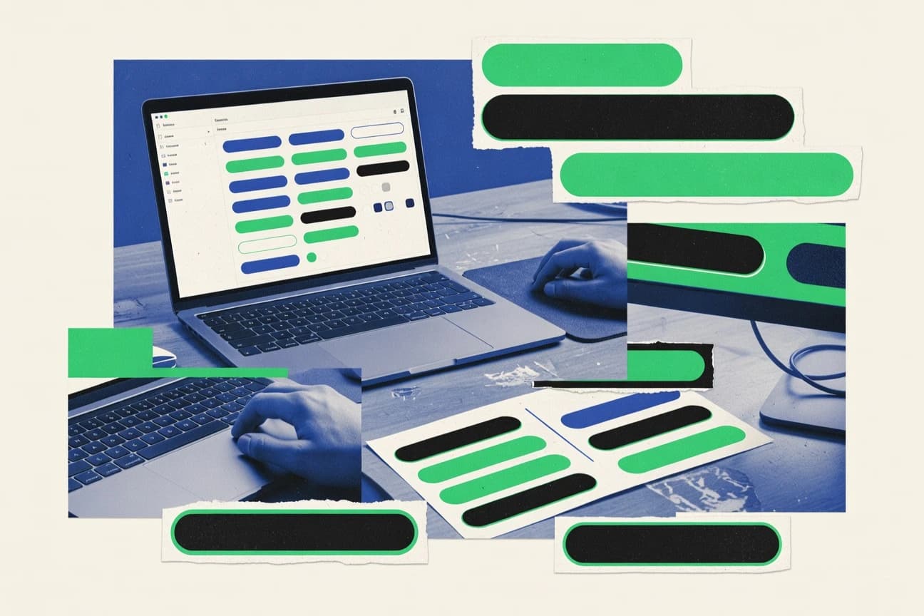
Art DesignTop 10 Best Button Design Software of 2026
Compare top Button Design Software picks with a ranked list of the best tools for UI button mockups. Explore the top 10 now.

How we ranked these tools
Core product claims cross-referenced against official documentation, changelogs, and independent technical reviews.
Analyzed video reviews and hundreds of written evaluations to capture real-world user experiences with each tool.
AI persona simulations modeled how different user types would experience each tool across common use cases and workflows.
Final rankings reviewed and approved by our editorial team with authority to override AI-generated scores based on domain expertise.
Score: Features 40% · Ease 30% · Value 30%
Gitnux may earn a commission through links on this page — this does not influence rankings. Editorial policy
Editor’s top 3 picks
Three quick recommendations before you dive into the full comparison below — each one leads on a different dimension.
Figma
Components with Variants for managing button states across an entire design system
Built for product teams defining consistent button systems with components and interactive prototypes.
Adobe Illustrator
Editor pickVector editing with the Pen tool plus precise anchor and path controls
Built for designers creating scalable button icon sets and UI assets with strict visual control.
Adobe Photoshop
Editor pickLayer styles for reusable bevel, glow, and shadow effects across button variations
Built for designers creating pixel-precise button assets and variants for UI mockups.
Related reading
Comparison Table
This comparison table contrasts button design software used to create UI icons, interactive control graphics, and scalable button assets. It covers tools including Figma, Adobe Illustrator, Adobe Photoshop, Sketch, and Affinity Designer, with notes that focus on each app’s core design workflow and common asset export needs.
Figma
UI prototypingDesigns and prototypes UI elements like button states, variants, and interactive hover and click behaviors inside a collaborative design canvas.
Components with Variants for managing button states across an entire design system
Figma stands out with real-time collaborative editing and a component system built for scalable UI design. It supports designing button states using auto layout, variants, and interactive prototypes that link hover and click behaviors.
Teams can manage design tokens-like styling via consistent styles and reuse assets across files through libraries and shared components. Vector tools and grid snapping make it practical for pixel-precise button geometry, spacing, and typography.
- +Variant-based button states keep hover, pressed, and disabled designs consistent
- +Auto layout preserves padding, alignment, and responsive text behavior
- +Interactive prototypes validate button flows with click and hover interactions
- +Shared libraries and components reduce duplication across product surfaces
- +Cloud collaboration updates button specs in real time across reviewers
- –Complex button variants can slow down big component trees
- –Design-to-code handoff requires careful naming to avoid mismatches
- –Managing exhaustive state matrices becomes tedious in large systems
- –Editing dense vectors for icon-like buttons can be slower than CAD-grade tools
Best for: Product teams defining consistent button systems with components and interactive prototypes
More related reading
Adobe Illustrator
Vector graphicsCreates scalable vector button icons and styles with precise paths, gradients, and reusable graphics built for UI asset export.
Vector editing with the Pen tool plus precise anchor and path controls
Adobe Illustrator stands out for precision vector drawing built around scalable artwork, which suits crisp button graphics and icon sets. It provides robust shape tools, advanced typography, and extensive export options that support multiple UI resolutions.
Styles, global edits, and symbol-like reuse workflows help keep button variants consistent across screens. Layering and artboards support structured design delivery for interface components.
- +Pixel-perfect vector control for sharp button edges and icons
- +Symbols and global styles support consistent button variants
- +Artboards and export presets speed delivery for UI mockups
- +Powerful typography tools fit text-heavy button designs
- +Layer management keeps states like hover and disabled organized
- –No native button-state component system like dedicated UI tools
- –Learning curve is steep for path, pen, and complex workflows
- –Handoff to developers can require extra setup for production assets
Best for: Designers creating scalable button icon sets and UI assets with strict visual control
Adobe Photoshop
Raster designPaints and composites button visuals with layered effects, texture control, and export workflows for UI mockups.
Layer styles for reusable bevel, glow, and shadow effects across button variations
Adobe Photoshop stands out for its pixel-level editing and mature compositing workflow for designing button graphics. It supports advanced layers, masks, blending modes, and vector-shape tools that help create crisp hover and pressed states.
Export options cover multiple formats and resolutions, which fits UI asset pipelines and design-to-dev handoff. The learning curve remains steep because Photoshop mixes raster tools, typography, and effects into one interface.
- +Pixel-perfect layers, masks, and blend modes for detailed button states
- +Vector shape layers speed up clean icons and rounded button geometry
- +Smart Guides and transform tools support consistent sizing and alignment
- –No built-in button state system like component-based UI design tools
- –Effects stacks can become hard to manage across many variants
- –Complex UI and tool overlap slow down early workflow setup
Best for: Designers creating pixel-precise button assets and variants for UI mockups
More related reading
Sketch
Desktop UI designBuilds button UI designs using vector layers, reusable symbols, and responsive artboards for interactive design review.
Symbols and libraries for reusable button components across screens
Sketch stands out for its fast vector-first design workflow, with mature symbol and library tooling for consistent UI production. It supports button-focused layout work using Auto Layout, scalable styles, and reusable components that speed iterative design. Exports and handoff options help move button specs into developer workflows, especially for pixel-level mockups.
- +Auto Layout speeds consistent button sizing across states
- +Symbols and reusable styles keep button typography and spacing uniform
- +Vector editing and component organization work well for UI polish
- –macOS-only workflow limits team usage across operating systems
- –Figma-style real-time collaboration and versioning are not its core strength
- –Advanced prototyping and interactions feel less comprehensive than some competitors
Best for: Design teams producing button-heavy UI mockups with reusable components
Affinity Designer
Vector-firstDesigns sharp button icons and UI artwork using vector and pixel workflows with export-ready asset generation.
Persona-based workspace switching for vector and pixel-accurate button details in one document
Affinity Designer stands out for combining vector-first design with fast, professional page layout in a single app. It supports precise vector drawing, typography, and icon-style workflows that map well to button creation with consistent shapes and strokes.
Advanced alignment tools, snapping, and layer-based styling help maintain uniform button systems across multiple states. Export options cover common UI formats so button assets can move cleanly into design handoff and development pipelines.
- +Vector tools deliver accurate button shapes, strokes, and corner radius control
- +Layer and style management supports reusable button component variations
- +Snapping and alignment features speed up consistent button grid layouts
- +Export workflows support common asset needs for UI mockups and prototypes
- –UI and typography tools require setup to match advanced UI-kit conventions
- –Button state exports take manual discipline for naming and versioning
- –Learning curve is steeper than specialized UI button libraries
Best for: Designers producing consistent vector button sets for web and app mockups
Inkscape
Open-source vectorProduces button icons and UI graphics as editable vector shapes with SVG export and consistent alignment tooling.
Boolean operations combined with node editing for accurate button silhouettes
Inkscape stands out as a free-form vector editor built for precise shape work and reusable design elements. It supports SVG-native button design via layers, snapping, boolean operations, gradients, and text styling for crisp UI-ready artwork. Designers can reuse components through symbols and manage complex icons with robust path editing tools.
- +SVG-first workflow keeps button artwork scalable and export-ready
- +Powerful path editing with node tools improves icon and button shape precision
- +Boolean ops and snapping speed creation of rounded and segmented button forms
- +Layer and group management supports systematic UI button variations
- +Symbols and cloning reduce repetition across a button set
- –No dedicated button UI kit workflow like component-based design tools
- –Advanced effects can feel unintuitive compared with mainstream vector editors
- –Auto layout and responsive variants require manual setup
Best for: Independent designers creating SVG-based button sets and icon assets
More related reading
Canva
Template-basedDesigns button graphics for UI mockups using template layouts, vector elements, and straightforward asset export.
Brand Kit for applying colors and typography consistently across button designs
Canva stands out for turning button design into a template-driven workflow with drag-and-drop layout and instant visual previews. It includes a large component library with rounded rectangles, icons, and typography styles that support consistent button sets.
Designers can use brand kits and reusable elements to standardize colors, fonts, and sizing across many button variations. Export options cover PNG, SVG, and PDF assets for UI mockups and production-ready handoff.
- +Template-based button styling speeds up consistent button variant creation
- +Brand Kit syncs colors and fonts across button sets
- +SVG export preserves vector edges for scalable UI assets
- +Extensive icon and shape library supports multiple button styles
- –Advanced UI states like hover and disabled need manual setup
- –Component behavior for real interactivity is limited to static exports
- –Grid and constraint controls feel less precise than dedicated UI tooling
Best for: Teams creating branded button iconography for marketing and UI mockups
CorelDRAW
Illustration suiteCreates button iconography and UI illustrations with advanced vector tools and production export for digital assets.
Object Styles for fast, consistent formatting across button icons and states
CorelDRAW stands out for its vector-first design workflow with robust shape, typography, and layout tools built for precision button art. It supports export formats used by hardware and UI pipelines, including vector outputs and high-resolution raster for production.
The app’s effects, alignment tools, and reusable styles make it efficient for consistent icon and button sets. Separate design layers help manage states such as normal, hover, and pressed in a single file.
- +Vector tools produce crisp button edges at any size.
- +Layering and alignment speed up multi-state button set creation.
- +Export options cover SVG and print-ready raster outputs.
- –Advanced vector workflows require a learning curve.
- –UI-heavy button prototyping needs more external tooling than drawing.
Best for: Teams creating scalable vector button icon sets and production-ready assets
More related reading
Gravit Designer
Web vectorDesigns button shapes and vector icons with a lightweight interface and exports for UI asset workflows.
Boolean operations directly on vector shapes for fast button geometry edits
Gravit Designer stands out with a strong vector-first workflow that supports full-page UI and button layout from a single canvas. It includes shape tools, boolean operations, text styling, and export controls that fit the typical needs of button design systems.
The app also supports plugins and cross-platform work, which helps reuse design patterns across states and variants. Compared with dedicated UI toolchains, collaboration features and asset pipeline automation for large teams are less comprehensive.
- +Robust vector tools for precise button shapes, icons, and corner treatments
- +Boolean operations and alignment tools speed up layered button builds
- +Export presets and multiple artboards support state-based button variants
- –Component and state management for design systems stays basic
- –Advanced auto-layout and responsive behaviors are limited versus UI-focused tools
- –Collaboration and review workflows feel lighter than specialized design platforms
Best for: Freelancers designing vector button variants and exporting clean assets
Krita
Digital paintingPaints button styles and decorative UI elements with brush workflows, layers, and high-resolution exports.
Highly customizable brushes with stabilizers and layer blending modes
Krita stands out for its high-end raster painting engine and extensive brush customization aimed at icon and button mockups. It supports layered canvas workflows with vector shapes for crisp UI button silhouettes. Button design benefits from snapping aids, transform tools, and exportable assets for rapid iteration across states like hover and pressed.
- +Powerful brush and layer workflows for detailed button mockups
- +Vector shape tools help keep button outlines crisp
- +Fast asset export supports multi-state UI design cycles
- –Primarily raster-first, making strict UI component workflows harder
- –Advanced settings can slow onboarding for button-only tasks
- –Limited built-in UI state management compared with design tools
Best for: Designers creating detailed button icons and mockups using layered artwork
Key Features to Look For
The right features determine whether a team can maintain consistent button systems at scale and still produce clean, exportable assets.
Variant-based button state management
Variant-based button states keep hover, pressed, and disabled visuals consistent without duplicating artwork. Figma excels with components that use variants to manage button states across an entire design system, and Sketch also supports reusable symbols and libraries for consistent button components across screens.
Auto layout and responsive spacing control
Auto layout preserves padding, alignment, and text behavior so button geometry stays correct across sizes and labels. Figma uses auto layout to maintain consistent button sizing across states, and Sketch also uses Auto Layout to speed consistent button sizing across variants.
Interactive prototyping for hover and click behaviors
Interactive prototypes validate how button states behave in real user flows before handoff. Figma links interactive hover and click behaviors so teams can test button flows, while Canva limits interactivity to template-driven static exports for production-ready mockups.
Reusable styling with shared libraries or global edits
Reusable styling reduces drift when teams update colors, typography, and effects across many button variations. Figma uses consistent styles and shared libraries to reuse assets across files, and Adobe Photoshop provides layer styles for reusable bevel, glow, and shadow effects across button variations.
Precision vector path editing for crisp button edges
Pixel-sharp button geometry depends on precise anchor and path control for outlines, rounded corners, and icon silhouettes. Adobe Illustrator delivers this through Pen tool vector editing with precise anchor and path controls, and Inkscape supports SVG-native button design with powerful node tools for shape precision.
Geometry acceleration using boolean operations
Boolean operations speed the creation of rounded and segmented button forms by editing vector silhouettes directly. Inkscape combines boolean operations with node editing for accurate button shapes, and Gravit Designer applies boolean operations directly on vector shapes to edit button geometry quickly.
Common Mistakes to Avoid
Several recurring pitfalls show up when button workflows use the wrong feature model or overload design files with unmanaged state complexity.
Overloading a component system with an unmanageable state matrix
Large variant trees can slow down editing when every hover, pressed, and disabled state is captured as separate combinations. Figma can handle button states with variants, but exhaustive state matrices can become tedious at scale. Managing state scope with reusable styles and a controlled variant approach helps keep editing usable in Figma.
Using pure vector drawing tools without a native button-state workflow
Adobe Illustrator and Adobe Photoshop deliver precise artwork and reusable effects, but they do not provide a native component system that behaves like UI button states. This can force manual discipline for naming and versioning when exporting multiple states from Illustrator or when effects stacks become hard to manage in Photoshop.
Assuming template tools provide real interactive button behavior
Canva can speed branded button styling with templates and Brand Kit sync for colors and typography, but it supports limited component behavior for real interactivity. For hover and click validation, teams should rely on Figma interactive prototypes instead of expecting Canva exports to represent behavior.
Skipping layout automation and ending up with spacing drift across sizes
Tools that rely heavily on manual alignment can create inconsistent padding and text spacing across button sizes. Figma and Sketch both use Auto Layout to preserve padding and alignment, while Inkscape requires manual setup for auto layout and responsive variants.
How We Selected and Ranked These Tools
we evaluated every tool on three sub-dimensions with explicit weights of features at 0.4, ease of use at 0.3, and value at 0.3. The overall rating is the weighted average calculated as overall = 0.40 × features + 0.30 × ease of use + 0.30 × value. Figma separates itself on the features dimension because variant-based components manage hover, pressed, and disabled button states consistently while interactive prototypes validate click and hover behavior. That combination directly raises the feature score more than vector-only editors like Adobe Illustrator or raster-first editors like Adobe Photoshop.
Conclusion
After evaluating 10 art design, Figma stands out as our overall top pick — it scored highest across our combined criteria of features, ease of use, and value, which is why it sits at #1 in the rankings above.
Use the comparison table and detailed reviews above to validate the fit against your own requirements before committing to a tool.
Tools reviewed
Primary sources checked during evaluation.
Referenced in the comparison table and product reviews above.
Keep exploring
Comparing two specific tools?
Software Alternatives
See head-to-head software comparisons with feature breakdowns, pricing, and our recommendation for each use case.
Explore software alternatives→In this category
Art Design alternatives
See side-by-side comparisons of art design tools and pick the right one for your stack.
Compare art design tools→FOR SOFTWARE VENDORS
Not on this list? Let’s fix that.
Our best-of pages are how many teams discover and compare tools in this space. If you think your product belongs in this lineup, we’d like to hear from you—we’ll walk you through fit and what an editorial entry looks like.
Apply for a ListingWHAT THIS INCLUDES
Where buyers compare
Readers come to these pages to shortlist software—your product shows up in that moment, not in a random sidebar.
Editorial write-up
We describe your product in our own words and check the facts before anything goes live.
On-page brand presence
You appear in the roundup the same way as other tools we cover: name, positioning, and a clear next step for readers who want to learn more.
Kept up to date
We refresh lists on a regular rhythm so the category page stays useful as products and pricing change.