
In today’s data-driven world, effectively monitoring and analyzing the usage of business intelligence tools is crucial for maximizing their potential in driving informed decision-making. Power BI, a leading business analytics solution, offers powerful usage metrics to help organizations understand how users are interacting with their reports and dashboards.
In this blog post, we will delve deep into the importance of Power BI usage metrics, how to access and interpret them, and how these insights can guide you in optimizing your organization’s data analytics efforts for increased efficiency and impact. So, buckle up and join us on this insightful journey, as we unveil the secrets behind harnessing the full power of Power BI’s usage metrics.
Power BI Usage Metrics You Should Know
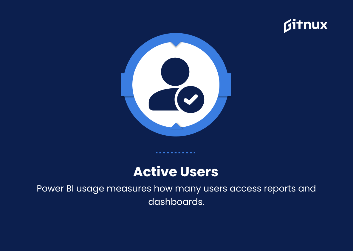
1. Active Users
This metric measures the number of users who have accessed Power BI reports and dashboards within a specific time period. It helps organizations understand the adoption and engagement rate of their users.
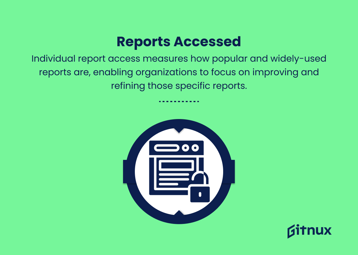
2. Reports Accessed
This metric counts the number of individual reports accessed by users. It helps in identifying the most popular and widely-used reports, enabling organizations to focus on improving and refining those specific reports.
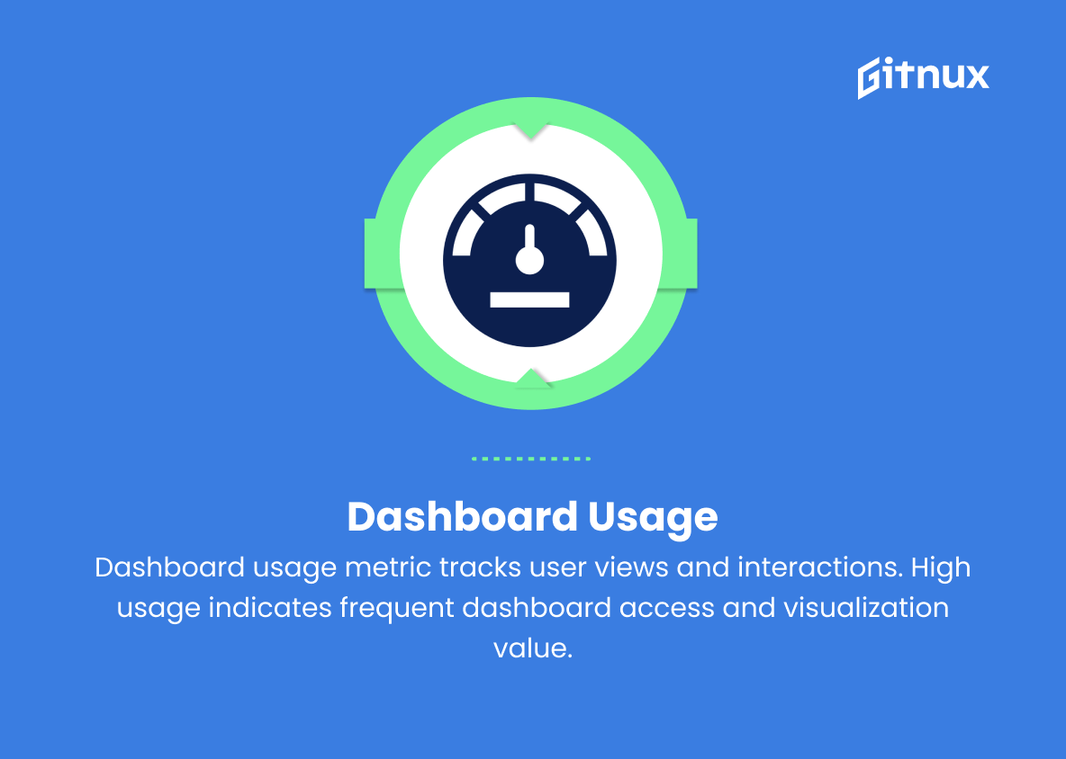
3. Dashboard Usage
Dashboard usage metric measures the number of dashboard views and interactions by users. High dashboard usage indicates that the users are frequently accessing reports and finding value in the visualizations provided.
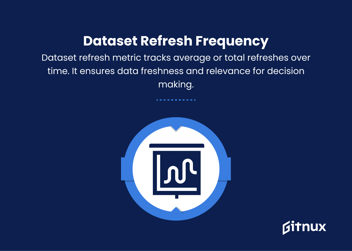
4. Dataset Refresh Frequency
This metric tracks the average or total number of dataset refreshes performed within a specific time period. It helps organizations ensure that their data is always up-to-date and relevant for decision making.
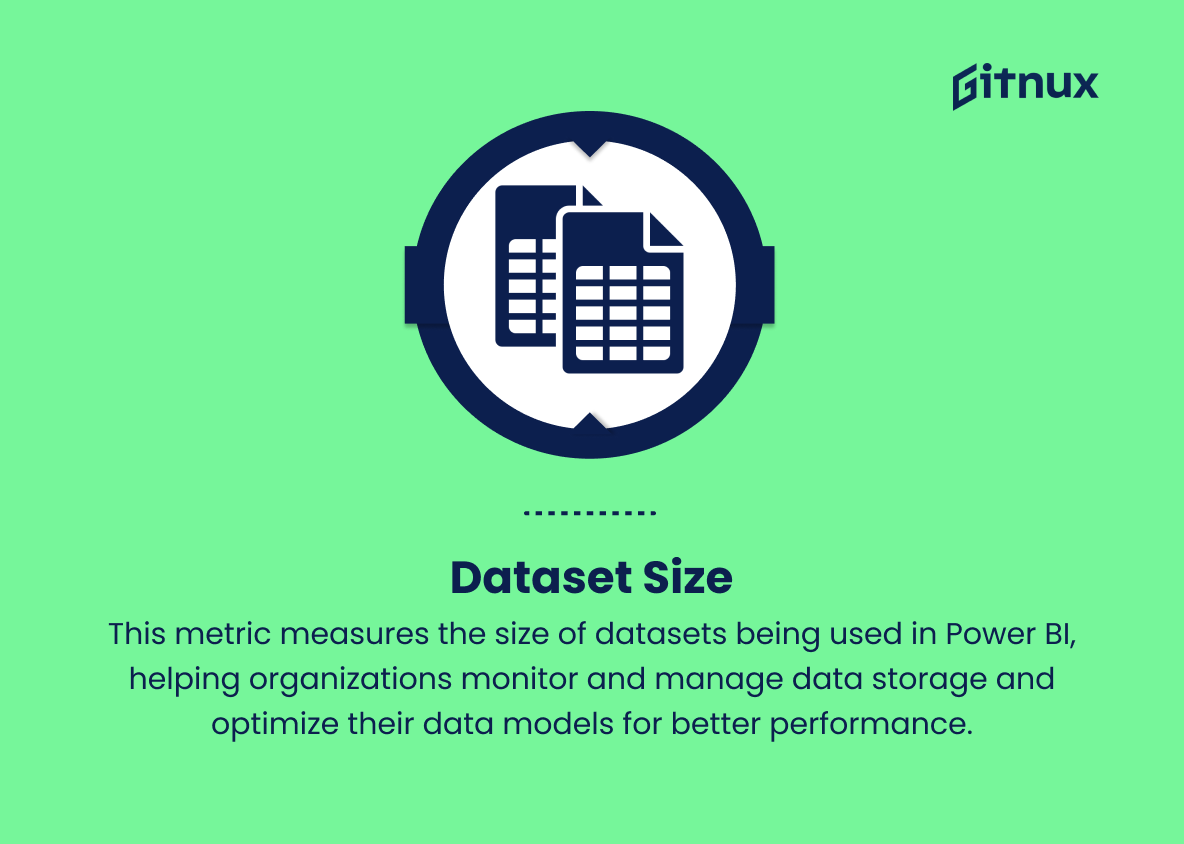
5. Dataset Size
This metric measures the size of datasets being used in Power BI, helping organizations monitor and manage data storage and optimize their data models for better performance.
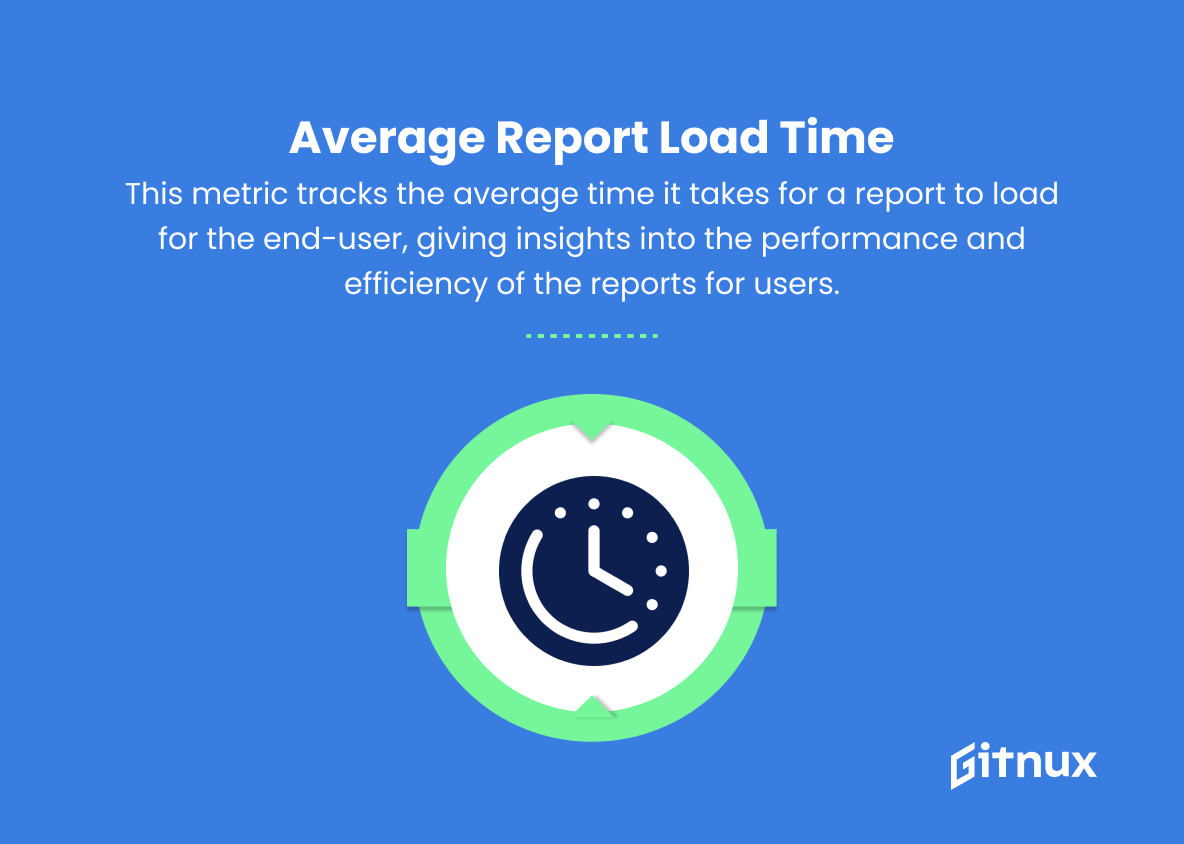
6. Average Report Load Time
This metric tracks the average time it takes for a report to load for the end-user, giving insights into the performance and efficiency of the reports for users.
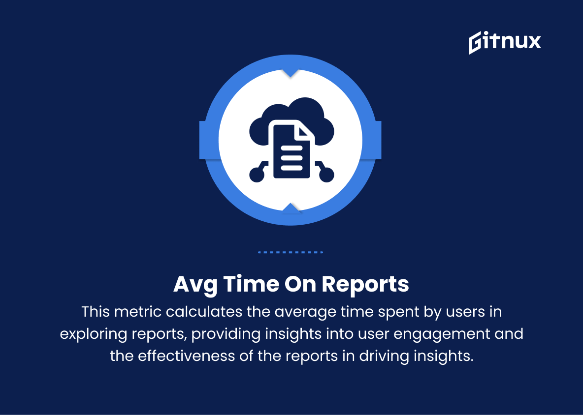
7. Avg Time on Reports
This metric calculates the average time spent by users in exploring reports, providing insights into user engagement and the effectiveness of the reports in driving insights for the end-users.
8. Sharing and Collaboration
This metric measures the number of shared dashboards, reports, and apps, indicating the level of collaboration among users within the organization.
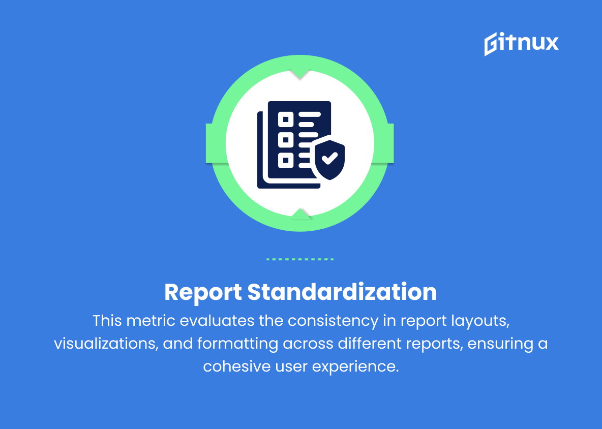
9. Report Standardization
This metric evaluates the consistency in report layouts, visualizations, and formatting across different reports, ensuring a cohesive user experience.
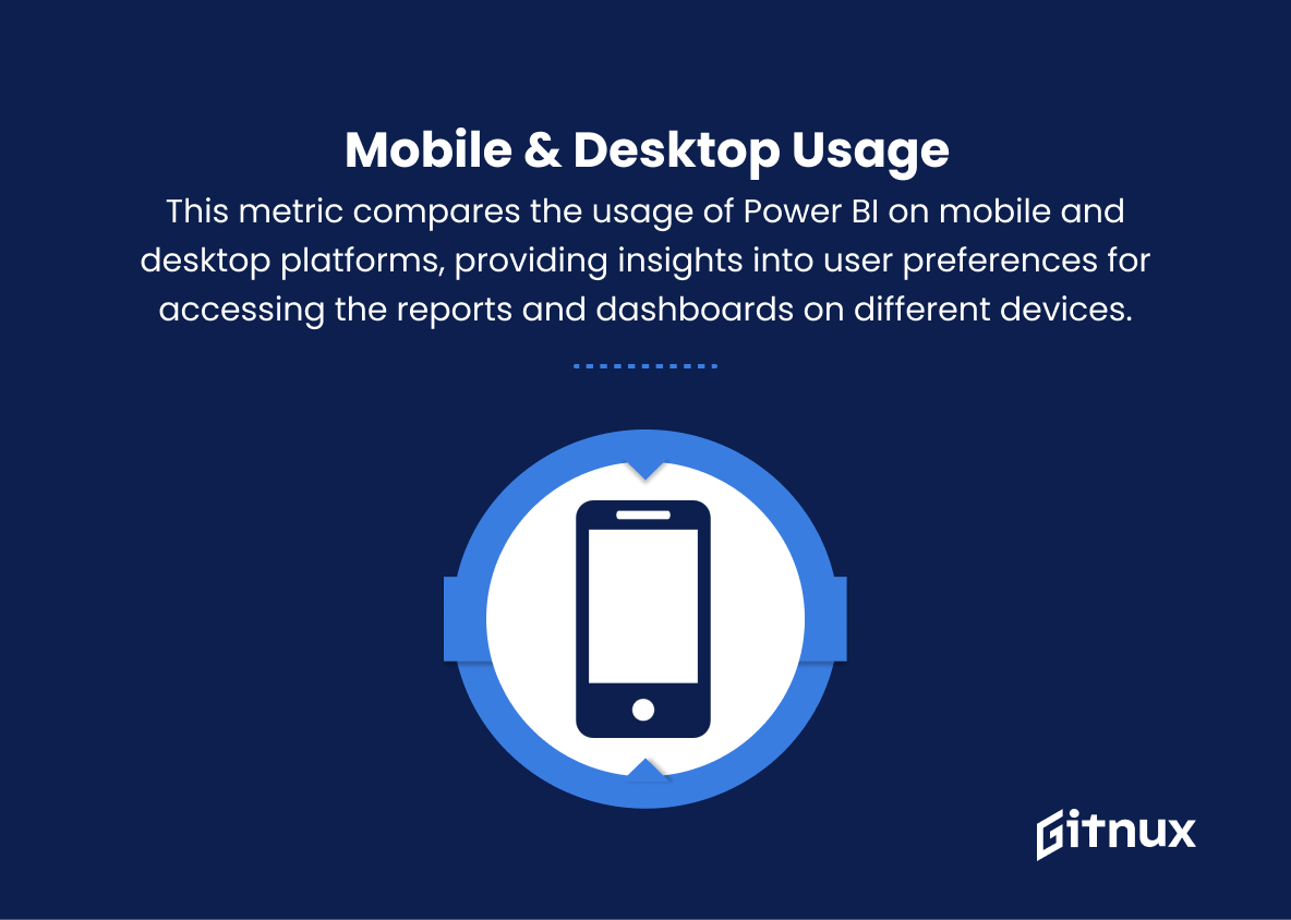
10. Mobile & Desktop Usage
This metric compares the usage of Power BI on mobile and desktop platforms, providing insights into user preferences for accessing the reports and dashboards on different devices.
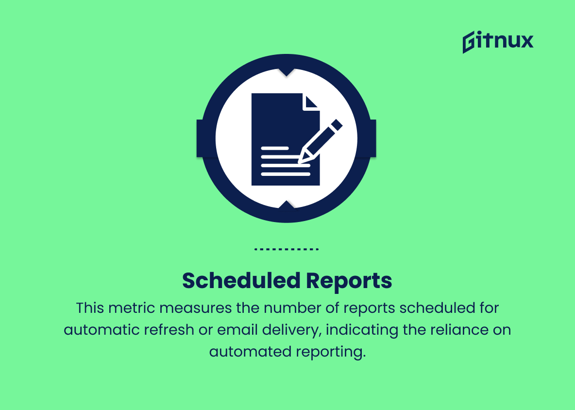
11. Scheduled Reports
This metric measures the number of reports scheduled for automatic refresh or email delivery, indicating the reliance on automated reporting.
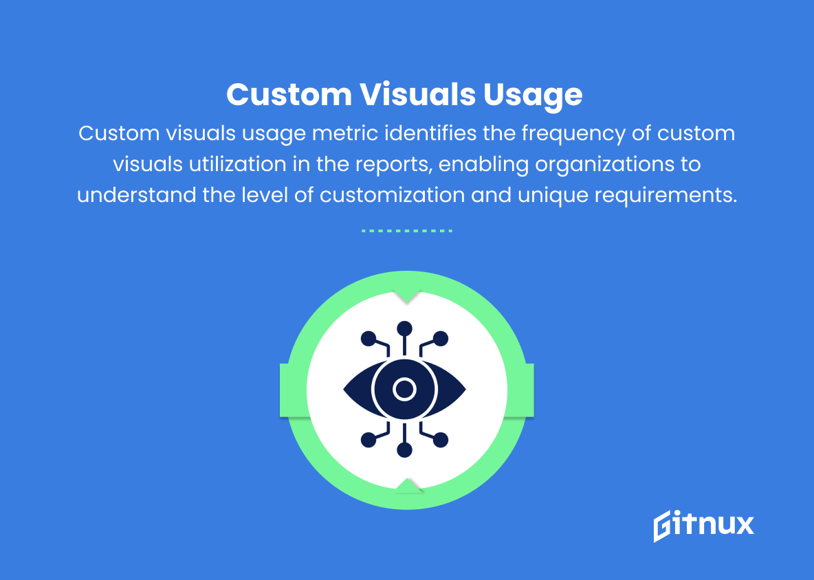
12. Custom Visuals Usage
Custom visuals usage metric identifies the frequency of custom visuals utilization in the reports, enabling organizations to understand the level of customization and unique requirements.
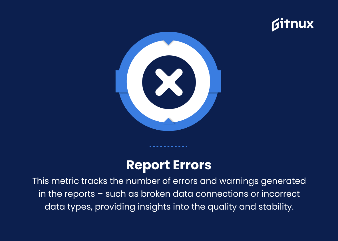
13. Report Errors
This metric tracks the number of errors and warnings generated in the reports – such as broken data connections or incorrect data types, providing insights into the quality and stability of the reports.
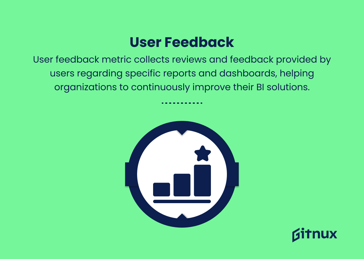
14. User Feedback
User feedback metric collects reviews and feedback provided by users regarding specific reports and dashboards, helping organizations to continuously improve their BI solutions.
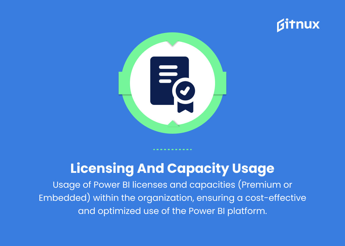
15. Licensing and Capacity Usage
This metric measures the usage of Power BI licenses and capacities (Premium or Embedded) within the organization, ensuring a cost-effective and optimized use of the Power BI platform.
Power BI Usage Metrics Explained
Power BI usage metrics serve as essential indicators for organizations to evaluate the performance, engagement, and effectiveness of their reports and dashboards. By analyzing metrics such as active users, reports accessed, and dashboard usage, organizations can gain insights into the overall user adoption and engagement rate, as well as identifying popular and valuable reports. Monitoring dataset refresh frequency, dataset size, and average report load time ensures that data is kept up-to-date, relevant, and optimally-performing for informed decision-making.
Metrics such as average time on reports, sharing and collaboration, report standardization, and mobile & desktop usage provide insights into user behavior, preferences, and the collaborative nature of the organization’s BI environment. Scheduled reports, custom visuals usage, report errors, and user feedback allow organizations to optimize their BI solutions by automating essential tasks, customizing reports to meet unique needs, addressing errors and inconsistencies, and continuously improving based on end-user feedback. Finally, tracking licensing and capacity usage ensures cost-effective utilization of the Power BI platform, thereby maximizing return on investment for the organization.
Conclusion
In conclusion, Power BI usage metrics has proven to be a vital tool for businesses and organizations aiming to optimize their data-driven decision-making processes. By monitoring and analyzing the engagement and performance of reports and dashboards, stakeholders can identify trends, discover potential pain points, and capitalize on opportunities for growth.
Proper utilization of these insights ultimately ensures improved efficiency, streamlined processes, and increased ROI. The key to achieving success lies in continuously investing in data literacy and fostering a data-centric corporate culture. As the data revolution continues to evolve, staying at the forefront of Power BI usage metrics will undoubtedly remain a top priority for businesses of all sizes, across various industries.