
In today’s data-driven world, the ability to effectively communicate complex information has become a vital skill. Data visualization, which involves the representation of data in a visual or graphical format, has emerged as a leading solution for expressing and interpreting these massive datasets. As organizations race to harness the power of big data, keeping up with the latest data visualization trends has become essential for professionals across industries.
In this blog post, we will explore the latest data visualization trends that are transforming the way we comprehend, analyse, and use data. This will enlighten both new and seasoned practitioners on the advancements shaping the future of this dynamic field.
Top Data Visualization Trends
1. Interactive Visualizations
As technology advances, data visualization tools are becoming increasingly interactive, allowing users to explore data in real time, filter results, and zoom in on specific data points.
2. Storytelling with Data
More organizations are using data visualization as a storytelling tool to convey complex ideas and insights in a simple and clear way.
3. Mobile-friendly Visualizations
As mobile usage continues to rise, data visualization tools and platforms will be optimized for smaller screens and touch-based interactions.
4. Virtual Reality (VR) and Augmented Reality (AR) Visualizations
The integration of VR and AR technology in data visualization will enable users to engage with data in three-dimensional spaces.
5. Real-time Data Visualizations
With the growth of IoT devices and streaming data, real-time visualizations will become crucial for monitoring, analysing, and making decisions based on live data.
6. AI-powered Data Visualization
Artificial intelligence will play an increasing role in data visualization, automating data filtering, and generating insights.
7. Collaborative Visualizations
Cloud-based data visualization platforms will facilitate collaboration and save time by enabling multiple users to interact with the same visualization simultaneously.
8. Customization and Personalization
Many organizations will prioritize the creation of custom and personalized data visualizations to cater to specific needs and preferences.
9. Geospatial Data Visualization
The use of maps and geospatial visualizations will increase, enabling more sophisticated analysis of location-based data.
10. Multi-layered Visualizations
Combining multiple visualizations in a single presentation will become more popular, providing a comprehensive view of complex data sets.
11. Data Art
The intersection of data visualization and art will continue to grow, with visually appealing and creative visualizations being used to engage audiences and raise awareness around important issues.
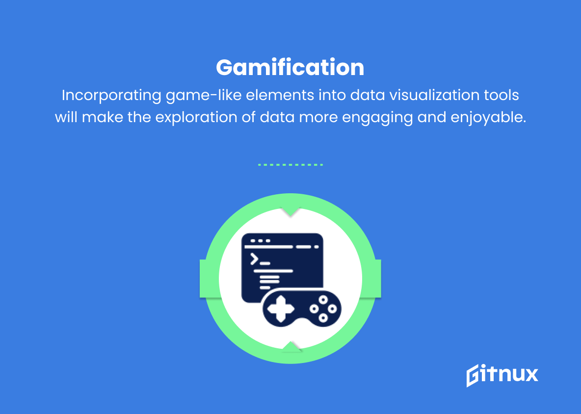
12. Gamification
Incorporating game-like elements into data visualization tools will make the exploration of data more engaging and enjoyable.
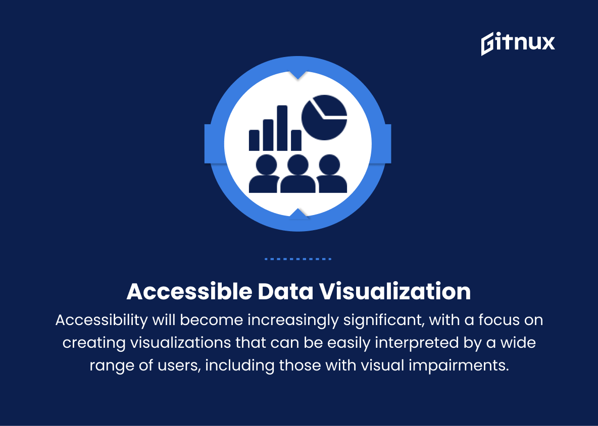
13. Accessible Data Visualization
Accessibility will become increasingly significant, with a focus on creating visualizations that can be easily interpreted by a wide range of users, including those with visual impairments.
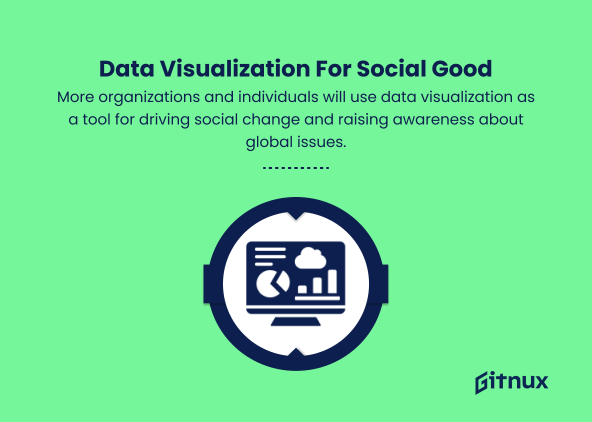
14. Data Visualization for Social Good
More organizations and individuals will use data visualization as a tool for driving social change and raising awareness about global issues.
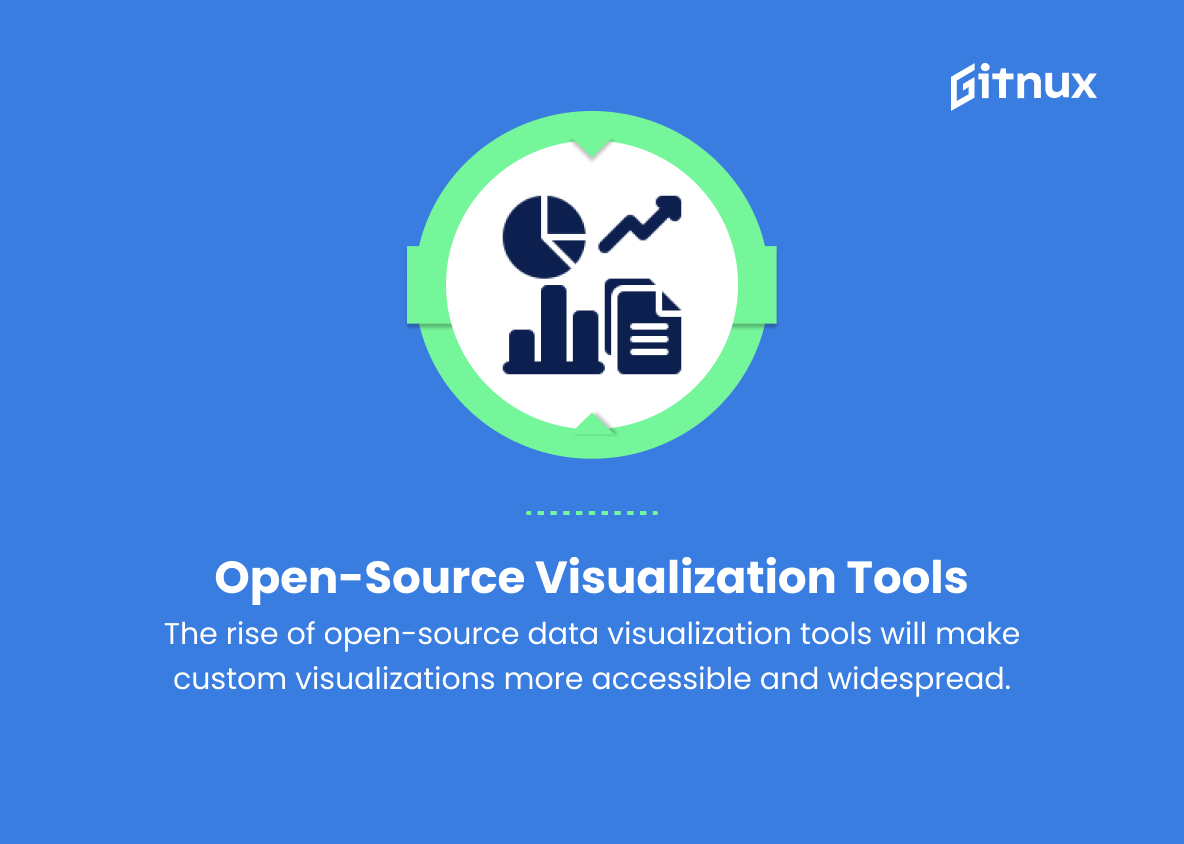
15. Open-source Visualization Tools
The popularity of open-source data visualization tools and libraries will continue to grow, making it easier for individuals and organizations to create custom visualizations without significant investment.
Implications
As we look towards the future, data visualization trends are set to revolutionize the way we engage with and interpret complex data. Interactive visualizations will enhance real-time data exploration, while storytelling techniques and mobile-friendly designs will make complex insights more accessible for diverse audiences. The integration of Virtual Reality and Augmented Reality will create immersive experiences of navigating through data, with real-time updates crucial for analysing live streams from IoT devices.
Artificial Intelligence will simplify data filtering and insight generation, while collaborative platforms foster teamwork and efficiency. Organizations will increasingly seek customized and personalized visualizations, with geospatial representations becoming invaluable for location-based analyses. Multi-layered designs will enable users to observe intricate relationships in data sets, as data art continues to blend creativity with information. Gamification techniques will make data analysis more engaging, with accessibility prioritized to ensure visualizations are inclusive for all.
Data visualization will become a powerful tool for social good, driving awareness and social change around global issues. Lastly, the growing popularity of open-source tools will make it simpler for users to create and share their own custom visualizations, empowering individuals and organizations alike to make sense of an increasingly data-driven world.
Conclusion
In summary, the rapidly evolving world of data visualization continues to break new ground, driven by advancements in technology and the growing need for organizations to make informed decisions. As a result, an array of innovative and emerging trends is playing a pivotal role in shaping the way data is presented and interpreted. It’s more important than ever for businesses to stay current with the latest trends and tools to optimize their data analysis and presentation.
From immersive storytelling and real-time interactivity to artificial intelligence and mobile-focused designs, these trends are pushing the boundaries of data visualization while empowering businesses with unprecedented access to critical insights. By adopting and adapting to these trends, organizations can elevate their analytical capabilities, establish more efficient processes, and foster engaging experiences for their end-users. The future of data visualization is undoubtedly bright, filled with opportunities to explore uncharted territories in the quest for more effective communication and decision-making.